
You’ve built a form that looks correct in the browser. The user can click the box, the label changes colour, and the submit button appears to work. Then someone reports that the conditional field can’t be reached with a keyboard, or your backend receives no value at all when a box is left unchecked.
That’s the uncomfortable part of the checkbox input type. The element is small, but it carries native state, submission rules, accessibility semantics, focus behaviour, and framework binding details. Treating it as a simple yes-or-no switch is how subtle bugs reach production.
Table of Contents
- Why Checkboxes Are Tricker Than They Look
- The Three States of a Native Checkbox Input
- Accessibility Requirements for Checkbox Inputs
- When to Use Checkboxes Instead of Radio Buttons or Toggles
- Styling Checkboxes Without Breaking Accessibility
- Integrating Checkboxes in Vue and Headless Component Libraries
- Build Better Checkboxes with This Practical Checklist
Why Checkboxes Are Tricker Than They Look
A common feature-request form asks users to choose the areas they want help with. A developer adds several checkbox inputs, attaches a click handler, and reveals a text field when “Other” is selected. Visually, everything seems fine. A mouse user can select an option, and the extra field appears below it.
The problems start elsewhere. A keyboard user may tab past the revealed field if the implementation removes it from the normal focus order. A screen-reader user may not hear that new content has appeared. On submission, unchecked boxes may be omitted entirely, leaving the server unable to distinguish “the user deliberately chose nothing” from “the browser sent no parameter”.
A native checkbox has more going on than its square shape suggests:
- A checked state, represented by the
checkedproperty. - An unchecked state, which is the default interactive state.
- An indeterminate state, used for partial selections in groups.
- A disabled condition, which changes interaction and submission behaviour.
- An accessible name and state announcement, normally supplied by a proper label.
- A framework value, which must stay synchronised with the DOM.
The safest approach is to understand the browser’s native model before adding CSS, JavaScript, Vue bindings, or a headless component. Once you know what the browser already handles, you can enhance the control without accidentally replacing its semantics.
Practical rule: Start with a real
<input type="checkbox">, then improve its presentation. Don’t begin with a clickable<div>that imitates one.
This guide follows the control from native markup to group validation, custom styling, conditional fields, and Vue integration. The aim isn’t merely to make a checkbox look polished. It’s to help you ship one that behaves predictably for users, assistive technology, browsers, and your application code.
The Three States of a Native Checkbox Input
Before styling a checkbox, separate its state from its appearance. The HTML checked attribute sets the initial state in markup, while JavaScript reads and changes the live checked property.
A basic control looks like this:
<label><input type="checkbox" name="updates" value="yes"> Receive updates</label>
When the user selects it, input.checked becomes true. When the user clears it, input.checked becomes false. The submitted value is normally sent only when the checkbox is checked, so your server should account for the unchecked case explicitly.
The third state is indeterminate. It means “some items in this group are selected”, not “the value is unknown” and not “the checkbox is checked”. It’s a JavaScript property, not a persistent HTML attribute:
const selectAll = document.querySelector('#select-all');
selectAll.indeterminate = true;
This is useful in a data table. If a group contains several rows and the user selects only part of them, the parent checkbox can display a mixed state. Selecting every row changes it to checked. Clearing every row changes it to unchecked.
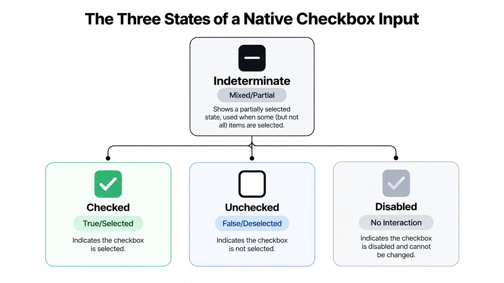
Disabled is different. It’s an interaction modifier rather than one of the three selection states. A disabled checkbox can be checked or unchecked, but the user can’t change it, and the browser won’t treat it like an ordinary successful form control.
Markup and submission
Use a name and value when the checkbox contributes to a form:
<input type="checkbox" id="alerts" name="alerts" value="email">
<label for="alerts">Send email alerts</label>
For a group, repeat the same name when the backend expects multiple values:
<input type="checkbox" name="topics" value="html"> HTML
<input type="checkbox" name="topics" value="css"> CSS
A form library may add a hidden input before the checkbox so the server receives a fallback when no box is selected. GOV.UK Form Builder documents this hidden-field helper, which prevents an absent value from being confused with an intentional empty selection.
The indeterminate property is visual and semantic state in the current document. It isn’t submitted as a separate form value, so send an explicit group value if the server needs to know whether the selection is partial.
For a closer look at the live checked property and related behaviour, see this checkbox checked-state guide. The important distinction is simple: HTML establishes initial state, JavaScript changes the live state, and form submission serialises successful controls rather than every element on the page.
Accessibility Requirements for Checkbox Inputs
Accessibility starts with the label, not with an ARIA attribute. A checkbox needs an accessible name that tells the user what selecting it means, and the label should be connected to the input in the DOM.
This explicit association works reliably:
<input type="checkbox" id="terms" name="terms" value="accepted">
<label for="terms">I agree to the terms</label>
The id must be unique, and the label’s for value must match it exactly. Wrapping the input inside the label is another valid pattern, but explicit associations are often easier to maintain when components generate markup.
UK public-sector guidance explains that screen readers announce the checkbox label and whether it is checked, then announce the changed state again. That behaviour depends on the browser recognising a real checkbox and finding a usable accessible name. A visually adjacent text node isn’t enough.
Accessible groups and conditional content
A collection of related checkboxes needs a group label. Use a fieldset and legend when the options share a question:
<fieldset>
<legend>Which services do you need?</legend>
...checkboxes...
</fieldset>
If at least one option is required, don’t assume the native required attribute on one checkbox validates the entire group. Validate the collection on the server, return a useful error, and associate that error with the group. The message should explain the action, such as “Select at least one service”, rather than merely saying “Invalid choice”.
Conditional content needs equal care. If checking a box reveals a dependent field, place that field naturally in the tab order and make its label and required status clear. University of Leeds design guidance highlights the need to announce revealed child fields and place them directly in the user’s navigation path.
The UK Government Digital Service also corrected a specific ARIA pattern for conditionally revealed questions. Its accessibility update explains why aria-expanded must not be used on a checkbox in a way that conflicts with the ARIA specification. Use the native checkbox state for the checkbox itself, and expose changes to the surrounding content through an appropriate structure rather than forcing an unsupported role-state combination.
| Requirement | Implementation | Why It Matters |
|---|---|---|
| Accessible name | Match label for to the input id, or wrap the input in a label |
Screen-reader users need an understandable control name |
| Group meaning | Use fieldset and legend for related options |
Users hear the question before navigating individual choices |
| Keyboard access | Keep the native input focusable and operable | Users must be able to select and clear options without a pointer |
| Error handling | Validate required groups server-side and link the error to the group | A multi-select requirement isn’t reliably expressed by one native attribute |
| Revealed fields | Insert dependent fields into the normal tab order and announce their status | Users need to discover and complete new content |
| ARIA usage | Don’t apply unsupported states to the checkbox role | Conflicting semantics can produce misleading announcements |
Test with a keyboard, then test with a screen reader. A checkbox that looks correct but loses its name, focus ring, or state announcement isn’t finished.
When to Use Checkboxes Instead of Radio Buttons or Toggles
A checkout form asks, “Which delivery options do you need?” The user can select weekend delivery, signature required, and pickup notification together. Checkboxes fit because each choice stands independently.
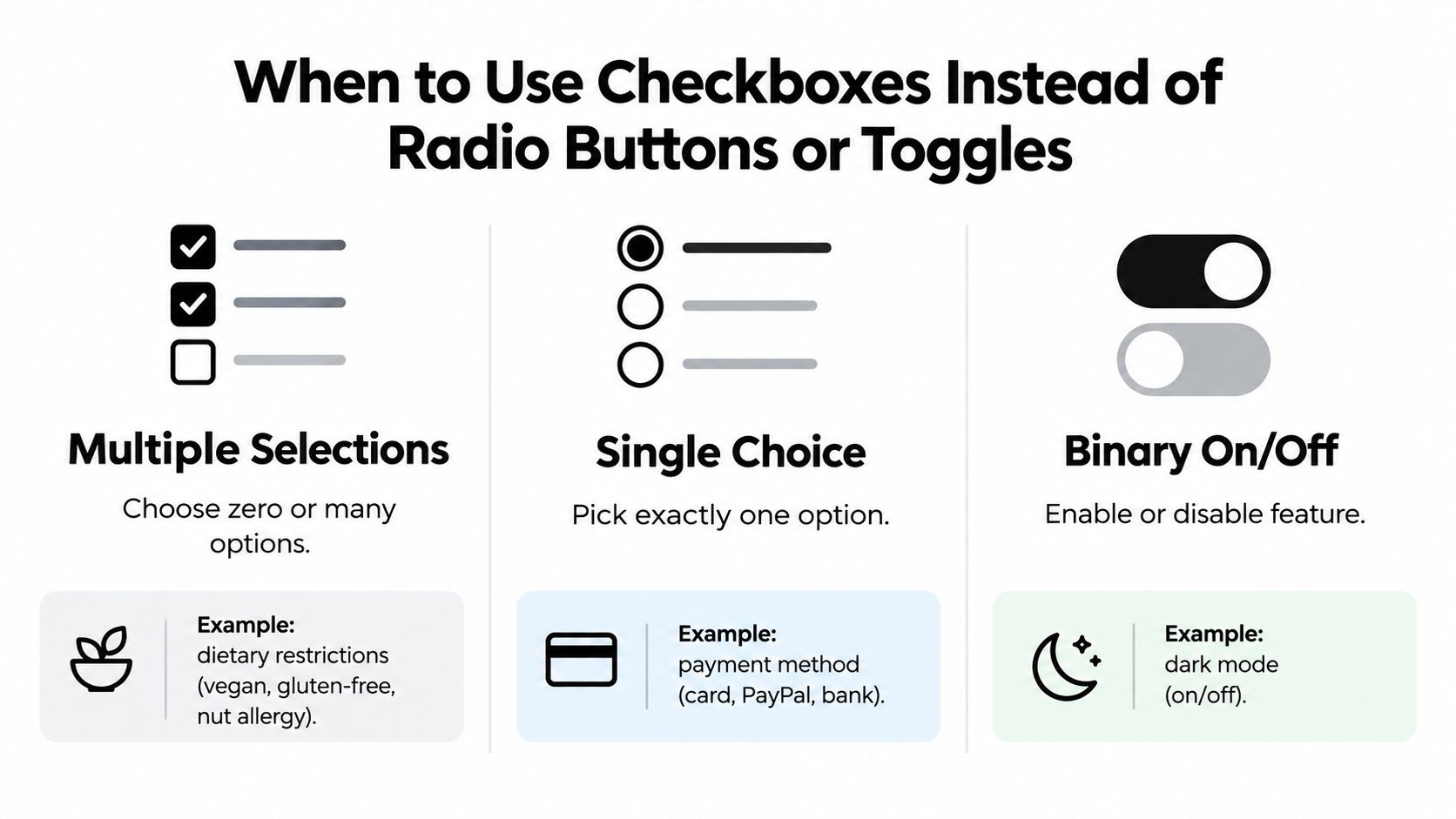
Use checkboxes when options are independent and the user may choose none, one, or several. Dietary requirements show the same pattern. Someone might select vegan, gluten-free, and nut allergy at once, so each checkbox represents its own boolean value.
Use radio buttons when the user must choose one option from a set. Payment method, delivery speed, and contact preference usually allow only one answer. UK parliamentary design guidance distinguishes checkboxes for multiple selections or independent settings from radio buttons where only one option is valid.
Use a switch or toggle for an on or off setting, particularly when the change takes effect immediately. “Dark mode” and “Mute notifications” describe enabled states. A checkbox can also represent a binary preference, but its appearance should match its meaning. A switch-shaped control that behaves like a multi-select checkbox gives users the wrong expectation.
The wording changes the control
Compare these labels:
- “Choose the newsletters you want”, followed by several checkboxes.
- “Which newsletter should we send?”, followed by radio buttons.
- “Receive product updates”, followed by one consent checkbox.
- “Email notifications”, followed by a settings toggle.
The first permits multiple selections. The second makes the choices exclusive. The third records affirmative consent and needs precise wording. The fourth describes an ongoing preference that can be turned on or off.
A consent checkbox should state what the user accepts instead of hiding vague meaning behind “Subscribe”. Keep optional marketing consent separate from an unrelated required action. UK accessibility forms guidance covers accessible form controls and consent flows, so legal and accessibility review should be part of the implementation when consent is involved.
Keep groups easy to scan
Arrange related checkboxes vertically, with enough space for each option and a clear reading order. Associate every label with its own input through a unique id and matching for value. Dense rows of unrelated choices make scanning and touch selection harder.
For a custom toggle, retain the underlying control’s semantics and label. This switch button CSS reference can help with presentation, but styling does not determine the control’s meaning. Choose the native control from the user’s decision first, then make its visual treatment support that decision.
Styling Checkboxes Without Breaking Accessibility
Custom styling becomes risky when developers hide the input completely and replace it with a decorative element. The browser’s native checkbox already provides keyboard interaction, focus behaviour, state changes, and assistive-technology semantics. Keep it in the accessibility tree unless you have a strong reason to implement and test an equivalent control.

A dependable pattern is to keep the input in the document, associate it with a label, and style a visual sibling or pseudo-element from the input’s state:
<label class="check-option">
<input type="checkbox" name="updates" value="yes">
<span class="checkmark" aria-hidden="true"></span>
<span>Receive updates</span>
</label>
Then use the input state in CSS:
.check-option input:checked + .checkmark { background: #111; }
.check-option input:focus-visible + .checkmark { outline: 2px solid currentColor; outline-offset: 3px; }
If you visually hide the native input, use a tested visually-hidden utility rather than display: none. The latter removes the input from keyboard navigation and assistive technology. The label must remain clickable, and the focus style must move visibly to the custom visual element when the hidden input receives focus.
Design for more than colour
A colour change alone may be invisible to users with colour-vision differences or low contrast. Combine colour with a check icon, a border change, a pattern, or a text indicator. Make the focus state distinct from the selected state, so a keyboard user can tell both where they are and what is selected.
Touch targets also need practical spacing. Give the label enough padding to select the control comfortably, and don’t place neighbouring boxes so close that a tap can easily select the wrong option.
This short visual example demonstrates the sort of interaction detail that custom controls need to preserve:
Before shipping custom CSS, check these states manually:
- unchecked and checked
- focused with the keyboard
- indeterminate, if the component supports it
- disabled and disabled-but-checked
- high zoom and narrow layouts
- forced-colour or high-contrast settings
- long labels and validation errors
The visual design is successful only when the native interaction remains understandable. If the custom layer becomes more complicated than the form feature itself, keep the browser’s default appearance and improve spacing instead.
Integrating Checkboxes in Vue and Headless Component Libraries
A checkbox can look correct in Vue while holding the wrong data shape. The binding syntax is short, but the model still needs to match the native control’s meaning.
For one independent option, use a boolean model:
<input id="alerts" type="checkbox" v-model="receiveAlerts">
Vue sets receiveAlerts to true when the checkbox is selected and false when it is cleared. For several independent options, bind the same model to each input and give every option its own value:
<input type="checkbox" value="html" v-model="topics">
<input type="checkbox" value="css" v-model="topics">
Here, topics is an array containing the selected values. Initialise it as an array, not a boolean. Each value also needs to identify one option. Reusing a value would make separate choices collapse into the same entry.
Controlled state needs one owner
A common production bug appears when a component maintains its own checked state while also accepting a parent-controlled v-model. The click changes the child, then the parent sends an older value back, so the checkbox flickers or reverts.
Define one source of truth. A reusable component should accept the model value, emit updates, and derive its visual state from that value. If the control supports an indeterminate state, expose it as a separate property or calculate it from the group. A boolean cannot represent partial selection.
A headless component handles interaction logic while your application supplies the markup and styles. The component still needs to expose an accessible name, predictable focus behaviour, keyboard interaction, and a form value that the application can serialise.
DOM Studio’s headless UI component library combines headless web component primitives with a Vue integration layer, including reactive props and v-model support. This can reduce repeated checkbox interaction code in a design system while leaving each product in control of its presentation.
Test the wrapper, not just the primitive
A library primitive may work correctly while your wrapper changes its behaviour. Render several instances and verify that generated IDs remain unique. Check that slots preserve the accessible label and that disabled or read-only states reach users through the expected control semantics.
For checkbox groups, test the array model when all, some, or none of the options are selected. Exercise server-side validation and the path that clears or replaces an error. A select-all parent should derive checked and indeterminate from its child values, rather than storing separate states that can drift apart.
Build Better Checkboxes with This Practical Checklist
Use this checklist during implementation and code review. It catches the failures that visual testing often misses.
Markup and meaning
- Start with native HTML: Use
<input type="checkbox">unless the interaction requires another control. - Give it a useful name: Connect every input to a visible label with matching
idandforvalues. - Choose the right semantics: Use a checkbox for independent choices, radio buttons for exclusive choices, and a switch-style control for an immediate on/off setting.
- Name the group: Wrap related options in a
fieldsetwith a meaningfullegend.
State and submission
- Separate the states: Keep checked, unchecked, and indeterminate as distinct concepts.
- Set indeterminate in JavaScript: Don’t rely on a CSS symbol to represent partial selection.
- Define empty submissions: Decide what your backend should receive when no option is selected, then implement that behaviour deliberately.
- Validate groups on the server: A required multi-select question needs collection-level validation and a clear error message.
Interaction and presentation
- Keep keyboard focus visible: Test
Tab,Space, and error navigation without a mouse. - Preserve the input: Don’t replace a native checkbox with a clickable generic element unless you’re prepared to reproduce and test its full interaction model.
- Use more than colour: Pair selected styling with an icon, border, text, or another perceivable cue.
- Support long labels: Let text wrap naturally and keep the whole label easy to activate.
- Handle dependent fields: When checking a box reveals a field, put that field in the normal tab order and make its required status clear.
Framework integration
- Use one source of truth: A Vue
v-modelshould not fight a second internal value. - Use arrays for groups: Give each checkbox a distinct
valueand bind the group to a collection. - Generate unique IDs: Repeated components need unique label associations.
- Test generated markup: Inspect the rendered DOM, not just the component API.
- Test assistive technology: Verify names, states, focus, errors, and revealed content with keyboard navigation and a screen reader.
A checkbox is ready when its semantics, state, submission value, appearance, and framework model agree. That agreement matters more than whether the control uses a custom tick, a rounded shape, or a branded colour.
DOM Studio offers headless checkbox primitives and Vue wrappers with reactive props, v-model support, slots, and built-in interaction patterns, giving your team a foundation for accessible form controls without rebuilding the behaviour from scratch. Visit DOM Studio to explore the component approach and apply these principles to your next production form.