
You inspect a checkbox in DevTools and see checked in the markup. It looks selected, yet the form submits no value. Then a Vue component hydrates with a warning, or a CSS rule refuses to match after a user click. The checkbox itself isn’t broken. The confusion usually comes from treating two different DOM concepts as though they were the same state.
The phrase input checkbox checked describes a small control with several connected behaviours. HTML establishes an initial default, the DOM stores the live value, CSS responds to the live value, JavaScript can change it, and form submission serialises only the state that exists at submission time. Accessibility adds keyboard, focus, labelling, and validation requirements around the same control.
By the end, you’ll have a practical model for reading and setting checkbox state in vanilla JavaScript, styling it with CSS, binding it in Vue, and choosing headless primitives without losing native browser behaviour. The useful test is simple: you should be able to predict what the browser will display, what element.checked will return, what FormData will contain, and what assistive technology will announce.
Table of Contents
- Introduction to Input Checkbox Checked Behaviour
- What Checked Really Means for a Checkbox
- Attribute Versus Property and Why It Matters
- Styling Checked State With CSS
- Controlling Checked State in JavaScript and Vue
- Accessibility Form Behaviour and DOM Studio Primitives
- Common Pitfalls and How to Avoid Them
Introduction to Input Checkbox Checked Behaviour
A form can show a selected checkbox, then submit without its field after the user clicks it off:
<input type="checkbox" name="updates" checked>
At page load, the box is selected because checked appears in the markup. After the click, the browser updates the control’s live state. The original HTML still contains the attribute, so inspecting the markup can make the element look selected even when the submitted form omits updates.
The key distinction is simple: checked is an HTML attribute that establishes the initial default, while checkbox.checked is the live DOM property. The attribute is like an instruction written on the control before the page opens. The property is the switch position at this moment.
Practical rule: Read and write
checkbox.checkedwhen you care about the user’s current selection.
This model helps explain several common bugs:
- CSS selectors may target the wrong state or DOM structure.
- JavaScript may read an attribute instead of the current property.
- Server-rendered markup and client state may disagree during hydration.
- Form reset may restore the original default, not the value present before submission.
- Native form submission omits an unchecked checkbox rather than sending a false value.
The MDN reference for checkbox inputs distinguishes the checked boolean attribute from HTMLInputElement.checked: the attribute sets the default, and the property reports the current state.
The same DOM rules apply whether the control is managed with vanilla JavaScript, Vue, React, jQuery, or a headless primitive such as DOM Studio. Vue wrappers can bind a reactive value, but the rendered input still has a live checked property underneath. Keeping default state separate from live state prevents hydration and form bugs, and gives you a reliable way to predict what the browser displays and submits.
What Checked Really Means for a Checkbox
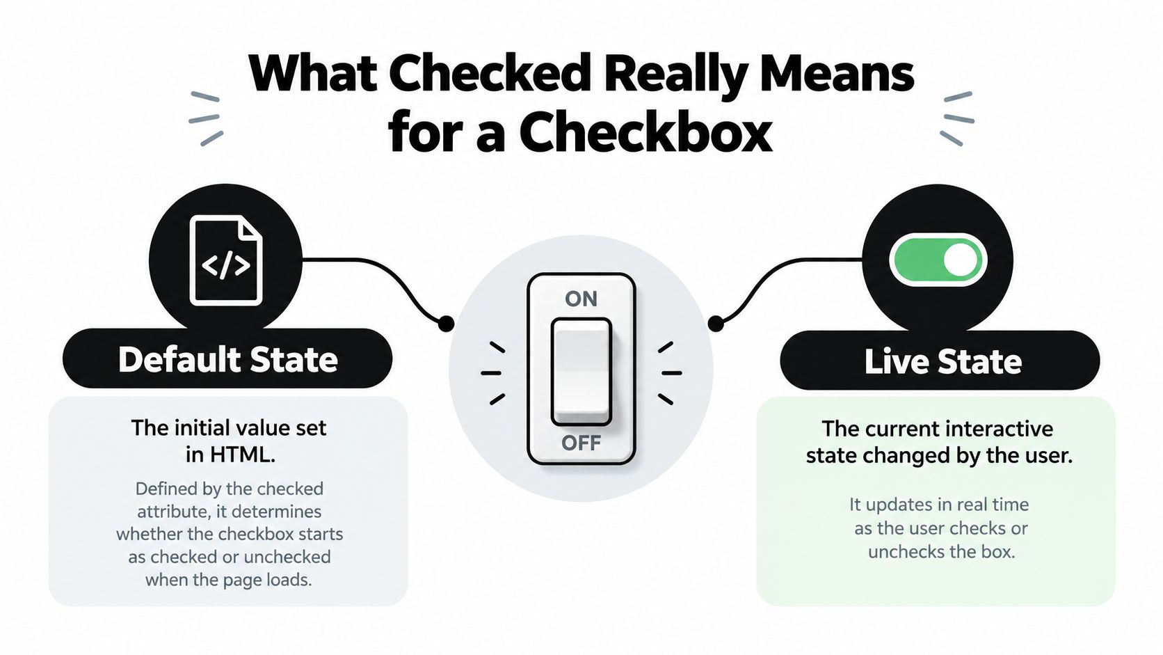
Think of a checkbox as a light switch installed in a room. The HTML attribute tells the installer how the switch should be positioned when the room opens. The live DOM property tells you where the switch is positioned right now.
That gives you two related but different questions:
- Should this checkbox begin selected?
- Is this checkbox selected at this moment?
The checked attribute answers the first question. The checked property answers the second.
Boolean attributes use presence
HTML boolean attributes have a rule that surprises many developers. The browser cares about whether the attribute is present, not whether its text looks like a JavaScript boolean.
These forms all communicate that the checkbox starts checked:
<input type="checkbox" checked>
<input type="checkbox" checked="checked">
<input type="checkbox" checked="true">
This form still communicates that it starts checked:
<input type="checkbox" checked="false">
The word false doesn’t turn off a boolean attribute. If the attribute exists, the default is enabled. To make the initial state unchecked, omit the attribute:
<input type="checkbox">
That behaviour belongs to HTML parsing. When the browser creates the input element, it uses the attribute to initialise the default state. After that, user interaction operates on the live control state.
Default and live state can diverge
Suppose the page starts with a selected checkbox. The user clicks it once. The current property becomes false, but the original attribute can remain present in the markup. The switch has moved, while the installation instructions on the wall haven’t changed.
This is why inspecting the Elements panel can mislead you. You may be looking at the serialised attribute rather than the property shown in the DevTools properties view or returned by JavaScript.
The ONS service manual uses the same page-load model and also connects checkbox selection with validation. If a form requires a choice, the application must validate the submitted selection and explain what the user needs to do when required detail is missing.
The mental model is therefore:
- Attribute: initial instruction.
- Property: current interactive state.
- Form data: the state captured when submission occurs.
Keep those three moments separate and input checkbox checked stops being a mysterious visual flag. It becomes a small state machine with a predictable lifecycle.
Attribute Versus Property and Why It Matters
The attribute and property can describe the same checkbox without holding the same value. The attribute lives in the HTML representation. The property lives on the DOM object created from that representation.
| Aspect | HTML checked Attribute |
DOM checked Property |
|---|---|---|
| Main purpose | Sets the initial default | Represents the current state |
| Read with | getAttribute('checked') |
checkbox.checked |
| Set with | setAttribute('checked', '') |
checkbox.checked = true |
| Changes after a user click | Usually remains as authored | Updates immediately |
| Used by live CSS state | Not directly | Reflected by :checked |
| Related reset value | Establishes the default through the element’s default state | Changes as the user interacts |
The property is the right API for current state:
const checkbox = document.querySelector('#updates');

console.log(checkbox.checked);

checkbox.checked = true;
checkbox.checked = false;
The attribute is useful when you need to inspect or change the authored default:
console.log(checkbox.hasAttribute('checked'));

checkbox.defaultChecked = true;
checkbox.checked = true;
defaultChecked gives JavaScript a property-level way to work with the initial default. It doesn’t replace checked. A useful distinction is that checked controls what the user sees and what the form uses now, while defaultChecked represents the value a form reset can restore.
Why attribute reads fail after interaction
This code asks the wrong question:
const wasConfiguredAsChecked =
  checkbox.getAttribute('checked') !== null;
It answers whether the original HTML contained the attribute. It doesn’t tell you whether the user currently has the box selected.
Use this instead:
const isSelectedNow = checkbox.checked;
The same issue appears when developers use setAttribute to toggle a live control:
checkbox.setAttribute('checked', 'false');
That still leaves the boolean attribute present. To change the current state, assign a real boolean to the property:
checkbox.checked = false;
Hydration and reactive rendering
Hydration makes this distinction especially important. A server can render a checkbox with a default attribute, while the client application holds a different reactive value. If the framework expects the server markup and client state to agree, the mismatch can produce warnings or a visible correction during startup.
The safest approach is to decide which value owns the state. For a server-rendered default, emit the correct HTML and initialise client state from the same value. For a controlled Vue component, bind the live model and avoid separately mutating the raw attribute.
This is also why a component library should expose a clear checked value rather than asking each consumer to manipulate attributes. The component can map its model to the native property while preserving the browser’s form and keyboard semantics.
Styling Checked State With CSS
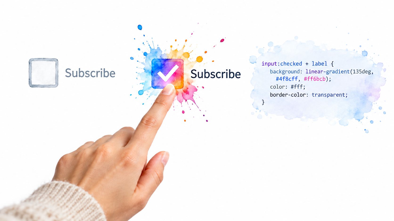
CSS can respond to the current checkbox state without a JavaScript click handler. The :checked pseudo-class follows the live state, so it updates when a user toggles the control.
Start with a native checkbox and an associated label:
<input id="emails" type="checkbox" name="emails">
<label for="emails">Send email updates</label>
A simple state rule looks like this:
#emails:checked + label {
  font-weight: 700;
}
The adjacent sibling combinator, +, works because the label comes immediately after the input. If your markup places the label first or inserts another element between them, this selector won’t match.
Building a custom visual
A visually custom checkbox should keep a real input in the document. You can hide the native appearance while retaining keyboard and form behaviour, then draw the design through the label or a pseudo-element.
<label class="check-option">
  <input type="checkbox" name="terms">
  <span class="check-option__box" aria-hidden="true"></span>
  <span>I accept the terms</span>
</label>
.check-option {
  display: inline-flex;
  align-items: center;
  gap: 0.5rem;
  cursor: pointer;
}

.check-option__box {
  width: 1rem;
  height: 1rem;
  border: 2px solid #555;
  border-radius: 0.25rem;
}

.check-option input:checked + .check-option__box {
  background: #000;
  box-shadow: inset 0 0 0 3px #fff;
}
The selector still reacts to the property. It doesn’t matter whether the initial state came from the HTML attribute, JavaScript, or a Vue binding. Once the live state changes, the browser recalculates :checked.
CSS follows the control’s live state. It doesn’t wait for the HTML attribute to change.
Revealing dependent fields
Checkboxes often control optional content. The input can remain the state holder while CSS reveals a following panel:
<div class="settings">
  <label>
    <input type="checkbox" class="settings__toggle">
    Add an alternative address
  </label>

  <div class="settings__panel">
    <label for="address">Address</label>
    <input id="address" name="address">
  </div>
</div>
.settings__panel {
  display: none;
}

.settings__toggle:checked ~ .settings__panel {
  display: block;
}
The general sibling combinator, ~, allows other siblings between the checkbox and the panel. For a production form, don’t rely on visual hiding alone when the dependent fields become required. The DOM and accessibility behaviour must reflect whether the fields are available, relevant, and announced.
For a component-level approach to native checkbox state and styling, see the DOM Studio checkbox component. Keep the native input or an equivalent accessible primitive as the source of interaction, and let CSS decorate the state rather than replacing the control with an unrelated clickable element.
Controlling Checked State in JavaScript and Vue
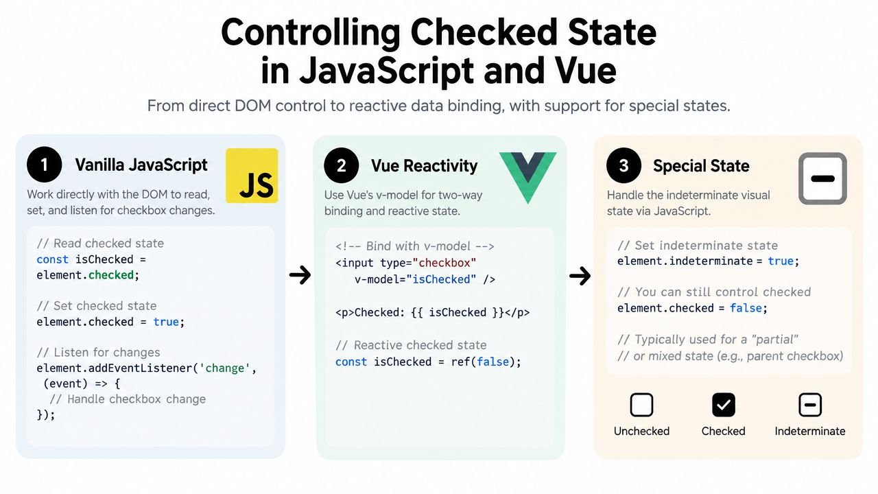
Vanilla JavaScript has a direct API because the browser exposes checkbox state as a boolean property:
const checkbox = document.querySelector('#newsletter');

checkbox.addEventListener('change', event => {
  const input = event.currentTarget;
  console.log(input.checked);
});

checkbox.checked = true;
Use the change event for a user-facing state transition. If code assigns checkbox.checked = true, the browser updates the property and CSS state, but it doesn’t automatically simulate a user interaction event for your application. If your business logic must run after a programmatic assignment, call that logic explicitly or dispatch an event deliberately.
For a group, query the inputs and filter their live values:
const selected = [...document.querySelectorAll(
  'input[name="topics"]:checked'
)].map(input => input.value);
That selector uses :checked, so it selects the current state rather than the authored attribute. For a partially selected parent in a tree view, use the separate indeterminate property:
const parent = document.querySelector('#all-topics');

parent.indeterminate = true;
Indeterminate is a visual state. It doesn’t mean the checkbox is checked, and it doesn’t create a native form value by itself. Your application still needs to decide how child selections map to the parent and what the submitted data should mean.
Vue bindings keep state in the model
For a two-way Vue binding, use v-model:
<script setup>
import { ref } from 'vue'

const subscribed = ref(false)
</script>

<template>
  <label>
    <input v-model="subscribed" type="checkbox">
    Subscribe to updates
  </label>

  <p v-if="subscribed">Updates are enabled.</p>
</template>
Vue reads the native live state and updates the reactive model when the user interacts. For one-way control, use :checked and handle the event yourself:
<input
  type="checkbox"
  :checked="subscribed"
  @change="subscribed = $event.target.checked"
>
A wrapper component should expose the same distinction through a clear model contract. DOM Studio’s Vue integration uses a boolean model value and an update event, so a checkbox can be connected with v-model while the underlying primitive manages the interaction.
The Vue v-model guide is useful when a wrapper’s model value, emitted update event, and slot content need to stay aligned.
Before shipping, test programmatic and user paths separately:
- Initial render: Confirm the model and visible state agree.
- User toggle: Confirm the model changes after keyboard and pointer interaction.
- Code update: Confirm assigning the model updates the control.
- Form submission: Inspect the actual
FormData, not just the screen. - Partial selection: Verify
indeterminatedoesn’t get mistaken forchecked.
Accessibility Form Behaviour and DOM Studio Primitives
A user checks “provide extra details,” and a new required field appears. The checkbox now has to work for keyboard users, screen readers, focus order, validation, and form submission. A visible tick is only one part of that contract.
A screen reader needs the control’s label and current checked state. Keyboard users need a reliable path to reach and toggle it. UK guidance describes Tab for moving focus and Space for toggling a focused checkbox. If checking the box reveals related fields, those fields should follow the checkbox in focus order, and newly required content should communicate its status. See the UK checkbox accessibility guidance for the interaction details.
Native HTML supplies the basic relationship:
<label for="details">Provide extra details</label>
<input id="details" type="checkbox" aria-controls="extra-fields">

<div id="extra-fields">
  <label for="note">Details</label>
  <input id="note" name="note">
</div>
The markup does not reveal or hide the panel by itself. Your code must update availability, validation, focus order, and announcements together. A panel that is visually hidden while its inputs remain confusingly focusable creates an accessibility problem, even though the checkbox property is correct. See the accessibility best practices guide for focus management and announcement patterns for revealed fields.
Submission is not the same as visual state
A checked checkbox contributes its name and value to native form data. An unchecked checkbox is omitted. If the server needs an explicit false value, define that contract separately with application logic or a paired hidden value. indeterminate affects visual state only, so it does not create a submitted checked value.
For a required group, validate the group’s meaning rather than requiring every individual box. GOV.UK and ONS guidance presents checkboxes as appropriate when users may select one or more options. That choice affects labels, error messages, and the data expected by the server.
DOM Studio headless primitives and Vue wrappers can standardise checked values, keyboard handling, focus management, and accessible roles across components. They map familiar DOM behaviour into a component contract, but they cannot decide whether a selected option satisfies your business rule. Keep the model, rendered state, and submitted meaning aligned.
Accessibility also needs testing after implementation. The UK monitoring report recorded overall compliance improving from 59% in the previous monitoring period to 70%, based on monitoring from January 2022 to September 2024. It also reported 55.3% of identified issues fixed, 67.9% of completed cases with issues fixed or a short-term plan, and a reduction in websites without an accessibility statement from 173 to 38. These figures appear in the UK public-sector accessibility monitoring report, showing why form behaviour should be measured rather than assumed.
Common Pitfalls and How to Avoid Them
Checkbox bugs become easier to fix when you classify the symptom before changing code.
| Symptom | Root cause | Fix |
|---|---|---|
checked="false" still appears selected |
Boolean attributes use presence, not a string value | Remove the attribute or assign input.checked = false |
| The attribute remains after a click | User interaction changes the property, not authored markup | Read input.checked |
| CSS doesn’t reflect a script update | The selector or DOM structure doesn’t match the input state holder | Use input:checked with the correct sibling relationship |
| A reset restores an unexpected value | The default and live states were treated as one value | Set the intended default with defaultChecked and the live value with checked |
| A parent looks partly selected but submits nothing useful | indeterminate is visual state only |
Derive submission data from the child checkboxes |
| A Vue hydration warning appears | Server markup and client model disagree | Initialise both from the same source of truth |
A frequent form mistake is checking the markup instead of the submitted data. Use the live property while the user is interacting, then inspect FormData at submission time:
const form = document.querySelector('form');
const data = new FormData(form);

console.log(data.get('updates'));
If the box is unchecked, get returns no checkbox entry. That result is normal native behaviour, not evidence that the browser lost state.
Accessibility testing should be part of the same verification routine. The UK monitoring evidence cited above shows that public-sector services improve through repeated testing and remediation, not through a single visual inspection. A checkbox that looks correct can still have a weak label, an incorrect focus order, an inaccessible dependent field, or a validation message that doesn’t identify the required action.
Use this short diagnostic sequence when a checkbox behaves unexpectedly:
- Inspect the property: Log
input.checked,input.defaultChecked, andinput.indeterminate. - Inspect the markup separately: Check whether the
checkedattribute is present, but don’t treat it as the live value. - Use the keyboard: Reach the control with Tab and toggle it with Space.
- Check the event path: Confirm your
changehandler runs for user interaction and that programmatic changes trigger the intended application logic. - Inspect form data: Create
FormDataand verify the exact name and value sent. - Test reset and hydration: Confirm the initial default, reset result, server markup, and client model all agree.
When a shared primitive or Vue wrapper handles the interaction contract, your application code can focus on state meaning and validation rather than rebuilding keyboard and ARIA behaviour for every form.
DOM Studio provides framework-agnostic headless primitives plus Vue wrappers with reactive props, v-model support, and slots, so checkbox state can remain aligned across DOM behaviour, styling, and application data. Visit DOM Studio to explore a component approach that lets you build on accessible interaction patterns instead of re-implementing them.