
The usual advice for a button with dropdown menu starts in the wrong place: draw a button, add a chevron, then position a list underneath it. That gives you a recognisable shape, but it doesn’t tell users what the control does. The same shape can reveal content, run a command or change a saved answer, and each job needs different behaviour.
Choose the control before styling the popup. Its purpose determines the roles, keys, focus movement and screen-reader announcements. A matching visual doesn’t mean matching behaviour, even when the components sit beside each other on the same toolbar.
Table of Contents
- Three Controls Behind One Visual Pattern
- How the Menu Opens Moves and Closes
- What UK Accessibility Monitoring Shows
- Everyday Places a Menu Button Belongs
- Who Relies on the Button Semantics
- Mistakes the Keyboard Contract Does Not Catch
- Choose the Control Then Implement It
Three Controls Behind One Visual Pattern
A chevron on a button does not name the control. Think of a flap that reveals a note, an order pad of commands and a field that holds an answer. They might look similar when closed, but users interact with them for different reasons.
A disclosure button reveals related content. A menu button opens actions. A select or listbox lets someone choose a value that the application retains.
The comparison below separates those jobs before any implementation decisions.
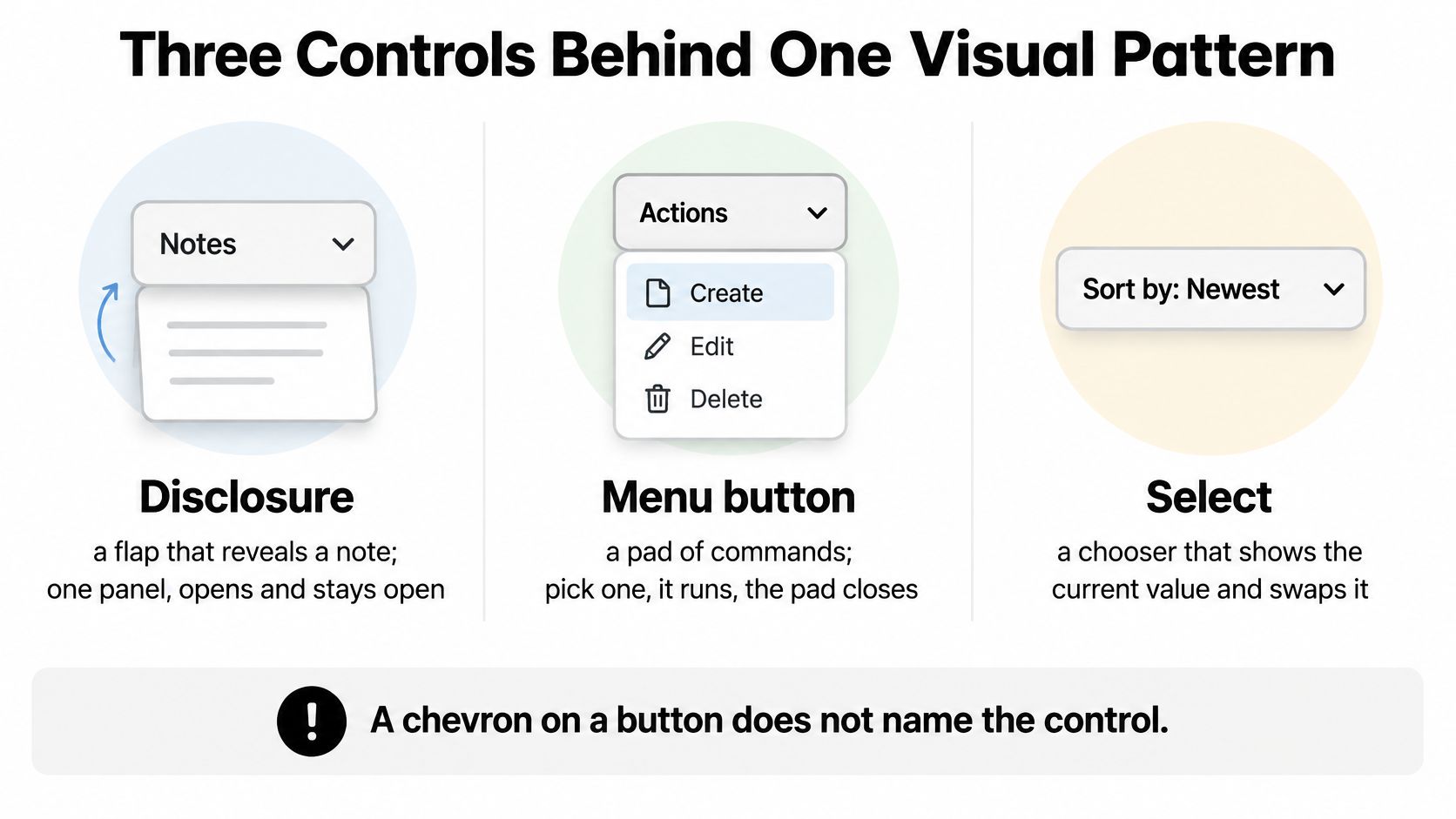
Disclosure, menu button and select compared
| Control | Job | Popup role | Stores a value | Focus while open |
|---|---|---|---|---|
| Disclosure button | Show or hide related content | Region or group when useful, not menu | No | Stays on the button or moves into the revealed content |
| Menu button | Run a command from a list | menu with menuitem |
No | Roving focus or aria-activedescendant on items |
| Select or listbox | Choose one stored option | Native select semantics, or listbox with option for a custom listbox |
Yes | Highlight moves with arrows; the field shows the committed value |
| Combobox cousin | Filter options by typing | combobox plus listbox |
Yes | Input keeps focus; the list is a separate popup |
Read the rows as different promises. Opening delivery instructions doesn’t select anything. Choosing Duplicate runs an action, whereas choosing a country changes form data.
For the select row, prefer a native <select> when it meets the requirement. A custom listbox needs its own selection behaviour; copying the command menu’s arrow handling isn’t enough. A typing-based combobox adds another distinction: text entry must continue working while the user explores suggestions.
Nielsen Norman Group’s dropdown guidance describes problems including difficulty closing dropdowns, confusing focus with selection, overlooking scrollable options and using controls on small screens. Those are practical reasons to specify behaviour, not just appearance.
Name the job before choosing the role
Write the intended outcome in ordinary language: reveal delivery details, duplicate this document or set the country. That sentence should make the appropriate row obvious.
For implementation context, Agentable’s guide to fixing WCAG failures at markup level is useful when a visually convincing control has the wrong underlying semantics. Use the button component reference for the trigger itself, while specifying the revealed content separately.
Decision rule: If the main job is storing an answer, don’t disguise it as a command menu. If it only reveals content, don’t give that content a menu role.
Menus can contain checkable settings, but that doesn’t make them a general replacement for form fields. Choose the pattern that matches the user’s task, not the component that already has the right border radius.
How the Menu Opens Moves and Closes
Treat the trigger and popup as separate responsibilities. The trigger is a real <button type="button">, with an accessible name, aria-haspopup="menu" and an accurate aria-expanded state. Its aria-controls references the popup’s identifier.
The Home Office keyboard accessibility guidance requires tasks to be completable by keyboard without trapping users. For a command menu, that means opening, navigating, activating and leaving must form a coherent interaction.
Keyboard contract for a menu button
| Action | Keys or gesture | When | Expected result |
|---|---|---|---|
| Open or toggle | Enter or Space | Focus on the trigger | Opens the popup and sets aria-expanded to true; toggling closed sets it to false |
| Move highlight | Up or Down Arrow | Popup open | Moves among items without changing a stored form value |
| Jump ends | Home or End | Popup open, particularly useful for a long list | Moves to the first or last item |
| Typeahead | Printable character | Popup open | Moves to the next matching label |
| Run a command | Enter or Space | Focus or highlight on an item | Performs the action and usually closes |
| Open a submenu | ArrowRight or Enter | Item has children | Opens the child menu and activates its first available item |
| Back to parent | ArrowLeft or Escape | Inside a submenu | Closes that submenu and returns to its parent item |
| Close and restore | Escape, outside click, or focus leaving | Popup open | Escape restores the trigger; pointer and Tab dismissal preserve the user’s intended destination |
| Pass a closed menu | Tab or Shift+Tab | Popup closed | Skips hidden items without a keyboard trap |
Opening should establish an active item, rather than leave keyboard users wondering whether the menu received focus. Up and Down Arrow then operate within the open menu. Unlike a select, moving between command items doesn’t commit a field value.
Pick a focus model and keep it consistent
With roving tabindex, DOM focus moves between items. The active item has tabindex="0" and the others have tabindex="-1".
With aria-activedescendant, DOM focus stays on the focusable menu container while the attribute identifies the active item. Keep that item visible and ensure its identifier exists. Don’t combine the models accidentally, leaving DOM focus on one command while assistive technology announces another.
When closed, remove the popup from interaction, not merely from view. An opacity change alone can leave invisible items reachable.
Dismissal needs particular care:
- Escape cancels: Close the menu and restore focus to its trigger.
- Tab continues: Close the menu and let focus proceed to the next appropriate control.
- Outside activation continues: Close without stealing focus from the field or button the person clicked.
- Command activation follows the task: A command that opens a dialog should place focus in that dialog, not immediately pull it back.
Touch must use the same visible trigger, without depending on hover. Under reduced-motion preferences, remove decorative sliding without removing the visible indication that the menu opened.
A screen reader should receive the button’s name, its menu-button purpose and its expanded or collapsed state. Exact phrasing varies by browser and assistive technology; the underlying information must remain accurate.
What UK Accessibility Monitoring Shows
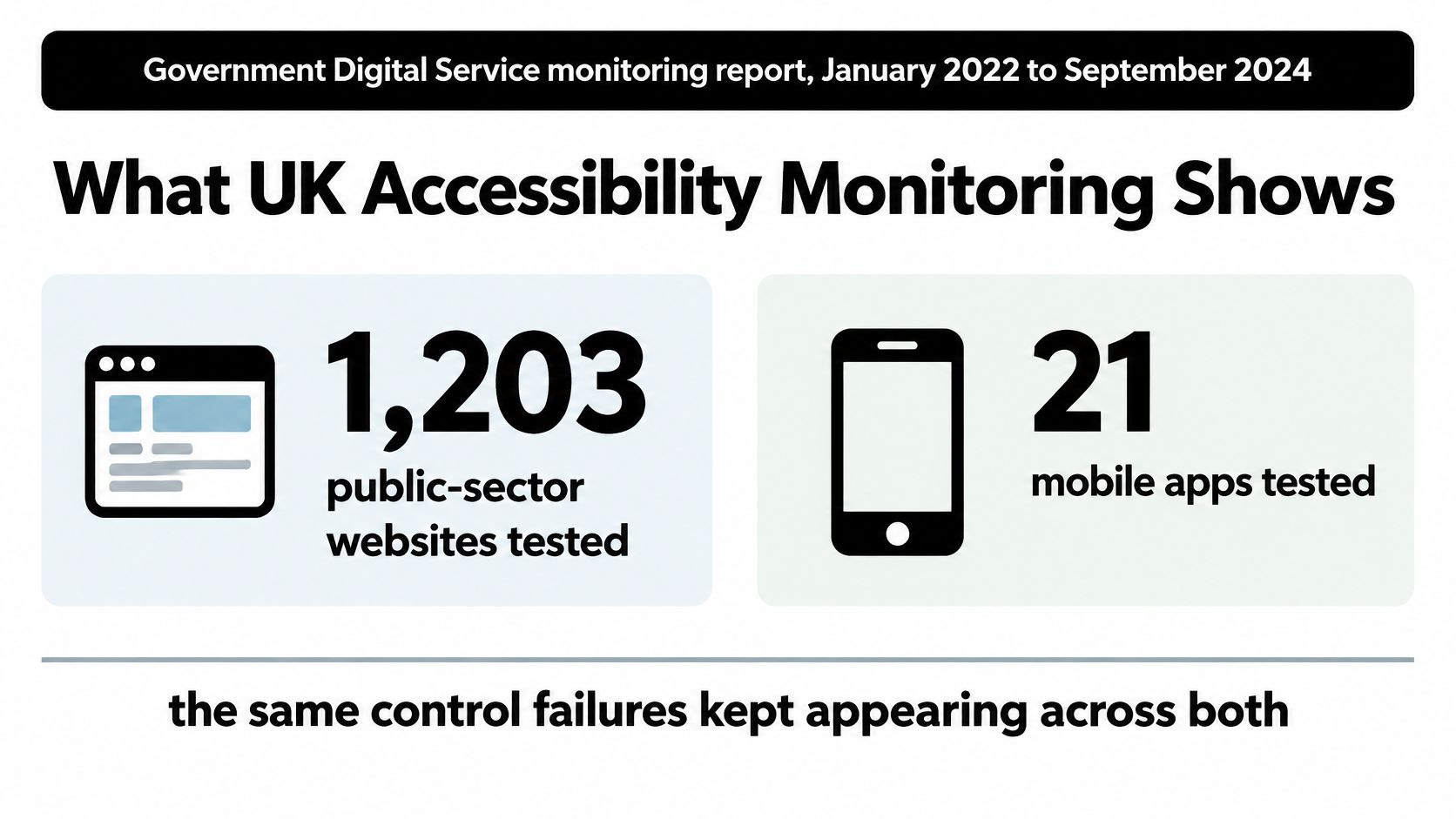
Overall compliance reached 70%, up from 59%, in the Government Digital Service accessibility monitoring report covering January 2022 to September 2024, but accessibility issues still appeared on nearly all tested sites and apps. The report’s figures below distinguish the share of recorded issues from the proportion of websites affected.
These aren’t measurements of menu buttons alone. They identify failure categories that a custom menu implementation must address.
UK monitoring figures that hit this pattern
| Measure | Figure | What fails on this button |
|---|---|---|
| Sites and apps tested | 1,203 public-sector websites and 21 mobile apps | Interactive controls must work in real service journeys |
| Overall compliance | 70%, up from 59% | An overall compliance measure doesn’t establish that every interaction works |
| Focus visibility share of issues | 13.3% | The focus indicator disappears on the trigger or active item |
| Keyboard operation share of issues | 10.8% | The menu cannot be opened, navigated or escaped |
| Name, role and value share of issues | 8.6% | The trigger lacks a name or exposes an inaccurate expanded state |
| Websites with a keyboard-accessibility issue | 63.6% | The keyboard path is missing, interrupted or trapped |
| Websites with a focus-visibility issue | 76.3% | Users can’t reliably see where keyboard focus sits |
The monitoring programme covered both websites and mobile applications.
Turn issue categories into acceptance criteria
For focus visibility, inspect the trigger and every active row against their actual backgrounds. A ring that looks clear on a white design canvas may disappear against a selected row, dark surface or overlapping panel. Product colours are fine only when the indicator remains distinguishable.
For keyboard operation, assess the completed task rather than the opening animation. Someone must be able to reach the intended action and leave the control without requiring a pointer.
For name, role and value, inspect the accessibility tree alongside the rendered interface. Confirm that the trigger’s exposed state changes with the popup, and that the relationship points to the correct menu instance. Repeated table-row menus are a useful place to catch duplicated identifiers.
A dropdown’s behaviour is part of its accessibility, not a layer of polish applied after the visual design.
Use accessibility testing tools to support these checks, but retain manual interaction testing. A tool can identify missing attributes without proving that the chosen command is reachable or that focus lands somewhere useful afterwards.
Treat a custom menu as unfinished until its focus indicator, keyboard operation and announced state work together under keyboard use, zoom and a screen reader.
Everyday Places a Menu Button Belongs
Consider a document workspace. Users need account actions, document commands and editing tools, but they shouldn’t have to scan every possible action at once. A menu button can keep secondary commands available without turning each toolbar into a crowded row.
These examples share a visual family while serving distinct tasks.
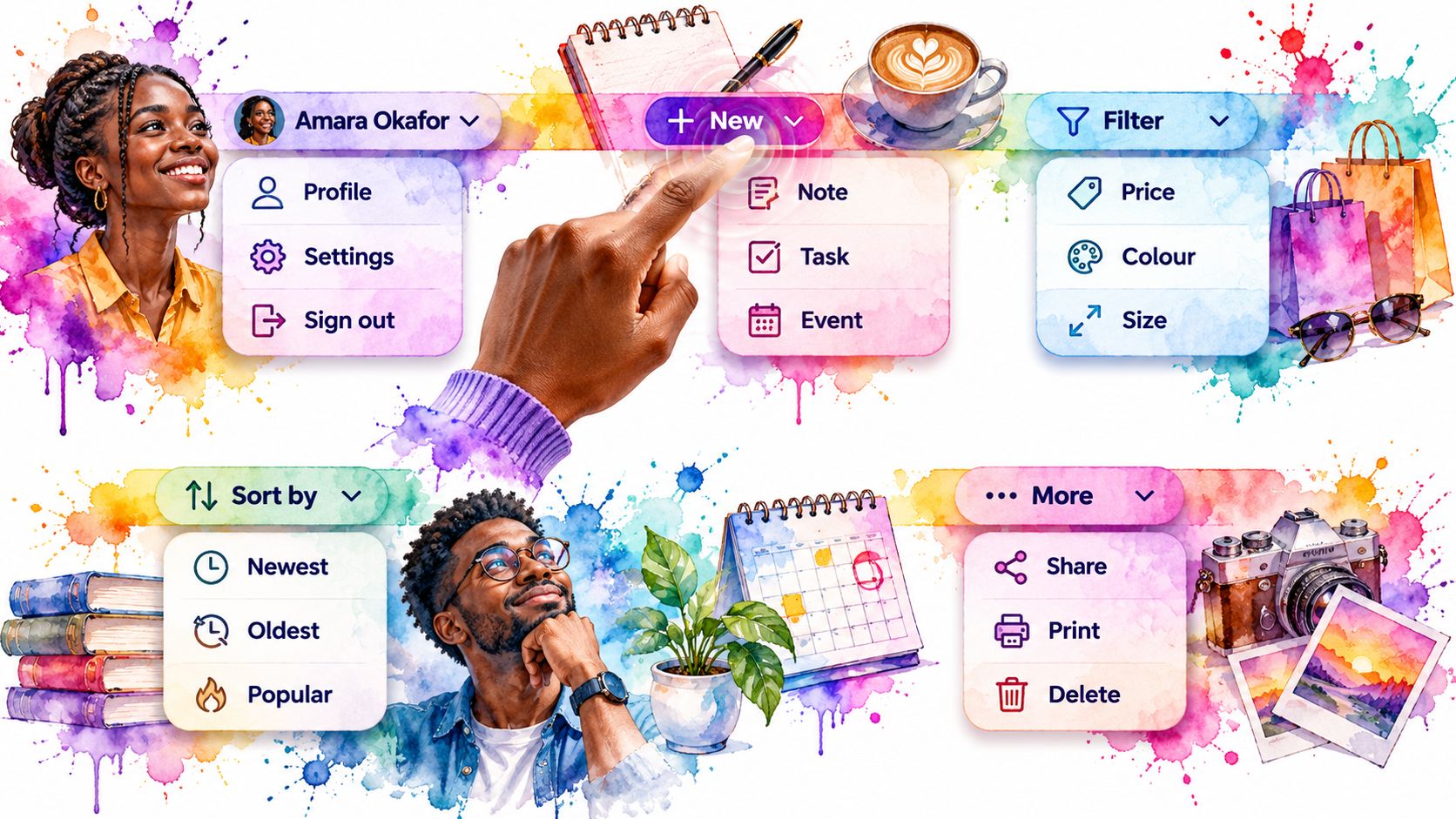
Account and document actions
An account trigger labelled Amira Patel can offer Profile, Settings and Sign out. The trigger identifies the account; the rows open screens or perform actions. Separate Sign out visually if useful, but don’t automatically style it as destructive: ending a session isn’t the same as deleting an account.
In a document table, Actions for Quarterly report can contain Edit, Duplicate and Archive. Keep the visible label compact if necessary, but include the row’s identity in the accessible name. Otherwise, speech and screen-reader users encounter indistinguishable Actions buttons.
A split button has a different composition. Save performs the primary action immediately; its adjacent menu trigger offers Save as draft and Save and close. Give the halves separate focus stops and distinct names so users don’t have to open a menu for the default action.
Editing and overflow commands
An editor’s Insert menu can offer Image, Table and Code block. Each item starts an operation, potentially opening a further dialog. It isn’t a stored editing mode, and it shouldn’t behave like a country field.
An ellipsis button can collect rare commands when a toolbar is crowded. Name it Actions for this item, or something more specific, rather than exposing an unnamed icon. Don’t hide a task’s only discoverable primary action there merely to achieve a cleaner screenshot.
A menu interaction is easier to assess when you watch where focus goes, not just where the panel appears.
A right-click context menu is a sibling to these visible controls, not their replacement. It can share the same commands and item model, but users still need a discoverable route that doesn’t require a pointer gesture.
Keep nearby alternatives honest:
- Country: Use a select, not a command menu.
- More about Amira: Use a disclosure for the additional biography.
- Find a document: Use an appropriate search or combobox interaction when typing filters suggestions.
On narrow screens, let the popup reposition or become a contained panel rather than extending beyond the viewport. Label your trigger with its job, such as Insert or Document actions, not Dropdown.
Who Relies on the Button Semantics
The 2016 GOV.UK assistive-technology survey received 712 completed responses; screen magnifiers were reported by 30% of respondents, screen readers by 29%, speech-recognition software by 18%, and readability tools by 15%. These are historical survey results, not current market shares or estimates of your application’s audience.
Their practical relevance is straightforward: users don’t all discover or operate a button by looking at its shape. A person may speak its label, inspect it through magnification or explore its exposed semantics.
Translate semantics into completed tasks
An unnamed icon gives speech-input users no clear label to target. An inaccurate expanded state leaves screen-reader users unsure whether activating the trigger worked. An unexpected jump away from the control can force a magnifier user to search the page again.
Test with realistic content and surrounding controls, not an isolated component alone. Include a repeated row menu, a trigger near the viewport edge and a command that changes the interface.
Checks before shipping a menu button
| Test | Pass looks like | Common fail |
|---|---|---|
| Keyboard only | The intended task completes, dismissal restores an appropriate location, and closed items are skipped | Focus remains trapped in collapsed items |
| Screen reader | Name, menu purpose and expanded or collapsed state are exposed, including with iOS VoiceOver | Silent icon or stale state |
| Zoom and magnification | Popup remains usable within the viewport, with the active item and focus indicator visible | Clipped commands or focus outside the visible area |
| Reduced motion | Opening and closing remain clear without animation | State is communicated only through a slide |
| Touch and small screen | A tap opens a usable list without hover | A desktop-only hover interaction |
| Speech input | Speaking the visible label activates the intended button | Accessible name differs from the on-screen wording |
Use browser zoom and operating-system magnification where available. Increase magnification until the layout changes, then check whether a person can still reach every command without losing their place.
For screen-reader testing, listen to the interaction rather than insisting on a memorised sentence. Different combinations may announce information in a different order; missing purpose or stale state is the defect.
The ARIA roles guide can help when the exposed structure doesn’t match the intended interaction. Correcting a role is only useful when the behaviour associated with it also works.
Record the browser, input method, assistive technology and task outcome with each result. Pass means the person can complete the task. A failure in this matrix belongs in the defect queue, not a list of optional visual improvements.
Mistakes the Keyboard Contract Does Not Catch
Correct keys don’t guarantee a usable menu. A popup can respond perfectly to arrows while appearing behind a card, activating a supposedly disabled command or leaving the page unable to scroll.
Review the surrounding layout and application behaviour as carefully as the menu itself.
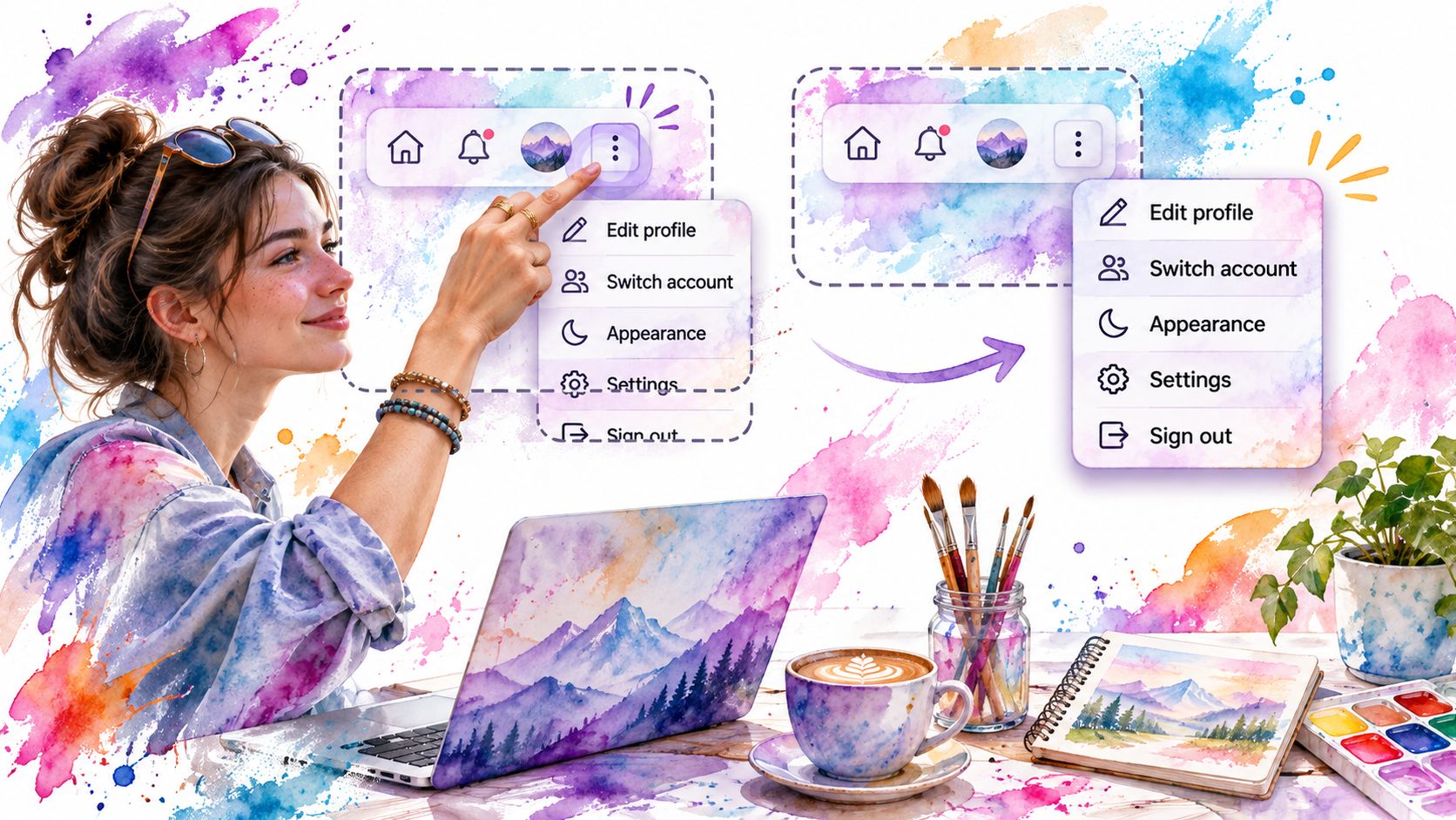
Review the boundaries around the popup
- Clipping and stacking: An ancestor with
overflow: hiddencan cut off commands. Render the popup outside that clipping context where necessary, then handle positioning, scrolling and viewport collisions. - False disabled states: Grey text doesn’t disable an action. Prevent activation in the event handler and expose the unavailable state. If a disabled menu item remains arrow-focusable for discoverability, it must be announced as unavailable and must not execute.
- Navigation disguised as an action: A destination should retain link behaviour, including an appropriate
href. A command needs an actionable element with menu-item semantics. A bare clickable<span>supplies neither contract. - Colour-only destructive meaning: Name Delete explicitly. Keep it in the normal navigation sequence and use colour as reinforcement, not as the only indication of consequence.
A link within a menu still needs the menu’s navigation behaviour, but it shouldn’t lose useful native capabilities unnecessarily. Users may expect to open a destination in another tab or copy its address.
Likewise, deciding whether unavailable commands remain visible is a product decision. Don’t hide an important capability when an unavailable row and a clear explanation would help someone understand what to do next.
Check page state and nested boundaries
Scroll locking needs an explicit reason. A small non-modal command menu doesn’t automatically require it; a panel-like presentation may benefit from preventing the background from moving. When you apply a lock, release it on every closing path, including navigation, unmounting and errors.
Nested menus create another boundary. Don’t advertise a child menu unless it has reachable content and a working return path. Near a screen edge, reposition the child panel or use a contained presentation rather than allowing it to open off-screen.
Code-review check: Close the component through every route the application permits, then confirm that the page still scrolls and the next interaction still works.
Test content changes while the menu is open, too. If a command removes the current row or permissions remove an item, choose a sensible remaining focus target rather than leaving focus attached to a vanished element.
Choose the Control Then Implement It
Write the job in a sentence before choosing a component. Reveal content calls for a disclosure. Store an answer calls for a select, listbox or suitable combobox. A list of commands is the menu-button case.
That decision should appear in the component specification alongside the trigger label, item model and outcome of each command. It gives designers and developers something more useful to agree on than whether the chevron points upwards when open.
Specify outcomes before visual details
For each command, say what happens after activation. Does Edit open a dialog, does Duplicate add a neighbouring row, or does Archive remove the current item? Those outcomes determine where focus belongs after the command has run.
Keep a compact implementation checklist:
- Purpose: The chosen pattern matches the user’s task.
- Structure: The trigger and popup expose the intended semantics.
- Behaviour: Navigation, dismissal and command outcomes are deterministic.
- Release evidence: The relevant testing modes have recorded pass results.
For Vue teams, our DOM Studio package includes DomButton, and our Vue Menu is a roving-focus action menu for command lists, settings panels and skinned menus. It supports menuitem, menuitemcheckbox and separators within a keyboard-navigable menu, including a destructive tone. Child menus open with Hover, ArrowRight, Enter or Space; ArrowLeft or Escape returns to the parent.
Use primitives without changing the job
Those primitives are appropriate when the product needs a command menu. They aren’t a reason to turn a country field into one, or to place arbitrary revealed content inside menu-item roles.
Keep your application responsible for meaningful labels, sensible command grouping and useful outcomes. A reusable primitive can manage interaction mechanics, but it can’t decide whether Delete belongs beside Duplicate or what users should encounter after archiving a document.
Before adjusting shadows and spacing, write the trigger’s job, choose the matching control and verify the accessible name, cancellation path and focus destination. Visual polish should refine a sound interaction, not conceal an unresolved one.
DOM Studio offers button and menu primitives for Vue teams building command-based interfaces without re-implementing their keyboard and ARIA behaviour. Visit DOM Studio to explore the components, then test your chosen menu against a real task before adapting its visual design.