
Adding ARIA roles can make an interface worse, not better. A role changes what assistive technology announces, but it doesn’t add focus, keyboard handling or state. That’s a serious gap when, in a 2021 report covering two years of monitoring, the Government Digital Service stated that accessible digital services were vital for 14.1 million disabled people in the UK. Treat each role as a contract covering role, states, keyboard behaviour and accessible name, and don’t ship a role you haven’t tested as a complete interaction.
Table of Contents
- What ARIA Roles Do and Where They Fit
- Common ARIA Roles at a Glance
- Remaining Roles and Their Native Equivalents
- Required States and Owned Elements by Role
- Keyboard and Focus Expectations by Role
- Naming, Describing and Announcing Each Role
- Roles That Get Confused and How to Choose
- When to Skip ARIA and Use Native HTML
- Using Roles in Web Components and Vue Wrappers
- Testing Roles and Shipping the Contract
What ARIA Roles Do and Where They Fit
Say a team builds a settings panel as a styled div. A sighted user sees a modal appear. A screen reader user, without a role, may hear only generic text, with nothing announcing that a dialog has opened or where focus should go.
A role tells assistive technology what kind of object an element is, such as a button, dialog or tab. States and properties describe its current condition and relationships. For example, aria-expanded says whether a disclosure button is open, while aria-controls links that button to the panel it controls. The role is what gets announced, so a wrong role makes a false promise.

A role adds no behaviour. The browser won’t supply arrow keys, focus movement or Escape to close just because you wrote role=“dialog”.
That’s why native HTML comes first. A real button element brings focus and Enter and Space activation with it. A div with a role brings none of that, so you must build and maintain it yourself.
The legal context explains why this matters in the UK. The UK government guidance on accessibility requirements for public sector websites and apps notes that the regulations came into force on 23 September 2018, identifies WCAG 2.2 AA as the relevant benchmark, and reports that 4 in 10 local-council homepages failed basic accessibility tests in one cited study. Teams outside the public sector still benefit from the same discipline, and practical accessibility guidance for UK small businesses from DesignStack is a useful starting point for smaller sites.
Use this reference in order. Look up the role, check its required states, confirm keyboard and naming rules, then test the whole pattern before shipping.
Common ARIA Roles at a Glance
Read the last column first, because a native element there usually ends the decision.
| Role | Category | Purpose | Native HTML equivalent |
|---|---|---|---|
| button | Widget | Triggers an action in place | button element |
| checkbox | Widget | Two-state or mixed selection | input type checkbox |
| combobox | Widget | Text entry with a popup list of options | No direct equivalent |
| link | Widget | Navigates to a resource | a element with href |
| listbox | Widget | Selects one or more items from a visible list | No direct equivalent (select is a partial match) |
| menu | Widget | Command list opened from a button | No direct equivalent |
| menuitem | Widget | Action item inside a menu | No direct equivalent |
| option | Widget | Item inside a listbox or combobox | option element |
| slider | Widget | Chooses a value within a range | input type range |
| switch | Widget | On or off toggle | No direct equivalent (checkbox is a partial match) |
| tab | Widget | Selects a tabpanel within a tablist | No direct equivalent |
| tablist | Composite | Container for tab controls | No direct equivalent |
| tabpanel | Structure | Content shown for the selected tab | No direct equivalent |
| progressbar | Range | Shows progress of a task | progress element |
| dialog | Window | Modal or non-modal popup window | dialog element |
| alert | Live region | Urgent message that needs immediate attention | No direct equivalent |
| status | Live region | Advisory update that does not interrupt | output element (partial match) |
| banner | Landmark | Site-wide header | header element outside article or section |
| main | Landmark | Primary content of the page | main element |
| navigation | Landmark | Group of navigation links | nav element |
| region | Landmark | Named section of content | section element with an accessible name |
| search | Landmark | Search functionality | search element (partial match) |
How to Read the Native Column
If a native element appears, use it. It brings keyboard behaviour, focus and state without extra code, and assistive technology already knows how to announce it. Adding a matching role on top, such as role=“navigation” on a nav element, duplicates semantics and adds maintenance without value.
Where the column says no direct equivalent, such as combobox, menu or tablist, the role is only usable with the full custom pattern. You owe the required states, owned children, focus model and keys. Don’t add the role as decoration and hope the browser fills the gaps.
Partial matches need care. A select element resembles a listbox, but it doesn’t give you a custom visible listbox pattern. A checkbox resembles a switch, yet users hear different expectations, checked versus on or off. Check the announcement and interaction you need before settling for the partial match.
Landmarks cause a quieter confusion. A nav, main or top level header is already exposed correctly, so Landmark roles are often unnecessary. Use them mainly when legacy markup can’t be changed, and give repeated landmarks distinct accessible names so users can tell them apart.
Remaining Roles and Their Native Equivalents
The main catalogue leaves out roles you’ll meet in documents, data and grouped controls.
- Document and content roles: article, heading with aria-level, img with alt text as its name, list and listitem, plus table, row, columnheader and cell for tabular data. Native article, h1 to h6, img, ul, li and table elements already do these jobs.
- Grid and tree roles: grid suits editable or interactive tables and needs arrow key cell navigation. tree suits hierarchical lists such as file explorers, with treeitem children, aria-expanded, and arrow keys moving between levels. Neither has a simple native replacement.
- Grouping roles: group wraps related controls and can take a name, similar to fieldset with legend. toolbar groups a row of buttons under one arrow key focus model, so Tab enters the toolbar once.
- Input roles: searchbox is a textbox for search, and the native first choice is input type search. textbox itself maps to input or textarea.
Ask the native question first for every role here too. Where no native element fits, such as tree or toolbar, you’re building a custom pattern, and the full contract checks apply.
Required States and Owned Elements by Role
A role is a contract, and role=“listbox” alone doesn’t satisfy it. The pattern also needs its options, selection state and keyboard model. The WAI-ARIA specification requires user agents to map roles into platform accessibility APIs and update those mappings when the role changes, and WCAG 4.1.2 requires each component to expose a programmatically determinable name, role, value, state and property information.
| Role | Required states and properties | Required owned elements | Common omission |
|---|---|---|---|
| checkbox | aria-checked on non-native elements | None | Missing aria-checked on a div |
| combobox | aria-expanded, aria-controls | Popup element it controls | Popup not linked by aria-controls |
| dialog | Accessible name (aria-labelledby or aria-label) | None | Dialog without a name |
| listbox | Accessible name; aria-multiselectable if multiple | option or group | Options rendered as plain divs |
| menu | Accessible name | menuitem, menuitemcheckbox, menuitemradio or group | Using menu for site navigation |
| menuitemcheckbox, menuitemradio | aria-checked | None | Checked state not updated on change |
| progressbar | aria-valuenow for determinate progress | None | Value not updated as work proceeds |
| slider | aria-valuenow; aria-valuemin and aria-valuemax recommended | None | Value text not matching the visual |
| switch | aria-checked | None | Toggle state not announced |
| tab | aria-selected | None (must sit inside a tablist) | aria-selected left true on every tab |
| tablist | Accessible name recommended | tab | Tabs not wrapped in a tablist |
| tabpanel | None required; labelled by its tab | None | Panel not linked to its tab |
| alert | None required | None | Message injected without the live region already present |
| status | None required | None | Status text replaced with a new node each time |
Omissions That Break the Announcement
A div used as a checkbox without aria-checked gives users no state, so they can’t tell whether it’s ticked. That’s the whole purpose of the control, missing. A combobox without aria-controls leaves the popup unlinked, so a screen reader can’t tell which list the input controls.
Tabs fail differently. If aria-selected stays true on every tab, every tab announces as current and the active panel is hidden in plain sight. A progressbar whose aria-valuenow never changes announces the same value for the whole task, which is worse than silence because it’s confidently wrong.
Check each row against live markup after each state change, not against a snapshot taken at load. States must stay accurate at runtime. Put the attribute update in the same function that changes the visual state, so they can’t drift apart.
Keyboard and Focus Expectations by Role
Two focus models explain most rows in the table. Roving tabindex gives one item in a group tabindex=“0” and moves that value with the arrow keys, so Tab enters the group once. aria-activedescendant keeps focus on a container, such as a combobox input, and names the active option by ID, so typing continues in the field.
| Role or pattern | Key | Expected behaviour | Focus after the action |
|---|---|---|---|
| button | Enter or Space | Activates the action | Stays on the button |
| checkbox or switch | Space | Toggles the state | Stays on the control |
| combobox | Down Arrow | Opens the popup and highlights the first option | Stays in the input (aria-activedescendant) |
| combobox | Escape | Closes the popup and keeps the typed text | Stays in the input |
| listbox | Arrow Up or Down | Moves the highlight between options | Moves to the highlighted option |
| listbox | Type-ahead letters | Jumps to the next matching option | Moves to the matched option |
| menu | Enter or Space | Activates the item and closes the menu | Returns to the menu button |
| menu | Arrow Up or Down | Moves between menu items | Moves to the next item |
| tablist | Left or Right Arrow | Moves to the adjacent tab | Moves to the adjacent tab |
| tablist | Home or End | Moves to the first or last tab | Moves to that tab |
| tablist | Tab | Leaves the tablist and enters the tabpanel | Moves into the tabpanel |
| dialog | Tab | Cycles focus among focusable elements inside | Stays inside until closed |
| dialog | Escape | Closes the dialog | Returns to the element that opened it |
| slider | Arrow keys | Changes the value by one step | Stays on the slider |
| slider | Page Up, Page Down, Home, End | Changes by a larger step or sets min and max | Stays on the slider |
The Focus Return Rule
When a menu item activates or a dialog closes, focus returns to the element that opened it. A keyboard user should never be dropped at the top of the page and forced to tab back through everything. Store the trigger when the widget opens, and restore focus on close, including when the user presses Escape.
Tabs follow the same logic in reverse. Tab leaves the tablist and enters the tabpanel, so focus follows the content the user just selected. Arrow keys move between tabs, Tab moves on. Mixing those up traps users in the tab strip.
Practical rule: If a role appears in your markup and no key in this table does anything, the role is decorative. Remove it.
Treat each row as a test case. If you can’t demonstrate the key working, the pattern isn’t finished, however correct the markup looks in the inspector.
Naming, Describing and Announcing Each Role
Every focusable interactive component needs an accessible name, and structural roles such as dialog, region and table often need one too. The ARIA Authoring Practices guidance on names and descriptions explains that the name computation gives precedence to higher priority author or host language sources, so ordering matters.
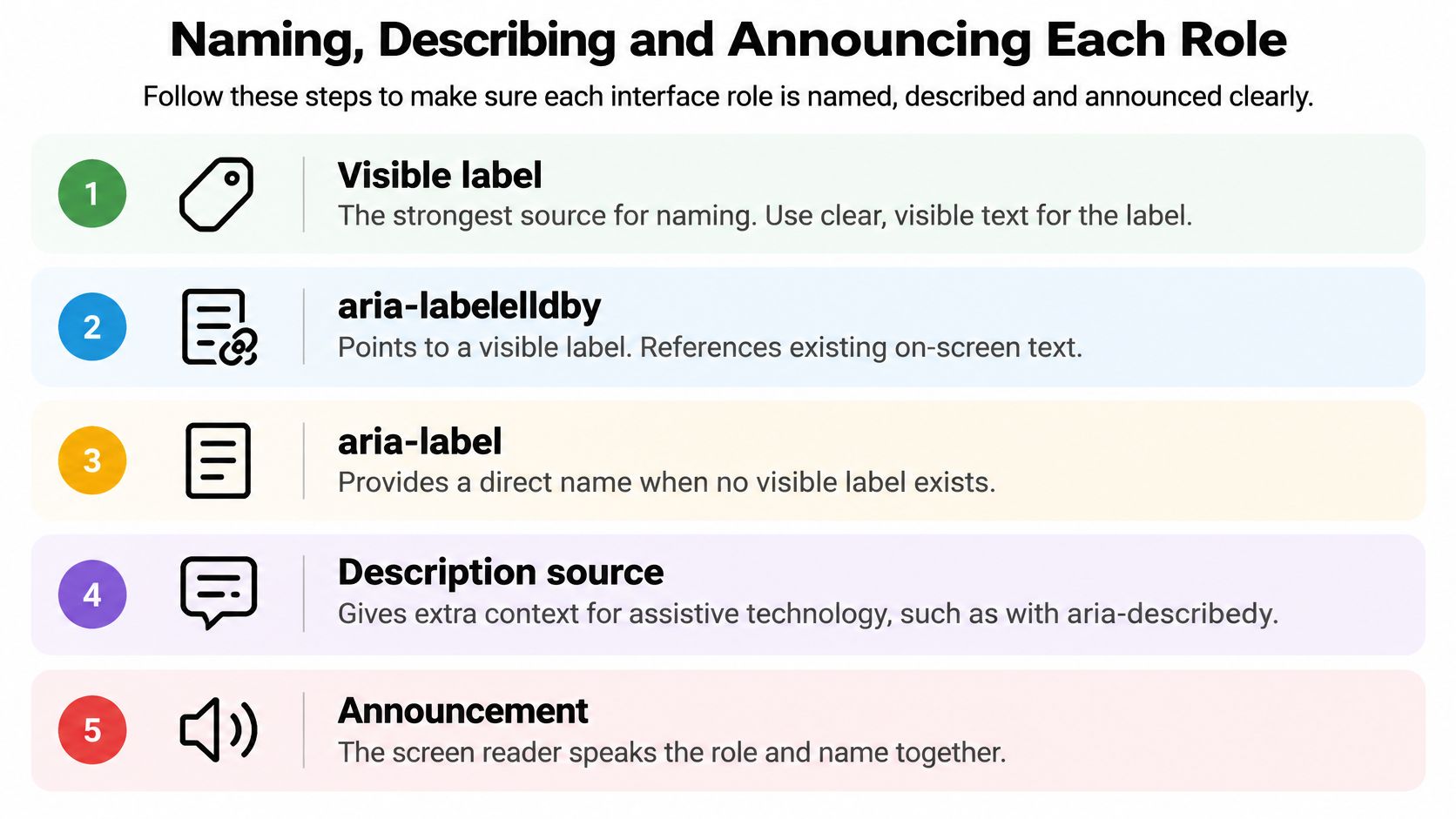
- Visible label: Use a label element for form controls. It’s the strongest source, it enlarges the click target, and sighted and screen reader users get the same words.
- aria-labelledby: Point to a visible heading or text node that already labels a dialog, region or control. Check the ID exists, because a broken reference fails.
- aria-describedby: Use it for supplementary instructions or error text. It’s read after the name, so it describes rather than replaces.
- aria-label: Reserve it for controls with no visible text, such as an icon only close button. Keep it short and start it with the visible cue where one exists.
Adding aria-label blindly is risky because it overrides visible text. A sighted user reads Search while a screen reader user hears something else, and voice control users can’t activate the control by saying what they see. Reading screen reader implementation tips for 2026 from Waymap helps you hear these mismatches before users do.
For live regions, keep the container in the DOM before updates and change its text content. alert is assertive and interrupts, while status is polite and waits for a pause.
Verify each component’s computed name in your browser developer tools before release. A syntactically valid attribute can still produce a misleading announcement, so listen to the result as well as inspecting it.
Roles That Get Confused and How to Choose
| Pair | Choose when | Avoid when |
|---|---|---|
| navigation or menu | Site links grouped in a navigation landmark | Site links given menu role, which expects arrow-key behaviour |
| dialog or alertdialog | Ordinary modal or window with user-driven content | Urgent message needing an immediate response (use alertdialog) |
| alert or status | Urgent error needing attention (alert) or polite update such as saved (status) | Routine update announced as alert, which interrupts |
| button or link | Action performed in place (button) or navigation to a URL (link) | A button used to change the page |
| listbox or combobox | Options always visible (listbox) or user types to filter a popup (combobox) | Filtered input built as listbox with no text entry |
| tab or button | Switching panels within the same view (tab) | Changing the page or URL (button or link) |
| region or main | Any named section of content (region) or the single primary content area (main) | More than one main on a page |
Pairs Where the Table Needs Help
Navigation and menu cause the most damage. We call both menus in conversation, but site navigation is a list of links users expect to tab through. The menu role announces an application style widget and sets an arrow key expectation. If you haven’t built that behaviour, users who try it get nothing. Even if you have, you’ve forced an unfamiliar model onto ordinary navigation.
Alert and status differ by politeness, not importance to you. A routine save confirmation announced as alert interrupts whatever the user is hearing. Use status for saved, result counts and background progress, and save alert for errors that block the task.
Listbox and combobox turn on one question. Are the options always visible, or does the user type to filter a popup? A filtered input built as a listbox with no text entry is the wrong pattern, and users will try to interact with it the wrong way.
Tab and button turn on location. Tabs switch panels within the same view. If selecting it changes the page or URL, it’s navigation, and a link is the right tool. If a pair is still unclear, check the native element first, because a native choice removes most of the decision.
When to Skip ARIA and Use Native HTML
Most ARIA decisions should end with no ARIA. Work through these steps before you write a role.
- Is there a native element? If button, a, input, select, dialog or nav already carries the semantics, use it and add no role. Our guide to what semantic HTML gives you for free covers the built in behaviour you’d otherwise rebuild.
- Does the interaction need a custom widget? If native HTML can express it, stop. The native element is enough.
- Can you commit to the full pattern? If you can’t deliver the required states, keys and focus model, don’t add the role. An honest generic element beats a lying widget.
- Test the result. Run the keyboard, focus and screen reader checks before shipping.
The common failure is a div with role=“button”, no tabindex, no keydown handler and no name. It’s announced as a button but can’t be reached or activated by keyboard. That’s worse than a plain div, because the announcement promises an action the user can’t perform.
No ARIA is better than bad ARIA. A wrong announcement sends users down a path that doesn’t work.
Adoption figures don’t change that. The 2025 Web Almanac accessibility chapter reports that roughly 66% of pages use aria-label, about one quarter use aria-labelledby, and around 33% use aria-live, while required is used on approximately 67% of desktop pages compared with aria-required on 36%. Those numbers measure adoption, not correctness. They say nothing about whether labels are valid or announcements are timely.
Duplicate naming is the everyday version of this problem. A native button given an aria-label that differs from its visible text creates two names for one control. Ask instead when you should use no ARIA, native semantics or a carefully constrained role, and how you’ll test the announcement in menus, comboboxes, dialogs and toasts.
Using Roles in Web Components and Vue Wrappers
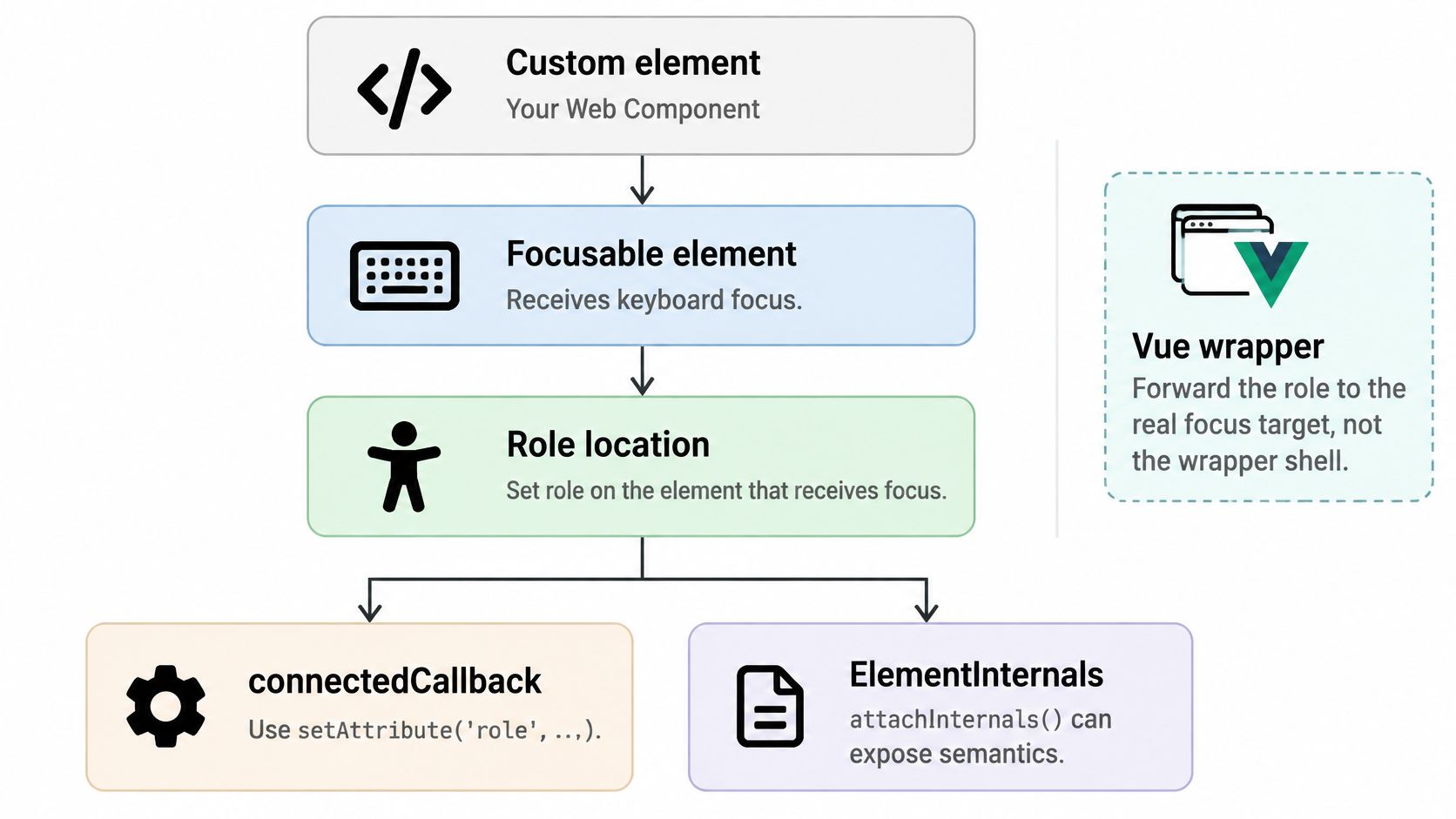
Put the role on the element that receives focus, not on a convenient wrapper. In a custom element you can set it with setAttribute(‘role’, …) in connectedCallback, or use ElementInternals through attachInternals and internals.role, which exposes the role without a visible attribute. Reflect states from properties to attributes, so aria-expanded follows your open property automatically rather than relying on callers to keep them in sync.
The Shadow DOM Boundary
aria-labelledby, aria-describedby and aria-controls take IDs, and IDs don’t resolve across a shadow root boundary. A label outside the component can’t name a control inside it by ID reference. Solve this by passing element references through your component API, for example an ariaLabelledByElements property, or by keeping the labelling element inside the same shadow root. Test the computed name in the accessibility tree, because the markup can look correct while the reference resolves to nothing.
The short walkthrough below shows the component boundary problem in practice.
Binding States in Vue
Bind states explicitly in Vue wrappers. Writing :aria-expanded=“String(open)” avoids ambiguity about how a false value renders, and v-model should update state on the same element that owns the role. Forward the role to the focus target, not the wrapper shell, and generate relationship IDs with an SSR-safe ID helper so server and client markup match. Our notes on using web components in Vue cover the wrapper mechanics in more depth.
Finish by mapping one wrapper to the contract. List its role, required states, keys and name source in the component documentation, so anyone can audit the wrapper against this reference without reading its source.
Testing Roles and Shipping the Contract
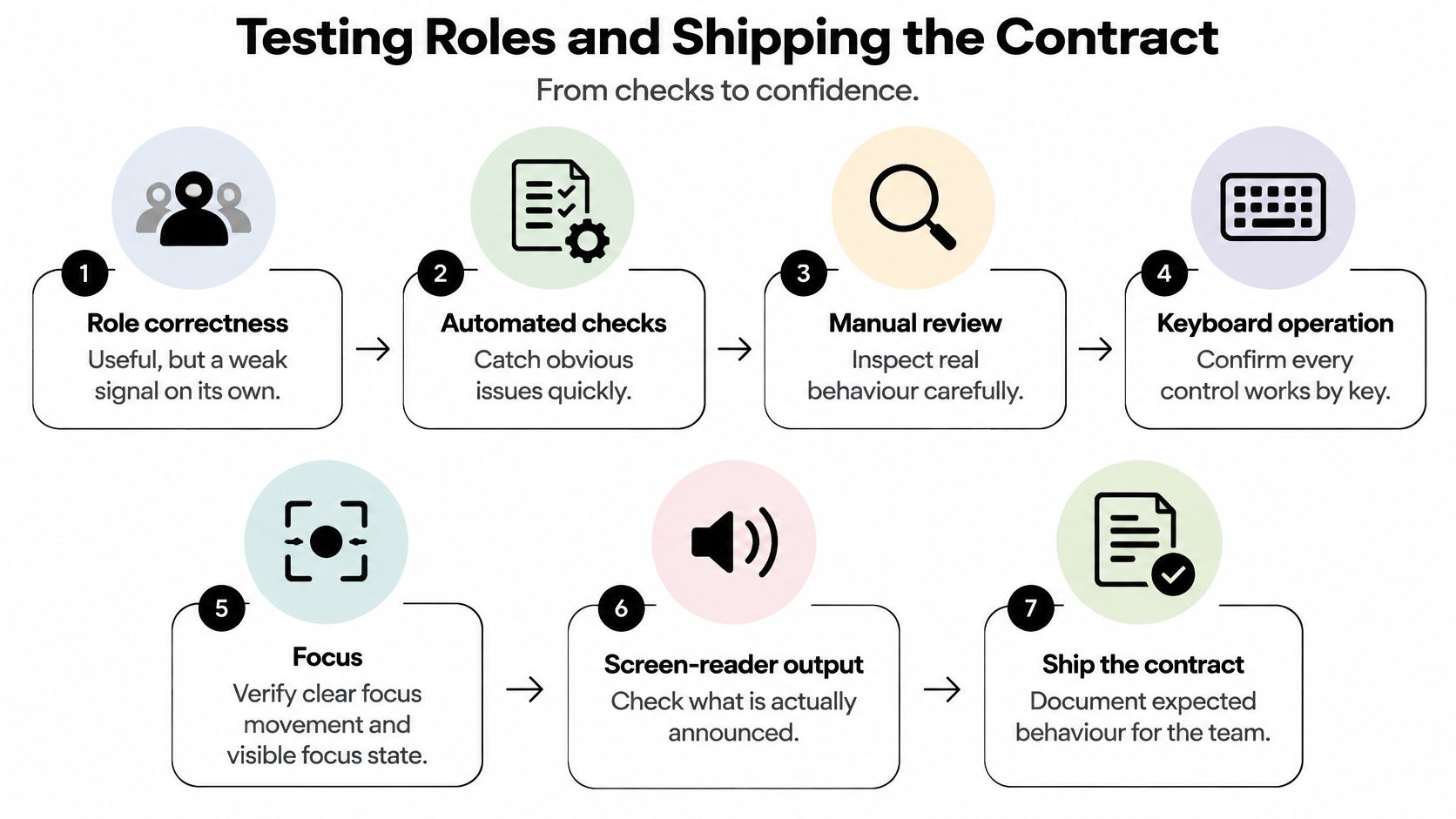
Role correctness alone is a weak quality signal. A component can carry the right role and still be unusable. The Met Office app accessibility audit shows what real improvement looks like, with clearer screen reader communication of search results, stronger keyboard focus management, and better heading and link structures, not merely adding roles, under testing against WCAG 2.2 AA through automated and manual review.
A Manual Test Script You Can Reuse
- Check role exposure: Confirm the role appears in the accessibility tree in browser developer tools.
- Confirm the name: Check the computed accessible name matches the visible label.
- Walk the keyboard path: Press every key the pattern requires and check each result.
- Check focus movement: Verify focus lands correctly on open and returns to the trigger on close.
- Listen to state changes: Trigger each change and confirm NVDA, JAWS or VoiceOver announces it.
- Record results: Keep one row per role in a manual test script, so regressions are easy to spot.
Automated tools catch missing names and invalid attributes, but they can’t judge whether an announcement is timely or comprehensible. That’s why the keyboard, focus and listening steps stay manual, and why making automated release signals trustworthy from devPulse is worth reading before you treat a green dashboard as proof. Our WCAG compliance checklist helps you place these checks inside a wider audit.
Writing the Contract Down
Audit each role in your component library and first confirm no native element was available. For each role that remains, write the contract in one place. Record the role, its required states, its keys, its naming source, its focus return behaviour, and the manual test script that proves it.
We follow that approach in our own library. Every component ships with a contract, examples and agent guidance, and component metadata includes props, events and examples, plus llms.txt and an installable skill, so a team has a written contract to audit against. Our profile menu playground lets users test keyboard navigation and item selection, which gives you a model for testing your own menu before writing a script. You still need to check the contract inside your own app, because your labels, content and focus order are yours.
Ship a role only when its states, keys, name and announcements are verified in a real user journey.
If you’re tired of rebuilding menu, dialog, tab and combobox patterns and then proving each one works, explore DOM Studio for headless web component primitives with a Vue integration layer and accessibility built in by default. Browse the component contracts, test the keyboard behaviour in the playgrounds, and bring the same contract checks from this reference into your own review process.