
Application UI blocks are reusable, production-shaped sections of an interface, such as an app shell, dashboard, settings panel, workflow form, or inbox. They sit between small primitives like buttons and inputs, and full product pages.
We build them to eliminate repeated layout and interaction work without turning every screen into a rigid template. The practical method is simple: define the block’s contract, compose stable primitives, make responsiveness intentional, and test it in a real product context.
Table of contents
Before you start: what we need
Before building an application UI block, gather:
-
A named product job, such as reviewing customer health or approving an invoice.
-
A small set of existing primitives, including buttons, fields, cards, navigation, and feedback controls.
-
Content states for loading, empty, error, and populated data.
-
A breakpoint or container-width decision for the narrow layout.
-
A keyboard and focus test plan.
A good block is not a screenshot turned into code. It is a repeatable arrangement with a documented public API: inputs, events, slots or regions, responsive rules, and states. In Vue, that boundary is typically expressed through props, emitted events, and slots. When we only need to share stateful behavior, a composable is usually a better fit than another visual component.
1. Choose one product job and draw the block boundary
Start with the job a user must complete, not with a collection of attractive components. For example, a revenue dashboard helps a manager scan performance, adjust the reporting period, and move to the next action. An application layout helps a user keep navigation available while working through detailed content.
Write a one-sentence purpose statement, then list what belongs inside the block.
Example boundary for a customer-health workspace
-
Owns: left navigation, workspace header, reporting control, summary metrics, the accounts list region, and narrow-screen navigation behavior.
-
Receives: selected workspace, report range, account data, loading state, and permission-aware actions.
-
Emits: range changes, account selection, export requests, and next-review requests.
-
Does not own: API fetching, routing policy, account scoring logic, or page-specific copy.
This boundary makes the block reusable because the layout and interaction structure remain stable while the host application supplies data and business rules.
Expected result: a teammate can identify what the block owns without reading its implementation.
Troubleshooting: if the block needs a dozen flags for one screen, split out a repeated region or move business decisions back to the parent page.
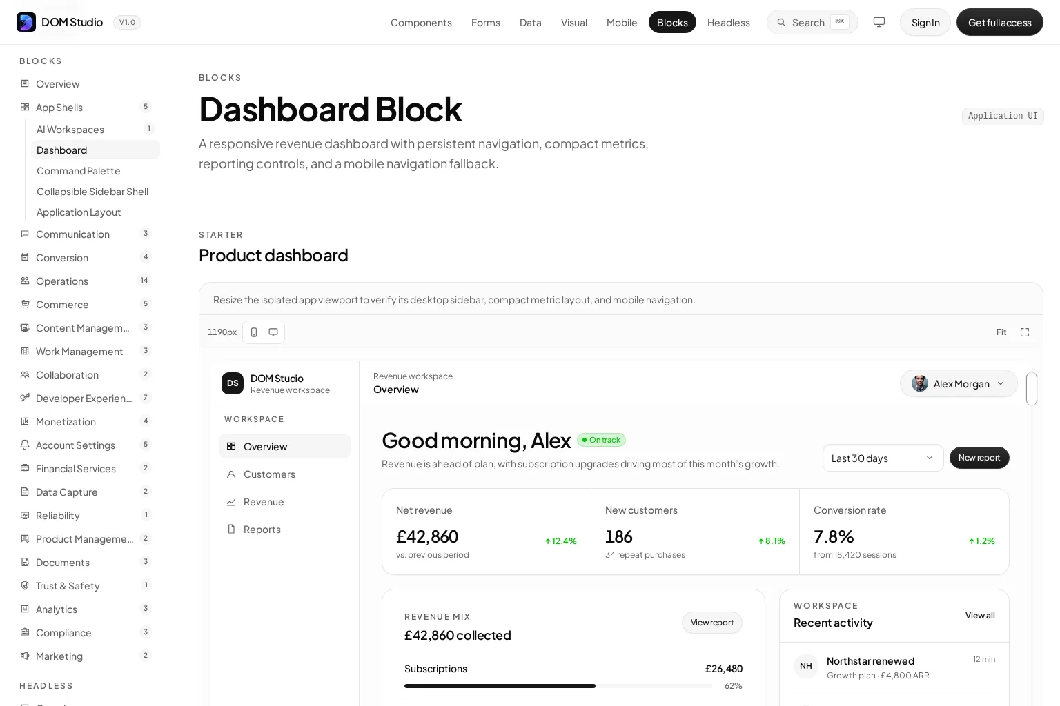
DOM Studio’s Dashboard Block is a useful reference point: it packages persistent navigation, compact metrics, reporting controls, and a mobile navigation fallback as one product-shaped composition.
2. Define the block contract before styling it
Treat the public interface as a product contract. We want another engineer to be able to use the block without inspecting internal markup.
For a Vue application UI block, define four parts:
-
Props: the data and configuration the host provides.
-
Events: user intent that the host must handle.
-
Slots or regions: places where the host can inject context-specific UI.
-
State rules: what changes for loading, empty, error, disabled, and narrow layouts.
Here is a concise contract for a reusable workspace block:
<script setup>
defineProps({
  title: { type: String, required: true },
  metrics: { type: Array, default: () => [] },
  isLoading: Boolean,
  canExport: Boolean,
})

const emit = defineEmits(['range-change', 'export', 'select-item'])
</script>

<template>
  <section aria-labelledby="workspace-title">
    <header>
      <h1 id="workspace-title">{{ title }}</h1>
      <slot name="controls" />
    </header>
    <slot name="navigation" />
    <slot name="content" :metrics="metrics" :loading="isLoading" />
  </section>
</template>
The exact markup will vary, but the contract is testable. Props move data into the block, events communicate user intent outward, and slots preserve flexibility without requiring a fork for every product team.
Expected result: an implementation can render a meaningful loading state and populated state using the same interface.
Troubleshooting: do not mutate a prop inside the block. Create local state only when the block truly needs a temporary, user-controlled draft, then emit the confirmed change.
3. Compose primitives into named regions
Build the first version from primitives that already have dependable semantics and interactions. Start with real buttons, labels, inputs, landmarks, and headings. Add ARIA only when native HTML does not express the required behavior.
We normally name regions after their responsibility, not their visual placement:
-
workspace-nav -
workspace-header -
summary-metrics -
primary-work-area -
context-actions -
mobile-navigation
This lets us change a two-column layout into a drawer-based mobile view without changing what the regions mean. It also keeps tests focused on user outcomes instead of fragile CSS selectors.
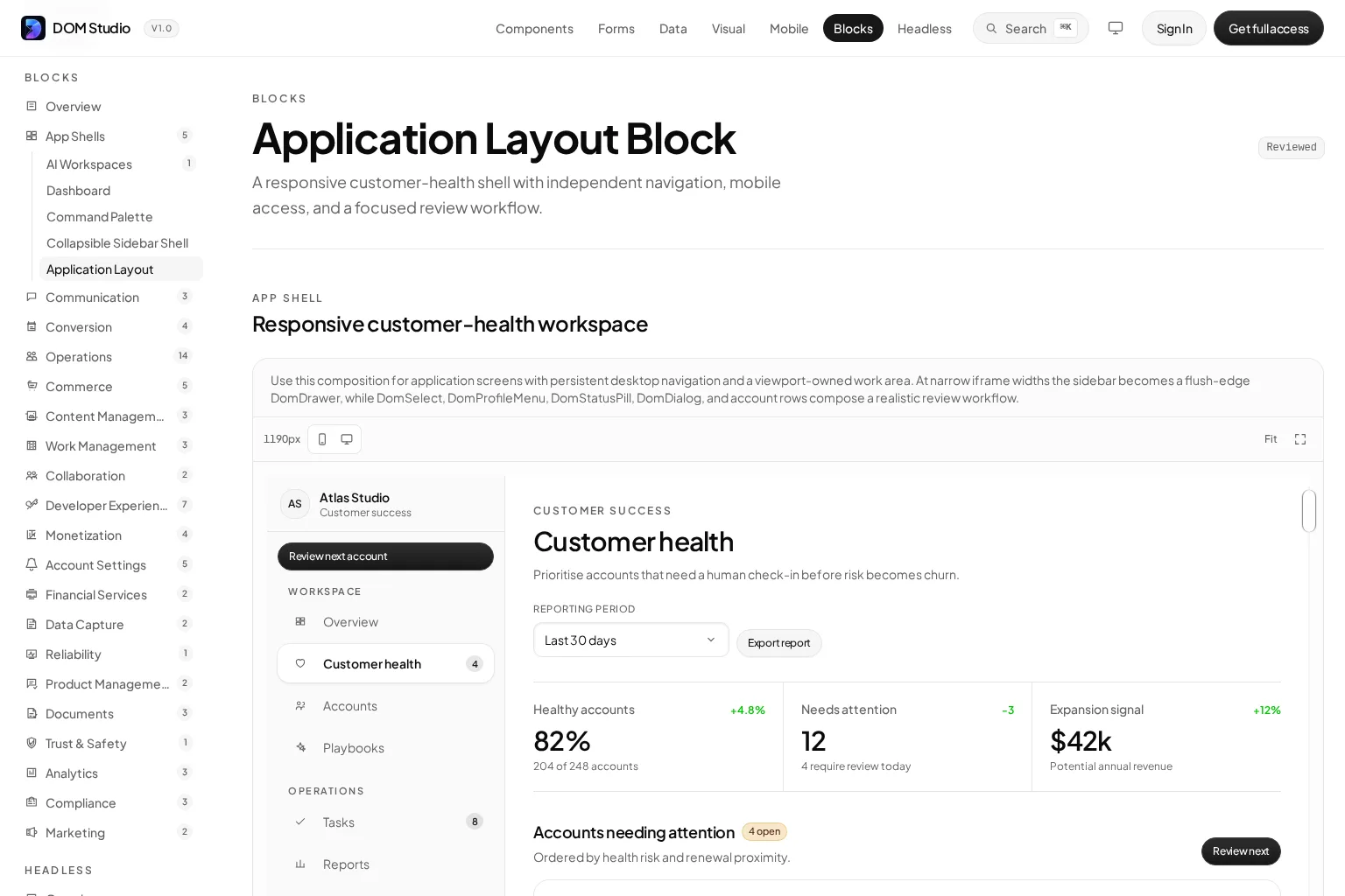
For a working composition, connect DOM Studio primitives rather than duplicating low-level control behavior. Its Application Layout Block demonstrates a persistent left area and an independently scrolling main work area. The page also shows the block composed from controls including DomButton, DomCard, DomDropdown, and DomNativeSelect.
Expected result: the block can render with realistic content and every interactive control has a clear semantic role.
Troubleshooting: if a clickable div appears in the layout, replace it with a native control before adding keyboard handlers. Native controls supply behavior and focus affordances that custom elements must otherwise recreate.
4. Make the responsive behavior part of the contract
Responsive application UI is more than shrinking columns. Decide what persists, what moves, and what becomes progressive disclosure at each available width.
For a workspace block, write rules such as these:
-
At wide widths, show a persistent navigation rail and a scrolling work area.
-
At medium widths, reduce the rail width and let secondary actions wrap.
-
At narrow widths, move navigation into a drawer or bottom navigation pattern.
-
Keep the primary task, current context, and main action visible before lower-priority utilities.
-
Preserve logical DOM order so keyboard focus still follows the user’s task.
Test the block at the exact widths you support, not only at a single desktop canvas. Resize an isolated preview and verify the mobile navigation fallback, header wrapping, metric stacking, dialogs, and overflow behavior. DOM Studio’s block previews are designed for this kind of viewport check, including desktop sidebars and mobile fallback behavior.
Expected result: a user can reach navigation, context controls, and the primary task without horizontal scrolling or lost focus.
Troubleshooting: if a visual reorder changes keyboard order in a confusing way, revise the DOM structure or use a layout that preserves the task sequence. Do not rely on CSS alone to hide a broken focus path.
5. Build states, not just the ideal screen
A reusable application UI block must explain what happens when data is not ideal. Define each state before polishing the populated dashboard:
-
Loading: keep the shell stable and show the structure that is being prepared.
-
Empty: explain why there is no content and present the next valid action.
-
Error: preserve context, identify the failed area, and offer retry where appropriate.
-
Permission limited: show what is available and avoid teasing inaccessible actions.
-
Disabled or pending: prevent duplicate actions and expose the reason when it matters.
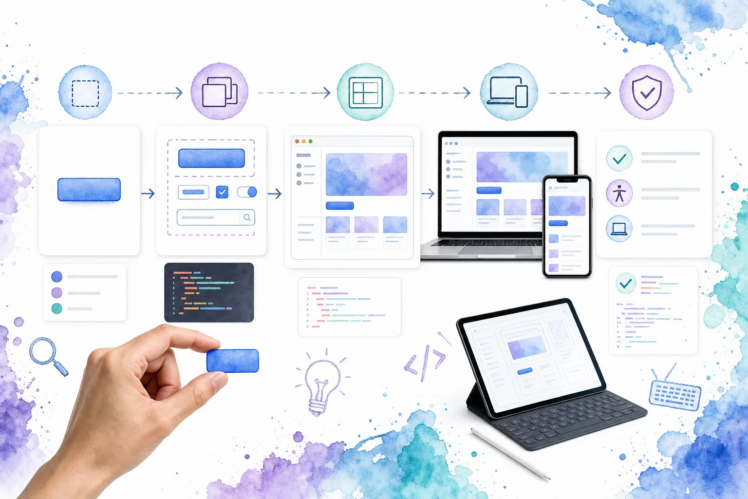
We also test transitions between these states. For example, open a filter, switch the reporting range, render loading, return an empty result, then return a populated result. Check that focus remains predictable and that the region communicates the update appropriately.
Expected result: the UI block remains understandable before, during, and after an asynchronous change.
Troubleshooting: if a state replaces the entire page, users may lose their position and context. Prefer keeping the app shell and stable heading in place while updating only the affected region.
6. Verify accessibility and interaction behavior in the real app
A block is only reusable if people can operate it across contexts. Use a browser and keyboard to test the actual integrated screen, not only a component sandbox.
Run this minimum verification pass:
-
Tab from the browser chrome into the block and confirm focus reaches controls in a logical order.
-
Activate buttons with Enter and Space.
-
Open and close menus, drawers, and dialogs. Confirm focus moves intentionally and returns to the trigger when appropriate.
-
Inspect labels, headings, form fields, error messages, and status changes.
-
Test narrow-width navigation and a long-content view with a keyboard.
-
Repeat with loading, empty, error, and disabled states.
Semantic HTML should be our baseline. When creating custom widgets, ARIA roles and states need to accurately communicate the behavior, and keyboard interaction needs to match the widget pattern. Complex controls such as dialogs, menus, comboboxes, tabs, and floating panels deserve a mature, tested interaction layer rather than a quick rebuild.
For that approach, DOM Studio’s headless component guide explains the useful split: the behavioral layer owns state, keyboard interaction, ARIA relationships, focus handling, and events, while the application owns composition and styling. Its headless library is relevant when we need flexible behavior without visual lock-in.
Expected result: the block works with a mouse, keyboard, responsive layout, and assistive technology-oriented semantics.
Troubleshooting: if focus disappears after closing an overlay, store a reference to the trigger and restore focus after the close transition. If the same control behaves differently across screens, centralize the interaction contract instead of patching each page.
7. Promote the block only after two real integrations
Do not label a composition reusable after its first successful page. Integrate it into two different product contexts with meaningfully different content or permissions.
For example, use the same workspace block for customer health and project delivery. Keep the shell, navigation behavior, header anatomy, and state contract. Change the metrics, list content, controls, and page-specific actions through props and slots.
Then assess the result:
-
Which props appear across both implementations?
-
Which regions genuinely need slots?
-
Which overrides belong in a theme or design token?
-
Which request is a page-specific exception rather than a reusable capability?
Only promote the common, stable behavior. This prevents application UI blocks from becoming a dumping ground for every one-off layout request.
Expected result: both screens share a dependable structure, while each retains its product-specific content and workflow.
Troubleshooting: if the second integration requires large conditional branches throughout the template, the two screens may need sibling blocks built on shared primitives, not one increasingly abstract mega-block.
Build the next screen from a verified block
We now have a repeatable way to create application UI blocks: start with a product job, define a public contract, compose named regions from semantic primitives, make responsive behavior explicit, cover every state, and verify it in two real integrations.
Our next action is to choose one repeated product surface, such as a dashboard, settings workspace, or approval flow, and write its contract before implementation. Then explore DOM Studio’s application blocks and form system to assemble the production-shaped pieces without rebuilding the hard interaction details from scratch.