
XS, SM, MD, LG, and XL are semantic size tokens for responsive breakpoints and spacing scales, not fixed pixel values. Their meaning changes only when your design system or framework configuration maps each token to a concrete value.
You may be looking at a dashboard that feels polished on a wide monitor, then testing it on a phone and finding that the navigation is cramped, cards refuse to stack, and icon buttons are too small to use comfortably. The labels look familiar, so it’s tempting to assume that xs, sm, md, lg, and xl have universal meanings. They don’t. In a production interface, they’re part of a shared vocabulary that must be mapped deliberately to layout, component, typography, and spacing behaviour.
That distinction matters beyond CSS. In an apparel system, for example, letter sizes aren’t universal either. One UK retailer maps XS to UK 32, S to 34, M to 36, L to 40, and XL to UK 42–44, which shows why labels need validation against measurements rather than assumptions (ASOS women’s size charts). UI tokens work in a similar way. The label is useful only when everyone agrees what it controls.
Table of Contents
- Why XS SM MD LG XL Sizes Break Layouts When Treated as Fixed Values
- Understanding Design Tokens and How XS SM MD LG XL Sizes Map to Pixels
- Comparing XS SM MD LG XL Across Frameworks and Layout Modes
- Implementing XS SM MD LG XL Sizes in Tailwind and DOM Studio
- Accessibility Rules and Responsive Targets When Using Size Tokens
- Theming and Customising XS SM MD LG XL Sizes for Production Apps
- Recommended Patterns for Choosing and Applying Size Tokens in Production
Why XS SM MD LG XL Sizes Break Layouts When Treated as Fixed Values
A team ships a reporting dashboard with sm cards, md controls, and an xl container. On desktop, the result looks orderly. On a narrow viewport, the card grid squeezes horizontally, the filters wrap in an awkward order, and the icon-only controls lose enough padding to become difficult to activate.
The root problem usually isn’t one bad CSS declaration. A developer has treated sm as a fixed width, while a designer has used sm to mean a compact component variant, and the framework uses sm as a minimum viewport breakpoint. The same word now describes three different decisions.

A token is a contract, not a measurement
A design token names an intentional choice. space-sm might represent a close relationship between an icon and its label. button-md might define a comfortable default control. md in a responsive utility might instead mean “apply this rule from the medium breakpoint upwards”.
Those choices can share a naming family, but they shouldn’t automatically share a value. A breakpoint answers a viewport question. A component size answers a component question. A spacing token answers a rhythm question.
Practical rule: Treat the label as an API name first. Treat its pixel or rem value as an implementation detail that can change by theme, platform, or framework.
This approach prevents regressions during a theme change. If every component contains hard-coded widths and padding, changing the scale means hunting through templates and stylesheets. If components consume semantic tokens, the team can adjust the mapping centrally and test the affected states systematically.
The mobile failure is often behavioural
Responsive work isn’t just about making elements smaller. A dashboard may need to change from a row to a stack, move filters into a drawer, or replace a multi-column table with a focused list. A token can trigger those changes, but it can’t decide them by itself.
Start by documenting what each token means in your system:
- Viewport token: controls when a layout mode changes.
- Component token: controls the internal size of a button, avatar, or dialog.
- Spacing token: controls relationships between elements.
- Type token: controls font size and line height.
Once those roles are separate, xs and sm stop being mysterious abbreviations. They become readable instructions that teams can audit, version, and apply consistently.
Understanding Design Tokens and How XS SM MD LG XL Sizes Map to Pixels
The safest way to map a token is to define its role, choose a value, and record the decision in one place. Don’t begin by copying a breakpoint chart into every component. Begin with a token table that makes the system’s assumptions visible.
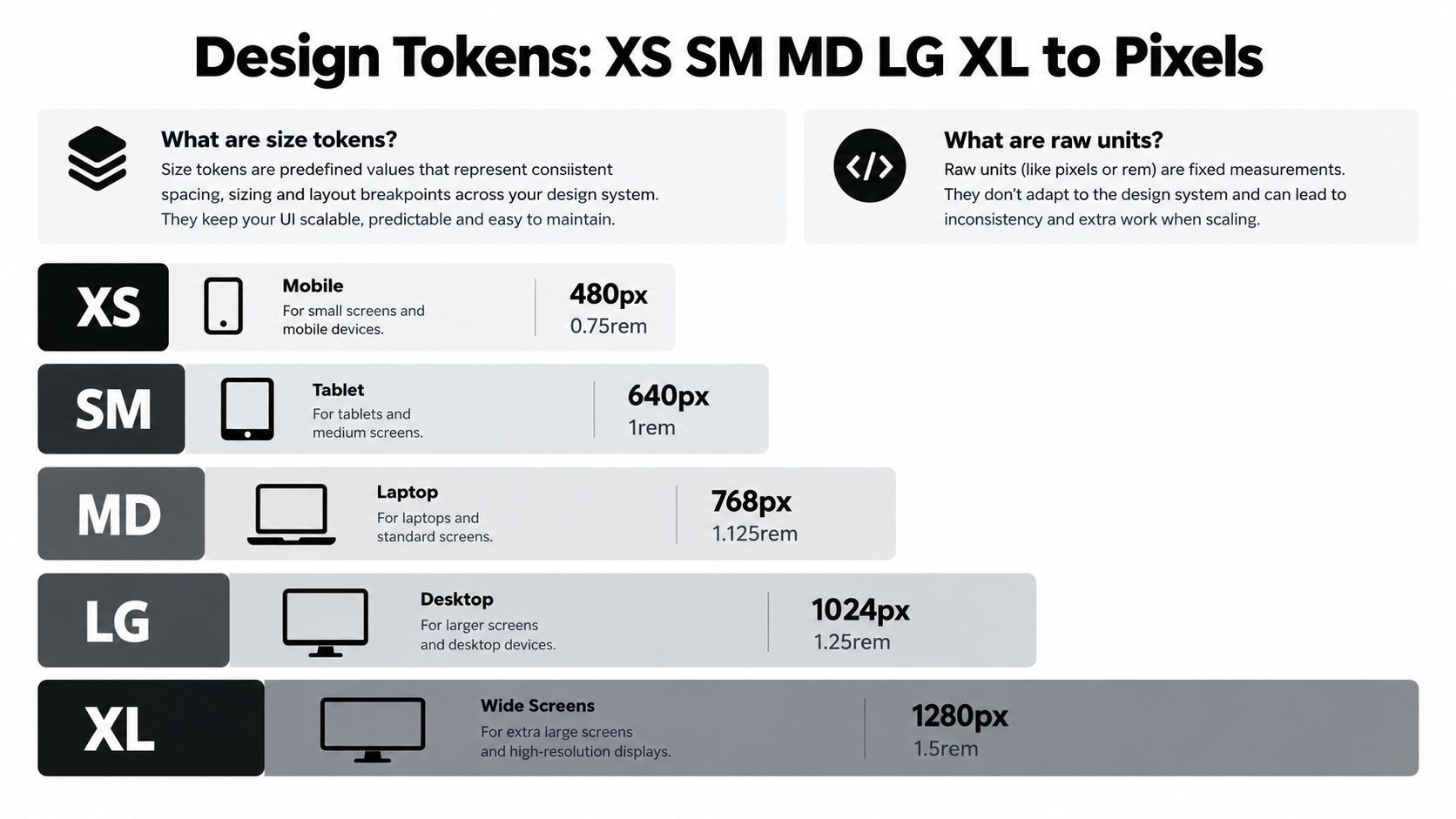
Tailwind’s familiar responsive defaults use sm at 640px, md at 768px, lg at 1024px, and xl at 1280px. Those are framework conventions, not universal definitions. A project can choose a different map if its content and layouts require it.
Keep the maps explicit
A reference table can separate a responsive map from a spacing or type map:
| Token | Example breakpoint | Example semantic use |
|---|---|---|
xs |
Base, below 640px |
Single-column or compact layout |
sm |
640px |
Additional horizontal room |
md |
768px |
Tablet-oriented layout changes |
lg |
1024px |
Desktop navigation or grid changes |
xl |
1280px |
Wide-screen container behaviour |
The table isn’t a law. It’s a contract for your project. If text-xs means 0.75rem, that doesn’t mean breakpoint-xs should also resolve to 0.75rem. Similar names are convenient, but semantic namespaces protect you from accidental coupling.
For typography, a tool such as how Font Checker Pro audits fonts can help you inspect whether a type scale is being applied consistently. The important engineering decision remains local: define what text-xs, space-xs, control-xs, and breakpoint-xs each mean, then make those meanings discoverable.
Use CSS variables as the translation layer
A token map can look like this:
:root {
  --breakpoint-sm: 40rem;
  --breakpoint-md: 48rem;
  --breakpoint-lg: 64rem;
  --breakpoint-xl: 80rem;

  --space-xs: 0.25rem;
  --space-sm: 0.5rem;
  --space-md: 1rem;
  --space-lg: 1.5rem;
  --space-xl: 2rem;
}
In a Vue system, components should consume semantic variables rather than repeat raw values. DOM Studio combines standards-based headless web component primitives with a Vue integration layer and Tailwind CSS 4 styling, so teams can keep behaviour in reusable primitives while applying their own token map. Its wrappers support reactive props, v-model, and slots, while the primitives handle accessibility patterns such as roles, focus management, and keyboard behaviour. The DOM Studio CSS variables guide is useful when you want those values to remain adjustable without scattering declarations through component templates.
The same principle applies to the rem equivalents shown in a design reference. They can describe type or spacing scales, but they shouldn’t be mistaken for viewport thresholds. Record the purpose beside every token, and developers won’t need to infer intent from a short label.
Comparing XS SM MD LG XL Across Frameworks and Layout Modes
The same five labels can produce different results because frameworks assign them to different systems. Tailwind’s responsive prefixes describe minimum viewport conditions, while a component library may use size="sm" to select padding, typography, and height. A spacing scale may use space-lg for a gap, and a design tool may use LG for a frame preset.
That means a comparison should start with the question being answered:
| Question | Token family | Example outcome |
|---|---|---|
| When should the layout change? | Breakpoint | A row becomes a grid |
| How large should the control feel? | Component size | Padding and text change |
| How far apart should elements sit? | Spacing | A gap grows between groups |
| How should text scale? | Type size | Font size and line height change |
Responsive prefixes aren’t component sizes
A class such as md:grid-cols-2 says that the grid should use a different column rule at the medium breakpoint. It doesn’t say that every child is now a medium-sized card. Conversely, a button with a md size prop can remain md regardless of viewport width.
This distinction is especially important in fluid layouts. A card can be a sm visual variant inside an xl container, or an xl control inside an xs layout if the interface needs a prominent action. The layout mode and component scale should be independent unless the design system explicitly couples them.
Choose tokens by behaviour
Use breakpoints when content needs a structural change. Use component tokens when the control’s visual density needs a deliberate variant. Use spacing tokens when you’re expressing a relationship between elements.
A good review question is, “What should happen if this token changes?” If changing lg alters both a media query and a button’s padding, you probably have two concepts sharing one name. Split them before the system grows. Clear namespaces make code easier to review, themes safer to change, and responsive bugs easier to isolate.
Implementing XS SM MD LG XL Sizes in Tailwind and DOM Studio
Start with a mobile-first base rule, then add responsive changes only where the layout needs them. In Tailwind, the standard responsive prefixes can express layout transitions without turning every component into a collection of hard-coded dimensions.
<section class="grid grid-cols-1 gap-md sm:grid-cols-2 lg:grid-cols-3">
  <article class="rounded-lg p-md lg:p-lg">
    <h2 class="text-lg">Revenue</h2>
    <p class="text-sm">Monthly reporting summary</p>
  </article>
</section>
Here, the grid changes at sm and lg, while the card’s internal spacing changes at lg. The class names describe when behaviour changes, not the absolute width of the card.
Configure names separately from component scales
If a project needs a custom breakpoint, define it in the Tailwind configuration and document why it exists. Keep component size tokens in a separate layer, even if both use the same words.
export default {
  theme: {
    extend: {
      screens: {
        sm: '40rem',
        md: '48rem',
        lg: '64rem',
        xl: '80rem'
      },
      spacing: {
        xs: '0.25rem',
        sm: '0.5rem',
        md: '1rem',
        lg: '1.5rem',
        xl: '2rem'
      }
    }
  }
}
The values above are an example project map. Your team should validate them against actual content, container behaviour, and accessibility requirements before adopting them.
Let primitives own interaction logic
DOM Studio provides headless web component primitives with a thin Vue layer, so a team can apply Tailwind classes while keeping interaction behaviour in the component. Its button and avatar APIs use xs, sm, md, lg, and xl as component size values, while its dialog API uses size values as width presets. Those are component semantics, not viewport breakpoints.
A Vue usage pattern might look like this:
<template>
  <DomButton size="md" @click="open = true">
    Open details
  </DomButton>

  <DomDialog v-model="open" size="lg">
    <template #title>Details</template>
    <p>Review the selected record.</p>
  </DomDialog>
</template>

<script setup>
import { ref } from 'vue'

const open = ref(false)
</script>
The primitives provide WAI-ARIA roles, focus management, and keyboard handling by default. Individual modules average under 2 kb gzipped, according to DOM Studio, and the library is tree-shakeable. For theme governance and reusable visual mappings, the Tailwind CSS themes guide provides a useful reference point.
Accessibility Rules and Responsive Targets When Using Size Tokens
A token is only successful if the resulting component remains usable. A compact xs control can look tidy in a screenshot and still be too difficult to activate with a keyboard, touch input, or assistive technology.
For UK front-end systems, the Home Office accessibility standard requires interactive targets to be at least 24 by 24 CSS pixels, or to have enough spacing around them. That requirement directly constrains responsive tokens, because a mobile rule that removes padding from an icon button can reduce its effective target below the expected minimum (UK Government accessibility standard).
Validate the rendered result
Don’t validate only the token declaration. Inspect the actual button, link, checkbox, and menu trigger after all responsive classes, inherited styles, and icon dimensions have been applied.
Check these conditions:
- Interactive area: Confirm the target remains at least 24 by 24 CSS pixels, or has sufficient surrounding spacing.
- Focus visibility: Ensure keyboard focus remains obvious at every size and colour mode.
- Content fit: Check that labels don’t disappear or overlap when a component switches scale.
- Spacing: Test adjacent controls, especially when
xsandsmvariants reduce padding. - Reflow: Confirm that the interface still works when a row becomes a stack.
Accessibility check: A smaller visual variant must not become a smaller interaction target unless the surrounding spacing preserves the required usable area.
GOV.UK’s design system treats breakpoint-specific widths as structured desktop, tablet, and mobile behaviour. Classes such as one-half on tablet and two-thirds from desktop illustrate the right mindset: a breakpoint should describe an intentional layout mode, not merely cosmetic shrinking. The media query breakpoints guide can help teams document those transitions beside their component rules.
The infographic supplied for this topic includes other commonly discussed checks, but don’t treat any unverified threshold as a substitute for the applicable accessibility standard. Record the rule your project follows, test it in the browser, and include it in component acceptance criteria.
Theming and Customising XS SM MD LG XL Sizes for Production Apps
A token-first system makes customisation safer because the team changes a mapping instead of editing every component. That only works if the mapping has clear ownership. Decide which tokens belong to the global foundation, which belong to components, and which are allowed to vary by theme.
A practical structure might separate:
- Foundation tokens: colour, type, spacing, and breakpoint names.
- Component tokens: button padding, dialog width, avatar diameter, and control density.
- State tokens: hover, focus, disabled, selected, and error behaviour.
- Theme aliases: brand-specific names that point to foundation values.
Don’t let a dark theme redefine sm to mean something unrelated. A theme may change colour, contrast, or surface treatment, but button-sm should continue to represent the same component intent. If a variant needs a different density, give it a deliberate name rather than changing the meaning of an existing token without clear intent.
Govern changes like an API
Write a short description beside each token, including its purpose and the components that consume it. When a value changes, review screenshots and keyboard behaviour at the smallest and largest relevant layouts. This catches the regressions that a visual desktop review often misses.
DOM Studio’s structured component approach fits this model because teams can keep headless behaviour stable while applying Tailwind-based visual tokens. The important practice is not the library choice itself. It’s preserving a stable contract between component props, CSS variables, responsive rules, and theme aliases.
Recommended Patterns for Choosing and Applying Size Tokens in Production
Use the default framework map when it matches your content and the team already understands it. Define a custom map when your layouts change at different content widths, but document the reason and test every affected component.
A reliable decision flow looks like this:
- Name the question. Is the token controlling a viewport, a component, spacing, or typography?
- Choose the smallest useful map. Avoid adding a breakpoint merely because a label exists.
- Set the base behaviour first. Build the narrow layout, then add structural changes.
- Separate namespaces.
breakpoint-mdandcontrol-mdcan coexist without sharing a value. - Test real states. Include focus, disabled, expanded, error, long labels, and empty content.
- Publish the contract. Put token definitions where designers and developers can find them.
Production habit: If a developer can’t explain what changes when a token changes, the token needs a clearer name or a narrower scope.
For Vue teams, keep reactive state and slots at the component boundary, then let the primitive handle interaction details. For Tailwind teams, use responsive utilities for layout decisions and semantic variables for reusable visual scales. For a shared library, validate every xs through xl component variant against the same accessibility and content rules.
The result is more durable than a breakpoint chart. It gives your team a language for layout, a controlled path to theming, and a repeatable way to review component behaviour before release.
DOM Studio provides headless, standards-based UI primitives with Vue wrappers, reactive props, slots, Tailwind CSS 4 styling, and built-in accessibility behaviour. Visit DOM Studio to explore components that let you apply semantic xs, sm, md, lg, and xl tokens without rebuilding interaction patterns from scratch.