
The HTML input type that defines a slider control is range, rendered with the <input type="range"> element. It represents a value within a bounded interval, rather than a field where users must enter an exact number.
Which input type defines a slider control is easy to answer, but the useful engineering question is harder: when should a team use a native range input, and when does that familiar control create accessibility, precision, or styling problems? A slider can be semantically correct and still be the wrong interface for the task.
Table of Contents
- Identifying the HTML Slider Control
- The Evolution of Native Range Inputs
- Practical Configuration and Binding Examples
- Accessibility Realities and Keyboard Behaviour
- Styling Limitations and Headless Alternatives
- Choosing the Right Slider Implementation
Identifying the HTML Slider Control
Which input type defines a slider control? The answer is range, created with <input type="range">. MDN describes the range input as a control for entering a number between a minimum and maximum, typically displayed as a slider rather than a text field.
A minimal native control is:
<label for="volume">Volume</label>
<input id="volume" type="range">
That markup provides browser-managed interaction, but production code should define the scale explicitly:
minsets the lower bound.maxsets the upper bound.stepsets the permitted increment.valuesets the initial position.
<label for="brightness">Brightness</label>
<input
  id="brightness"
  name="brightness"
  type="range"
  min="0"
  max="100"
  step="5"
  value="50">
The submitted value is numeric, while the interface communicates position along a scale. That suits tasks such as brightness or media volume, where users often select an approximate level instead of entering an exact number. It does not automatically make a slider appropriate for values that require precise, inspectable input.
The default value can surprise you
If value is omitted, the browser calculates an initial value from the defined range. The default is halfway between min and max when no value is supplied. Set it deliberately when the initial state affects application behaviour, visual feedback, or saved form data.
step also determines how the control feels. A value of 1 allows single-unit movement by default, while a larger value creates coarser adjustments. Choose the range input only when that granularity matches the task and its keyboard interaction meets the interface’s accessibility needs.
For implementation details, DOM Studio’s range input documentation offers a useful reference for comparing native form behaviour with a component-based interface. When native semantics or interaction limits become a problem, a headless slider primitive may provide the control needed without imposing a visual design system.
The Evolution of Native Range Inputs
Before standardised range controls, teams commonly built sliders from generic elements, mouse events, and JavaScript state. Those widgets could look polished, but every responsibility sat with the application developer: dragging, focus, keyboard movement, value constraints, form submission, and assistive technology semantics.
HTML5 changed that balance by introducing standardised form controls. The BBC’s accessibility guidance identifies input type="range" as an HTML5 addition that replaced older custom-built approaches in appropriate situations. The practical benefit wasn’t merely less code. A native control gives the browser a recognised form primitive with established interaction behaviour.
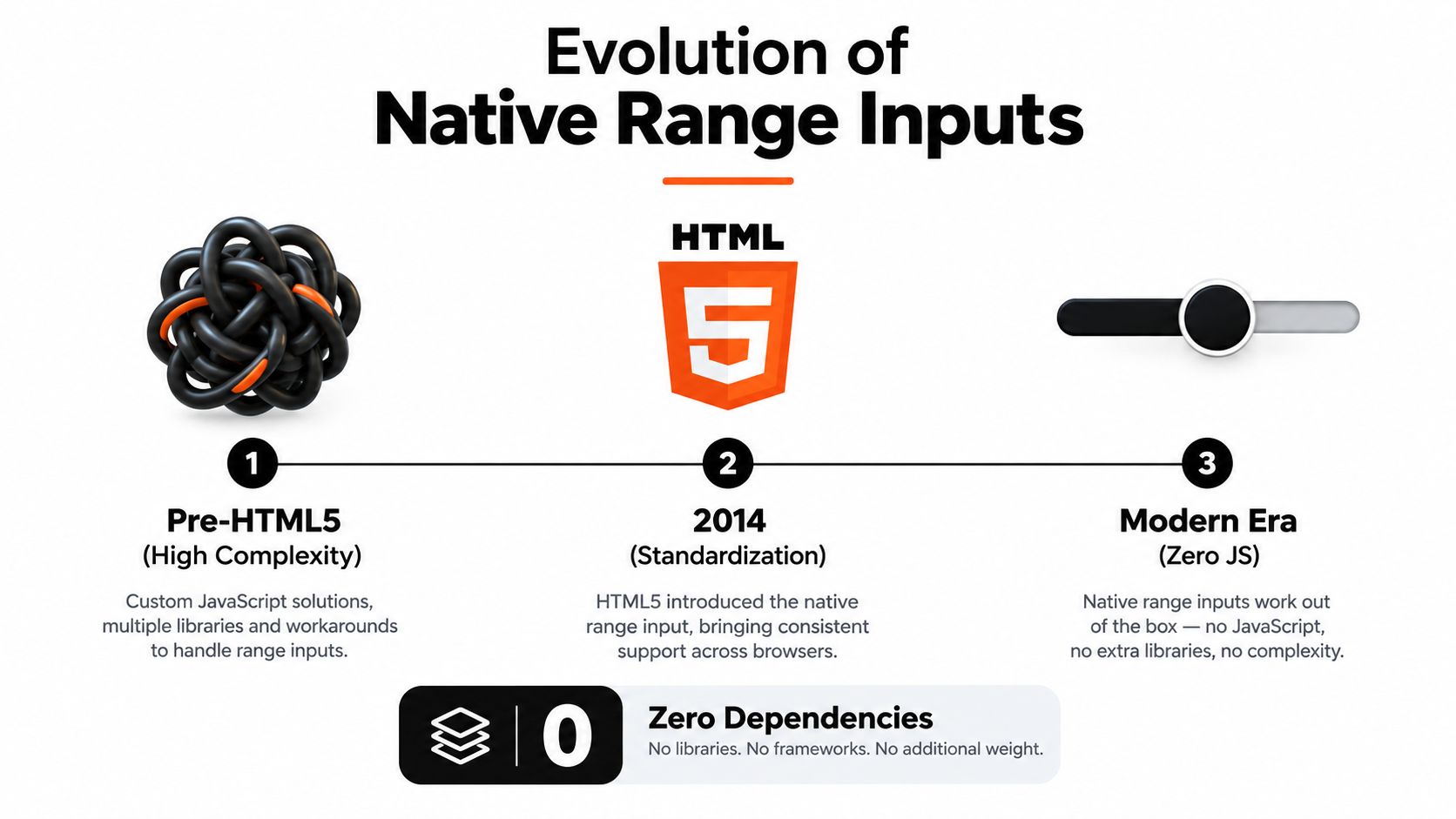
Why native usually wins the first comparison
A custom slider must recreate behaviours that users already understand from native controls. It needs a focus target, a meaningful accessible name, a current value, minimum and maximum constraints, pointer handling, keyboard handling, and form integration. Missing any one of those can leave keyboard users or screen-reader users with a broken experience.
Native range inputs also provide a sensible baseline for mobile interfaces. The BBC example uses a bounded rating control with min, max, and value, demonstrating that the element can support compact scales without a JavaScript replacement.
That doesn’t make native range inputs universally superior. Browser rendering differs, and the native visual treatment may not match a design system. Multiple thumbs, formatted values, non-linear scales, and rich labels often require additional structure. The historical lesson is narrower and more useful: start with the semantic HTML primitive, then add complexity only when the interaction needs it.
Practical rule: replace a native slider because the product requirement demands behaviour it can’t express, not because a custom component looks more fashionable.
Native support also reduces the number of moving parts in a basic form. The browser owns much of the interaction model, while your code can focus on validation, display, and application state.
Practical Configuration and Binding Examples
A reliable range input begins with an explicit scale. Pair type="range" with min, max, and step so the browser and your application agree about valid movement. MDN’s HTML input guidance confirms that step controls granularity and defaults to 1 for range inputs.
<label for="temperature">Temperature</label>
<output id="temperature-value" for="temperature">20</output>
<input
  id="temperature"
  name="temperature"
  type="range"
  min="-20"
  max="40"
  step="1"
  value="20">

<script>
  const input = document.querySelector('#temperature');
  const output = document.querySelector('#temperature-value');

  const updateValue = () => {
    output.value = input.value;
    output.textContent = input.value;
  };

  input.addEventListener('input', updateValue);
  updateValue();
</script>
Use the input event for live feedback while the thumb moves. Reserve change for workflows where the application should react after the user finishes an adjustment. The distinction matters for expensive updates such as filtering, rendering, or network requests.
Binding in Vue
Vue’s v-model keeps a range input and reactive state synchronised:
<script setup>
import { ref } from 'vue'

const opacity = ref(75)
</script>

<template>
  <label for="opacity">Opacity</label>
  <input
    id="opacity"
    v-model="opacity"
    type="range"
    min="0"
    max="100"
    step="5">
  <output :for="'opacity'">{{ opacity }}</output>
</template>
The value arrives as a string in ordinary DOM APIs, so convert it at the boundary when calculations require a number. In Vue, use a numeric modifier when appropriate:
<input v-model.number="opacity" type="range" min="0" max="100" step="5">
A Vue range slider implementation guide can help when a team needs reactive behaviour beyond a straightforward native binding.
Orientation and semantics
A vertical presentation is usually a styling decision, not a different input type:
<label for="zoom">Zoom</label>
<input
  id="zoom"
  type="range"
  min="50"
  max="200"
  step="10"
  value="100"
  aria-orientation="vertical">
Only add orientation semantics when the visual control and interaction behave vertically. Always provide a visible label or an appropriate accessible name. If the number is important to the user, display it beside the track instead of expecting the thumb position to communicate the exact state.
Accessibility Realities and Keyboard Behaviour
Native doesn’t mean automatically appropriate. A range input has a strong semantic foundation, but its design assumes that precision isn’t the primary need. MDN’s range documentation explains that this control suits numeric values where exact precision is less important.
That constraint changes the design decision. A volume control can work well because users generally adjust it by feel. A financial threshold, dosage, account limit, or exact distance may work better with a number input, or with a paired slider and editable numeric field.
Keyboard interaction is part of the contract
Keyboard users need a clear focus indicator and predictable movement. The browser supplies the core operation for a native range input, but your styling can accidentally hide the thumb, reduce contrast, or remove the visible focus state. Don’t treat the track as decoration only. It is the main interaction surface, and its boundaries should be visually understandable.
The accessible name should identify the value being changed, not merely the surrounding feature. “Volume” is clearer than “Control”. If the scale has meaningful endpoints, show them as text, such as “Quiet” and “Loud”, while retaining the numeric value where users need it.
A range input maps closely to the ARIA slider pattern. MDN’s slider role reference describes a read-write numeric interval whose thumb moves between defined minimum and maximum values. That relationship helps explain why a label, current value, bounds, and keyboard operation all matter.
A slider is accessible only when users can identify what it changes, understand its current state, and operate it without relying on pointer precision.
When the slider becomes the wrong field
Avoid forcing exact entry through a tiny draggable target. If users must reach a precise value repeatedly, provide a text or number input alongside the slider, or choose the number input alone. The slider can offer quick exploration while the adjacent field supports correction.
Take extra care with multiple thumbs. A dual-thumb price filter has separate minimum and maximum meanings, collision rules, announcements, and focus states. Two native inputs can provide a progressive fallback, but a single visual track still requires careful labelling and state management.
Test with keyboard-only navigation, zoom, high contrast settings, and a screen reader. Verify that the value is announced as it changes, that focus remains visible, and that the control’s label explains the unit and purpose.
Styling Limitations and Headless Alternatives
The native range input is simple to use until the design requires exact visual control. Track and thumb styling relies on browser-specific pseudo-elements, so a rule that works in one engine may need a different selector elsewhere. The more a team changes the native appearance, the more it must test focus, hover, disabled, filled-track, and high-contrast states.

A native input is a good fit when the browser’s visual model is close enough to the product design. It becomes costly when the team needs a branded thumb, segmented track, custom ticks, rich value bubbles, a vertical layout, or several coordinated handles.
Native CSS versus headless behaviour
A headless primitive separates interaction logic from presentation. The component owns focus management, keyboard handling, value constraints, and ARIA state, while the application supplies the markup and styling needed by the design system.
That approach can solve problems native CSS doesn’t address cleanly, but it introduces another dependency and another implementation to test. A headless slider isn’t automatically accessible. The team still needs to verify the component’s semantics, announcements, pointer behaviour, touch targets, and form integration.
Use the native element when:
- The scale is simple: One bounded value is enough.
- Approximation is acceptable: Users don’t need frequent exact entry.
- Browser styling is sufficient: Cross-browser visual differences won’t undermine the interface.
- Progressive enhancement matters: The form should remain useful without application code.
Consider a headless primitive when:
- The visual design is central: The track and thumb need coordinated, consistent styling.
- The interaction is composite: Multiple handles or linked values must behave as one control.
- The component belongs to a design system: Teams need reusable tokens and consistent states.
- The native control can’t express the UX: Rich labels, custom constraints, or specialised keyboard behaviour are required.
For teams comparing implementation approaches, DOM Studio’s headless UI component library represents the component-oriented model, with framework-agnostic primitives and a Vue integration layer.
A visual walkthrough can be useful when reviewing the difference between native styling and a custom primitive:
Keep the boundary clear. Don’t replace a reliable native control with a custom slider solely to gain a different colour. Replace it when the product needs a different interaction contract, then test that contract as rigorously as the visual design.
Choosing the Right Slider Implementation
The decision starts with the value, not the component catalogue. Ask whether users are selecting an approximate position, entering an exact number, or manipulating a relationship between several values.
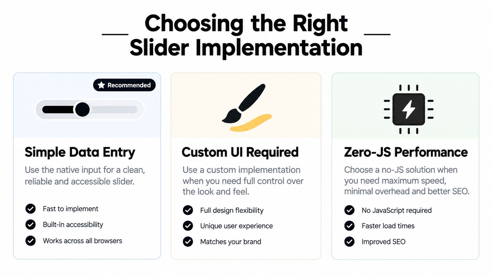
A native <input type="range"> is usually the right starting point for a single bounded setting such as volume, brightness, playback position, or an approximate filter. Give it a label, explicit bounds, a deliberate step, a visible value where useful, and an unmistakable focus state.
Choose a number input instead when the user needs exact entry, repeated correction, or values that are difficult to reach by dragging. Pairing a number field with a slider can work well when exploration and precision serve different user goals, but keep the two controls synchronised and avoid creating conflicting validation rules.
A practical decision table
| Requirement | Sensible first choice | Main reason |
|---|---|---|
| One approximate value | Native range input | Minimal code and familiar semantics |
| Exact numeric entry | Number input, or number plus range | Typing is more efficient than dragging |
| Strongly customised visual treatment | Headless slider primitive | Presentation and behaviour can be separated |
| Several coordinated handles | Headless or carefully composed solution | State, labelling, and constraints need deliberate design |
| Simple form with limited scripting | Native range input | The browser supplies the core interaction |
Don’t use a slider for a decision that users must verify numerically. Don’t build a custom component for a control whose native behaviour already meets the requirement. The best implementation is the smallest one that preserves the intended meaning, supports the required interaction, and remains testable across input methods.
For a mid-level front-end team, the answer to which input type defines a slider control is only the first checkpoint. The standard is whether the chosen control communicates its value clearly and gives every user a dependable way to change it.
DOM Studio provides range input support alongside headless web component primitives and a Vue integration layer, so teams can choose between native form behaviour and reusable custom interaction patterns. Visit DOM Studio to evaluate the available components and decide whether your slider should remain native or become part of a broader accessible UI system.