
Most advice about UI systems starts in the wrong place. It tells you to collect buttons, colours, spacing values, and typography styles in a shared library, then assumes consistency will follow. In practice, a polished component catalogue can still produce inaccessible menus, drifting form behaviour, duplicated fixes, and interfaces that AI tools can’t safely extend.
So, what is a UI system? It’s a governed implementation contract shared by design, engineering, accessibility, product, and increasingly AI-assisted development. It defines not only how an interface looks, but how it behaves, how teams use it, how exceptions are approved, and how quality is verified.
Table of Contents
- Defining a UI System Beyond Visuals
- Core Components and Design Tokens
- The Critical Role of Accessibility
- Governance and Machine-Readability
- DOM Studio as an AI-Ready Example
- Building Your Own UI System Strategy
Defining a UI System Beyond Visuals
A style guide describes visual intent. A component library packages reusable code. A UI system connects those things through documented rules, tested behaviour, and ownership. That distinction matters because teams rarely struggle to make one button look right. They struggle to make every button behave consistently across products, input methods, screen sizes, validation states, and future releases.
The difference between a style guide and a UI system becomes clear when a shared component needs to change. A colour update is relatively simple. A change to a dialog, combobox, or form field may affect focus movement, keyboard operation, error messaging, responsive layout, semantics, tests, documentation, and consuming applications. A system has to account for that whole chain.
GOV.UK shows the operational model
The GOV.UK Design System offers a useful public-sector example. Introduced in 2018, it had added or improved 32 styles, components, or patterns by March 2022, and its code had been reused more than 3,300 times, as reported by the UK Government Digital Service. Those figures describe adoption, but the more important point is what teams were reusing: shared implementation decisions, not merely visual assets.
Pages built with the system downloaded about twice as fast as pages that didn’t use it because they used roughly half as much code, according to the same source. During the COVID-19 response, 52 government services were built within weeks rather than months, and the service for extremely vulnerable people went from concept to live operation in fewer than four days.
The lesson isn’t that every organisation will reproduce those results. It’s that a system can turn proven decisions into infrastructure. Teams don’t need to rebuild the same interaction logic, debate the same spacing rules, or solve the same implementation problem in isolation.
The shared contract
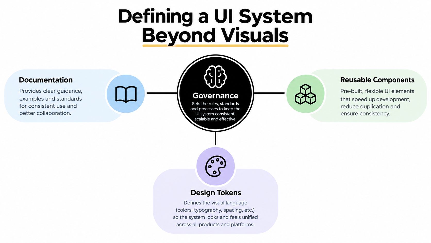
A practical UI system usually contains:
- Design tokens, which name decisions about colour, spacing, typography, borders, motion, and sizing.
- Components, which package reusable structure, styling, states, and behaviour.
- Interaction patterns, which describe how recurring tasks work across components and screens.
- Documentation, which explains when to use a component, when not to use it, and how to handle exceptions.
- Governance, which controls contribution, review, versioning, deprecation, and adoption.
- Validation, which checks visual, functional, accessibility, and integration requirements.
A library without these rules becomes a bag of parts. A system gives teams a dependable way to assemble and evolve products.
Practical rule: If a component only documents its appearance, it isn’t finished. Document its states, inputs, outputs, constraints, accessibility behaviour, and failure modes too.
Core Components and Design Tokens
A UI system has an anatomy, but the parts only become valuable when they reinforce one another. Tokens establish the vocabulary, components apply that vocabulary to interface elements, and interaction patterns make behaviour predictable across contexts.

Tokens are decisions with names
A hard-coded colour such as #1677ff tells a developer what value to use, but not why. A token such as color-action-primary communicates purpose and gives the team a controlled place to change that decision. The same principle applies to spacing, type scale, radii, shadows, motion durations, and responsive thresholds.
Tokens shouldn’t become an abstract naming exercise. They need a relationship to product decisions. A semantic token for an error surface should remain meaningful if the visual theme changes. A component should consume the semantic decision rather than reach directly into a palette of arbitrary values.
Theme work exposes this distinction quickly. A thoughtful approach to customising a component theme keeps brand expression separate from behavioural logic, so teams can change appearance without rewriting keyboard handling or state management.
Components are versioned APIs
A button is not a rounded rectangle. It has a role, a label, a disabled state, a loading state, focus behaviour, pointer behaviour, keyboard behaviour, and rules for when it should be used. A dialog has an opening trigger, an accessible name, focus entry, focus containment, escape handling, focus return, and an exit path.
Treating components as versioned APIs changes how teams design them. A component contract should define:
| Contract area | Questions to answer |
|---|---|
| Structure | What elements and semantic roles does the component render? |
| State | Which states exist, and how do users move between them? |
| Input | Does it support pointer, keyboard, touch, and assistive technology? |
| Styling | Which tokens control its appearance and responsive behaviour? |
| Integration | What props, events, slots, or extension points are supported? |
| Validation | Which automated and manual checks must pass before release? |
The GOV.UK Design System assessment describes a model in which new components and patterns pass through validation before inclusion. That governance prevents the catalogue from growing faster than the team’s ability to support it.
Components also create a useful cause-and-effect relationship. When a shared primitive receives a verified fix, consuming products can benefit from one maintained implementation. Duplicated controls require separate remediation, and their behaviour can drift even when the interfaces look identical.
The video below provides another visual way to think about reusable interface building blocks and their relationship to product development.
The Critical Role of Accessibility
Accessibility is part of the implementation contract, not a final inspection after the interface looks complete. Shared failures in semantics, focus movement, keyboard access, error handling, and assistive-technology feedback can spread across every product that uses the same component.
The scale is clear in the UK. At least one in five people in the UK report having a disability, according to the GOV.UK Design System accessibility strategy. GOV.UK brings accessible styles, components, and patterns together so improvements can reach public services used at scale.
A shared system can raise consistency, but it cannot certify an entire service. The UK Government states that adopting a design system does not automatically make a service accessible. Teams still need appropriate research, design and development decisions, and accessibility testing.
Put behaviour into the contract
A component specification should settle practical questions before implementation:
- Can a keyboard user reach every actionable control?
- Does focus move somewhere sensible when a view opens, closes, or changes?
- Do semantic roles and names describe the control accurately?
- Can a screen reader understand status changes, errors, and instructions?
- Does the component remain usable when text expands or the layout changes?
- Have real users and assistive technologies tested the complete task?
These requirements determine whether the component works. They are part of its contract, alongside tokens, APIs, and visual states.
The system should provide accessible defaults, correct composition examples, and warnings about unsafe customisation. It should also identify the boundary between system and product responsibility. A field component can expose an accessible input pattern, while the product team must supply meaningful labels, instructions, validation messages, and a logical form sequence.
Technical scores aren’t the whole experience
The 2025 State of Digital Government review reported that 24 of the 75 highest-priority government services failed to meet basic accessibility standards in the first quarter of 2024. It also found that 47% of central-government services and 45% of NHS services still lacked a digital pathway.
Those findings show the boundary of reusable components. A system can prevent repeated implementation errors while a service remains difficult to use because its content, information architecture, authentication journey, or complete task is confusing.
The 2025 Web Almanac reported a 94.31% accessibility score for UK government domains, the highest among the countries measured, in its accessibility analysis. A separate UK government inclusion report found that only 52% of disabled respondents considered government websites fully accessible, compared with 69% for online shopping and banking.
A mature team therefore measures more than automated checks. It reviews task completion, error recovery, keyboard journeys, screen-reader comprehension, and experiences across different impairments. Standardisation raises the floor. Product research shows whether people can complete the work.
Governance and Machine-Readability
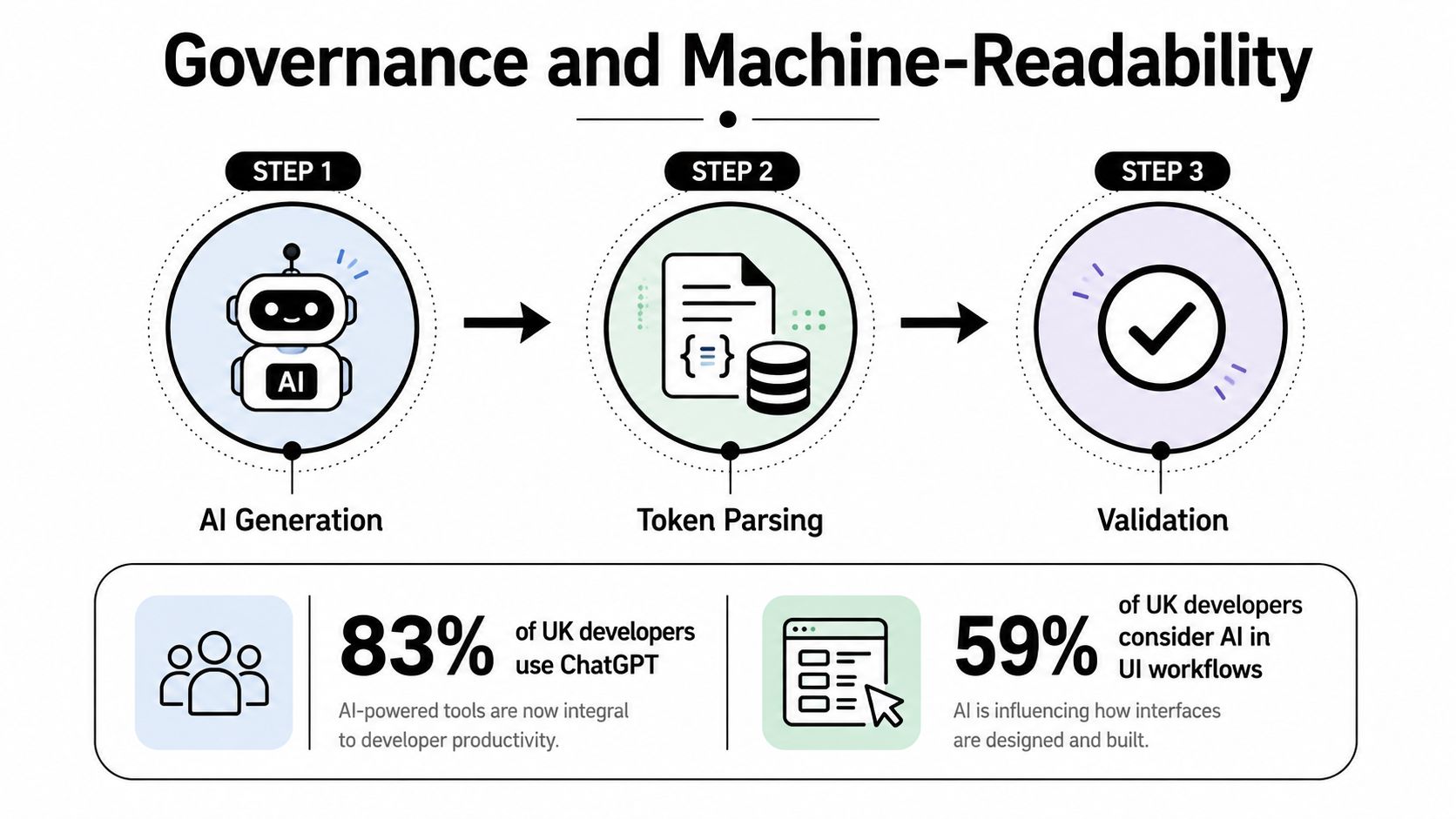
A UI system that only displays components is easy to browse and difficult to govern. AI-assisted development exposes the gap. A developer can inspect source code and ask how a component should behave. An AI tool needs explicit structure, constraints, examples, and feedback signals to produce interfaces that remain consistent and accessible.
A 2025 survey of 2,036 UK developers found that 83% reported using ChatGPT, while 42% said debugging AI-generated code takes longer than expected and 20% said AI solutions were often adequate but weak on complex tasks, according to UK developer survey reporting. The same reporting also found that 59% considered AI tools integral to their work and 69% used them at least several times a week, often for frontend components, tests, and documentation.
These findings do not mean generated UI is generally poor. They show why a visual catalogue cannot define the system by itself. A model may select the right-looking component, then misuse its state model, omit a required accessible name, invent an unsupported prop, or bypass an approved interaction pattern.
Make the system inspectable
An AI-ready UI system exposes machine-readable contracts alongside human documentation. Each primitive should define its identity, supported states, required inputs, events, accessibility requirements, composition limits, examples, and validation rules.
Store that information in component metadata, typed APIs, structured documentation, inspector hints, and testable specifications. The format matters less than the outcome. An AI tool should be able to discover what a component does, generate a plausible implementation, and check whether the result follows the contract.
The principle described in how to make content AI friendly applies to interface systems as well. Clear names, relationships, constraints, and examples reduce interpretation errors. Machine-readability is therefore an implementation concern, not a documentation exercise added after the components are built.
Governance remains a human responsibility
Machine-readable rules do not replace review. They focus it. Teams can check whether generated code uses approved primitives, stays within token boundaries, fulfils interaction requirements, and passes the relevant tests.
Useful governance includes:
- Contribution rules: Define when a new primitive is justified instead of extending an existing one.
- Version policy: Publish compatibility expectations and manage breaking changes deliberately.
- Deprecation paths: Explain what replaces an old component and how teams migrate.
- Exception records: Document why a product needs behaviour outside the standard pattern.
- Automated validation: Test semantics, keyboard paths, focus, visual states, and integration contracts.
- AI guidance: Provide approved composition patterns and reject unsupported generated variations.
The principles in design system governance apply whether people write every line or an AI tool produces the first draft. Governance defines what the organisation will maintain, which exceptions it accepts, and how those decisions remain visible to both developers and machines.
DOM Studio as an AI-Ready Example
A traditional component library usually gives a team code, examples, and perhaps a documentation site. That can be enough for a small product, but the team still has to interpret behaviour, wire accessibility, and decide how an AI-generated variation should be reviewed.
DOM Studio takes a different approach by combining headless web component primitives, a thin Vue integration layer, and Tailwind CSS 4 styling. The primitives use standards-based custom elements and remain framework-agnostic. Vue wrappers add reactive props, v-model support, and slots, allowing Vue teams to connect application state without re-implementing the underlying interaction patterns.
Static reuse versus inspectable reuse
The practical difference is less about whether a library contains a button or dialog. Both traditional and AI-ready systems can provide those components. The difference is how much implementation knowledge travels with each primitive.
| Traditional component library | AI-ready UI system |
|---|---|
| Provides reusable code | Provides reusable code plus inspectable contracts |
| Documents common usage | Documents states, constraints, and composition |
| Expects developers to infer edge cases | Makes edge cases explicit |
| Treats generated code as an external concern | Gives AI tools metadata and guidance |
| Reviews the final interface manually | Combines generation with contract-based validation |
| Often separates design files from implementation | Connects tokens, behaviour, documentation, and code |
DOM Studio’s primitives are designed to handle ARIA patterns, focus management, and keyboard behaviour so teams can wire product features without rebuilding those foundations. Its embedded documentation, inspector hints, and Studio specs give generated applications information that can be checked after the first pass.
That doesn’t make generated output automatically correct. Product teams still need to review content, composition, task flow, and service-specific accessibility. The system’s value is that it gives both humans and AI a maintained set of boundaries instead of leaving every decision open.
Where the trade-offs appear
Headless primitives provide control over markup and styling, but that control creates responsibility. Teams need to understand the component contract and avoid overriding behaviour they haven’t tested. Framework wrappers improve developer ergonomics, but they introduce another integration layer that needs versioning and documentation.
DOM Studio’s Pro tier adds blueprints and real app templates. Those assets can speed up assembly, but teams should still evaluate whether a blueprint fits their information architecture and user research. Reuse accelerates implementation. It doesn’t replace product judgement.
Building Your Own UI System Strategy
Start with the problems your products repeat, not with a wish list of fashionable components. If teams repeatedly implement buttons, dialogs, form validation, navigation, and data states, those patterns are candidates for shared contracts. If a component appears once and has no stable behaviour, it may belong in the product rather than the system.
Establish the language first
Define semantic tokens before spreading raw values through application code. Name decisions by purpose, separate brand expression from interaction meaning, and decide how themes inherit or override those values. This gives designers and engineers a common vocabulary without forcing every product to look identical.
Then choose a small set of high-value primitives and document them like APIs. A useful component page should include:
- When to use it: The task or problem the component supports.
- When not to use it: Similar patterns that solve a different problem.
- States and transitions: What happens during loading, validation, failure, focus, and dismissal.
- Accessibility behaviour: Keyboard operation, semantics, focus movement, and assistive-technology expectations.
- Extension points: Supported props, events, slots, styling hooks, and composition rules.
- Testing responsibilities: What the system verifies and what the consuming product must test.
Govern adoption as a product
A system fails when its maintainers publish components but don’t support the teams consuming them. Give the system an owner, a contribution process, release notes, migration guidance, and a way to measure whether the shared patterns solve real problems.
Avoid two opposite mistakes. Centralised control without feedback turns the system into a bottleneck. Unrestricted contribution turns it into a collection of incompatible preferences. A lightweight review group can protect contracts while allowing product teams to bring evidence from real work.
The useful standard: Build shared rules where repetition creates risk, and leave room for product-specific decisions where context changes the task.
Finally, design for both human and AI consumers. Humans need examples, rationale, and clear migration paths. AI tools need explicit metadata, supported states, constraints, and validation hooks. If your system only explains how a component should look, neither audience has enough information to use it safely.
The strongest UI systems don’t promise identical screens. They create reliable decisions that teams can reuse, inspect, test, and improve. That makes the system a communication layer as much as a codebase, and it keeps consistency from becoming a substitute for judgement.
DOM Studio provides headless web component primitives, Vue wrappers, Tailwind CSS 4 styling, embedded documentation, inspector hints, and Studio specs for building interfaces that people and AI tools can inspect and extend. Explore DOM Studio to see how an AI-ready UI system can turn shared behaviour into maintainable, production-focused components.