
A search for advice on web components vs React returns two answers wearing different clothes. React is faster and safer because it’s battle-tested; web components win because they’re a browser standard nobody can deprecate. Neither claim survives contact with the control you ship. A badly built dialog traps focus badly whether it’s a custom element or a function component, and a tooltip that downloads a runtime is expensive regardless of which standard sits underneath.
The deeper problem is the unit of comparison. Benchmark posts time a thousand rows rendering in a lab on a fast laptop. Your users open a combobox in a car park on a three-year-old phone with two bars of signal, one thumb, and a screen reader running. The costs that decide the outcome live in that gap: parse time, element upgrade, focus handling, and what happens when the script never arrives.
Table of Contents
- Web Components and React Side by Side
- What Each Technology Actually Is
- Interoperability Across Frameworks and Teams
- Performance Costs on Real Devices
- Accessibility Depends on Implementation
- Developer Experience and Hiring in the UK
- Which to Choose for Each Situation
- Confirm the Choice Before You Commit
Web Components and React Side by Side
| Criterion | Web Components | React |
|---|---|---|
| Foundation | Browser standards: Custom Elements, Shadow DOM, HTML templates | JavaScript library with a component model and virtual DOM |
| Framework dependency | None; works in plain HTML and inside React, Vue or Angular | Requires the React runtime and React-compatible code |
| Styling isolation | Shadow DOM encapsulation or adopted stylesheets | CSS Modules, CSS-in-JS or conventions for global styles |
| Rendering model | The element updates its own DOM directly | Virtual DOM reconciliation of component trees |
| Accessibility ownership | Author wires ARIA, focus and keyboard behaviour | Author wires the same, supported by a wide range of accessible component kits |
| Server rendering | Works with server-rendered HTML and upgrades progressively | Usually needs a React server rendering setup and hydration |
| Runtime cost | No library runtime when used alone; cost depends on the element | React runtime plus application code, shipped with the app |
| UK job-market signal | Rarely a standalone job keyword | Widely cited in UK job adverts |
Read that table as a budget rather than a scorecard. Every row marks where a cost lands, and the useful question is who pays it. A marketing site with no build step and a scattering of interactive widgets pays almost nothing for web components and a fair amount for a React runtime plus its toolchain. A dashboard with shared state, client-side routing and a large team pays for React once and gets real value back.
What the table can’t settle is quality. It won’t tell you whether your dialog returns focus when it closes, whether your combobox announces the highlighted option, or whether your form still submits when the script fails. Those outcomes belong to the author, not to the library or the standard.
The question worth answering isn’t which technology is better. It’s which costs your team already carries, and which it can afford to take on.
What Each Technology Actually Is
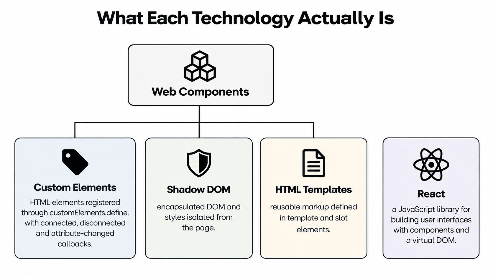
A custom element is a class the browser registers against a tag name with customElements.define('ui-dialog', UIDialog). The hyphen in the name is mandatory, which guarantees it can never collide with a future HTML element. The browser then calls lifecycle methods on it: connectedCallback when it enters the document, disconnectedCallback when it leaves, and attributeChangedCallback when a watched attribute changes. That’s the entire contract, and the element owns its own state inside those callbacks.
The three standards under the name
Shadow DOM attaches a separate tree to the element, so styles inside don’t escape and page styles don’t leak in. That’s what keeps a component looking identical in a host page you don’t control. HTML templates give you markup cloned on demand through <template> and projected through <slot>, which is reuse at the DOM level rather than at the library level.
React works differently. A component is a function that returns a tree of elements, and a reconciler compares successive trees to patch only what changed. State sits with the component or an external store, flows down through props, and comes back up through callbacks. The component never owns a persistent DOM node of its own.
The practical consequence is short. A web component can be used anywhere HTML appears, including inside a React render. A React component can only run where React runs. The two aren’t mutually exclusive either: React can render custom elements, and a custom element can wrap a React tree if you need the reverse.
Interoperability Across Frameworks and Teams
A design system shared by four product teams is the case web components were built for. One element serves React, Vue, Angular and plain HTML, so a corrected focus ring lands everywhere in a single release instead of four.

Where the wrapper friction appears
The friction sits in the seams. React passes values to a custom element as attributes unless you assign properties imperatively through a ref, so objects and arrays need extra wiring. Events from a custom element arrive as native DOM events rather than through React’s synthetic system, and form participation needs a check of its own. A thin wrapper is typically written to hide all that, which means the wrapper becomes code you maintain alongside the element.
The evidence that reusable interface components don’t need React at all is older than the current debate. An independent account of building services to Government Digital Service standards reports that eight services delivered the same GOV.UK Frontend components and user journeys without React, Angular, Vue, Svelte or another client-side framework. Those components are server-rendered HTML with JavaScript added only where interaction demands it.
For UK public-sector work, the Government Service Manual’s guidance on progressive enhancement makes the sharper argument. It advises that a client-side framework can increase code size and shift more processing to the browser, which may create performance problems on slower networks or lower-powered devices. It recommends frameworks only where interface complexity justifies them, while keeping the underlying HTML usable if JavaScript fails.
That points to a layered model rather than a winner. Standards-based elements carry portability, and optional framework wrappers give reactive teams the props and slots they expect. If your team works in Vue, using web components in Vue walks through that wrapper pattern in practice.
Before committing, run the check that catches most integration surprises: confirm that properties, events and form participation work in every framework you support, then write the wrapper maintenance cost into the plan rather than discovering it during the migration.
Performance Costs on Real Devices
Desktop render time is the least useful number in this comparison, because it measures the part of the journey where nothing usually goes wrong. The fair test is an equivalent accessible control built twice: a dialog that traps focus and returns it on close, or a combobox with keyboard navigation, typeahead and screen-reader announcements.
A smaller implementation that skips focus management or drops ARIA semantics will always look faster. It isn’t a production performance win, it’s an unfinished control, and the gap gets paid back in support tickets and accessibility audits.
| Metric | What it shows | How to measure |
|---|---|---|
| Compressed JavaScript transfer | Download cost on slow networks | Network panel with throttling |
| Parse and compile time | Main-thread work before the control is usable | Performance panel trace |
| Hydration or upgrade time | Delay before the control responds after load | Custom marks with performance.mark() |
| Interaction latency (INP) | Responsiveness on a real device | CPU slowdown of 4x or field data |
| Core journey without JavaScript | Whether the task still works if the script fails | Disable JavaScript and test the form |
Running the five measurements
Set the network panel to a slow 3G profile and record the compressed transfer for the page that hosts the control, not just the control’s own bundle. Take a Performance panel trace with a 4x CPU slowdown to see parse and compile work competing with your own code.
Wrap the point where the element upgrades, or where React hydrates, in performance.mark() and performance.measure() calls. That gives you the delay between HTML arriving and the control responding to a tap, which is the number users feel.
Then disable JavaScript entirely and attempt the core task. If the form can’t be submitted, the page has a hard dependency you should know about before launch, not after.
Measurement rule: test on a mid-range phone over a slow connection, using the whole page rather than an isolated component.
Startup cost is a per-visit figure, which changes how you read it. A dashboard someone keeps open for an hour pays the boot once and then benefits from client-side navigation and shared state. A checkout page visited once pays the full cost every time, which is where the comparison usually turns. Our guide to front-end performance optimisation covers the profiling workflow in more detail.
Accessibility Depends on Implementation
Accessibility isn’t a property of either technology. It’s a property of the markup, the keyboard handling and the testing that went into the component in front of you. Treating React libraries as accessible by association, or web components as framework-neutral by definition, gets the question backwards.
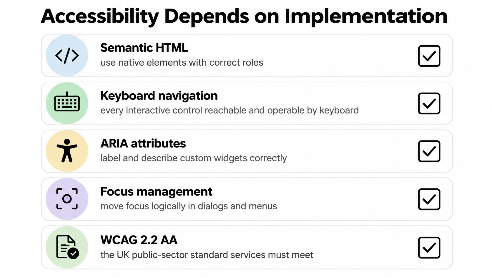
UK public-sector guidance is written in outcomes rather than tools. Services must meet WCAG 2.2 AA, be tested with assistive technology, publish an accessibility statement, and keep core journeys usable without JavaScript, as the government accessibility standards set out. None of that names a framework.
The checks that apply to both
- Keyboard operation: every interactive part reachable by Tab and operable with Enter, Space and the arrow keys, with a focus ring you can see.
- Focus return: when a dialog closes, focus goes back to the control that opened it, not to the top of the document.
- Roles and names: correct ARIA roles, an accessible name on every control, and state exposed through attributes rather than colour alone.
- Dynamic announcements: status messages for results, errors and counts delivered through a live region so a screen reader speaks them.
- Form participation: a custom element submits its value with the form and reports validation failures the way a native input does.
- Upgrade failure: what the user sees if the script loads slowly, fails, or never arrives at all.
How each side fails
A web component fails when it hides its semantics inside the shadow root and offers no label or slot to pass through, or when server-rendered content depends on an upgrade that never happens. A React component fails when it replaces a native control with divs that carry no role, or when a portal moves a modal outside the DOM order that focus management assumed.
Write the acceptance tests before you choose, then run the same list against both prototypes. Accessibility testing practices for component libraries covers how to structure those checks so they survive the framework decision.
Developer Experience and Hiring in the UK
The hiring signal is the most lopsided part of this comparison. IT Jobs Watch recorded 1,611 permanent UK vacancies citing React.js in the six months ending 14 November 2026, equal to 1.31% of all permanent jobs advertised in the UK and 13.51% of vacancies in its Libraries, Frameworks and Software Standards category.
| Period | Permanent vacancies citing React | Contract vacancies citing React |
|---|---|---|
| Equivalent period 2024 | 3,090 | Not stated in this dataset |
| Equivalent period 2025 | 1,507 | Not stated in this dataset |
| Six months to 14 November 2026 | 1,611 | 1,155 |
| Share of all advertised jobs, 2026 | 1.31% of permanent jobs | 2.07% of contract adverts |
Contract recruitment cited React in 1,155 UK vacancies over the same six months, which was 2.07% of all UK contract advertisements. The three-year pattern matters more than the headline: demand moved from 3,090 to 1,507 to 1,611, so the market is volatile rather than steadily growing, and you shouldn’t read a single period as a trend.
What that pool buys you
A large, visible hiring pool lowers recruitment risk. You can fill a React role in weeks and onboard someone who has already debugged the same reconciliation problems. React use is broad beyond the UK as well: the Stack Overflow Developer Survey 2025 recorded 46.9% of professional developers using React, though that source gives no UK-specific split.
The trade-off shows up in daily work. React has mature tooling, established testing libraries and a huge body of shared knowledge. Web components ask for more deliberate attention to the platform itself: lifecycle callbacks, attribute reflection, property versus attribute handling, and cross-framework testing.
Hiring reality: web components are less likely to appear as a standalone job keyword even when developers use native custom elements every day.
If you’re building a pipeline from the junior end, UI developer openings for bootcamp grads shows the roles that reward HTML, CSS and component fundamentals rather than fluency in one framework’s API. A team that hires React developers can adopt a standards-based design system with a short ramp-up, provided you document the element API and the wrapper rules in the same place as the components.
Which to Choose for Each Situation
| Situation | Lean towards | Main reason |
|---|---|---|
| Design system shared by several frameworks | Web Components | One element works in React, Vue and plain HTML |
| Public or content-led service needing no-JavaScript fallback | Server-rendered HTML with Web Components | Core journeys work without the script |
| Highly interactive app with shared state and routing | React | Mature state and routing ecosystem |
| Team recruiting from the UK React market | React | Larger candidate pool and faster onboarding |
| Vue app adopting headless primitives | Web Components core with Vue wrappers | Standards-based core with Vue ergonomics |
| Widget embedded in third-party sites | Web Components | Avoids clashing with the host framework |
The pattern is consistent: standards-based elements for the layer you share, React for the layer one product team owns and iterates quickly.
Three cases where teams change their mind
A React team building a shared design system should still ship it as web components. The internal cost is a wrapper layer, and the payoff is that the system survives the next re-platforming, an acquisition, or a marketing site that doesn’t run React at all. That’s why our headless library ships framework-neutral custom elements, with Vue wrappers for teams that want reactive props and slots without writing the wiring themselves.
A public service already built in React can keep its React shell. What it can’t do is make the core journey conditional on hydration. Server-render the pages that carry the task, keep the React islands where interactivity earns its keep, and confirm the forms submit without the client bundle.
A widget that must run inside a React host needs a thin wrapper and a pass-through test. Check that events cross the boundary with their payloads intact, that form values reach the enclosing form, and that property updates for objects and arrays work through your wrapper rather than silently becoming [object Object] attributes.
Our own components are built with Vue 3, web components and Tailwind CSS, which is the layered model in practice: native elements underneath, a familiar API on top.
Confirm the Choice Before You Commit
- Build one accessible control twice. Take the dialog or combobox from your product and implement it in both approaches, because only an equivalent control gives a fair comparison.
- Run the keyboard, focus-return and screen-reader checks on both builds. Implementation decides accessibility, so the prototype is the only place you’ll see the truth.
- Measure the five metrics on a mid-range phone over a slow connection. The whole page matters more than one component’s bundle size.
- Disable JavaScript and finish the core task. Content-led and public services fail this test permanently if the fallback was never designed.
- Stress the wrapper if you need one. Confirm it supports the props, events and form behaviour your team uses, since that’s where interoperability costs accumulate.
- Estimate hiring and onboarding against the UK vacancy figures. A pool that’s easy to recruit from lowers delivery risk more reliably than a benchmark win.
Pick the approach that passes your accessibility and fallback tests at the lowest maintenance cost, then write the choice down with its reasons so the next twenty components follow the same pattern. If you want a starting point rather than a blank file, our package can be added to a Vue or HTML app and the primitives behave the same way in both.
DOM Studio ships headless custom elements for dialogs, menus, comboboxes, tabs and tooltips, with ARIA roles, focus management and keyboard handling built into the primitive rather than bolted on later, plus a thin Vue layer and Tailwind CSS styling for teams that want ergonomics without giving up portability. You can use the same element in plain HTML or inside a framework and get identical behaviour, which is the part of this comparison that decides whether users finish the task in front of them. Visit DOM Studio to browse the components, read the source, and see how the elements behave with JavaScript disabled.