
Choose a web components library because it uses standards, and accessibility will take care of itself. That’s tempting advice, but it skips the part that breaks in production: the integration. A wrapper can lose a state update, a slot can remove an accessible name, and a dialog can look finished while leaving keyboard focus behind its overlay.
Web standards reduce integration risk. They don’t remove it. Choose a library by checking what its defaults do in your application, not by trusting the technology label or counting components in its catalogue.
Table of Contents
- What a Web Components Library Provides
- Custom Elements or Framework Wrappers Compared
- Packaging Choices That Keep Components Portable
- Accessibility Behaviour a Library Must Build In
- Theming Without Breaking Shadow DOM Boundaries
- How to Test Components With Keyboards and Screen Readers
- Where DOM Studio Fits in the Landscape
- Choose Your Library Before the Next Component Sprint
What a Web Components Library Provides
Think of standard electrical sockets: an appliance with the right plug works in different rooms, even when different builders installed the wiring. A web components library offers a similar contract for interfaces. It’s a collection of reusable interface pieces built on browser standards, exposed through custom HTML tags rather than a syntax only one framework understands.
Say you’re adding a confirmation dialog to a settings page. Instead of rebuilding its markup and interaction logic in each application, you load an element definition and use <my-dialog> in the page.
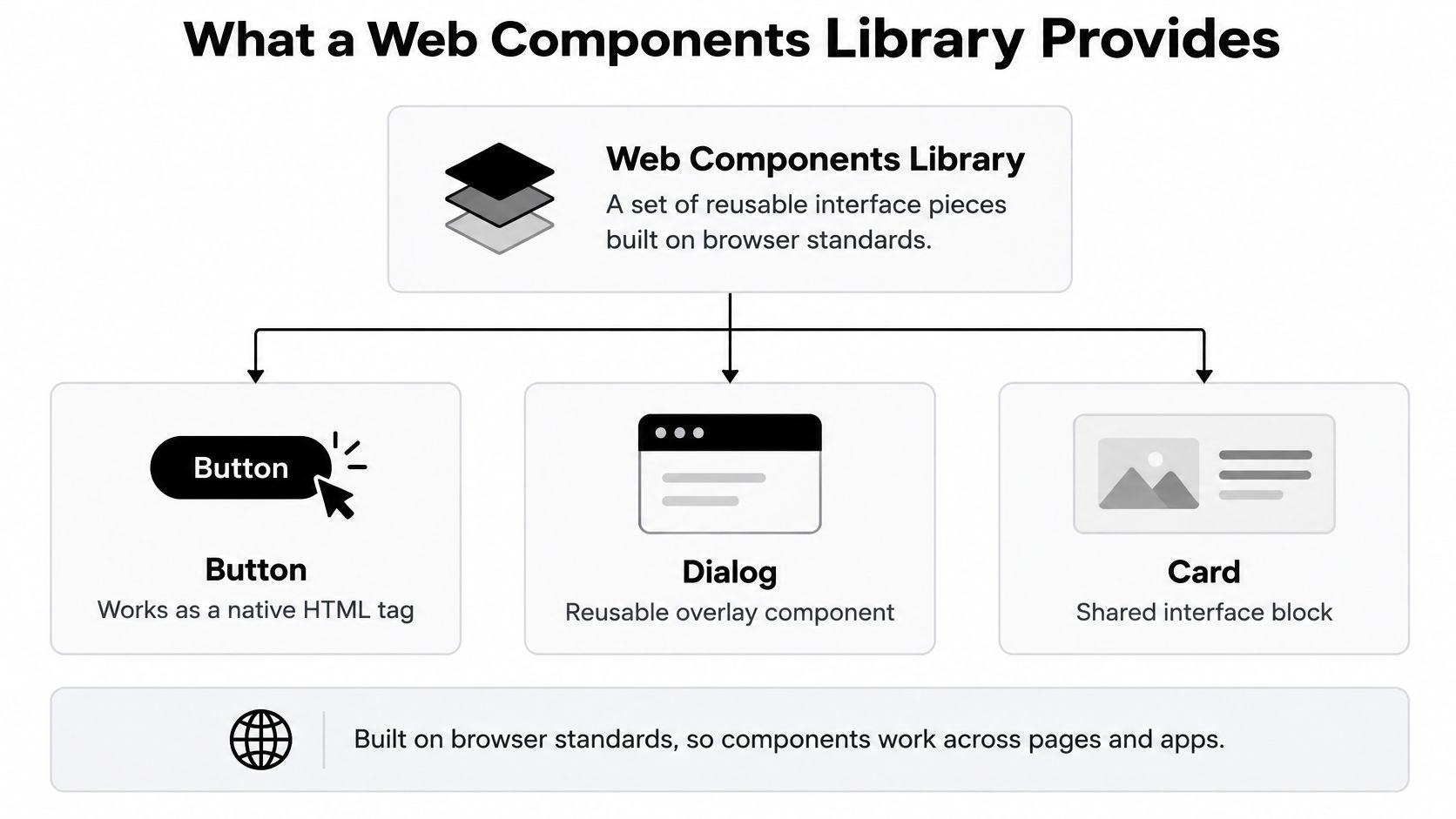
The browser features behind the contract
- Custom elements define tags such as
<my-dialog>, including their lifecycle, properties and behaviour. The browser recognises the registered tag, although registration alone doesn’t give it native dialog semantics. - Shadow DOM optionally encapsulates internal markup and styles. A dialog’s internal close-button styles can remain separate from the settings page’s button rules.
- Slots accept content supplied by the page author. A named title slot might contain the confirmation heading, while the default slot contains explanatory text.
- CSS custom properties pass design values into components. A property such as
--dialog-radiuslets the application adjust corners without editing internal selectors.
These features work together, but a component doesn’t have to use all of them. Light-DOM custom elements can be appropriate when preserving existing HTML and page styling matters more than encapsulation.
A library supplies reusable structure and behaviour. A design system adds decisions about tokens, branding, content and when each pattern should be used.
For a quick portability check, create a blank HTML page, define an HTMLElement subclass, register it with customElements.define(), and place its tag in the document. Confirm that it renders without a framework loaded, then inspect the resulting DOM. That demonstrates the delivery model, not the accessibility or completeness of a production control.
Custom Elements or Framework Wrappers Compared
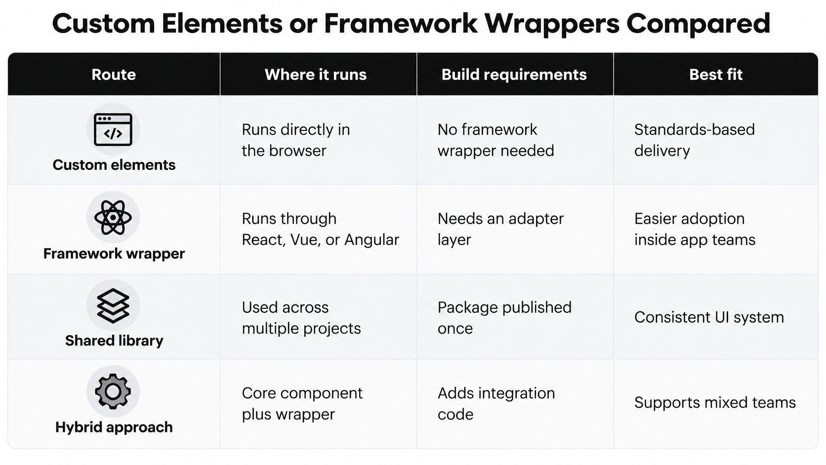
Four routes to a component library compared
| Route | Runs in | Build step | Strength | Trade-off |
|---|---|---|---|---|
| Standards custom elements only | Any HTML page or framework | Optional | Maximum portability | You write all behaviour yourself |
| Lit-based elements | Any page that loads custom elements | Usually a bundler | Small reactive base class | Adds a dependency to manage |
| Stencil compiled components | Any page, with generated wrappers | Compiler required | Wrappers for several frameworks | Compiler-specific output and workflow |
| Framework component wrappers | Only inside that framework | Framework build tooling | Native props, events and idioms | Duplicated for each framework |
The practical decision is whether consumers use custom elements directly or adopt framework components around them. The underlying implementation and the consumption API are separate choices. A Vue wrapper can depend on Vue while its underlying custom element remains framework-neutral.
Direct custom elements suit shared systems used by server-rendered sites and applications with different frameworks. You own the property conversions, rendering and lifecycle code, so this route fits teams willing to maintain that browser-level plumbing.
Lit supplies a reactive base class and templating facilities without changing the output into framework-only components. It fits teams that want custom-element delivery but don’t want to implement their own rendering mechanism.
Stencil uses a compiler to produce custom elements and can generate framework integrations. It fits organisations prepared to standardise on its authoring and release workflow.
Wrappers should translate, not duplicate
A wrapper should map props to element properties, translate events and preserve slots. It shouldn’t maintain an independent implementation of selection or focus behaviour, because that creates competing sources of truth.
For Vue adoption, the guide to using web components in Vue provides a useful integration starting point. When reviewing React-specific adapter documentation, resources such as MeshBase’s guide to using React with MeshBase are useful prompts for checking the documented integration contract rather than assuming every package behaves identically.
HTML-first delivery still matters. The GOV.UK progressive-enhancement guidance requires government services to work with HTML first and warns that frameworks can increase code size and client-side processing, affecting people on slower networks or lower-powered devices.
That doesn’t mean an unregistered custom tag automatically provides a fallback. Preserve meaningful HTML content and native controls where basic functionality must survive JavaScript failure.
Practical rule: Choose framework-neutral primitives when teams share behaviour across applications. Choose framework-native components when one team controls the application and the tighter integration earns its maintenance cost.
Finally, remove the framework from a minimal example. If the exported interface stops working, you’re testing a framework-dependent surface, not proving that the underlying primitive is absent.
Packaging Choices That Keep Components Portable
A standards-compliant component can still fail during installation. Package exports, registration side effects and server imports are part of its public contract, even though they don’t appear in the component demo.
Say an application installs unrelated libraries that both register <button-group>. Everything looks fine while developers load isolated examples, but the combined production page throws when the second definition runs. A generic tag name has become an application-wide collision.
Ship an explicit package contract
- Export ES modules and types. Publish declaration files and component-level entry points. ES modules enable static analysis, but tree-shaking also requires sensible exports and accurate side-effect declarations, especially when imports register elements.
- Prefix every element name. Use a library-specific prefix such as
acme-. A hyphen makes a custom-element name valid; it doesn’t make that name unique across packages. - Guard registration deliberately. Check
customElements.get()before callingcustomElements.define(). Don’t accept an incompatible existing definition without a check: warn during development when the registered constructor isn’t the expected implementation. - Version the whole API. Use semantic versions and a changelog for events, properties, slots and styling hooks. Renaming a wrapper prop or changing an event payload can break consumers just as surely as removing a method.
- Keep framework runtimes external. Declare supported framework versions as peer dependencies for wrappers, and configure the build not to bundle those runtimes. Peer dependency metadata alone doesn’t prevent an incorrectly configured bundle from embedding Vue.
Test the published artefact
Install the packed release into a fresh Vite application, a plain HTML page and a server-rendered application. Use the package’s documented browser module entry for HTML rather than assuming browsers resolve npm package names.
Check server imports for unguarded access to window, HTMLElement or customElements. Then inspect production chunks and the network panel for duplicate runtimes, unexpected catalogue-wide imports and missing styles.
For the surrounding application, Web Mage’s website speed guide provides a broader performance review to accompany package inspection. Measure the code your test page downloads, not just the package archive.
Before releasing, install the packed artefact into a clean consumer project and run its production build. A workspace demo can hide missing files and accidental dependency access.
Accessibility Behaviour a Library Must Build In
Accessibility pattern requirements by component
| Component | Required ARIA pattern | Keyboard expectation | Common failure |
|---|---|---|---|
| Dialog | Accessible title, dialog role, aria-modal for modal dialogs |
Focus moves inside, Escape closes, focus returns to trigger | Focus escapes behind the overlay |
| Tabs | tablist, tab and tabpanel roles, linked panels and selected state |
Arrow keys move between tabs, one tab stop in the tab list | Every tab reachable with Tab |
| Listbox | listbox and option roles, aria-selected |
Arrow keys and Home/End move focus or selection according to the documented model | Selected state not announced |
| Combobox | combobox role, aria-expanded, aria-controls |
Down arrow opens the popup, Enter accepts an option, Escape dismisses | Popup not linked to the input |
| Menu | menu and menuitem roles, accessible item names |
Roving focus with arrow keys | Items without accessible names |
A library can provide correct controls without guaranteeing a correct product. The table describes behavioural contracts for custom implementations, not a reason to add redundant ARIA to native HTML. Start with native elements where they provide the required interaction.
Where a correct primitive becomes an incorrect control
Consider a Vue wrapper around a listbox. The primitive exposes a selected value and reflects it through aria-selected, but the wrapper updates only the classes used to highlight an option.
A mouse user sees the new selection. A screen reader user receives stale information because the wrapper never passed the value to the primitive’s state API.
The fix isn’t another ARIA attribute in the application template. Make the primitive the authority for selection, route the wrapper’s reactive value through its documented property, and translate the resulting event back to the application model.
Slots create another failure path. An application might replace a text label with an icon, or move a heading into a different DOM tree while retaining a string-based aria-labelledby reference that no longer resolves.
A visible label and an accessible name are related requirements, not interchangeable evidence.
Shadow boundaries deserve particular attention: don’t assume an ID reference crosses them successfully. Inspect the accessibility tree and test the name exposed to assistive technology.
Defaults that deserve release tests
The UK Government’s accessibility monitoring report records testing 1,203 websites and 21 mobile apps in the 2022–2024 monitoring period, with accessibility issues found on nearly all of them. Shared controls are a useful place to prevent repeated failures, provided teams verify their integrations too.
Build these requirements into implementation and development tooling:
- Explicit semantics and state. Expose the correct role, expanded state, selection and disabled behaviour through a single state model.
- Reliable labelling. Support accessible names and descriptions, and validate required relationships after slotted content changes.
- Complete keyboard operation. Implement the chosen interaction pattern, including dismissal and focus restoration.
- Predictable reading order. Keep DOM order meaningful rather than relying on visual rearrangement.
- Actionable development warnings. Identify missing labels and invalid composition with messages that name the component and the repair.
For modal dialogs, prevent interaction with background content as well as containing keyboard focus. For listboxes, distinguish focus from selection explicitly, particularly when multiple selection is supported. Documentation should state those choices so wrappers and application tests can enforce the same contract.
Theming Without Breaking Shadow DOM Boundaries
A page stylesheet can style a custom-element host without reaching the markup inside its shadow root. That boundary prevents accidental interference, but it also means a global button rule isn’t a dependable component-theming API.
Styling hooks and their limits
| Hook | Crosses shadow boundary | Best use | Limit |
|---|---|---|---|
| CSS custom properties | Yes, through inheritance | Colour, spacing and radius tokens | Only values the component consumes |
Parts with ::part() |
Yes, by exposed name | Restyling a named internal element | Every part becomes a public API |
| Slots | Content only | Author-supplied icons or labels | Internal styling of slotted content is limited |
| Global page stylesheets | No, not for internal selectors | Page resets and surrounding layout | Cannot directly select inside shadow roots |
| Tailwind utility classes | Internal selectors must exist in shadow styles | Internal component layout | Page utilities don’t reach internal nodes |
Prefer values over internal selectors
Design tokens expressed as CSS custom properties are the default theming route. Set an accent colour and radius on a parent, then let components consume those inherited values with documented fallbacks.
Say a brand team updates the shared accent and corner tokens. Buttons and dialogs that consume those tokens change without anyone editing their source, while unrelated styling remains encapsulated.
The guide to CSS variables is useful for organising that inheritance. Avoid redeclaring public tokens on every host in ways that unexpectedly override the parent theme.
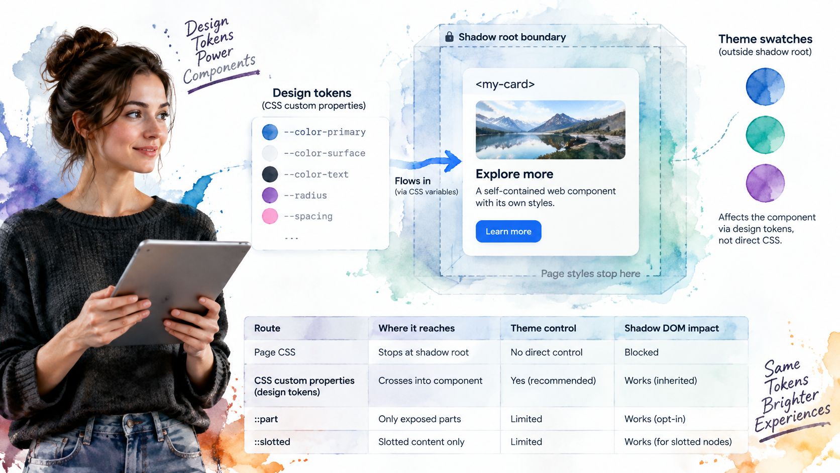
Expose parts when consumers need more than a value change. A named dialog header can be styled through ::part(header), but removing that part later is an API change, not an internal refactor.
Use slots for authored content such as avatars and custom labels. The page can style its light-DOM content, while the component’s ::slotted() selectors have limited reach and don’t provide arbitrary descendant selection.
Tailwind classes on the host can control the host’s layout. Classes on internal shadow nodes need matching rules inside that shadow root, whether compiled into component styles or deliberately supplied through another supported mechanism.
Finally, test dark mode, reduced motion and forced colours in the rendered component. A page-level override might never affect an internal animation or hard-coded colour, so inspect the result rather than assuming the theme setting reached every layer.
How to Test Components With Keyboards and Screen Readers
Test the finished composition, including its content and wrapper. PPC Land’s reporting on website accessibility barriers identifies recurring problems including low colour contrast, missing alternative text and unlabelled form inputs, all of which can remain outside a primitive’s control.
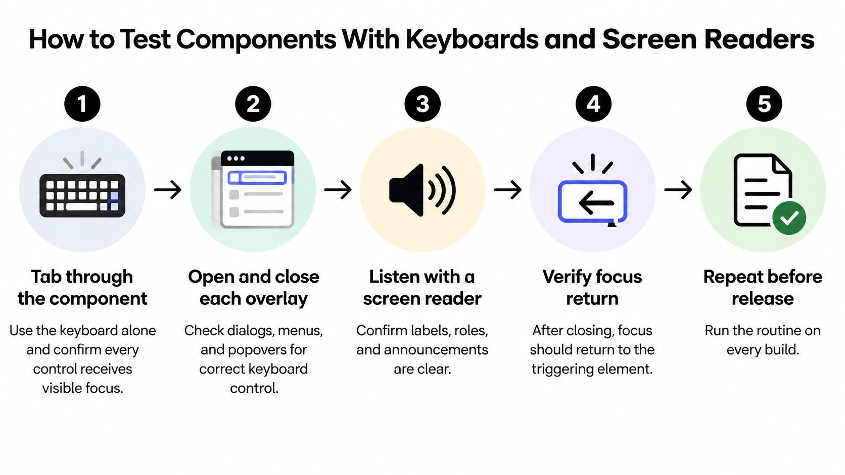
Run the release routine
-
Control using only the keyboard.
Use Tab and Shift+Tab to enter and leave the component, then use its documented keys within composite controls. A common slip is checking that focus moves without checking that the focus indicator remains visible and unobscured. -
Open and dismiss overlays.
Exercise dialogs, menus and popovers, using Escape where dismissal is expected, and inspect where focus lands afterwards. Don’t treat every overlay as modal or trap focus inside a non-modal popup. -
Scan the rendered page.
Run axe against meaningful states, including open dialogs, expanded suggestions and validation errors. Scanning only the initial screen misses conditional content, and a clean result doesn’t prove the interaction is usable. -
Listen with a screen reader.
Use NVDA on Windows or VoiceOver on macOS to check names, roles, states and reading order, with a repeatable script such as the screen reader testing guide. Don’t accept an announcement merely because it contains words: verify that it communicates the current selection and available action. -
Repeat inside the framework wrapper.
Change the bound value programmatically, interact with the control, and confirm the application model and accessible state agree after each update. Skipping this check leaves event translation, reactive timing and slot forwarding untested. -
Include disabled users in task testing.
Ask participants to complete realistic flows such as choosing an account or cancelling a destructive action, rather than navigating a component demo. A technically operable control can still have unclear instructions, confusing terminology or an exhausting interaction sequence. -
Record evidence and prevent recurrence.
Save the component version, browser, assistive technology, scenario, expected result and observed result, then add a regression test for each repaired defect. Don’t mark a failure resolved until the original manual scenario passes and the relevant accessibility documentation reflects the outcome.
Define a pass in observable terms
Use Upfling’s website accessibility checks before launch as a release-planning companion, not a replacement for component-level evidence. Give unresolved findings an owner and a remediation route.
Release evidence: A pass names the tested environment, records the expected interaction and confirms the observed result. It isn’t a screenshot with an accessible label attached.
For a dialog, the record should describe its announced name, initial focus, background interaction, dismissal and focus return. For a combobox, include typed input, suggestion navigation, accepted selection and an external value update.
Where DOM Studio Fits in the Landscape
DOM Studio sits in the hybrid part of the spectrum: framework-neutral headless custom elements underneath a thin Vue integration layer. Our primitives provide behaviour and ARIA handling, while the wrappers expose reactive props, v-model support and slots, with Tailwind CSS styling for the presented interface.
That arrangement is useful when teams want a Vue-friendly authoring surface without implementing separate keyboard behaviour for every control. It doesn’t make wrapper verification unnecessary; it gives the team a shared implementation to verify.
Where the fit is weaker
A team maintaining only a Vue application may prefer a framework-native kit if it already meets its interaction, styling and maintenance needs. Introducing another abstraction is worthwhile only when the team benefits from the underlying separation.
Likewise, a page that needs a tooltip doesn’t automatically need a broad component catalogue. Compare the cost of adopting conventions, dependencies and theming against the behaviour the product requires.
| Evaluation question | Evidence to inspect |
|---|---|
| Does the behaviour suit the application? | Keyboard contracts and rendered accessibility states |
| Is the integration economical? | Production imports, generated chunks and wrapper setup |
| Can developers maintain generated interfaces? | Discoverable props, examples and usage documentation |
| Can designers make controlled changes? | Supported styling hooks and representative themed states |
Where the separation helps
Our catalogue includes buttons, dropdowns, drawers, toasts and a command palette alongside shared interactive primitives. Visual Blocks extend the theming options, while embedded documentation, inspector hints and Studio specifications support inspecting and improving interfaces after an AI-generated first pass.
The portable docs engine discovers local components, examples, props and usage notes. That helps developers inspect the intended API rather than infer it from generated markup.
Judge the result in a representative application. Check accessible defaults with real content, inspect the modules shipped, and determine whether the documentation makes an incorrect composition easier to identify and repair. Those are stronger adoption signals than a polished catalogue page.
Choose Your Library Before the Next Component Sprint
Give each candidate a yes, partly or no against evidence your team can reproduce. Don’t combine the results into a score that lets cosmetic strengths conceal an accessibility failure.
| Verification | Evidence required | Result |
|---|---|---|
| Standards-based delivery | Working custom-element example without a framework | Yes / Partly / No |
| Package contract | Types, prefixed tags, semantic versions and changelog | Yes / Partly / No |
| Accessible patterns | Documented behaviour and test records for complex controls | Yes / Partly / No |
| Theming contract | Documented tokens, parts and slots where applicable | Yes / Partly / No |
| Integrated interaction | Keyboard and screen reader results in the consuming app | Yes / Partly / No |
Treat an accessibility no as an adoption blocker for public-sector or regulated work until there’s a verified repair. The UK Government’s accessibility requirements guidance explains that public-sector websites and apps must meet WCAG AA requirements and publish an accessibility statement covering known limitations and contact routes.
Make the next evaluation concrete: install the shortlisted package into a disposable application, render a dialog and a combobox, and run the release routine against both. Record failures before anyone starts adapting the product around them.
Choose the library whose defaults you can verify today, not the one with the longest feature list.
DOM Studio offers framework-neutral headless custom elements and Vue components through the @getdom/studio npm package, which can be added to a Vue or HTML app. Visit DOM Studio, build a dialog and combobox in your test app, and verify their keyboard behaviour, announcements and state updates before adopting the library.