
You’ve added a help icon beside a registration field. The bubble looks right on hover, but pressing Tab does nothing, a phone user can’t open it, and the link inside disappears before anyone can select it. The CSS isn’t the main problem. You’ve given a tooltip a job that needs a different component.
A reliable Vue tooltip starts with a content decision, then a small interaction contract. Choose the right container before writing the visibility logic, and you’ll avoid spending time making an unsuitable overlay increasingly complicated.
Table of Contents
- When a Tooltip Should Become a Popover
- How Tooltips Behave for Mouse, Keyboard and Touch
- Build a Basic Accessible Tooltip Component
- Customise Placement, Delay and Layout
- Test Keyboard, Screen Reader and Layout Behaviour
- Confirm Your Tooltip Is Non-Essential Before You Ship
When a Tooltip Should Become a Popover
Tooltip, popover or inline help by content type
| Content | Use | Reason |
|---|---|---|
| Plain label or icon name | Tooltip | Short, non-essential and read on hover or focus |
| One-sentence hint | Tooltip | Supplementary and readable at a glance |
| Validation error | Inline help | Must stay visible while the user fixes the field |
| Help text with a link | Popover | The link needs keyboard focus and a stable panel |
| Button or form control | Popover | Interactive content cannot live in a bubble that hides on blur |
| Longer explanation | Inline help | Too long to read comfortably in a transient overlay |
Adding role="tooltip" doesn’t make an interactive panel accessible. A tooltip describes its trigger without receiving focus itself. If its contents include a link, closing the bubble when the trigger loses focus can make that link effectively pointer-only.
GitLab’s accessibility guidance recommends using a popover for interactive content and connects inaccessible tooltip controls with WCAG keyboard-operability failures. The practical boundary is whether the user needs to enter the content, not whether the overlay looks like a small bubble.

Give interactive help a stable panel
For an action-bearing help panel, start with a popover component. Give its trigger aria-expanded and aria-controls, and choose panel semantics that match its contents. Don’t assign menu semantics to ordinary explanatory text.
A compact Vue implementation can follow this pattern:
- State and references: In
<script setup>, createopen = ref(false)and template refs for the trigger and panel. - Opening: Toggle
openfrom the trigger’s click handler, which also supports a mobile tap. Watchopen, awaitnextTick(), then focus the panel’s first appropriate control. - Escape: Close from the panel’s keydown handler and return focus to the trigger.
- Click-away: Register a document click listener on mount. Close only when neither the trigger nor panel contains the event target, and remove the listener on unmount.
Don’t restore trigger focus after an outside click if that would steal focus from the control the user just selected. Escape dismissal and outside-click dismissal need different focus decisions.
Practical rule: If the user must read to the end, act on the content or type into it, choose a popover or persistent inline help.
An icon also needs its own accessible name. A tooltip may supplement that name, but it shouldn’t be the only way someone discovers what the button does.
How Tooltips Behave for Mouse, Keyboard and Touch
Expected tooltip behaviour by input mode
The timings below are an example interaction configuration, not a compliance threshold.
| Input | Trigger | Expected behaviour | Common failure |
|---|---|---|---|
| Mouse hover | mouseenter and mouseleave |
Shows after an example 300 ms delay; schedules hiding on leave | Pointer-only CSS hover with no focus path |
| Keyboard focus | focus and blur |
Shows when Tab lands on the trigger and hides after blur | Tooltip never appears for keyboard users |
| Escape key | keydown with Escape |
Hides the bubble and keeps focus on the trigger | Focus moves into the bubble or is lost |
| Touch tap | Click and outside tap | Tap opens the tooltip and a tap elsewhere closes it | No stable hover state, so it never opens |
| Screen reader | aria-describedby relationship |
Description is available when the trigger receives focus | Referenced ID is removed or changes during rerenders |
Mouse users need more than an opening animation. Keep the bubble open while the pointer travels from the trigger onto the tooltip, then hide it when the pointer leaves both. Otherwise, someone using magnification may lose the explanation while trying to inspect it.
Keyboard users need a focus path. CSS :hover alone doesn’t respond when Tab reaches a button, and putting a focus handler on a non-focusable wrapper doesn’t fix the trigger. Use the existing native button or link rather than adding an unnecessary tab stop around it.
Dismiss without losing the user’s place
Escape should dismiss the bubble, not change the focused element. Suppress reopening until a fresh interaction occurs, otherwise a visibility calculation based on the still-focused trigger can immediately undo dismissal.
Touch has no dependable hover state. For a dedicated help trigger, use click activation without requiring long press. Don’t casually consume the first tap on a navigation link or submit button just to display supplementary text.
For screen readers, keep the description relationship stable. Replacing aria-describedby during every render can produce inconsistent results, so generate the identifier once and preserve any descriptions the trigger already has.
The UK government’s public-sector accessibility guidance explains the regulations’ requirements for perceivable, operable, and understandable services, using WCAG Level AA as the technical benchmark. A hover-only implementation isn’t a sufficient interaction model for covered services.
A keyboard user should receive the explanation without moving focus into the tooltip. If they need to navigate its contents, choose a different component.
Build a Basic Accessible Tooltip Component
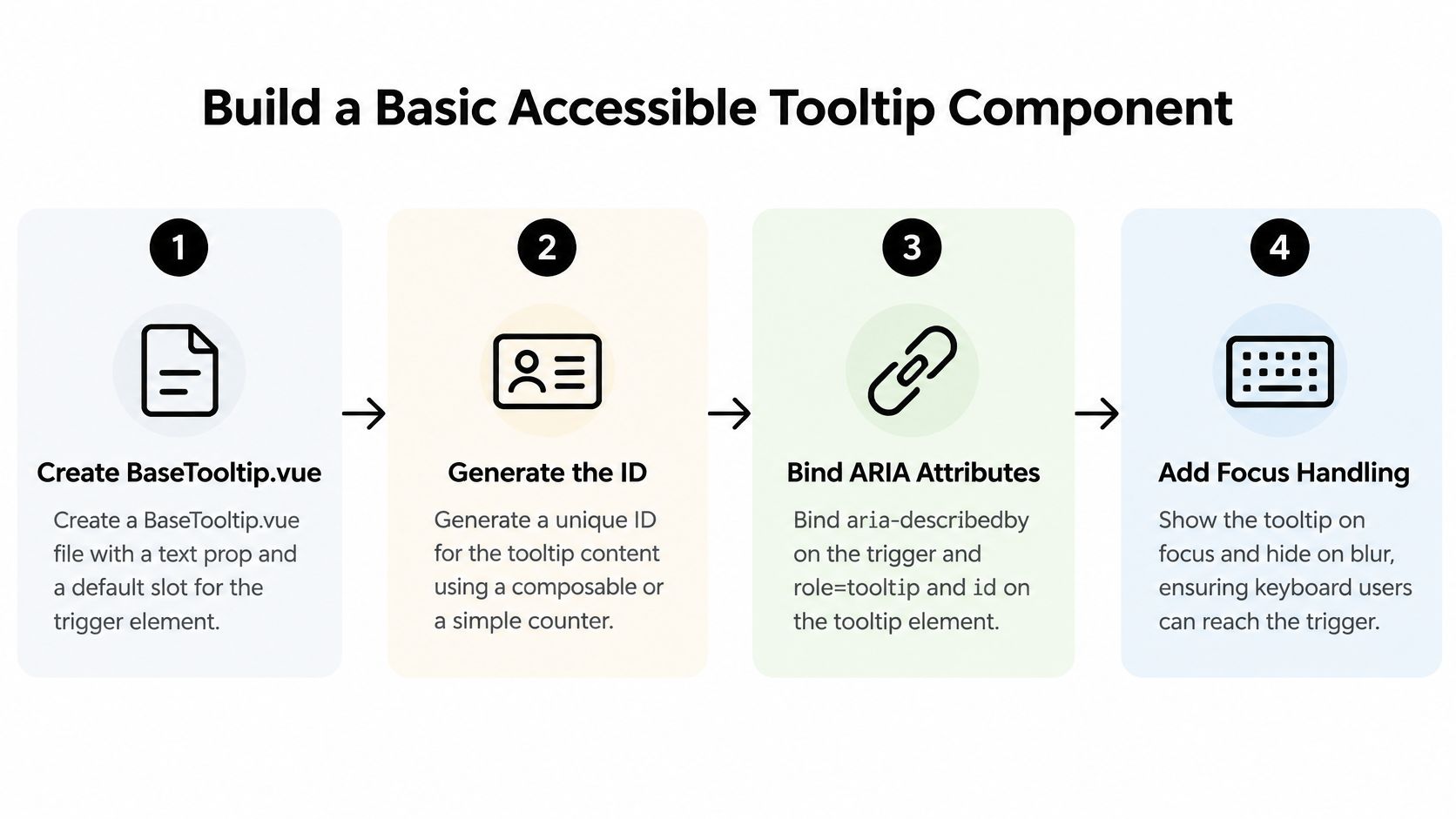
The relationship depends on role="tooltip", a stable id, and aria-describedby on the actual trigger. Those attributes express meaning; your event handling still has to make the content usable.
Establish the component contract
Create BaseTooltip.vue with a required text prop and a default scoped slot. Expose trigger attributes through that slot rather than pretending a wrapper can automatically apply attributes to an arbitrary slotted button.
-
Create the state. Import
ref,useIdandonBeforeUnmountfrom Vue. Initialiseopen = ref(false)and separate timer handles for pending opening and closing. -
Generate the identifier once. Use
const tooltipId = useId()during setup in a Vue release that supports it. Avoid random identifiers generated during rendering, especially in server-rendered applications where hydration must match. -
Render a persistent description node. Give the bubble
:id="tooltipId",role="tooltip"andv-show="open". This keeps the referenced element in the DOM, although retaining a node alone doesn’t guarantee identical announcements across screen readers. -
Expose attributes to the slot. Pass a
triggerAttrsobject containing'aria-describedby': tooltipId. The consumer binds it to the native trigger, for example<button v-bind="triggerAttrs">Help</button>inside the scoped slot.
If the button already references field guidance, merge the description IDs into a space-separated value. Don’t replace the existing relationship when the tooltip mounts.
Wire the handlers before styling
Continue the implementation with a small, explicit state model:
-
Schedule opening and closing. Expose trigger listeners through the slot alongside its attributes. Each opening handler cancels pending closing; each closing handler cancels pending opening. Use configurable delays rather than scattered timer literals.
-
Handle competing inputs. Track trigger focus and pointer presence separately. Pointer leave shouldn’t close a bubble while its trigger remains keyboard-focused, and entering the bubble should cancel pending pointer dismissal.
-
Implement dismissal and cleanup. Escape cancels both timers, sets
opento false and suppresses reopening for the current interaction. Clear timers and remove document listeners inonBeforeUnmount.
Start with a native button in the consuming template, then Tab to it with a screen reader running. Confirm that its name and supplementary description make sense together, without duplicate text.
If you’re bringing in implementation support, Hire Developers from HireDevelopers.com is a resource to consider when staffing the work. Specify component delivery alongside keyboard and assistive-technology acceptance tests, not just a screenshot.
Don’t call this finished after the bubble appears. The base contract still needs positioning, touch handling and layout testing before production use.
Customise Placement, Delay and Layout
Put BaseTooltip inside a settings card with overflow: hidden, and the bubble may disappear at the card boundary. Increasing z-index won’t let a descendant escape that clipping ancestor.
Use Vue’s Teleport to body to move the bubble outside the card. The description relationship can still connect the trigger and bubble within the same document, but positioning now needs explicit coordinates rather than assumptions about the card’s layout.
Keep positioning reactive
Support top, right, bottom and left placement. Measure the trigger and bubble, flip when the preferred side won’t fit, and shift the result within the viewport. Recalculate while open when scrolling, resizing or content changes affect those measurements.
A headless floating primitive is worth considering instead of maintaining collision calculations yourself. Check its behaviour inside dialogs and transformed containers, because teleporting to the document body isn’t automatically the correct layering choice everywhere.
BaseTooltip props and defaults
These are illustrative defaults for your component, not accessibility requirements.
| Prop | Default | Purpose |
|---|---|---|
text |
Required | Brief supplementary bubble copy |
placement |
top |
Preferred side, with collision-aware flipping |
openDelay |
Example 300 ms | Wait before showing |
closeDelay |
Example 100 ms | Brief grace period before hiding |
maxWidth |
Example 15rem |
Constrain line length while allowing wrapping |
Use normal whitespace wrapping and overflow-wrap: anywhere for long strings. Keep the bubble within the available viewport width rather than enforcing a fixed width that breaks on narrow screens.
For Tailwind styling, begin with a readable pairing such as bg-slate-950 text-white, then check the actual rendered colours, including theme overrides. Disable movement and fading under prefers-reduced-motion.
Don’t use a dismissal timer as a reading deadline. Keep the explanation available while the user maintains the relevant hover or focus.
Copy matters too. SupportGPT’s guide to designing intuitive conversational interfaces offers useful context for concise interface language, but tooltip text should remain supplementary rather than become a miniature conversation.
Test Keyboard, Screen Reader and Layout Behaviour
Run behavioural checks against the consuming page, not just an isolated component preview. A working tooltip can still fail inside a scrolling drawer, a dense toolbar or a field with existing descriptive text.
The UK government’s accessibility monitoring report recorded 26,171 accessibility issues across monitored public-sector websites and mobile applications from 2022 to 2024. Treat interaction testing as release work rather than optional polish.
Run these acceptance scenarios
-
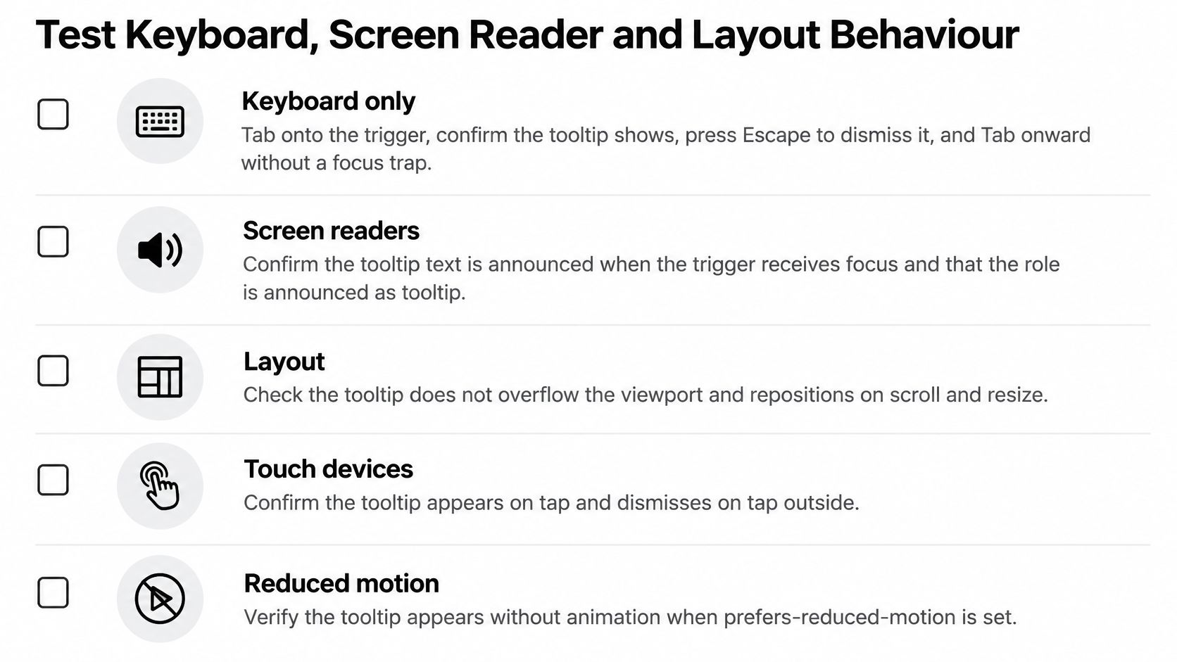
Keyboard only. Tab onto the trigger, wait for the configured opening behaviour, press Escape, then Tab onward. Pass only if the bubble dismisses without reopening immediately, focus remains visible and navigation continues without a trap.
-
Screen readers. Test VoiceOver with Safari on macOS and NVDA with Firefox on Windows. Pass when the trigger has a meaningful name and its description is announced appropriately, without duplicate announcements caused by your own live-region or rerender logic.
-
Browser engines. Exercise the component in Chromium, Firefox and WebKit. Check event behaviour and description relationships, not merely whether the bubble has the same dimensions.
-
Zoom and reflow. Increase browser zoom and narrow the viewport until the layout reflows. Pass when the explanation remains readable, doesn’t obscure the trigger and doesn’t introduce clipping or unwanted horizontal scrolling.
-
Touch. On a physical phone, tap the help trigger, then tap elsewhere. Confirm opening and dismissal work without accidental form submission, navigation or a requirement to long-press.
-
Viewport edges. Put triggers against each edge and inside nested scroll containers. Pass when the bubble flips or shifts into view and stays correctly anchored during scrolling and resizing.
-
Reduced motion. Enable the operating system’s reduced-motion preference. Pass when the explanation appears without the movement or animation you’ve agreed to suppress.
Record behaviour rather than screenshots
Keep a pass or fail record for each scenario, including browser, assistive technology and the page tested. Use screen-reader testing guidance to make manual checks repeatable, while recognising that the exact spoken role can differ between tools.
Automate opening, Escape dismissal, outside interaction and unmount cleanup where practical. PullNotifier’s advice on how to streamline regression tests can help organise those checks alongside manual coverage.
Block release when a required keyboard or assistive-technology scenario fails. If you use a Vue wrapper over a custom element, test both layers, including reactive visibility, attribute forwarding and cleanup after removal.
Confirm Your Tooltip Is Non-Essential Before You Ship
Take one concrete action this sprint: find a tooltip containing a link or form control, and move that content into a popover or inline help. Run the acceptance scenarios against that change and keep the results beside the component’s implementation.
Before approving any remaining tooltip, ask what happens when the user never opens it. If they can’t complete the task, understand a validation failure or identify the control, move that information into the interface itself.
- Review the consuming page: Include its labels, surrounding instructions and responsive layout, not just the tooltip text.
- Keep the evidence: Record failures, fixes and the environment used for the latest successful check.
- Assign ownership: Make tooltip behaviour part of component review whenever trigger markup or overlay positioning changes.
Our DOM Studio components are built with Vue, Web Components and Tailwind CSS. Treat ready-made components as a starting point, then verify their behaviour within your application’s layouts and input modes rather than assuming library defaults settle every integration question.
DOM Studio offers Vue and Web Component interface building blocks, examples and documentation for assembling consistent interfaces. Visit DOM Studio to evaluate the components for your next help interaction, then apply the same keyboard, screen-reader and layout checks before release.