
You’ve inherited a Vue interface where every team has built its own dropdown, dialog and form control. They look similar, but their keyboard behaviour differs, v-model updates fail in edge cases, and a styling change in one product breaks another. Reusable Vue JS components should remove that uncertainty, not package it into a more convenient folder.
The reliable approach is to separate responsibilities. Let a headless primitive own behaviour and accessibility, let a thin Vue wrapper expose props, slots and v-model, and let Tailwind CSS handle presentation. That gives teams a component system they can compose, inspect and test rather than a collection of attractive, tightly coupled templates.
Table of Contents
- Why Vue JS Components Still Matter in Modern Frontends
- Understanding Single File Components and Headless Primitives
- Creating and Composing Vue JS Components With Props Slots and v-model
- Making Vue JS Components Accessible by Default
- Styling With Tailwind CSS and Shipping Tiny Tree Shakeable Bundles
- Putting It All Together and What to Build Next
Why Vue JS Components Still Matter in Modern Frontends
A reusable component earns its place when it makes the next implementation safer. Copying a button is easy. Rebuilding a disclosure, combobox or modal is different because each control combines state, focus rules, keyboard behaviour, labels and visual states.
Vue remains useful here because its component model keeps an interface’s template and reactive logic close, while the Composition API lets teams extract behaviour without forcing every screen into identical markup. That supports a narrow wrapper around a headless primitive, as well as a larger product pattern composed from several controls. The trade-off is clear: a small public API takes design work up front, but it reduces the number of interaction decisions each feature team must repeat.
UK adoption data also places Vue in production rather than treating it as a niche experiment. One technology dataset associates 4.7% of Vue.js websites with the UK, while a UK-specific snapshot places Vue at 15.6% of frontend-framework share, behind React at 54% and ahead of Next.js at 11.9% (TechnologyChecker’s Vue.js technology profile). The same source lists 2,068 UK customers using Vue.js, and another dataset reports 2,135 UK companies. Together, those figures indicate use across multiple industries, not one specialised community.
Where consistency creates value
A component library should standardise interaction as well as colour and spacing. A headless primitive can own state transitions and accessibility, while a Vue wrapper exposes the props, slots and v-model contract that application code needs. Tailwind then controls presentation without making every product fork the underlying behaviour.
- Consistent state: Loading, disabled, invalid and selected states behave predictably.
- Shared semantics: Consumers do not need to rediscover roles, labels or relationships.
- Controlled composition: Teams can customise content without copying interaction logic.
- Measurable maintenance: A fix to a primitive reaches every wrapper that uses it.
A 2021 Vue survey found that the UK accounted for 5.4% of global respondents using Vue.js, and reported that 11% of respondents had used Vue.js for more than two years in 2019 (State of Vue.js 2021 report). That history matters for library design. Teams maintaining components across several release cycles learn that reuse pays off only when the API remains deliberate and changes are tested at the primitive and wrapper layers.
For a practical view of how reusable parts support a larger product system, see these component reusability principles. They apply to a new Vue 3 application and to teams adapting React composition patterns for Vue.
Understanding Single File Components and Headless Primitives
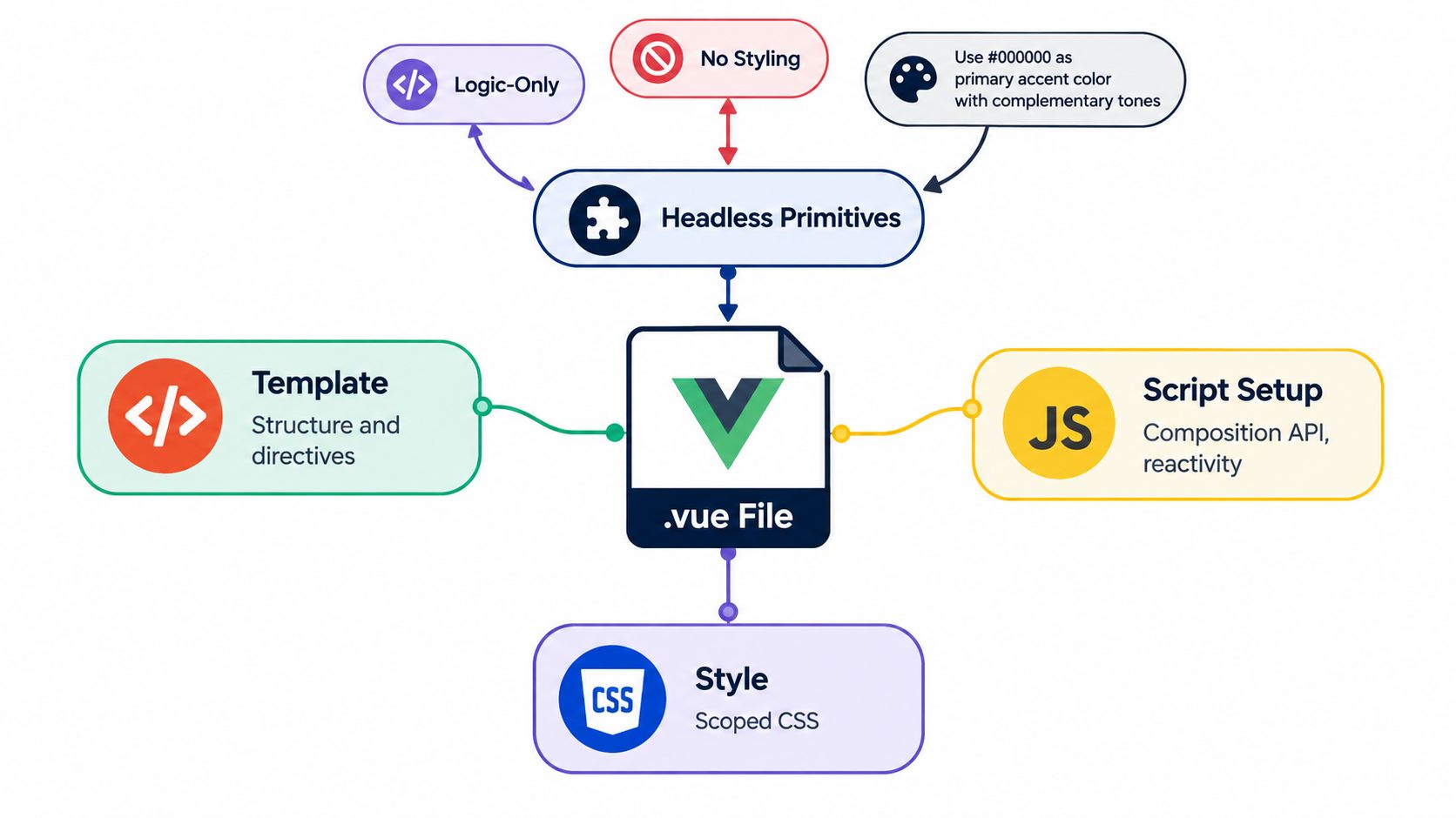
A Vue Single File Component usually has three layers:
<template>defines the rendered structure and Vue directives.<script setup>contains Composition API logic, props, emits and reactive state.<style>contains component styling, either scoped or shared.
That structure is productive, but it doesn’t mean every concern belongs in one file. A component that owns markup, focus management, keyboard listeners, state transitions and a large styling surface can become difficult to test and harder to replace.
Separate behaviour from appearance
A headless primitive provides behaviour without prescribing the final visual design. It might manage whether a listbox is open, which option is active, where focus should move and which ARIA relationships must exist. The consuming application supplies layout, colour, typography and sometimes the content structure.
This separation is especially valuable for teams using Tailwind CSS. Tailwind can express product-specific visual decisions directly in the Vue layer, while the primitive protects interaction logic from accidental styling changes. A wrapper then translates Vue conventions into the primitive’s public interface.
Think of the stack as three contracts:
- Primitive contract: DOM behaviour, state transitions, focus and semantics.
- Vue contract: Reactive props, emitted events,
v-modeland slots. - Design contract: Tailwind classes, tokens, responsive layout and visual states.
DOM Studio follows this kind of model with standards-based custom-element primitives and thin Vue wrappers. Its headless UI component library approach is useful as a reference point, but the principle also works with primitives you build internally.
Decide what belongs in a wrapper
Write a component from scratch when the interaction is product-specific, the native element already solves the problem, or the abstraction would hide more than it saves. Compose an existing primitive when the control has established interaction rules, especially for dialogs, menus, tabs, listboxes and disclosure patterns.
Avoid wrappers that only rename every attribute while adding no useful Vue ergonomics. A good wrapper should make the intended usage obvious, preserve native semantics where possible and expose extension points without leaking internal implementation details.
Tailwind should remain the styling layer, not the behaviour layer. If a class determines whether a dialog is logically open, that state still belongs in reactive logic. If a class only changes the visual treatment of an open dialog, Tailwind is the right place for it.
Creating and Composing Vue JS Components With Props Slots and v-model
The most maintainable Vue components have APIs that read like product language. A filter dropdown should accept a value and options, emit a predictable update, and let the caller control how an option looks. Props, v-model and slots provide those boundaries.

Start with a narrow props API
Use props for data and configuration, not for arbitrary access to internal state. A filter component might accept an array of options, a selected value and a disabled state:
<script setup>
defineProps({
  options: {
    type: Array,
    required: true
  },
  modelValue: {
    type: String,
    default: ''
  },
  disabled: Boolean
})

const emit = defineEmits(['update:modelValue'])
</script>
Validation catches incorrect usage close to the caller. Defaults should describe a safe initial state, not conceal missing required data. Avoid a single config object that contains every possible option. It makes autocomplete weaker, obscures the public contract and encourages consumers to depend on implementation details.
API rule: A prop should describe a decision the consumer needs to make. If the consumer shouldn’t make that decision, keep it inside the component.
Wire v-model as a contract
For a Vue 3 component, v-model conventionally maps to modelValue and the update:modelValue event. The component can pass the current value into a primitive and emit changes back to the parent:
<template>
  <dom-listbox
    :value="modelValue"
    :disabled="disabled"
    @change="event => emit('update:modelValue', event.detail.value)"
  >
    <slot name="options" />
  </dom-listbox>
</template>
The parent then gets a concise interface:
<FilterSelect
  v-model="filters.status"
  :options="statusOptions"
  aria-label="Filter by status"
/>
The important detail is ownership. The parent owns the selected business value. The child owns interaction details such as opening, highlighting and keyboard movement. Don’t mutate the prop directly, and don’t emit an object whose shape changes between interaction paths.
Use slots for controlled flexibility
Slots are more stable than prop-driven HTML strings. A default slot can replace the trigger content, a named slot can provide empty-state content, and a scoped slot can expose an option to the caller:
<FilterSelect v-model="status">
  <template #trigger="{ selected }">
    <span class="font-medium">{{ selected?.label || 'Choose status' }}</span>
  </template>

  <template #option="{ option, active }">
    <span :class="{ 'font-semibold': active }">
      {{ option.label }}
    </span>
  </template>
</FilterSelect>
Use scoped slot data intentionally. Expose the smallest useful object, such as option, active or selected, rather than the entire internal state machine. For broader guidance on keeping component boundaries predictable, these component reusability best practices offer a useful companion reference.
Compose upwards. A page-level filter panel can combine a listbox, date control and reset button, while each child remains independently testable. Events should describe what happened, not instruct the parent how to change internal state. update:modelValue is a good example because it communicates a value change without exposing the implementation that produced it.
Making Vue JS Components Accessible by Default
A headless primitive can expose clean behavior and still ship an inaccessible wrapper. The failure usually starts in the DOM: a clickable <div>, an unlabeled input, or a state that never reaches assistive technology. Because Vue components are reused, one structural mistake can spread across every screen that imports the component.
Vue’s accessibility guidance points teams toward semantic HTML, correct heading hierarchy, explicit form labels, and interfaces that are perceivable, operable, understandable, and resilient. Put those rules in the primitive, then let Tailwind wrappers handle presentation.
Build with the native element first
Choose a native button, input, select, or dialog pattern whenever it matches the interaction. A wrapper <div> does not gain focus, keyboard activation, or the expected role just because a click handler is attached.
For a custom disclosure, bind state to the actual trigger:
<button
  type="button"
  :aria-expanded="open"
  :aria-controls="panelId"
  @click="open = !open"
>
  {{ label }}
</button>

<div v-show="open" :id="panelId">
  <slot />
</div>
Generate IDs so the trigger and panel remain correctly associated when several instances share a page. Bind aria-* values reactively. A stale attribute can describe the opposite of what the user sees.
Test behavior, state, and focus
A reliable review checks the component in layers:
- Native structure: Confirm that the element matches the interaction.
- Reactive semantics: Check
aria-expanded,aria-selected,aria-controls,aria-describedby, and invalid states as they change. - Keyboard operation: Use tabs, menus, dialogs, and disclosure controls without a pointer.
- Automated checks: Run linting and axe-based tests in CI.
- Manual verification: Use a screen reader to test announcements, focus movement, and route changes.
An independent Vue audit guide recommends WCAG 2.2 AA checks, a 24 by 24 CSS pixel target size, and a single-pointer alternative for drag interactions (Vue accessibility audit guidance). Its automated checks can identify issues quickly, but they do not replace keyboard and screen-reader review.
Use ARIA to describe valid custom behavior, not to repair unsuitable markup. Teams can find ARIA best practices for roles, states, and properties while keeping native HTML as the starting point.
The common failure is adding attributes to the wrong DOM. Another is skipping heading levels because the visual design uses a particular font size. Correct those decisions in the primitive, then test every Vue wrapper that composes it. Treat these accessibility best practices as release criteria, not a final QA reminder.
Styling With Tailwind CSS and Shipping Tiny Tree Shakeable Bundles
A headless primitive should own interaction, while its Vue wrapper owns composition and its Tailwind classes express appearance. This boundary lets several products share keyboard and state logic without forcing them into one visual system. Global CSS still fits tokens, resets, and base typography, while scoped rules suit local layouts. Utility classes make component variants visible beside the markup.
Tailwind CSS 4 works best when a component exposes a limited set of visual decisions. Define shared colour, spacing, and typography tokens, then apply utilities for documented variants instead of copying long style blocks. Visual Blocks can provide a higher-level theming surface when product teams need to adjust the system without rewriting the underlying primitives.
Compare the delivery options
| Approach | Best For | Trade-off |
|---|---|---|
| Global styles | Tokens, resets and application-wide typography | Changes can affect unrelated components |
| Scoped styles | Local visual rules and specialised layouts | Shared variants can become repetitive |
| Tailwind utilities | Explicit variants and rapid composition | Class-heavy markup needs naming discipline |
| Headless primitive plus wrapper | Shared behaviour across products | Requires a clear boundary between behaviour and styling |
Tree-shaking depends on package boundaries. Prefer per-component imports, avoid a barrel that eagerly initialises the catalogue, and declare side effects explicitly. A button import should not load dialog, autocomplete, or command-palette behaviour. Keep the custom element primitive and Vue wrapper in separate modules so consumers can select the layer they need.
DOM Studio combines headless custom-element primitives with Vue wrappers, Tailwind CSS 4 styling, and tree-shakeable modules. Its product information states that individual modules average under 2 kb gzipped (DOM Studio’s component library). That approach suits a growing catalogue where applications should include only the controls they import.
Keep the public surface smaller than the implementation
A wrapper may contain substantial internal logic while exposing only a few props, slots, and events. Keep that API deliberate. Publish entry points that match consumer needs, mark package exports clearly, and inspect the production bundle whenever a dependency enters the component.
Bundle analysis belongs in design review, not only release checks. If a primitive needs a large runtime for a small interaction, split the behaviour, defer it, or use a platform feature. Small bundles come from both efficient code and boundaries that make unused code removable.
Putting It All Together and What to Build Next
A durable Vue component system follows a practical order: choose the semantic element, isolate interaction behaviour in a primitive, expose a narrow Vue wrapper, style the wrapper with Tailwind, and verify the result with automated and manual checks. That sequence prevents visual polish from hiding an unstable API.
Audit an existing library with a short release checklist:
- Props: Are names, types, defaults and required values obvious?
- Events: Does
v-modelemit one predictable update path? - Slots: Can consumers customise content without copying the component?
- Semantics: Does the DOM use the correct native element and heading structure?
- Keyboard flow: Can users reach, operate and leave every interactive state?
- Focus: Does a dialog, menu or route change place focus deliberately?
- Bundle: Can consumers import the component without loading unrelated modules?
- Documentation: Are examples, inspector hints and usage constraints available beside the component?
Start with one high-impact primitive, such as a dialog or listbox, rather than redesigning the entire catalogue. Test it in isolation, exercise it through a real page, then use the same contract for adjacent controls. DOM Studio’s catalogue and Pro blueprints can accelerate that work, while embedded documentation and inspector hints help teams inspect and improve generated or rapidly assembled interfaces.
The outcome isn’t just a set of reusable files. It’s a shared agreement about behaviour, semantics, styling and ownership. That agreement lets Vue teams extend an interface without reintroducing the same accessibility and maintenance problems in a new wrapper.
Use DOM Studio to explore headless primitives and thin Vue wrappers for accessible, Tailwind-based interfaces. Start by applying one component to your own library, then inspect its props, v-model, keyboard behaviour and bundle contribution before expanding the system.