
Vue Form Components: How to Build Reusable, Validated Forms
Reusable Vue form components let us move beyond a page-specific collection of inputs. In this guide, we will build a small account form that has a clear data contract, accessible field chrome, client-side validation, server error handling, and a path toward schema-driven rendering.
The practical goal is simple: each field should work alone with v-model, then join a parent form without adopting a second API. DOM Studio is designed around that model: fields own one named value, while the form aggregates values, errors, validation, and nested paths.
Table of contents
- Before you start
- 1. Define a small, stable form data model
- 2. Build fields around the same component contract
- 3. Compose the account form with named Vue form components
- 4. Choose the correct control for the data, not just the visual style
- 5. Layer validation and error handling deliberately
- 6. Add nested sections and schema-driven rendering when repetition appears
- 7. Test the behavior users and APIs depend on
- Build one form system, then reuse it
Before you start
You need a Vue 3 app, a component library with form primitives, and a server endpoint that validates submitted data. The examples use DOM Studio’s Vue package and assume that your app can import its global styles.
We will create an account form with a name, email address, role, and owner picker. Keep browser validation enabled for basic semantics, but always repeat validation on the server. Client-side checks improve feedback, while the server remains the authority for submitted data.
1. Define a small, stable form data model
Start from the submission object, not from the individual controls. A small model makes it obvious what the form owns and prevents UI-only details from leaking into the payload.
<script setup>
import { ref } from 'vue';

const account = ref({
  name: '',
  email: '',
  role: 'member',
  ownerId: '',
});
</script>
Expected result: you have one reactive value that represents the data your API accepts.
Check: edit account.value.name in Vue DevTools and confirm the object changes without needing to coordinate separate refs.
When the form becomes more involved, retain this separation: the definition describes controls, labels, validation, and layout, while the model contains only entered values. DOM Studio’s form architecture follows this split so form controls can stay reusable instead of hard-coding page state.
2. Build fields around the same component contract
A reusable field needs more than a styled <input>. It needs a label, description, generated ID, HTML name, required state, errors, and the standard modelValue and update:modelValue contract.
In DOM Studio, DomField handles shared visual chrome, while form-capable controls use the same field contract. This gives us standalone controls when there is no parent form and registration when a named control is placed inside one.

If you are creating a project-specific input, wrap the native control rather than rebuilding labels and error presentation in every component:
<script setup>
import { DomField, fieldProps, useField } from '@getdom/studio/vue';

const props = defineProps({
  ...fieldProps,
  type: { type: String, default: 'text' },
});

const emit = defineEmits(['update:modelValue', 'blur', 'focus']);
const field = useField(props, emit, { idPrefix: 'project-input' });
</script>

<template>
  <DomField v-bind="field.fieldAttrs.value">
    <input
      v-bind="field.inputAttrs.value"
      :type="type"
      class="project-input"
      @input="field.onInput($event.target.value)"
      @focus="field.onFocus"
      @blur="field.onBlur"
    >
  </DomField>
</template>
Expected result: the custom field can bind directly with v-model, and it can also participate in a form by receiving a name.
Troubleshooting: if the label does not activate the input or an error is disconnected from the control, inspect the generated ID and the label association. Do not rely on placeholder text as the field label.
3. Compose the account form with named Vue form components
Now compose real inputs inside a provider. The name prop is important: it is the bridge between the visible control and its location in the form model.
<script setup>
import { computed, reactive, ref } from 'vue';
import {
  DomButton,
  DomEmailInput,
  DomForm,
  DomTextInput,
} from '@getdom/studio/vue';

const account = ref({
  name: '',
  email: '',
  website: '',
});

const feedback = reactive({ type: '', message: '' });

async function saveAccount({ values }) {
  feedback.type = 'working';
  feedback.message = 'Saving account...';

  const response = await fetch('/api/accounts', {
    method: 'POST',
    headers: { 'Content-Type': 'application/json' },
    body: JSON.stringify(values),
  });

  if (!response.ok) {
    feedback.type = 'error';
    feedback.message = 'The account could not be saved. Review the highlighted fields.';
    return;
  }

  feedback.type = 'success';
  feedback.message = 'Account saved.';
}

function showInvalid({ errors }) {
  const count = Object.keys(errors).length;
  feedback.type = 'error';
  feedback.message = `Correct ${count} field${count === 1 ? '' : 's'} before saving.`;
}
</script>

<template>
  <DomForm
    v-slot="{ state }"
    v-model="account"
    class="space-y-4"
    @submit="saveAccount"
    @invalid="showInvalid"
  >
    <DomTextInput
      name="name"
      label="Full name"
      autocomplete="name"
      required
    />

    <DomEmailInput
      name="email"
      label="Work email"
      autocomplete="email"
      required
    />

    <DomTextInput
      name="website"
      label="Website"
      type="url"
      autocomplete="url"
    />

    <div class="flex items-center gap-3">
      <DomButton type="submit">Save account</DomButton>
      <p class="text-sm" aria-live="polite">
        {{ state.valid ? 'Ready to save' : `${state.errorCount} error(s)` }}
      </p>
    </div>
  </DomForm>
</template>
Expected result: the form emits valid values on submit and reports invalid fields before your request is sent.
Check: submit with an empty email, then enter a valid address and submit again. Confirm the status changes and the request body contains the same shape as account.
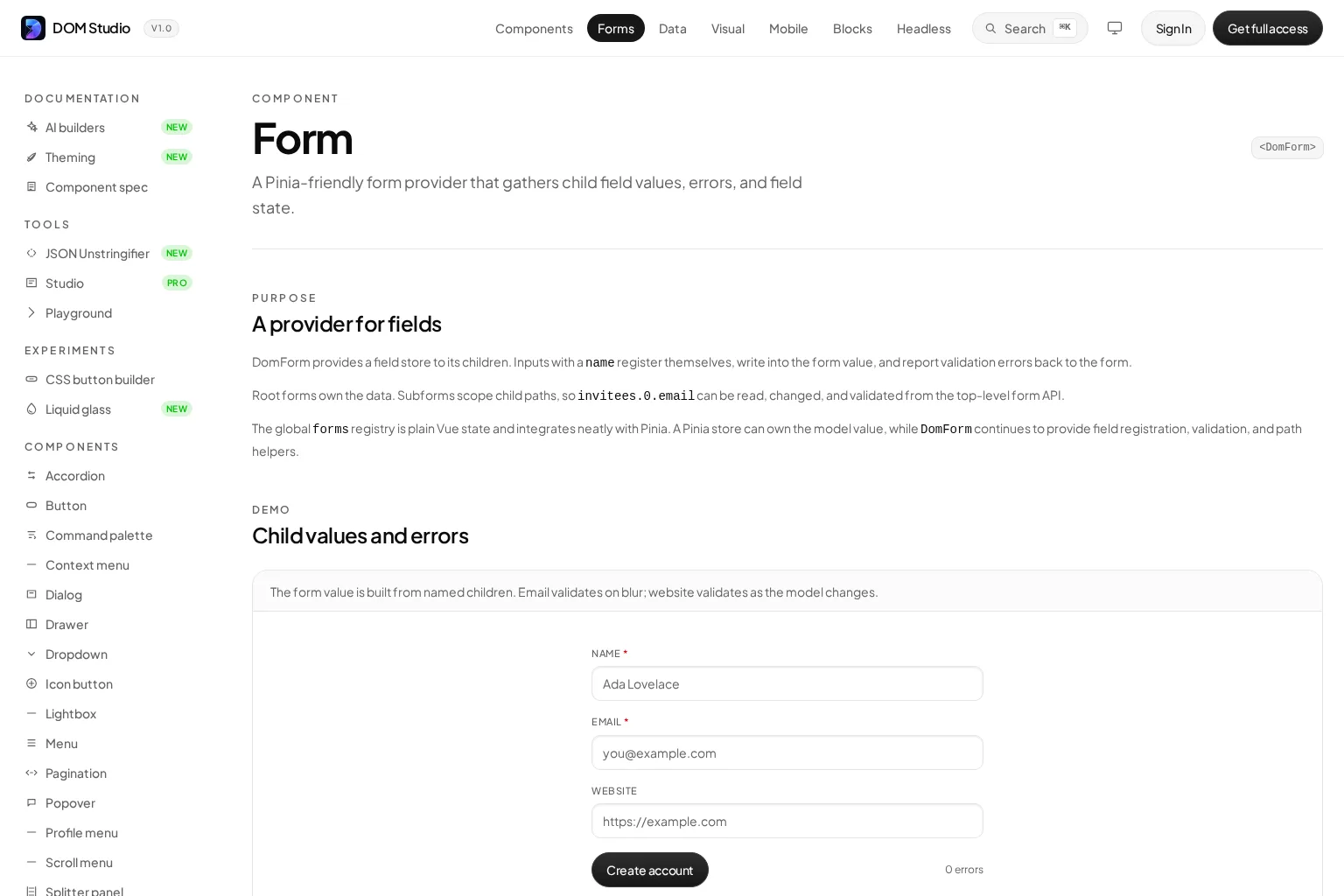
Use the DomForm reference when you need nested path scopes, a named form registry, programmatic validation, or runtime field errors from an API response.
4. Choose the correct control for the data, not just the visual style
A form component should express the data users are entering. Use email and URL controls for email addresses and web addresses. Use checkboxes or toggles for booleans. Use a native select for a short, fixed list. Use a combobox when users need to search or choose from a larger list.
For example, a searchable owner picker can preserve a stable ID in the model while showing a human-friendly label:
<script setup>
import { ref } from 'vue';
import { DomCombobox } from '@getdom/studio/vue';

const ownerId = ref('');
const owners = [
  { value: 'usr_01', label: 'Maya Patel' },
  { value: 'usr_02', label: 'Jordan Lee' },
  { value: 'usr_03', label: 'Sam Rivera' },
];
</script>

<template>
  <DomCombobox
    v-model="ownerId"
    name="ownerId"
    label="Account owner"
    :options="owners"
    placeholder="Search people"
  />
</template>
Expected result: the visible choice is readable, while ownerId contains the value your API expects.
Troubleshooting: do not place a combobox inside a nested native <form>. Use a scoped subform or a fieldset-style grouping for sections such as billing or invitees. The combobox documentation includes keyboard behavior, custom item rendering, and server-loaded options.
5. Layer validation and error handling deliberately
Use native HTML constraints first. type="email", required, min, max, pattern, and minlength provide meaningful browser semantics and a baseline experience. Add component or schema validation when rules involve multiple fields, product rules, or asynchronous checks.
We recommend three layers:
- Field constraints: required values, formats, ranges, and simple length rules.
- Form rules: checks that compare fields, such as matching passwords or a required billing section for a paid plan.
- Server rules: authorization, uniqueness, inventory, pricing, and every rule that protects data integrity.
When an API rejects a value, put that error back into runtime form state instead of replacing authored component props. In DOM Studio, a parent form can set field state by name, which keeps server feedback attached to the correct control.
forms.account.setFieldState('email', {
  invalid: true,
  errors: {
    unique: 'An account already exists for this email address.',
  },
});
Expected result: a server-side error appears beside the correct component and remains separate from your initial field definition.
Check: simulate a 409 Conflict response for an existing email and verify that focus, error copy, and retry behavior are clear to keyboard and screen-reader users.

6. Add nested sections and schema-driven rendering when repetition appears
Nested data should use scoped paths, not copied field names. For example, a billing postcode belongs at billing.postcode, and an invitee email belongs at invitees.0.email. This makes repeated groups testable and lets the parent own a predictable payload.
When teams repeatedly create the same forms from product configuration, introduce a definition that describes types, components, and validation separately from entered values. DOM Studio can normalize typed definitions into renderable children and can adapt Zod-like objects or JSON Schema into the same form structure.
const memberFormDefinition = {
  type: 'DomForm',
  properties: {
    name: {
      type: 'string',
      label: 'Full name',
      required: true,
    },
    email: {
      type: 'email',
      label: 'Work email',
      required: true,
    },
    role: {
      type: 'string',
      component: 'DomSelectInput',
      label: 'Role',
      options: ['viewer', 'editor', 'admin'],
    },
  },
};
Expected result: the definition can evolve with product requirements while the submitted model remains a small plain object.
Troubleshooting: do not store validation messages, current errors, or touched state in a schema. Keep authored definition data separate from runtime state and user-entered values. Read the schema and data guide before making schemas a shared API contract.
7. Test the behavior users and APIs depend on
A component test should verify behavior, not only snapshots. For each reusable Vue form component, test these outcomes:
- A visible label is associated with the interactive control.
v-modelupdates with the expected value type.- Required and invalid states are exposed clearly.
- Keyboard users can reach, operate, and leave the control.
- Error text is announced or discoverable without relying on color alone.
- A parent form receives the correct nested path and final payload.
- A server error can target a field without destroying the user’s other input.
For a complementary walkthrough of schema validation with VeeValidate and Zod, watch the video below. Those tools can be useful when your team wants validation-focused primitives, while full UI libraries such as Vuetify or PrimeVue make different tradeoffs around components, styling, and ownership.
Build one form system, then reuse it
You now have a practical pattern for Vue form components: start with a stable model, give every field one shared contract, compose named controls in a form provider, validate at the right layers, and move to schemas only when repeated form structure justifies it.
Our next action is to take one repeated account, settings, or invite flow and rebuild it with this contract. Start with the inputs that currently duplicate label, error, and validation logic, then turn those patterns into editable components your team can own and ship.