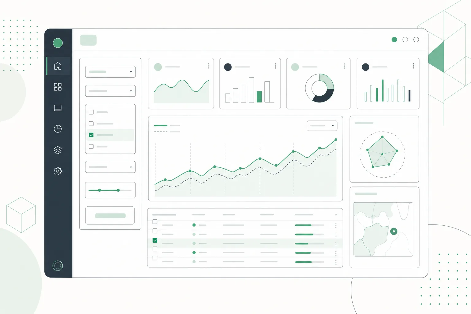
A production dashboard is not one large Vue component. It is a coordinated system of layout, metric, filter, visualization, table, and feedback components that share a clear data contract.
To build reliable Vue dashboard components, start with a route-level shell, give each widget typed inputs, centralize query state, model every API state, make charts and tables responsive, then verify the result with keyboard, network, and viewport tests. I will walk through that process using Vue 3, the Composition API, Pinia, Vue Router, and DOM Studio examples.
If you want to inspect a production-shaped starting point before writing code, review the DOM Studio dashboard block. It combines persistent navigation, compact metrics, reporting controls, and a mobile fallback.
Table of contents
- Prerequisites
-
- Define the dashboard contract and shell
-
- Build reusable metric components
-
- Centralize filters and query state
-
- Connect API data with explicit UI states
-
- Add responsive charts and data tables
-
- Verify accessibility, responsiveness, and performance
- Choosing a Vue dashboard component approach
- The completed outcome
Prerequisites
Before starting, you should have:
- A Vue 3 application using Single-File Components
- TypeScript enabled, preferably with
<script setup lang="ts"> - Vue Router for dashboard routes
- Pinia if filters or results must be shared across widgets
- An API contract, fixture, or mocked endpoint for dashboard data
- A component system such as DOM Studio, Vuetify, PrimeVue, or shadcn-vue
- A charting library such as Apache ECharts or Chart.js
Define the minimum data contract before touching layout code:
export interface DashboardQuery {
  range: '7d' | '30d' | '90d'
  segment: 'all' | 'new' | 'returning'
  page: number
  sort: string
}

export interface DashboardPayload {
  metrics: Array<{
    id: string
    label: string
    value: string
    delta?: number
  }>
  series: Array<{ date: string; value: number }>
  rows: Array<Record<string, unknown>>
  totalRows: number
  updatedAt: string
}
This contract prevents cards, charts, and tables from inventing incompatible versions of the same data.

1. Define the dashboard contract and shell
Build the outer application structure before individual widgets. The shell should own navigation, page width, scrolling boundaries, route content, and mobile behavior. It should not own revenue calculations, chart options, or table filtering.
A practical project structure looks like this:
src/
  components/dashboard/
    MetricCard.vue
    DashboardFilters.vue
    TrendChart.vue
    ResultsTable.vue
    DashboardState.vue
  composables/
    useDashboardData.ts
  stores/
    dashboard.ts
  views/
    DashboardView.vue
  router/
    index.ts
Keep the dashboard as a lazy-loaded route so users do not download its charting and table dependencies until they visit it:
const routes = [
  {
    path: '/dashboard',
    component: () => import('@/views/DashboardView.vue'),
  },
]
Inside DashboardView.vue, compose the page from sections rather than embedding every detail:
<template>
  <DashboardFilters />

  <section class="metric-grid" aria-label="Key metrics">
    <MetricCard
      v-for="metric in payload?.metrics ?? []"
      :key="metric.id"
      v-bind="metric"
    />
  </section>

  <section class="dashboard-grid">
    <TrendChart :series="payload?.series ?? []" />
    <ResultsTable :rows="payload?.rows ?? []" />
  </section>
</template>
DOM Studio’s application layout block demonstrates a useful pattern: persistent navigation can scroll independently from the main work area. That separation matters when dashboards grow into reports, forms, and editor panels.

Expected result
You should have a route that renders a stable shell with clearly named component boundaries. Resizing the page should not create nested page-level scrollbars or hide navigation without an alternative.
Troubleshooting
If the sidebar and main panel both scroll unpredictably, define one explicit scrolling container for each region and ensure their parents have constrained heights. If the initial bundle grows sharply, confirm the dashboard route uses a dynamic import.
2. Build reusable metric components
A metric card should receive display-ready data and emit user intent. It should not fetch its own endpoint or know the active dashboard date range.
Here is a small typed example using DomCard:
<script setup lang="ts">
import { DomCard } from '@getdom/studio/vue'

defineProps<{
  label: string
  value: string
  delta?: number
  loading?: boolean
}>()
</script>

<template>
  <DomCard padding="md" aria-live="polite">
    <p class="metric-label">{{ label }}</p>

    <div v-if="loading" class="metric-skeleton" aria-label="Loading metric" />

    <template v-else>
      <p class="metric-value">{{ value }}</p>
      <p v-if="delta !== undefined" :class="delta >= 0 ? 'positive' : 'negative'">
        {{ delta >= 0 ? '+' : '' }}{{ delta }}%
      </p>
    </template>
  </DomCard>
</template>
The important design choice is the boundary:
- The parent owns data fetching and refresh timing.
- The card owns presentation.
- Props describe the visible state.
- Events describe actions such as opening a detail view.
- Formatting is centralized so every card uses consistent currency, date, and percentage rules.
Do not create one component per metric unless each metric has genuinely different behavior. A reusable MetricCard with stable props is easier to test and maintain.

If your team needs a broader Composition API refresher before extracting dashboard logic into components and composables, the following tutorial provides useful background.
Expected result
You can render several metric cards from an array, reorder them without editing component internals, and test loading and complete states independently.
Troubleshooting
If cards mutate values passed from the parent, stop and move that change into an emitted event or shared store action. If formatting differs between cards, pass normalized display values or use one formatting utility.
3. Centralize filters and query state
Dashboard controls often affect several widgets at once. A date range may refresh the metric cards, chart, table, export action, and URL. Keep that state in one place.
A compact Pinia store can hold the query contract:
import { computed, ref, watch } from 'vue'
import { defineStore } from 'pinia'

export const useDashboardStore = defineStore('dashboard', () => {
  const range = ref<'7d' | '30d' | '90d'>('30d')
  const segment = ref<'all' | 'new' | 'returning'>('all')
  const page = ref(1)
  const sort = ref('-revenue')

  const query = computed(() => ({
    range: range.value,
    segment: segment.value,
    page: String(page.value),
    sort: sort.value,
  }))

  watch([range, segment, sort], () => {
    page.value = 1
  })

  return { range, segment, page, sort, query }
})
Use a rich select when options need labels, descriptions, status, or metadata. DOM Studio’s DomSelect documentation shows v-model, option records, searchable panels, and custom option slots.
<script setup lang="ts">
import { DomSelect } from '@getdom/studio/vue'
import { useDashboardStore } from '@/stores/dashboard'

const store = useDashboardStore()

const ranges = [
  { label: 'Last 7 days', value: '7d' },
  { label: 'Last 30 days', value: '30d' },
  { label: 'Last 90 days', value: '90d' },
]
</script>

<template>
  <DomSelect
    v-model="store.range"
    label="Date range"
    :options="ranges"
    width="min-w-[12rem]"
  />
</template>
For shareable reports, mirror meaningful filter state into the route query. Avoid placing transient details such as an open tooltip or highlighted chart point in the URL.
Expected result
Changing one filter updates a single query object, resets pagination when appropriate, and triggers every dependent widget consistently.
Troubleshooting
If one widget shows stale results, check whether it maintains a private copy of the filter. If requests fire multiple times, remove duplicate watchers and make the centralized query the only fetch dependency.
4. Connect API data with explicit UI states
A production dashboard must render more than success. Treat loading, refreshing, empty, error, and complete states as part of the component contract.
I recommend keeping request orchestration in a composable:
import { ref, watch, type Ref } from 'vue'
import type { DashboardPayload, DashboardQuery } from '@/types/dashboard'

export function useDashboardData(query: Ref<DashboardQuery>) {
  const payload = ref<DashboardPayload | null>(null)
  const loading = ref(false)
  const error = ref<string | null>(null)

  watch(
    query,
    async (nextQuery, _previous, onCleanup) => {
      const controller = new AbortController()
      onCleanup(() => controller.abort())

      loading.value = true
      error.value = null

      try {
        const params = new URLSearchParams({
          ...nextQuery,
          page: String(nextQuery.page),
        })

        const response = await fetch(`/api/dashboard?${params}`, {
          signal: controller.signal,
        })

        if (!response.ok) throw new Error('Dashboard request failed')
        payload.value = await response.json()
      } catch (requestError) {
        if ((requestError as Error).name !== 'AbortError') {
          error.value = 'We could not load this dashboard.'
        }
      } finally {
        if (!controller.signal.aborted) loading.value = false
      }
    },
    { immediate: true, deep: true },
  )

  return { payload, loading, error }
}
Aborting stale requests prevents a slower, older response from replacing newer filter results. Keep the previous successful payload visible during a background refresh when that reduces visual disruption, but clearly indicate that an update is in progress.
DOM Studio’s data component guidance recommends server-shaped demos that exercise query, mutation, pagination, refresh, loading, empty, and error behavior. That is a strong standard for dashboard work because it tests the real interface rather than a static array.
Render states in a deliberate order:
<template>
  <DashboardSkeleton v-if="loading && !payload" />
  <DashboardError v-else-if="error" :message="error" @retry="refresh" />
  <DashboardEmpty v-else-if="payload && payload.rows.length === 0" />
  <DashboardContent v-else-if="payload" :payload="payload" />
</template>
Expected result
Fast filter changes cannot display out-of-order responses. Users see an actionable error, a meaningful empty state, or the completed dashboard instead of a blank panel.
Troubleshooting
If loading flashes on every small update, separate initialLoading from refreshing. If the empty state appears before the request finishes, only evaluate emptiness after a successful payload exists.
5. Add responsive charts and data tables
Charts and tables serve different jobs. A chart reveals direction, concentration, or change. A table supports exact inspection, sorting, filtering, pagination, and export.
Make the chart follow its container
Do not size a chart only from window.innerWidth. Dashboard panels change size when a sidebar collapses, a splitter moves, or a parent grid changes. Observe the chart container and call the chart library’s resize method.
const chartRoot = ref<HTMLElement | null>(null)
let chart: ReturnType<typeof echarts.init> | undefined
let observer: ResizeObserver | undefined

onMounted(() => {
  if (!chartRoot.value) return

  chart = echarts.init(chartRoot.value)
  chart.setOption(buildChartOptions(props.series))

  observer = new ResizeObserver(() => chart?.resize())
  observer.observe(chartRoot.value)
})

onBeforeUnmount(() => {
  observer?.disconnect()
  chart?.dispose()
})
Also provide a concise text summary near the visualization. A chart should complement the data, not become the only way to understand it.
Keep table state aligned with the API
For large datasets, send search, filters, sorting, and pagination to the server. Do not fetch an entire production dataset merely to sort it in the browser.
Your table component should receive:
interface ResultsTableProps {
  rows: Array<Record<string, unknown>>
  totalRows: number
  loading: boolean
  sort: string
  page: number
}
It should emit intent such as update:sort, update:page, and select-row. The store then updates the central query, and the composable fetches the next payload.
PrimeVue provides a feature-rich DataTable with controlled pagination, filtering, sorting, selection, scrolling, and virtualization options. TanStack Vue Table provides headless table logic when you want to own the markup. shadcn-vue pairs its table primitives with TanStack Vue Table for advanced behavior.
On narrow screens:
- Keep the most important columns visible.
- Allow horizontal scrolling when the data relationship requires columns.
- Move secondary filters into a drawer or sheet.
- Avoid converting every table into cards unless cards improve the task.
- Preserve row actions and selection semantics.
Expected result
The chart resizes with its panel, the table keeps query state synchronized with the API, and both remain usable from phone widths to wide desktop layouts.
Troubleshooting
If a chart is blank, confirm its container has a measurable width and height before initialization. If a table becomes slow, paginate or virtualize large lists and verify that row keys are stable.
6. Verify accessibility, responsiveness, and performance
A dashboard is complete only after its failure modes have been tested. Use a repeatable verification matrix.
Responsive checks
Test at approximately 320px, 768px, and 1280px, plus any product-specific breakpoints. Confirm that:
- Navigation has a mobile replacement.
- Filters wrap or collapse without clipping.
- Metric values do not overflow.
- Charts retain a useful height.
- Tables remain inspectable.
- Only intentional regions scroll.
Keyboard and assistive technology checks
Verify that:
- Every control is reachable in a logical order.
- Focus remains visible.
- Menus, selects, dialogs, and drawers return focus correctly.
- Icon-only buttons have accessible names.
- Loading and error changes are announced without excessive interruption.
- Color is not the only indicator of positive, negative, or warning status.
Data-state checks
Simulate:
- A slow initial request
- An empty successful response
- A server error
- A stale request canceled by a new filter
- A partial payload
- A large table result
- A background refresh
Performance checks
Use production builds when profiling. Lazy-load the dashboard route, import only the components you use, and virtualize genuinely large lists. Avoid unnecessary component wrappers inside long table bodies because each abstraction adds runtime work.
Expected result
The dashboard remains understandable and operable across devices, input methods, request outcomes, and realistic data volumes.
Troubleshooting
If tests are inconsistent, create deterministic API fixtures for each state. If performance work is based on intuition, profile first and optimize the measured bottleneck rather than rewriting every component.
Choosing a Vue dashboard component approach
The right component system depends on how much control and built-in behavior your team wants.
- DOM Studio: A strong fit when you want editable Vue wrappers, headless elements, application blocks, form tools, metadata, and source-aware documentation in one system. Its dashboard and app-shell examples are useful when the goal is a production-shaped interface rather than an isolated widget gallery.
- Vuetify: A comprehensive Vue design system with a broad component collection and an integrated ecosystem. It suits teams that want a full framework and established conventions.
- PrimeVue: A comprehensive UI suite with especially deep data-display components. It is worth evaluating when advanced table behavior is the dominant requirement.
- shadcn-vue: An open-code approach that gives your team the component source. It suits teams that prefer direct ownership and are comfortable assembling advanced behavior from supporting libraries.
- TanStack Vue Table: Headless table state and rendering logic for teams that want complete control over table markup and styling.
I recommend choosing based on ownership, accessibility requirements, table complexity, theming constraints, and how much custom integration your team can maintain. Do not choose solely from the number of components in a catalog.
The completed outcome
You now have a dashboard architecture in which the shell controls layout, reusable components control presentation, Pinia controls query state, a composable controls API behavior, and charts and tables respond to the same contract.
The most useful next action is to build one vertical slice: one date filter, three metric cards, one chart, and one paginated table backed by a mocked endpoint. Verify every UI state before expanding the dashboard.
If you want to shorten that first implementation, start from DOM Studio’s dashboard block and adapt its navigation, metric, filter, and responsive patterns to your product. Then replace the sample data with your API contract rather than rebuilding the entire interface from an empty file.