
Vue components become easier to reuse when each one has a narrow job and a clear public contract. In this guide, we will build six practical Vue component examples with Vue 3 single-file components and <script setup>. By the end, we will have a small set of patterns we can test, compose, and document across a real application.
We will use plain Vue markup so the examples work in any Vue 3 application. If we prefer to begin with editable application primitives, we can pair these patterns with the DOM Studio component library, which provides Vue wrappers and headless elements for common product UI.
Table of contents
- Before you start
- 1. Build a prop-driven status badge
- 2. Create a product card that emits an action
- 3. Use named slots to build a flexible app shell
- 4. Switch workspace views with a dynamic component
- 5. Turn a field into a reusable form component
- 6. Add examples and metadata next to the component
- Choose the pattern that matches the boundary
- Build the next component with a testable contract
Before you start
Prerequisites: a Vue 3 project with a build tool such as Vite, familiarity with .vue files, and a browser devtools console for checking warnings.
Inputs: create a src/components folder and a parent page such as App.vue. We will use TypeScript in a few examples for clearer contracts, but the patterns also work without it.
Success criteria: each example should render with no console warnings, accept only the data it needs, and expose an explicit way for the parent to react.
1. Build a prop-driven status badge
Start with the smallest useful reusable component: a badge that turns a status value into consistent UI. This is a good first example because it shows the core component contract: a parent owns the data, and a child receives it through props.
Create StatusBadge.vue:
<script setup lang="ts">
type Status = 'draft' | 'active' | 'paused'

const props = defineProps<{
  status: Status
}>()

const labels: Record<Status, string> = {
  draft: 'Draft',
  active: 'Active',
  paused: 'Paused',
}
</script>

<template>
  <span class="status-badge" :data-status="props.status">
    {{ labels[props.status] }}
  </span>
</template>
Use it from a parent:
<script setup lang="ts">
import StatusBadge from './components/StatusBadge.vue'
</script>

<template>
  <StatusBadge status="active" />
</template>
Expected result: the badge renders Active, and the data-status attribute gives CSS a stable hook for each visual state.
Verify it: change status to draft and confirm the label updates. Then intentionally pass status="unknown". With TypeScript and a compatible editor, we should receive a type error before runtime.
Troubleshooting: do not copy props.status into local mutable state unless the component truly needs an independent draft. Props are an input contract, not child-owned state. Vue’s component model uses declared props to pass data into the child component.

2. Create a product card that emits an action
Next, combine a prop with an event. The card displays information it receives, while the parent decides what adding an item actually does. This keeps network calls, cart state, and analytics out of a presentational component.
Create ProductCard.vue:
<script setup lang="ts">
type Product = {
  id: string
  name: string
  price: number
}

const props = defineProps<{
  product: Product
}>()

const emit = defineEmits<{
  add: [product: Product]
}>()
</script>

<template>
  <article class="product-card">
    <div class="product-card__media" aria-hidden="true"></div>
    <h2>{{ props.product.name }}</h2>
    <p>${{ props.product.price.toFixed(2) }}</p>
    <button type="button" @click="emit('add', props.product)">
      Add to cart
    </button>
  </article>
</template>
Then handle the event in a parent page:
<script setup lang="ts">
import ProductCard from './components/ProductCard.vue'

const product = {
  id: 'keyboard-01',
  name: 'Compact Keyboard',
  price: 129,
}

function addToCart(item: typeof product) {
  console.log('Added:', item.id)
}
</script>

<template>
  <ProductCard :product="product" @add="addToCart" />
</template>
Expected result: clicking the button logs keyboard-01 from the parent function.
Verify it: inspect the parent handler and confirm it receives the full product object. The card should not import a cart store or call an API to pass this check.
Troubleshooting: if @add never fires, make sure the child emits the exact same event name the parent listens for. Explicit defineEmits() declarations make the event contract easier to inspect and validate.
3. Use named slots to build a flexible app shell
Props work well for data, but slots are better when the parent needs to supply arbitrary markup. A panel with a header, body, and footer is a dependable slot example.
Create AppPanel.vue:
<template>
  <section class="app-panel">
    <header class="app-panel__header">
      <slot name="header">
        <h2>Untitled panel</h2>
      </slot>
    </header>

    <div class="app-panel__body">
      <slot />
    </div>

    <footer v-if="$slots.footer" class="app-panel__footer">
      <slot name="footer" />
    </footer>
  </section>
</template>
Consume it like this:
<AppPanel>
  <template #header>
    <div class="panel-heading">
      <h2>Team members</h2>
      <button type="button">Invite</button>
    </div>
  </template>

  <p>Invite and manage people who can access this workspace.</p>

  <template #footer>
    <button type="button">Save changes</button>
  </template>
</AppPanel>
Expected result: the parent controls the content of all three regions without the panel needing specialized props such as headerTitle, headerAction, or footerButtonLabel.
Verify it: delete the #footer template. The footer element should disappear because it is only rendered when the slot is present.
Troubleshooting: remember that slot content is authored in the parent’s scope. If a variable in the slot is undefined, define it in the parent or pass it from the child as a scoped slot prop.
4. Switch workspace views with a dynamic component
A tabbed workspace is one of the most useful Vue component examples because it avoids a large chain of conditional blocks. Put each view in its own component, then select the active one with <component :is="...">.
<script setup lang="ts">
import { ref } from 'vue'
import OverviewView from './OverviewView.vue'
import ActivityView from './ActivityView.vue'
import SettingsView from './SettingsView.vue'

const views = {
  overview: OverviewView,
  activity: ActivityView,
  settings: SettingsView,
}

const currentView = ref<keyof typeof views>('overview')
</script>

<template>
  <nav aria-label="Workspace views">
    <button v-for="(_, key) in views" :key="key" @click="currentView = key">
      {{ key }}
    </button>
  </nav>

  <KeepAlive>
    <component :is="views[currentView]" />
  </KeepAlive>
</template>
Expected result: each button changes the rendered view. Wrapping the dynamic component in <KeepAlive> preserves the inactive view’s component instance instead of recreating it each time.
Verify it: put a text field with local state in SettingsView, type a value, move to Overview, then return to Settings. The value should remain.
Troubleshooting: if the view resets, check that <KeepAlive> directly wraps the dynamic component. If the component does not render, confirm that the views object contains actual imported component objects, not paths or strings with spelling errors.
5. Turn a field into a reusable form component
Form components should present a consistent label, help text, validation state, and input binding. Here is a compact email field using the conventional modelValue and update:modelValue contract.
Create EmailField.vue:
<script setup lang="ts">
const props = defineProps<{
  modelValue: string
  error?: string
}>()

const emit = defineEmits<{
  'update:modelValue': [value: string]
}>()
</script>

<template>
  <label class="field">
    <span>Email address</span>
    <input
      type="email"
      :value="props.modelValue"
      aria-describedby="email-help"
      @input="emit('update:modelValue', ($event.target as HTMLInputElement).value)"
    />
    <small id="email-help">We will only use this for account updates.</small>
    <small v-if="props.error" role="alert">{{ props.error }}</small>
  </label>
</template>
Use it with v-model:
<script setup lang="ts">
import { ref } from 'vue'
import EmailField from './components/EmailField.vue'

const email = ref('')
</script>

<template>
  <EmailField v-model="email" />
  <p>Current value: {{ email }}</p>
</template>
Expected result: typing in the field updates email in the parent immediately.
Verify it: enter an email address and confirm the paragraph reflects the new value. This proves that the component sends changes upward rather than mutating the prop directly.
Troubleshooting: v-model will not work if the prop or emitted event is misspelled. The default Vue convention is modelValue plus update:modelValue.
For more substantial inputs, we can compare this approach with DOM Studio’s form components, including field, combobox, date picker, and schema-oriented controls.
6. Add examples and metadata next to the component
A component is much easier to reuse when its props, events, slots, and working examples are discoverable. We recommend storing a basic example alongside each component, then documenting the component contract as the API becomes stable.
DOM Studio follows this progressive approach. Its component metadata can expose a name, tag, description, slots, events, and Studio hints, while generated pages can infer a playground and prop reference from local Vue component information. See the component specification for the full metadata approach.
The practical workflow is:
- Build a normal Vue single-file component with one clear responsibility.
- Add a minimal example that exercises its important props and emitted events.
- Check the example in an isolated preview before composing it into a feature.
- Add names, descriptions, slot documentation, and constrained editor options where they improve discovery.
Expected result: a new teammate can understand how to render the component, which inputs it accepts, and what it emits without tracing through unrelated feature code.
Verify it: ask someone who did not build the component to use it from its example alone. Any repeated question is a missing contract detail or an opportunity to simplify the API.
Troubleshooting: do not write a separate documentation page first if the component is still changing daily. Start with a working usage example, then add metadata and richer documentation once the API has settled.
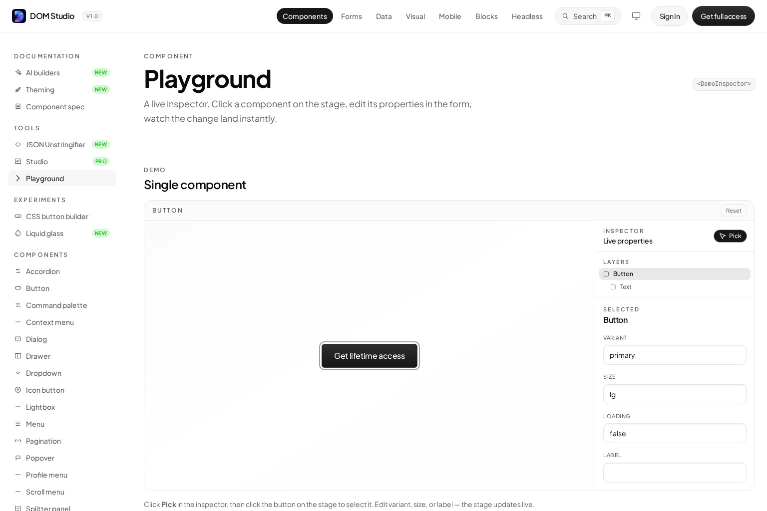
DOM Studio’s live component playground demonstrates the value of this workflow: select a component, change its properties, and see the preview update immediately.
Choose the pattern that matches the boundary
We can use these six patterns as a decision guide:
- Use props when the parent supplies data or configuration.
- Use events when the child reports an interaction or requested state change.
- Use slots when the parent needs to control markup inside a reusable layout.
- Use dynamic components when one region swaps between a known set of views.
- Use
v-modelcontracts for form inputs that need two-way coordination with parent state. - Use examples and metadata when a component will be used beyond the feature where it was created.
The same review applies whether we build from scratch or evaluate a UI system such as DOM Studio, Vuetify, PrimeVue, Ark UI, Nuxt UI, or shadcn-vue. We should favor components with transparent contracts, working examples, accessible behavior, and an ownership model that matches our team.
Build the next component with a testable contract
We now have a reusable badge, an action-emitting card, a slot-driven panel, dynamic views, a form field, and a documentation workflow. The most useful next action is to pick one repeated UI pattern in the product and rebuild it with one of these contracts.
Start with a small component that is easy to verify, then test it in a live environment such as the DOM Studio component playground. Once its props, events, and examples feel predictable, we can compose it into larger screens with much less duplication and fewer hidden dependencies.