
Typing a name into a Vue autocomplete should produce suggestions, while the browser may separately offer to fill a saved address. Those behaviours serve different purposes and need separate accessibility checks. A form can have a working dropdown and still leave someone using a screen reader without feedback.
Vue has been used to build web interfaces for years, and teams often implement autocomplete as a reusable form control. Treat it as a form-accessibility problem as well as a dropdown: browser autofill and interactive suggestions are distinct features, with different controls and failure modes.
Table of Contents
- Wire the Combobox Markup and ARIA Attributes
- Keep Vue State in Sync with v-model
- Filter, Debounce and Cancel Stale Requests
- Keyboard Navigation, Selection and Focus
- Autofill Tokens Alongside Suggestions
- Large Datasets and Remote Search Failure Modes
- Test the Component and Confirm Your Next Step
Wire the Combobox Markup and ARIA Attributes
A field can look like a search box while remaining silent to assistive technology. Give the editable input a visible label and combobox semantics, then connect it to the suggestion list and status message.
Attributes in template order
| Element | Attribute or role | Purpose |
|---|---|---|
| Text input | role="combobox" |
Marks the field as an editable combobox |
| Text input | aria-expanded |
true only while the suggestion list is open |
| Text input | aria-controls |
ID of the listbox element |
| Text input | aria-autocomplete="list" |
Indicates that suggestions come from a list |
| Text input | aria-activedescendant |
ID of the highlighted option, keeping DOM focus in the input |
| Text input | aria-describedby |
Links hint text and status message to the field |
| Suggestion list | role="listbox" |
Identifies the container for the options |
| Suggestion item | role="option" and aria-selected |
Identifies each suggestion and marks the highlighted one |
| Status region | aria-live="polite" |
Announces result counts, loading and no-results states |
Set aria-expanded from the list’s actual visibility, and make aria-controls reference the listbox’s ID. aria-autocomplete="list" describes the suggestion pattern; it does not replace a label or tell the user what to enter.
Keep DOM focus on the input as the highlighted suggestion changes. Set aria-activedescendant to the highlighted option’s ID, and remove it when no option is active. Generate stable option IDs with useId or a counter. IDs that change on each render can leave the input pointing to an option that no longer exists.
Give every suggestion role="option". Set aria-selected="true" on the active suggestion and false on the others. The live region should announce useful state changes, such as loading, the result count or no matches. Link the field’s hint with aria-describedby; avoid repeatedly announcing the same status on every keystroke.
Practical rule: Keep the list positioned so it does not obscure the field or nearby form content. The user must still be able to see and edit the input while suggestions are open.
Check the rendered attributes against the table. Tab should move through the form, not each suggestion. Highlighting an option is not the same as committing it, so the input’s value and the selected form value must remain distinct.
Keep Vue State in Sync with v-model
One ref that stores both the typed text and the submitted value is the bug I would fix first. The user picks a country, types one more letter, and the form still believes the old selection is valid, because the string and the id lived in the same place.
Give each piece of state one job.
- inputText: what the user has typed, including a half-finished query.
- selectedId: the committed identifier, empty until Enter, click, or touch confirms a row.
- selectedLabel: the text shown after that confirmation, which can differ from the id.
- results: the current suggestion list, replaced in full on every committed query.
- activeIndex: the highlighted row, reset to the first option whenever results change.
- status: loading, empty, or error, written into the live region.
Expose only the committed id through v-model. Emit update:modelValue with selectedId, or use defineModel from Vue 3.4 onward. The parent binds the identifier and never sees keystrokes. That split is the same contract described for controlled components: the parent owns the value, the field owns the editing.
A country field that stores a code
Say the form needs an ISO code. The user types “fr”, the list shows France, and Enter sets selectedId to FR while selectedLabel becomes “France”. The input displays the name. The payload sends the code.
Watch inputText. When the user edits after a choice, clear selectedId at once. Otherwise the form can submit a code whose label no longer matches the text. Replace results instead of appending, or rows from the previous query sit under the new ones. Reset activeIndex to the first option so the next ArrowDown does not land on an index that has gone.
Keep this in a small composable. You can assert the watch, the emit, and the reset without mounting a dropdown, which is the only way the logic stays honest once three people edit the component.
Filter, Debounce and Cancel Stale Requests
A postcode lookup that fires on every keystroke will show the wrong street. The response for “SW1” arrives after the response for “SW1A”, and the list paints the older addresses on top of the newer query.
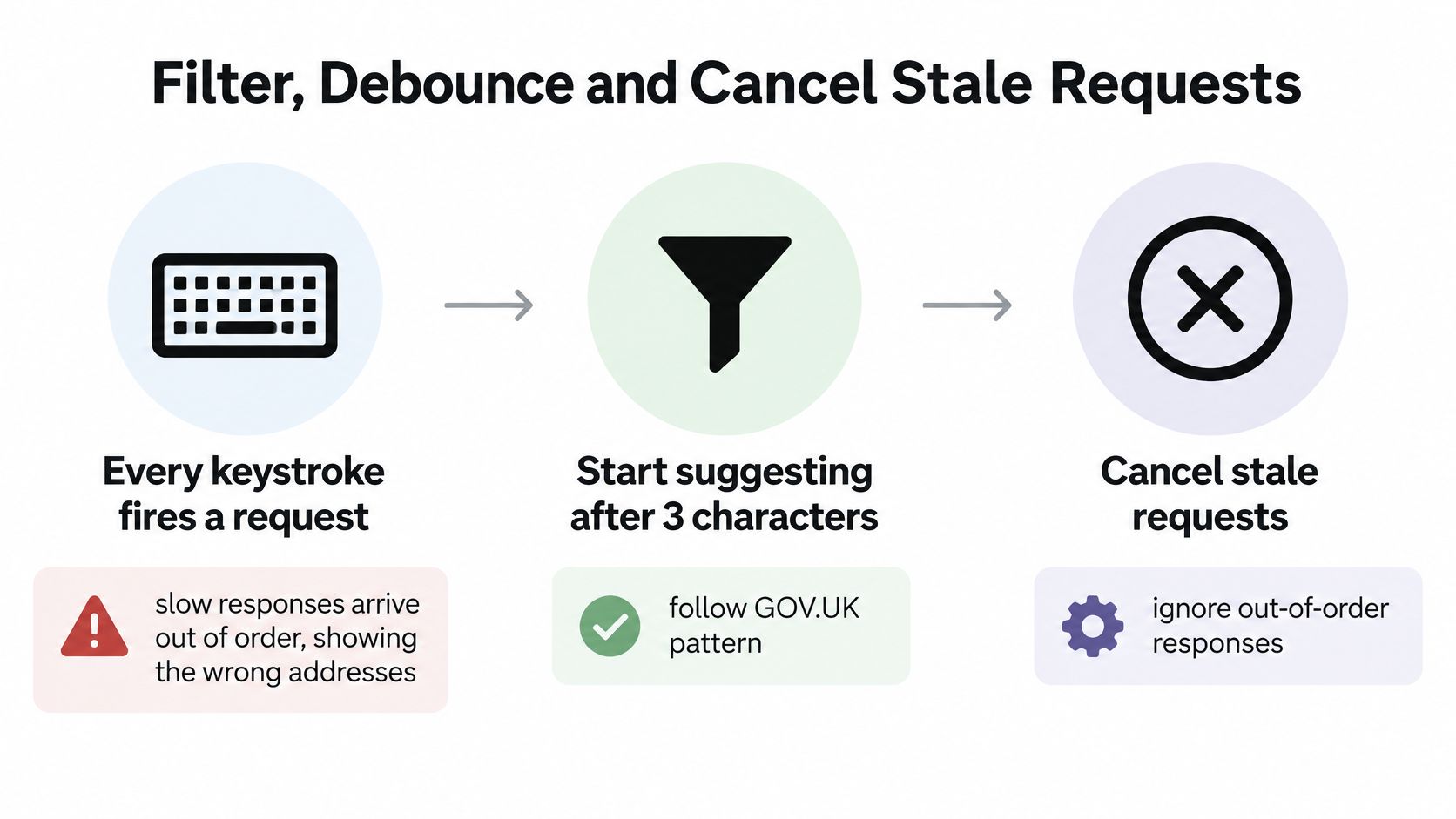
GOV.UK Search Autocomplete displays suggestions only after 3 characters and limits the dropdown to 5 suggestions, because relevance improves past that threshold and fewer options reduce cognitive load and scrolling. In 2024, GOV.UK reported that autocomplete suggestions were used in 55% of searches when suggestions were displayed. A short, checked list beats a long untrusted one. The same guidance warns against autocomplete unless the suggestions have been validated for relevance and factual correctness.
Six steps and why each one exists
- Trim and normalise the query, so stray spaces and a change of case do not start a second request for the same postcode.
- Debounce by 150 to 300 milliseconds, and I would ship 200 as the default, so a pause in typing triggers one request rather than one per letter.
- Attach an
AbortController, or a sequence number, so each in-flight call can be told apart when the next character arrives. - Discard any response older than the latest query, so a slow network cannot paint a stale street over a newer one.
- Render only suggestions that pass validation and match the typed prefix, with exact-prefix matches first, so a loosely related hit never outranks the obvious one.
- Commit the visible label and the underlying identifier separately, so the text on screen and the value in the form can differ without one overwriting the other.
Cap the rendered list at five high-confidence rows. When nothing matches, say so in the live region and offer ordinary search, so nobody is trapped in an empty popup. A fast empty result is still a result, and it still needs announcing.
Judge the field on suggestion acceptance, the zero-result rate, the stale-response rate, keyboard completion, and how long the task takes. Raw click-through does not prove the suggestions were right.
The abort point is easier to see when you watch the requests leave and come back.
Keyboard Navigation, Selection and Focus
Keyboard users judge this field by whether each key does exactly one predictable thing. If ArrowDown sometimes opens the list and sometimes commits a value, people stop trusting it.
| Key | List open | List closed |
|---|---|---|
| ArrowDown | Moves highlight to the next option, stopping or wrapping at the end | Opens the list if suggestions exist |
| ArrowUp | Moves highlight to the previous option, stopping or wrapping at the start | No action |
| Enter | Commits the highlighted option; submits the form if nothing is highlighted | Submits the form |
| Escape | Closes the list and keeps the typed text | Clears the typed text only if the component is set to do so |
| Tab | Closes the list and moves focus to the next field without selecting | Moves focus to the next field |
| Backspace | Edits the query and clears the committed ID | Edits the query and clears the committed ID |

What the table cannot show
Moving the highlight updates the active descendant and nothing else. The stored id stays put until Enter, click, or touch confirms a row. Teams blur that line, then wonder why a half-reviewed suggestion lands in the database.
Enter commits only when a row is highlighted. With nothing highlighted, Enter submits the form as it would on any other input. Escape closes the list and keeps whatever was typed. Tab closes the list and moves to the next field without selecting, which is how you avoid trapping people inside the popup. The same discipline shows up in a well-built accessible dropdown menu: one key, one outcome, and a way out that does not invent a selection.
After a mouse or touch choice, put focus back on the text field and announce the chosen label. If the user then presses Backspace or types further, clear the committed id and keep the text. The form must not hold a value the visible string no longer describes.
Unplug the mouse and run the whole flow. If you cannot open, move, commit, dismiss, and leave the field, the table is fiction.
Autofill Tokens Alongside Suggestions
A postcode field can offer address suggestions and still miss the browser’s saved postcode. These are separate behaviours: the autocomplete attribute identifies the kind of personal data a browser may fill, while a Vue combobox presents options generated by the application.
The Home Office forms guidance recommends valid autocomplete tokens for fields that collect a user’s own information. Use autocomplete="email" for an email field, autocomplete="postal-code" for a postcode, and autocomplete="username" for a sign-in name. Suggestions do not replace these tokens.
Both layers on one input
The browser’s saved-value UI and the application’s suggestion popup may appear alongside each other. Keep the typed value unchanged while a user moves through suggestions, and update it only after an explicit choice. For example, highlighting an organisation address should not replace the email already entered.
Use aria-describedby to connect the input to a concise hint, such as “A space in the postcode is optional.” That instruction is distinct from status messages about results. Test browser autofill and the interactive combobox separately; passing one test does not establish that the other works.
- Browser autofill: Check that saved email, postcode, and username values can be offered and accepted.
- Voice control: Confirm that the visible label identifies the field and that a row can be chosen.
- Focus changes: After a choice, focus remains on the input rather than disappearing into the list.
- Announcements: Check that result counts, loading and empty states, and the committed label are announced.
- Keyboard only: Disconnect the mouse and check that the field and its suggestions remain usable.
Large Datasets and Remote Search Failure Modes
A few hundred local items and a remote postcode search only look alike in the prototype. Local filtering is instant and complete. A product, address, or customer search arrives late, in pages, and sometimes in the wrong order.
| Dataset | Strategy | Watch for |
|---|---|---|
| A few hundred local items | Filter in a computed property, no network request | Highlight lost when the filtered list shrinks |
| Remote postcode or address search | Server query with AbortController and sequence check, cache recent queries | Out-of-order responses and repeated requests on mobile |
| Large product or customer catalogue | Server query with paged results and a mounted active option | Active option removed by virtual scrolling; more results not announced |
Where each strategy breaks
Filter a small local list in a computed property and skip the network. The trap is the highlight. When the filtered list shrinks, an index that pointed at row four now points at nothing. Keep the active position by option id, not by index.
Remote search needs the cancellation and sequence check, plus two extras. Cache recent queries for the session so backspacing does not refetch the same postcode, and pause requests while input is still rapid. Mobile users pay for every repeat over a variable network. CoreUI’s Vue autocomplete notes treat virtual scrolling and server filtering as performance options. They don’t, on their own, keep loading and empty states announced, or stop pagination from dropping the active option.
For a large catalogue, page the results and show a clear count plus a load-more control. Infinite scroll that swaps DOM nodes under a held highlight will strand aria-activedescendant on an id that is no longer mounted. Virtualisation has the same limit. The active option must stay in the DOM, and the user must be told that more results exist. The same care with identity shows up in business name matching logic explained, where a displayed label and the record behind it are not interchangeable.
Static accessibility checks pass on a fixture with no delay. Add several hundred milliseconds of artificial latency and run the three rows of the table again. That is where out-of-order responses, a lost highlight, and a silent empty state show up.
Test the Component and Confirm Your Next Step
A search field can look complete while keyboard users cannot select a result or recover focus. Test autocomplete as part of the form: the input label, browser autofill, suggestions, announcements, and selection each need to work together.
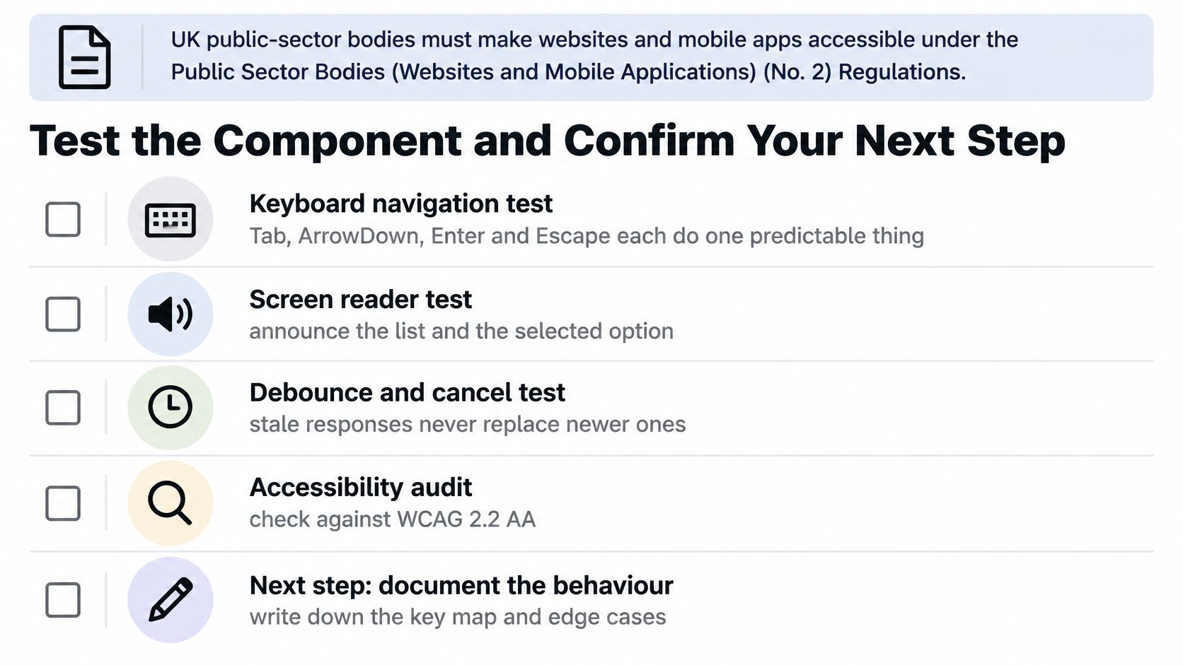
The UK Ministry of Justice Design System documents input details such as using the autocomplete attribute for purposes like postal-code and username, and aria-describedby for additional screen-reader information. Check these on the built field, not just in the design.
- Visible label: the input has a visible label, not only a placeholder.
- Focus: the input and each option show a visible focus indicator.
- Announcements: counts, loading states, and no-results messages are announced, not only displayed.
- Keys: each key behaves as specified in the keyboard interaction.
- Selection: choosing an option restores focus to the input and communicates the selected label.
- Autofill: personal-data fields use appropriate autocomplete tokens; test browser autofill separately from interactive suggestions.
- Slow network: an older response never replaces a newer one.
- Keyboard only: the complete flow works without a mouse.
Run the checklist as part of component testing before release, then record failures and retest them. The accessibility statement should describe the behaviour that ships. DOM Studio’s Vue component library is installed from @getdom/studio, and the package can be added to a Vue or HTML app. A library does not replace testing the form in its actual context.
DOM Studio provides Vue components with v-model support and built-in keyboard handling. If you are choosing a component for a search field, check that its behaviour fits the form and the tests above. Visit DOM Studio to explore its Vue components and documentation.