
A Vue app layout should give every route a predictable place to render, keep navigation stable, and adapt cleanly from desktop to mobile. In this guide, we will build a Vue 3 dashboard shell with a persistent sidebar, a sticky workspace header, independently scrolling content, and nested routes.
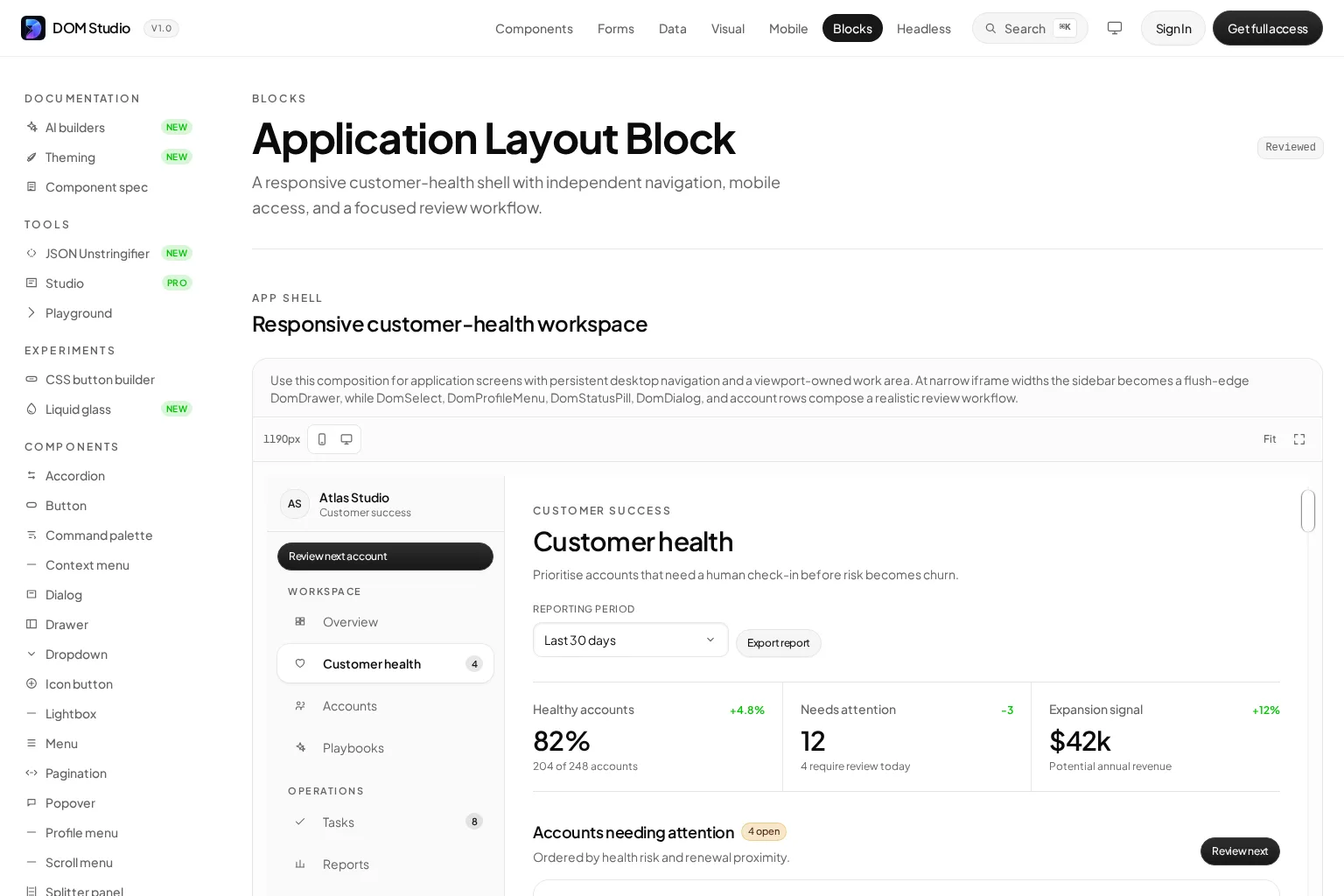
We will use plain Vue and Vue Router so the architecture works with Tailwind, CSS Modules, or a component system. The same layout pattern also works with UI libraries such as Vuetify and PrimeVue. If we want editable, production-oriented primitives rather than a blank starting point, DOM Studio provides an Application Layout block that demonstrates this kind of persistent-navigation shell.

Table of contents
Before you start
We need:
-
Vue 3 with Vue Router installed
-
A Vite-based Vue project, or an equivalent Vue 3 setup
-
At least two child pages, such as
OverviewPage.vueandProjectsPage.vue -
A place for global CSS, such as
src/assets/main.css
The finished structure will look like this:
src/
  layouts/
    AppLayout.vue
  pages/
    OverviewPage.vue
    ProjectsPage.vue
    SettingsPage.vue
  router/
    index.ts
1. Define the layout contract before styling
Start by separating what belongs to the shell from what belongs to a route page. Our shell owns global navigation, the workspace header, mobile navigation state, and the outlet for child pages. Each route page owns its own page title, filters, tables, forms, and loading states.
This division prevents a common failure mode: copying the sidebar and header into every page, then trying to synchronize them later. Vue Router supports nesting a RouterView inside a parent route component, which maps naturally to this parent-shell and child-page relationship.
Expected result: we can name one component, AppLayout.vue, that renders the shared chrome exactly once.
Troubleshooting: if a page needs a radically different frame, such as sign-in or checkout, make it a separate top-level route instead of adding conditionals throughout the authenticated shell.
2. Build the desktop Vue app layout shell
Create src/layouts/AppLayout.vue. The important details are minmax(0, 1fr), which lets the main column shrink without overflowing, and a fixed-height grid, which lets the workspace scroll independently from navigation.
<script setup lang="ts">
import { onBeforeUnmount, onMounted, ref, watch } from 'vue'
import { RouterLink, RouterView, useRoute } from 'vue-router'

const route = useRoute()
const sidebarOpen = ref(false)

const navigation = [
  { label: 'Overview', to: '/' },
  { label: 'Projects', to: '/projects' },
  { label: 'Settings', to: '/settings' },
]

function closeSidebar() {
  sidebarOpen.value = false
}

function handleKeydown(event: KeyboardEvent) {
  if (event.key === 'Escape') closeSidebar()
}

watch(
  () => route.fullPath,
  () => closeSidebar(),
)

onMounted(() => window.addEventListener('keydown', handleKeydown))
onBeforeUnmount(() => window.removeEventListener('keydown', handleKeydown))
</script>

<template>
  <div class="app-shell">
    <button
      v-if="sidebarOpen"
      class="app-shell__backdrop"
      type="button"
      aria-label="Close navigation"
      @click="closeSidebar"
    />

    <aside
      id="primary-navigation"
      class="app-sidebar"
      :class="{ 'app-sidebar--open': sidebarOpen }"
    >
      <div class="app-sidebar__brand">Atlas</div>

      <nav aria-label="Primary navigation" class="app-sidebar__nav">
        <RouterLink
          v-for="item in navigation"
          :key="item.to"
          :to="item.to"
          class="app-sidebar__link"
        >
          {{ item.label }}
        </RouterLink>
      </nav>
    </aside>

    <section class="app-workspace">
      <header class="app-workspace__header">
        <button
          class="app-workspace__menu-button"
          type="button"
          aria-controls="primary-navigation"
          :aria-expanded="sidebarOpen"
          @click="sidebarOpen = !sidebarOpen"
        >
          Menu
        </button>
        <p class="app-workspace__context">Workspace</p>
      </header>

      <main class="app-workspace__content">
        <RouterView />
      </main>
    </section>
  </div>
</template>
Add the CSS below to your global stylesheet.
:root {
  font-family: Inter, ui-sans-serif, system-ui, sans-serif;
  color: #172033;
  background: #f6f7fb;
}

* { box-sizing: border-box; }
body { margin: 0; }
button { font: inherit; }

.app-shell {
  display: grid;
  grid-template-columns: 16rem minmax(0, 1fr);
  height: 100dvh;
  overflow: hidden;
}

.app-sidebar {
  position: sticky;
  top: 0;
  height: 100dvh;
  overflow-y: auto;
  padding: 1.25rem;
  background: #111827;
  color: #fff;
}

.app-sidebar__brand {
  margin-bottom: 2rem;
  font-weight: 800;
  letter-spacing: 0.03em;
}

.app-sidebar__nav {
  display: grid;
  gap: 0.4rem;
}

.app-sidebar__link {
  border-radius: 0.65rem;
  padding: 0.7rem 0.8rem;
  color: #cbd5e1;
  text-decoration: none;
}

.app-sidebar__link:hover,
.app-sidebar__link.router-link-exact-active {
  background: #263247;
  color: #fff;
}

.app-workspace {
  min-width: 0;
  min-height: 0;
  overflow-y: auto;
  background: #f6f7fb;
}

.app-workspace__header {
  position: sticky;
  top: 0;
  z-index: 10;
  display: flex;
  align-items: center;
  min-height: 4rem;
  padding: 0 1.5rem;
  border-bottom: 1px solid #e2e8f0;
  background: rgb(246 247 251 / 0.92);
  backdrop-filter: blur(12px);
}

.app-workspace__context { margin: 0; font-weight: 700; }
.app-workspace__content { padding: 1.5rem; }
.app-workspace__menu-button { display: none; }
.app-shell__backdrop { display: none; }

@media (max-width: 768px) {
  .app-shell { display: block; }

  .app-sidebar {
    position: fixed;
    z-index: 30;
    width: min(18rem, 86vw);
    transform: translateX(-105%);
    transition: transform 180ms ease;
    box-shadow: 1rem 0 3rem rgb(15 23 42 / 0.2);
  }

  .app-sidebar--open { transform: translateX(0); }

  .app-shell__backdrop {
    position: fixed;
    z-index: 20;
    inset: 0;
    display: block;
    border: 0;
    background: rgb(15 23 42 / 0.45);
  }

  .app-workspace__header { padding: 0 1rem; gap: 0.75rem; }
  .app-workspace__content { padding: 1rem; }

  .app-workspace__menu-button {
    display: inline-flex;
    border: 1px solid #cbd5e1;
    border-radius: 0.5rem;
    padding: 0.45rem 0.65rem;
    background: #fff;
    color: #172033;
  }
}
Expected result: on desktop, the sidebar stays visible while only the right-side workspace scrolls. The header remains visible during long-page scrolling.
Troubleshooting: if horizontal overflow appears, check that the grid’s second column is minmax(0, 1fr) and that .app-workspace has min-width: 0. Those two declarations resolve most long-table and wide-card overflow issues.
3. Render pages inside the layout with nested routes
Next, register AppLayout.vue as the parent route. Child routes render in the layout’s RouterView, so navigation changes the workspace content without recreating the sidebar.
import { createRouter, createWebHistory } from 'vue-router'
import AppLayout from '@/layouts/AppLayout.vue'

const router = createRouter({
  history: createWebHistory(),
  routes: [
    {
      path: '/',
      component: AppLayout,
      children: [
        {
          path: '',
          name: 'overview',
          component: () => import('@/pages/OverviewPage.vue'),
        },
        {
          path: 'projects',
          name: 'projects',
          component: () => import('@/pages/ProjectsPage.vue'),
        },
        {
          path: 'settings',
          name: 'settings',
          component: () => import('@/pages/SettingsPage.vue'),
        },
      ],
    },
  ],
})

export default router
Create a minimal page to verify the outlet:
<template>
  <section>
    <p class="eyebrow">Overview</p>
    <h1>Customer health</h1>
    <p>Route content now renders inside the shared workspace.</p>
  </section>
</template>
Expected result: /, /projects, and /settings all retain the same sidebar and workspace header while rendering different page content.
Troubleshooting: if the shell renders but the page area is blank, confirm that AppLayout.vue contains <RouterView /> and that the default child route uses path: '', not path: '/'.
For a focused walkthrough of this router pattern, watch the nested-routes video below.
4. Make the mobile navigation practical, not merely smaller
A desktop sidebar should not just shrink until it becomes unusable. At the 768px breakpoint, our CSS changes it into an off-canvas panel. The menu button controls the panel, the backdrop closes it, and the Escape key provides a fast keyboard exit.
Before shipping, test these behaviors:
-
Tab to the Menu button and open the panel with the keyboard.
-
Verify
aria-expandedchanges fromfalsetotrue. -
Press Escape and confirm the drawer closes.
-
Follow a navigation link and confirm the drawer closes after the route changes.
-
Test a narrow viewport with a long navigation list.
For a more advanced application, move focus into the drawer when it opens and restore focus to the Menu button when it closes. That is especially valuable when the drawer contains many focusable controls.
Expected result: content stays readable at small widths, the workspace does not shift unpredictably, and users can dismiss navigation without relying on a pointer.

5. Keep layout state small and route content independent
The shell should manage only shell-level concerns: whether mobile navigation is open, which global notifications are visible, or whether a global command palette is active. Do not store page-specific filters, form values, or data-fetching results in the layout just because it is a common ancestor.
When a page needs persistent local UI, keep it in that route page or a page-level composable. If we deliberately cache dynamic route views, Vue’s <KeepAlive> can preserve inactive component instances, but we should apply it only after confirming that preserving page state is the desired behavior.
Expected result: visiting /projects does not accidentally change the data or controls on /settings, and the layout remains easy to test.
Troubleshooting: if one page appears to leak state into another, inspect shared stores and composables first. A route layout is not automatically the right place for global state.
6. Add reusable primitives without losing layout ownership
Once the shell works with plain HTML, introduce components for repeated UI patterns. We still want the layout to own its grid, scrolling behavior, and breakpoints. Components should make the interior more consistent, not hide the page structure.
For example, DOM Studio’s Button component supports semantic visual variants and can render as a link when needed. Its Playground also demonstrates inspecting live component properties and composing nested UI. Use components such as cards, dropdowns, dialogs, and form fields inside the workspace while keeping the layout shell explicit.
For settings pages, use a native select when platform-native picker behavior or broad compatibility is specifically valuable. For richer app choices that need descriptions, avatars, counts, or status metadata, choose a richer select or combobox pattern instead.
This approach is useful whether we are standardizing on DOM Studio, adopting an established component library, or maintaining a small in-house design system.
Expected result: the app feels consistent, while an engineer can still identify where navigation, scrolling, and responsive behavior are defined.
7. Verify the finished Vue app layout
Run this final check before merging:
-
Desktop navigation stays visible and is independently scrollable when needed.
-
The main workspace is the only long-scrolling region.
-
The sticky workspace header does not cover focused fields or anchor targets.
-
Each child route appears inside
AppLayout.vue. -
Active navigation styling follows the current route.
-
At narrow widths, the sidebar becomes a dismissible drawer.
-
Keyboard users can open and close the drawer.
-
Long tables, code blocks, and cards do not cause horizontal page overflow.
The completed result is a reusable Vue app layout that gives every authenticated route a stable home without duplicating UI chrome. Our most useful next step is to swap the placeholder route content for real pages, then build the first production screen against the shared shell. If you want a faster starting point, review DOM Studio’s Application Layout block and adapt its component composition to your project.