
You’re probably dealing with this already. The tabs work in Storybook, the ARIA attributes look right, and keyboard access seems fine until the component lands inside a real app with a sticky header, a cookie banner, a floating chat launcher, and a responsive layout that shifts under zoom.
That’s where most tab navigation guidance stops being useful. Production interfaces don’t fail because developers forgot the Tab key exists. They fail because focus moves somewhere the user can’t see, arrow-key behaviour breaks once the tab list overflows, or a custom component library makes every team re-solve the same focus problems by hand.
Table of Contents
- The Hidden Focus Problem in Modern Interfaces
- Anatomy of an Accessible Tab Component
- Implementing Tabs with DOM Studio Vue Wrappers
- Handling Responsive and Scrollable Tab Layouts
- Testing Keyboard Interactions and Focus Visibility
- Migrating to Headless Primitives and Next Steps
The Hidden Focus Problem in Modern Interfaces
Most tab navigation tutorials assume a clean viewport. Real products rarely have one. You tab onto a control, the browser technically focuses it, and the focused element sits under a sticky bar or behind a floating widget. From the browser’s perspective, nothing is wrong. From the user’s perspective, focus has vanished.

That failure shows up more often than many teams expect. A UK accessibility audit notes that modern UI chrome such as sticky headers, chat widgets, cookie banners, carousels, and back-to-top controls can obscure the focused element, and the same audit reports missing skip-navigation links on 61.3% of pages tested (UK accessibility audit report). Keyboard users still get forced through repeated navigation, then hit focus states that are reachable but not clearly visible.
Tabbable is not the same as usable
A control can be in the tab order and still be a bad experience. That distinction matters.
When I review tab navigation in production apps, I look for three separate guarantees:
- Reachability: Can the user get to every interactive control with Tab and reverse with Shift+Tab?
- Visibility: Is the focused element visible, not clipped, covered, or scrolled halfway out of frame?
- Predictability: Does focus move in a way the user can anticipate from the visual layout?
UK public-sector guidance treats keyboard movement as a baseline requirement. Users should be able to use Tab to move through links and controls, Shift+Tab to reverse, and the sequence should follow the visual order from left to right and top to bottom (Home Office accessibility standard).
Practical rule: If a keyboard user has to hunt for the focus ring, your tab navigation is broken even when the DOM says it isn’t.
What fixes this in component systems
The reliable fix isn’t “add more tabindex values”. That usually makes things worse. Positive tabindex creates a second navigation system that fights the document order.
What works is boring and robust:
- Keep DOM order aligned with visual order.
- Let native focus move naturally where possible.
- Use roving tabindex only inside composite widgets such as tabs.
- On focus, ensure the active control scrolls into view within its nearest scroll container.
- Reserve space and z-index rules so sticky UI doesn’t sit on top of focus targets.
If your team is standardising accessible components, it helps to use headless primitives that already model these rules instead of rewriting them in every feature branch. The broader patterns behind that approach line up with modern accessibility best practices for production UI systems.
Anatomy of an Accessible Tab Component
Tabs are a composite widget. Treat them like a row of ordinary buttons and you’ll usually end up with a noisy tab sequence, inconsistent announcements, and too many edge cases around selection versus focus.
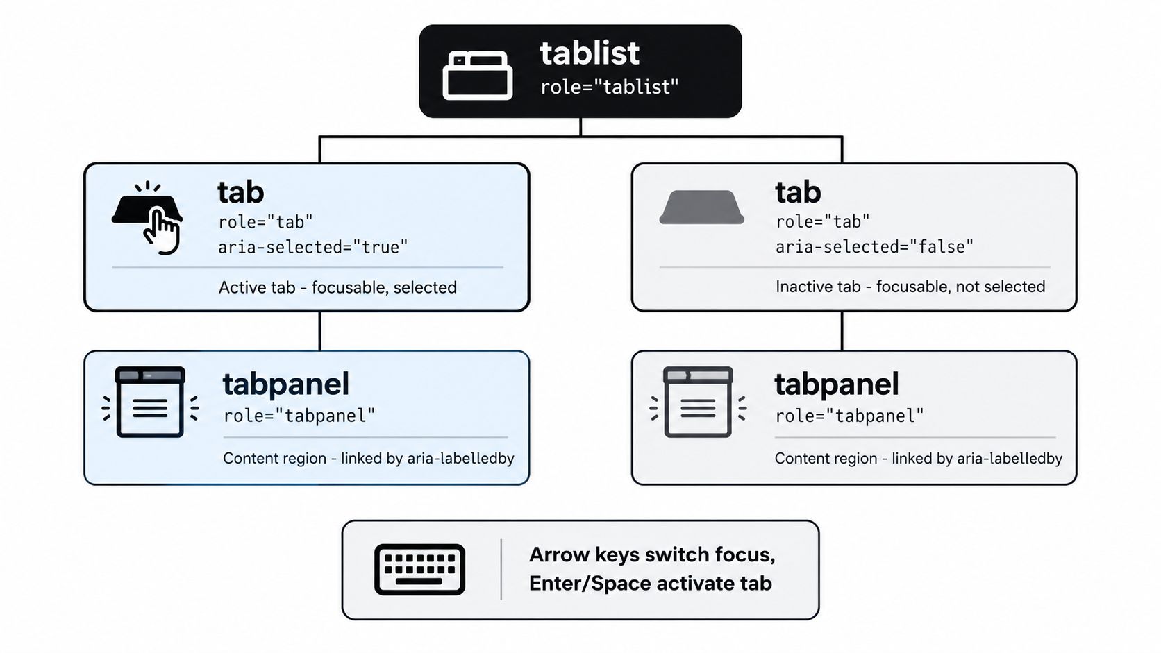
The semantic contract
An accessible tab set needs a small but strict contract between three parts:
| Element | Role | Purpose |
|---|---|---|
| Tab container | tablist |
Groups the available tabs |
| Each trigger | tab |
Represents one selectable tab |
| Each content area | tabpanel |
Holds the content associated with the active tab |
The state and relationship attributes matter just as much as the roles:
aria-selectedtells assistive tech which tab is active.aria-controlslinks a tab to its panel.aria-labelledbyon the panel points back to the controlling tab.tabindexdetermines which tab is in the keyboard sequence at a given moment.
A common mistake is making every tab trigger tabbable all the time. That turns a simple tab set into a long keyboard detour. Users should be able to enter the widget, move within it efficiently, and leave it without stepping through every sibling first.
The single-focus-target pattern
UK design guidance for tabbed interfaces recommends a smarter pattern. Focus lands on the tab bar once, then users move between tabs with arrow keys, activate with Space or Enter, and jump to the first or last tab with Home and End (Intelligence Community Design System tabs guidance).
That pattern matters for two reasons.
First, it reduces tab-stop bloat. A tab row with six items shouldn’t require six separate Tab presses just to move past it.
Second, it separates focus movement from selection state. In a good implementation, the keyboard user can explore the tab options with arrow keys, and your component can decide whether focus also activates the panel immediately or waits for Enter or Space.
Good tabs feel closer to a radio group with content regions than a row of unrelated buttons.
What naïve implementations get wrong
You’ll see the same problems repeatedly in custom tab components:
- Every tab in the Tab order: Users get trapped in unnecessary repetition.
- Hidden panels left focusable: Keyboard users tab into content that isn’t visible.
- Selection without linkage: The active tab changes visually, but screen readers don’t get the right relationships.
- Manual IDs everywhere: Teams duplicate ARIA wiring by hand and introduce mismatches during refactors.
The fix is to think in terms of a composite widget, not isolated controls. Once you do that, the DOM structure becomes simpler. One active tab is tabbable. Siblings are arrow-navigable. One panel is shown. The others are removed from interaction in a way that matches your rendering strategy.
Implementing Tabs with DOM Studio Vue Wrappers
If you’ve built tabs from scratch in Vue, you know where the code starts to sprawl. A simple visual component turns into ID generation, selected-state syncing, arrow-key handlers, panel registration, and edge cases around focus when tabs mount or unmount.
A headless primitive approach removes most of that glue code. The primitive owns behaviour and relationships. The Vue wrapper exposes them through props, slots, and model binding that fit naturally into app code.
Start with state, not markup tricks
The first decision is whether your tab set is controlled or uncontrolled.
For app-level state, a controlled pattern is usually cleaner:
<script setup>
import { ref } from 'vue'
import { TabsRoot, TabsList, TabsTab, TabsPanel } from '@domstudio/vue'

const activeTab = ref('billing')
</script>

<template>
  <TabsRoot v-model="activeTab" activation="manual">
    <TabsList class="flex gap-2 border-b">
      <TabsTab value="overview" v-slot="{ selected, focused }">
        <button
          class="px-4 py-2"
          :class="selected ? 'border-b-2 font-medium' : 'text-slate-600'"
          :data-focused="focused || undefined"
        >
          Overview
        </button>
      </TabsTab>

      <TabsTab value="billing" v-slot="{ selected }">
        <button
          class="px-4 py-2"
          :class="selected ? 'border-b-2 font-medium' : 'text-slate-600'"
        >
          Billing
        </button>
      </TabsTab>
    </TabsList>

    <TabsPanel value="overview">
      <section>Overview content</section>
    </TabsPanel>

    <TabsPanel value="billing">
      <section>Billing content</section>
    </TabsPanel>
  </TabsRoot>
</template>
The important part isn’t the styling. It’s that the wrapper can keep the ARIA relationships, roving tabindex, and keyboard behaviour in sync with your Vue state.
Why wrappers help in real teams
In practice, Vue teams don’t struggle with rendering tabs. They struggle with keeping behaviour consistent across dozens of variants.
A thin wrapper helps because it gives you:
- Reactive selection state:
v-modelkeeps the active tab aligned with route state, filters, or persisted preferences. - Scoped slot signals: You can style
selected,focused, ordisabledstates without re-implementing interaction logic. - Stable panel linkage: The primitive handles trigger-to-panel relationships so refactors don’t break announcements.
- Framework-friendly composition: You can place custom content inside the visual button while preserving the widget behaviour underneath.
One option in this category is DOM Studio tabs, which expose headless tab primitives with Vue wrappers. That setup is useful when you want standards-based behaviour without hand-authoring every ARIA and keyboard interaction.
A pattern that survives design changes
Teams often paint themselves into a corner by binding behaviour to a very specific HTML shape. Then design asks for icons, badges, counters, or horizontally scrollable triggers, and the whole thing gets rewritten.
A better structure keeps a narrow contract:
- Root manages value and activation mode
- List manages composite keyboard behaviour
- Tab trigger exposes state for styling
- Panel renders content for the current value
That contract survives redesigns because the behaviour layer doesn’t care whether the tab trigger contains text only or an icon, label, and status pill.
Implementation note: The less ARIA you write by hand in app code, the fewer regressions you create during UI refreshes.
For styling, keep the focus ring on the actual interactive element, not an outer wrapper that may get clipped. If you’re using Tailwind CSS 4 or a visual theming layer, define focus tokens once and apply them consistently to the tab trigger primitive. That gives your design system room to evolve without rewriting keyboard behaviour each time the visual spec changes.
Handling Responsive and Scrollable Tab Layouts
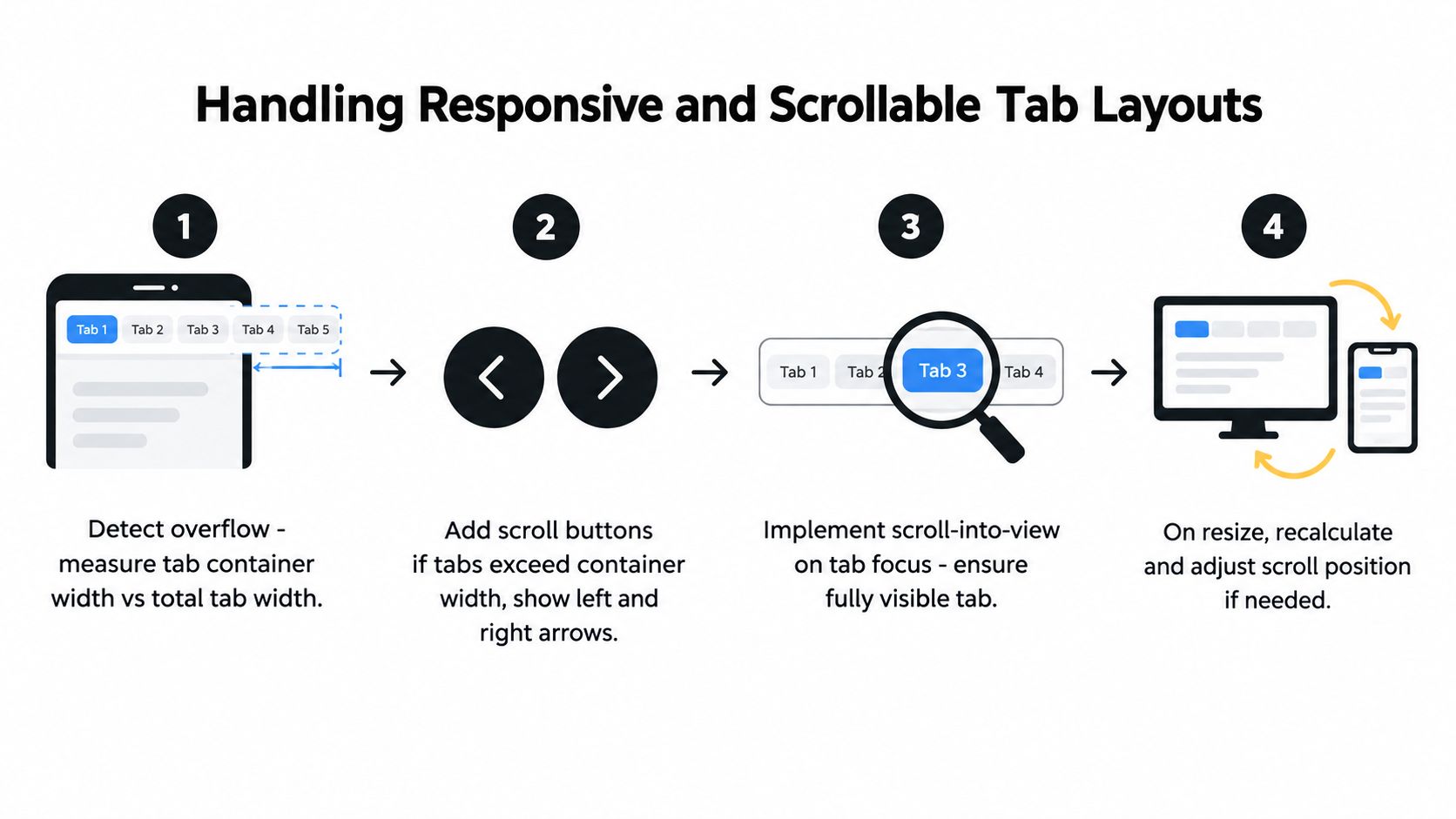
Tabbed interfaces often break the moment the tab list gets wider than the viewport. On desktop, the row fits. On mobile, half the labels disappear, someone adds overflow-x-auto, and the keyboard experience degrades.
Scrolling must follow focus
The first rule is simple. If arrow-key movement changes which tab is focused, the newly focused tab must scroll fully into view inside the tab strip.
Without that, a keyboard user can move focus onto an off-screen tab and lose orientation immediately. The browser won’t always fix this for you, especially inside nested overflow containers.
A practical implementation usually does this on each focus change:
- Find the active tab element
- Find the nearest horizontal scroll container
- Compare the tab’s bounds with the container’s visible bounds
- Adjust
scrollLeftenough to reveal the whole trigger - Preserve the natural arrow-key behaviour while scrolling
Roving tabindex in dense layouts
Scrollable tabs are exactly where roving tabindex earns its keep. One tab is tabbable. The rest are reachable with arrow keys. That keeps the document-level tab order short even when the component contains many options.
Here’s the trade-off:
| Approach | Works well | Breaks down |
|---|---|---|
| Every tab tabbable | Small static tab sets | Long rows, mobile overflow, repetitive tabbing |
| Roving tabindex | Composite widgets, scrollable tab bars | Poorly implemented focus syncing |
| Positive tabindex ordering | Almost never | Maintenance, unpredictability, keyboard confusion |
For dense component libraries, roving tabindex is usually the right default for tabs. It keeps keyboard interaction local to the widget instead of polluting the whole page order.
Responsive behaviour under zoom and layout shifts
A lot of teams test responsive behaviour at narrow widths but forget browser zoom. That’s where sticky headers get taller, labels wrap, and scroll buttons overlap the focus ring.
The safer patterns are:
- Keep scroll buttons outside the trigger hit area: Don’t let overlay controls hide focused tabs.
- Avoid clipping focus outlines: Use padding or outline offsets so the ring stays visible.
- Recalculate on resize and content changes: Font loading, translated labels, and dynamic badges can change widths after initial render.
- Degrade cleanly in virtualised or AI-edited layouts: If a system can’t guarantee stable left-right movement, simplify interaction rather than pretending the full pattern still works.
UK public-sector monitoring increasingly checks keyboard access in more complex flows, including carousels, modals, and authentication journeys, and GOV.UK documents a keyboard-access issue in a carousel that couldn’t be closed with standard keyboard shortcuts (GOV.UK ID Check app accessibility statement). The lesson carries over to tabs. Once a component starts scrolling, collapsing, or rendering conditionally, you need interaction rules that still make sense when the UI gets crowded.
Testing Keyboard Interactions and Focus Visibility
A quick manual Tab test catches obvious failures. It doesn’t catch enough of them. Tabs can look fine in a local build and still fail once you add zoom, sticky UI, browser extensions, or a screen reader into the mix.
What manual testing should include
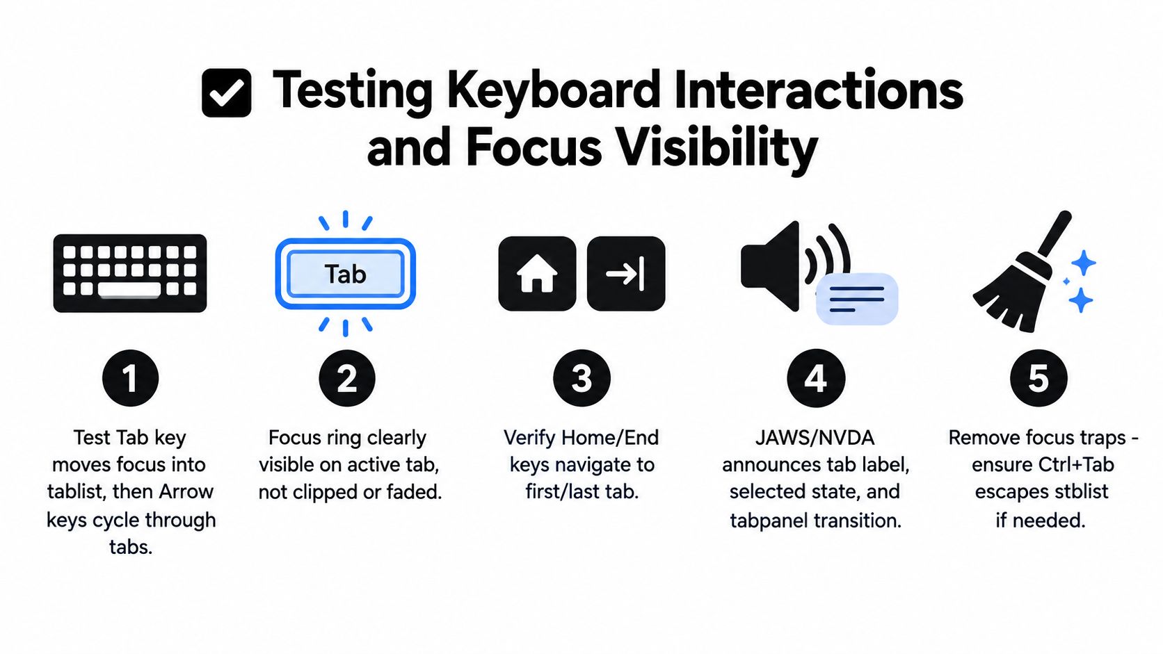
For government services in the UK, keyboard testing is a formal quality check. NHS guidance says testing should confirm you can tab to all links, buttons, and form controls, can’t tab to non-functional elements, don’t get trapped in hidden or scripted elements, and that tabbing follows the visual order from left to right and top to bottom (NHS accessibility testing guidance).
That’s a strong baseline for product teams too. For tabs, manual checks should include:
- Entry and exit: Tab into the widget once, move within it, then Tab out without getting stuck.
- Reverse movement: Shift+Tab should behave logically when leaving and re-entering the component.
- Arrow-key behaviour: Left and Right Arrow should move as your component pattern defines.
- Selection model: Verify whether focus automatically activates panels or waits for Enter or Space.
- Hidden content: Inactive panels must not leak focusable descendants into the keyboard path.
What automation can and can’t prove
Automation is useful, but it has a ceiling.
Automated checks are good at flagging missing roles, broken relationships, duplicate IDs, and obvious visibility issues. They’re not good at judging whether a sticky toolbar hides the focus ring at a particular zoom level, or whether a scrollable tab strip keeps the active item visible while arrowing across it.
That means the most reliable workflow is mixed:
- Run automated accessibility checks in CI.
- Do manual keyboard testing in the browser.
- Repeat at multiple zoom levels.
- Repeat with any persistent UI chrome enabled.
- Spot-check with a screen reader before release.
A related pattern shows up in other composite widgets too. If your team also builds menus and popovers, the same focus-discipline issues appear in an accessible dropdown menu pattern.
Before release, it helps to watch a full keyboard testing walkthrough and compare your own checks against a real interaction sequence.
If a test plan only says “Tab through the component”, it’s too shallow for modern UI.
A release checklist that catches real regressions
Use a short gate before shipping:
- Focus is always visible: No clipping, overlap, or hidden active states.
- Logical order holds under responsive layouts: Especially after wrapping, overflow, or conditional rendering.
- No keyboard traps: Users can always leave the tab set and any related overlays.
- Home and End behave consistently: If your tab pattern supports them, they should always work.
- Panel content matches selected state: Screen reader announcements and visible content should stay aligned.
Migrating to Headless Primitives and Next Steps
Legacy tab components usually carry a lot of hidden cost. The visual layer seems simple, but the implementation accumulates one-off fixes for focus bugs, custom key handlers, route syncing, disabled states, and responsive overflow behaviour.
That’s why migration pays off even when the existing component “mostly works”. You’re not just swapping markup. You’re removing duplicated interaction logic from every product surface that uses tabs.
A practical migration path
Refactoring goes more smoothly when you separate concerns first.
Start by identifying what your current component is responsible for:
| Responsibility | Keep in app code | Move to primitive layer |
|---|---|---|
| Visual styling | Yes | No |
| Active value state | Usually yes | Sometimes |
| Keyboard interactions | No | Yes |
| ARIA relationships | No | Yes |
| Focus movement rules | No | Yes |
Once that boundary is clear, migration becomes incremental instead of disruptive.
A sensible order is:
- Wrap existing visuals first: Keep your current classes and slot content.
- Replace keyboard logic next: Remove bespoke arrow-key handlers and tabindex bookkeeping.
- Move panel linkage into the primitive layer: Many legacy bugs hide.
- Test under real layout pressure: Sticky headers, small screens, zoom, and embedded app shells.
Why this approach holds up better
Headless primitives give teams a stable behaviour layer that doesn’t depend on one framework’s component internals. That matters if your design system spans multiple apps or if AI-generated UI needs to remain inspectable after the first pass.
The operational benefit is straightforward. Fewer hand-written accessibility rules in feature code means fewer regressions during redesigns, theme work, and content changes. It also gives design and engineering a cleaner contract. Designers can iterate on the trigger appearance, spacing, and motion, while the primitive preserves the keyboard model underneath.
There’s a bundle-size angle too. DOM Studio’s individual modules average under 2 kb gzipped, which makes it realistic to standardise primitives without dragging in a heavy UI runtime. Small, tree-shakeable behaviour units are easier to adopt across a large Vue codebase than a monolithic component stack.
For teams rebuilding custom tabs yet again, that trade is usually worth taking. You keep control of markup and styling, but you stop treating keyboard behaviour as bespoke app logic.
DOM Studio gives teams headless UI primitives, Vue wrappers, and embedded component specs that make tab navigation easier to ship without re-implementing focus management every time. If you want accessible tabs that hold up in responsive, AI-editable interfaces, visit DOM Studio.