
You’ve built a pricing or admin table that looks tidy on a wide monitor. Then someone opens it on a phone, the columns collapse into unreadable fragments, and a screen reader announces a stream of values without explaining which heading belongs to which cell. Adding a darker header or a few borders won’t fix that problem.
To style a table properly, start with meaning, then add visual treatment. Semantic HTML gives browsers and assistive technologies the relationships they need. CSS and Tailwind CSS 4 can then handle spacing, colour, alignment, responsive behaviour and interaction without disguising the data structure.
The UK public sector offers a useful quality baseline. Home Office guidance treats tables as structured data for assistive technologies, not as decorative grids or page-layout tools, while GOV.UK guidance stresses simple markup, descriptive headers and a logical reading order. Those rules apply just as well to a Vue dashboard, SaaS comparison screen or internal reporting tool.
This guide follows the workflow that works in production: build the semantic skeleton, apply restrained CSS, translate the pattern into Tailwind CSS 4, choose a mobile strategy deliberately, and test the result with keyboard navigation, magnification and screen readers. The examples are intentionally practical, because a table that only works in a design file isn’t finished.
Table of Contents
- Introduction to Styling Tables That Actually Work
- Build the Semantic Foundation Before You Add Style
- Core CSS Techniques for Clean Readable Tables
- Responsive Table Patterns With Tailwind CSS 4
- Accessibility Performance and Production Polish
- Putting It All Together for Production Apps
Introduction to Styling Tables That Actually Work
A table usually starts life as a data problem. A product manager asks for plans, limits and prices in one view. An analyst wants users to compare account activity. A service team needs a report with statuses, dates and totals. The first implementation often looks acceptable because desktop browsers provide a great deal of default table behaviour for free.
The trouble begins when visual styling takes priority over relationships. A developer may use a table for page layout because its columns line up conveniently, or replace header cells with ordinary div elements to make a card layout easier. The result can still look polished while losing the information that tells a screen reader how rows and columns relate.
Practical rule: A table’s visual grid should express its data model, not substitute for one.
The Home Office’s guidance on accessible table structure establishes the right starting point. Use semantic elements such as <table>, <tr>, <th> and <td>, and don’t use tables to position page elements. Where headers apply across the top row and down the first column, the guidance recommends the scope attribute so assistive technology can identify those relationships.
That foundation also improves maintainability. When your markup clearly distinguishes headers from data, CSS selectors remain understandable, component APIs stay smaller and future redesigns don’t require rebuilding the content from scratch. The same principle sits behind semantic HTML, where the element communicates its purpose instead of relying on visual appearance.
Meaning before decoration
A useful production sequence is straightforward:
- Model the data. Decide what each row represents and what each column describes.
- Write the semantic markup. Add the caption, header cells and data cells before styling.
- Check the reading order. Confirm that the table makes sense from left to right and top to bottom.
- Add visual hierarchy. Use spacing, borders, alignment and typography to support scanning.
- Choose the narrow-screen pattern. Keep the table scrollable when relationships matter, or redesign the presentation when they don’t survive compression.
- Test the interactive behaviour. Keyboard focus, sorting, filtering and selection need their own accessible treatment.
A clean table isn’t necessarily minimal. Dense operational data may need strong alignment, restrained colour and careful overflow handling. The goal is to make the information easy to interpret without flattening the semantics that make it usable.
Build the Semantic Foundation Before You Add Style
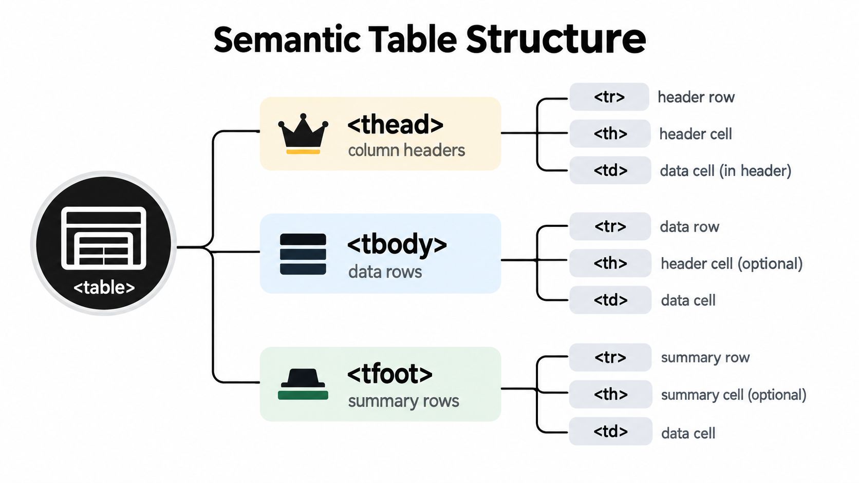
Start with a plain table that would still make sense if every stylesheet disappeared. A descriptive <caption> gives users context before they encounter the values. <thead> groups the header row, <tbody> contains the records, and <tfoot> is appropriate for a summary row when one exists.
<table>
  <caption>Current support requests by team</caption>
  <thead>
    <tr>
      <th scope="col">Team</th>
      <th scope="col">Open requests</th>
      <th scope="col">Oldest request</th>
    </tr>
  </thead>
  <tbody>
    <tr>
      <th scope="row">Platform</th>
      <td>12</td>
      <td>Monday</td>
    </tr>
    <tr>
      <th scope="row">Accounts</th>
      <td>7</td>
      <td>Tuesday</td>
    </tr>
  </tbody>
</table>
The first column uses <th scope="row"> because each team labels its row. The other headings use <th scope="col"> because they describe columns. This distinction is small in the source but important when assistive technology announces a cell.
The Home Office table guidance recommends semantic table elements and the scope attribute when headers appear in both the top row and first column. It also warns against layout tables, overly complex structures and using ARIA to recreate native table semantics unless there’s a compelling reason.
Keep the data model simple
GOV.UK content guidance, echoed by Norfolk County Council’s table guidance, sets useful constraints for production markup. Every column needs a descriptive header, the table should have only one header row, and cells shouldn’t be split, merged or left empty. Each cell should contain one item without line breaks, so a single cell doesn’t become a miniature list that’s difficult to scan or announce.
The same guidance describes a minimum viable table of 2 columns by 3 rows, although a dataset that small may be clearer as ordinary prose. That isn’t a target to hit. It’s a prompt to question whether a table is the right information architecture at all.
Avoid these common shortcuts:
- Layout tables: Use CSS Grid or Flexbox for page positioning, never
<table>elements. - Merged cells: Redesign the data model or repeat the relevant context instead of relying on
rowspanorcolspan. - Empty cells: Write “no data” or “not applicable” where that meaning matters.
- Multiple items per cell: Give each value its own cell or choose a different presentation.
- Decorative ARIA: Don’t add roles that conflict with the browser’s native table semantics.
Before writing CSS, inspect the table with a screen reader. Move through the headers and data cells, and check whether the tool announces the relevant row and column context. Keyboard testing should also confirm that users can reach any links, buttons or controls inside cells in a sensible order.
Core CSS Techniques for Clean Readable Tables
Once the markup is reliable, styling becomes a controlled visual layer. Start with width, borders and spacing, then refine typography and state changes. Don’t begin with compressed font sizes or dense padding. Those choices may fit more data on screen, but they often make the table harder to scan.
A dependable base pattern looks like this:
.data-table {
  width: 100%;
  border-collapse: collapse;
  caption-side: top;
}

.data-table caption {
  padding-block: 0.75rem;
  text-align: left;
  font-weight: 600;
}

.data-table th,
.data-table td {
  padding: 0.75rem 1rem;
  border-bottom: 1px solid #d8dee8;
  text-align: left;
}

.data-table thead th {
  font-weight: 700;
  background: #f3f5f7;
}

.data-table tbody tr:nth-child(even) {
  background: #fafafa;
}

.data-table tbody tr:hover {
  background: #eef5ff;
}
border-collapse: collapse gives the table a single border system and prevents doubled lines. border-spacing can be preferable when you want visibly separated cells, but it needs careful handling because large gaps quickly make dense data feel disconnected. The CSS border colour guide is useful when you’re building a consistent token system for these boundaries.
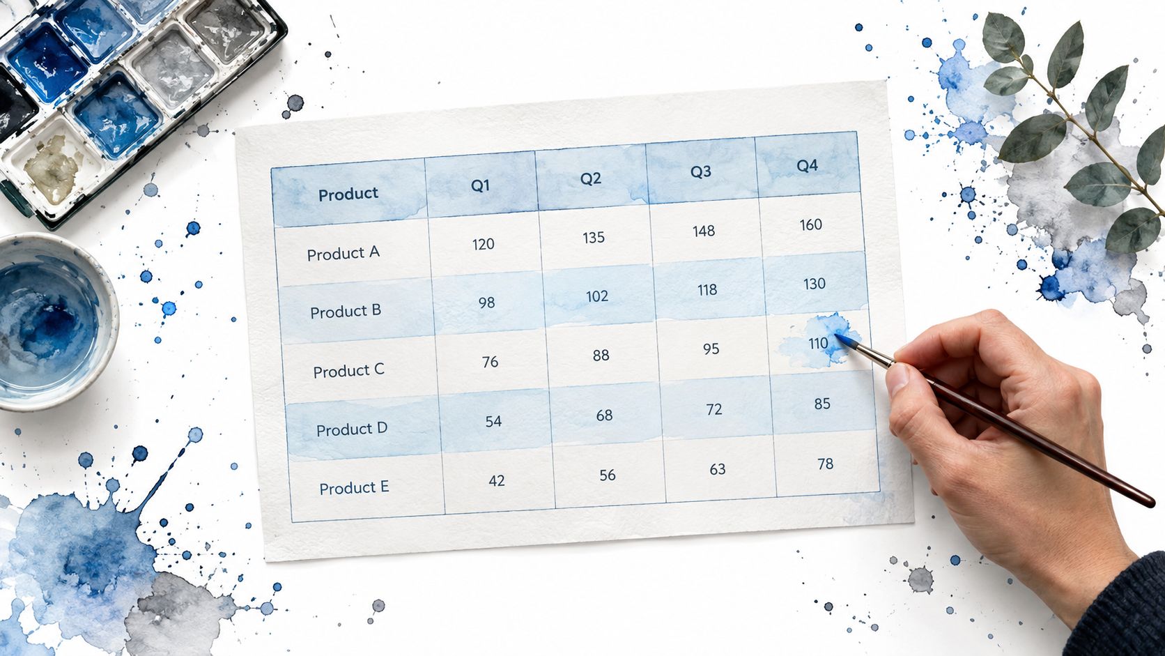
Make alignment carry meaning
Text usually reads best when it’s left-aligned. Numeric values should normally be right-aligned so users can compare magnitudes vertically. The Government Analysis Function’s table publishing guidance recommends publishing tables as text with correct markup rather than images of text. It also recommends commas for thousands, consistent precision within each column, right-aligned figures and a leading zero for values below one.
Those conventions matter in a pricing table as much as in a government report. If one column contains currency values with mixed decimal precision, readers have to perform extra visual work before comparing them. Apply formatting when you prepare the data, not as a visual afterthought.
.data-table .numeric {
  text-align: right;
  font-variant-numeric: tabular-nums;
}
font-variant-numeric: tabular-nums can make columns easier to scan when the chosen font supports it. Don’t use colour alone to communicate status. Pair a colour with text, an icon that has an accessible name, or another visible distinction.
In Tailwind CSS 4, the same treatment stays close to the markup:
<table class="w-full border-collapse text-sm">
  <caption class="mb-3 text-left font-semibold text-slate-900">
    Current support requests by team
  </caption>
  <thead class="bg-slate-100 text-left text-slate-900">
    <tr>
      <th scope="col" class="border-b border-slate-300 px-4 py-3 font-semibold">Team</th>
      <th scope="col" class="border-b border-slate-300 px-4 py-3 text-right font-semibold">Open requests</th>
    </tr>
  </thead>
  <tbody class="[&>tr:nth-child(even)]:bg-slate-50">
    <tr class="hover:bg-blue-50">
      <th scope="row" class="border-b border-slate-200 px-4 py-3 text-left font-medium">Platform</th>
      <td class="border-b border-slate-200 px-4 py-3 text-right tabular-nums">12</td>
    </tr>
  </tbody>
</table>
Use hover states as orientation, not as the only indication of a selected row. For keyboard users, add a visible focus style to links and buttons inside cells. Keep the palette quiet enough that the header, status and selected state have room to communicate.
Responsive Table Patterns With Tailwind CSS 4
A table can be technically responsive and still be unpleasant to use. Shrinking every column until labels wrap into several lines preserves the grid but destroys scanning. Hiding columns without telling users what disappeared creates a different problem.
GOV.UK guidance notes that a table is usually practical when users can see about 4–5 columns and 10 rows without scrolling on desktop, and warns against tables that are too large, split or merged, or contain multiple items in a cell. The GOV.UK table formatting guidance is a useful decision point, not a rigid breakpoint rule. If your data needs more room, give it room. If the relationships stop making sense on a narrow screen, change the presentation.
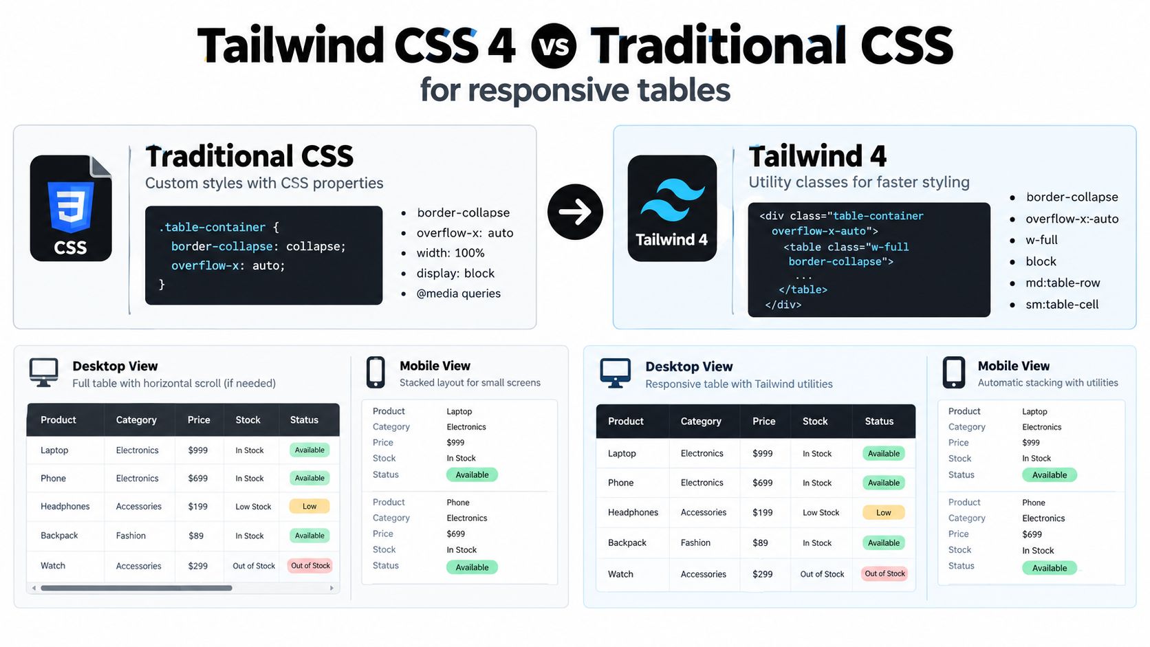
Pattern one keeps the grid and enables scrolling
Horizontal scrolling is usually the safest choice for financial reports, audit logs and comparison matrices where users need to compare values across a row. Keep the native table intact, wrap it in a scroll container, and give the wrapper a visible boundary so the affordance is clear.
<div class="overflow-x-auto rounded-xl border border-slate-200">
  <table class="min-w-[42rem] w-full border-collapse text-sm">
    <caption class="sr-only">Subscription plan comparison</caption>
    <thead class="bg-slate-100">
      <tr>
        <th scope="col" class="sticky left-0 bg-slate-100 px-4 py-3 text-left">Plan</th>
        <th scope="col" class="px-4 py-3 text-right">Seats</th>
        <th scope="col" class="px-4 py-3 text-right">Storage</th>
        <th scope="col" class="px-4 py-3 text-right">Support</th>
      </tr>
    </thead>
  </table>
</div>
A sticky first column can help users retain row context, but test it carefully. Shadows, background colours and stacking order need to make the pinned cell visibly distinct. If the wrapper is keyboard-focusable, provide an obvious focus ring and avoid trapping focus inside it.
Pattern two changes rows into labelled records
Stacking can work for cards, order summaries and account records where each row is a self-contained item. At the mobile breakpoint, change the visual layout while retaining the underlying semantic structure only if the resulting reading order remains understandable. For more radical transformations, render a separate mobile view from the same data model rather than forcing CSS to perform an opaque restructure.
| Pattern | Best for | Trade-off |
|---|---|---|
| Horizontal scroll | Comparison matrices and audit data | Preserves relationships, but users must move sideways |
| Stacked records | Independent product or account summaries | Easier on narrow screens, but cross-row comparison becomes harder |
| Reduced columns | Tables with secondary fields | Cleaner view, but hidden information needs an accessible alternative |
| Reframed content | Dense workflows and action-heavy dashboards | Often clearer, but requires a different information architecture |
Tailwind CSS 4 makes the utility translation direct. Use overflow-x-auto, min-w-*, whitespace-nowrap only where it protects important values, and responsive display utilities for carefully designed alternatives. The Tailwind CSS 4 overview can sit alongside your project’s utility conventions, but don’t let a class-based approach decide the information architecture for you.
The practical test is simple. Ask whether a user needs to compare columns or inspect one record at a time. Comparison favours scrolling. Independent records favour stacking. A table that serves both jobs may need two deliberate views, not a collection of increasingly clever CSS tricks.
Accessibility Performance and Production Polish
A styled table still fails if users can’t understand its structure, reach its controls or recover their position after an interaction. Treat accessibility as part of the component contract. The visual design should expose the same hierarchy that the markup and accessibility tree provide.
GOV.UK-aligned guidance says every column needs a descriptive header, the table should have one header row, and cells shouldn’t be split, merged or empty. It also identifies 2 columns by 3 rows as a minimum viable table, while noting that such a small dataset may be better presented as normal text. These constraints help teams avoid building a technically valid table for content that would be clearer in a sentence or a list.
Native semantics should do most of the work
Use a native <table> whenever the content is tabular. Native elements give browsers and assistive technologies a shared baseline for headers, rows and cells. ARIA roles such as role="table" are mainly relevant when a team has a strong reason to build the structure from other elements, and recreating native behaviour introduces more responsibilities rather than fewer.
Interactive controls need separate attention:
- Sorting controls: Put the button inside the relevant header cell, give it a name that describes the action, and expose the current sort state.
- Row links: Make the target and link text clear, rather than turning an entire row into an ambiguous click area.
- Selection: Provide a visible selected state that doesn’t rely on colour alone.
- Keyboard focus: Keep the tab order predictable and make focus rings visible against the table background.
- Scrollable wrappers: Ensure users can discover and operate the overflow region without losing context.
A caption should explain the table’s purpose, not repeat the page heading. If a caption isn’t visually appropriate, hide it with an accessible visually-hidden utility rather than removing it from the accessibility tree. Avoid images of tabular text. Text with correct markup can resize, reflow and be interpreted by assistive technologies, while an image can’t provide equivalent cell relationships by itself.
Test the component in its real environment
Desktop browser inspection catches only part of the problem. Test with keyboard-only navigation, browser zoom or magnification, a screen reader and a narrow viewport. Check the actual application shell, because a table that behaves well in isolation may become unusable inside a modal, drawer or horizontally constrained panel.
Performance also belongs in the production review. Render only the data users need, avoid expensive re-renders when sorting or filtering, and don’t place unnecessary imagery inside cells. If a cell contains an image, provide an appropriate text alternative and load it according to its importance. A lightweight component architecture can help, but bundle size alone doesn’t compensate for a broken reading order.
Shipping check: If a user can’t identify the table’s purpose, locate the headers, reach an action and understand the current row on a small screen, the table isn’t ready.
Putting It All Together for Production Apps
A reliable table workflow begins with the data model and ends with interaction testing. Keep the visual layer separate enough that you can change colours or spacing without rewriting header relationships. In a Vue application, pass structured records into a table component, render headers from an explicit definition, and keep formatting functions predictable so numeric alignment and empty states don’t drift between views.
A production checklist can stay short:
- Semantics: Use
<caption>,<thead>,<tbody>,<th>and<td>correctly. - Relationships: Add
scopewhere row and column headers require it. - Content: Keep cells simple, replace meaningful emptiness with clear text, and avoid merged structures.
- Visual hierarchy: Apply consistent padding, borders, header emphasis and row states.
- Numbers: Use right alignment, consistent precision and readable number formatting.
- Responsive behaviour: Choose scrolling, stacking, reduced columns or a different information architecture.
- Interaction: Test sorting, filtering, selection, links and focus with a keyboard and screen reader.
- Maintenance: Keep tokens and component variants centralised so a redesign doesn’t produce conflicting table styles.
Headless component patterns are useful when the table sits beside menus, dialogs, tabs, filters and command interfaces. DOM Studio provides framework-agnostic web component primitives with a Vue integration layer, plus Tailwind CSS 4 styling and theming controls. Its individual modules average under 2 kb gzipped, according to the provided product information, and the system includes embedded documentation and inspector hints for examining generated interfaces.
Use those primitives to avoid re-implementing behaviour that belongs in a shared component system, but keep the table’s native HTML intact. A headless wrapper should make the surrounding interface easier to maintain, not turn a straightforward table into a custom accessibility project.
Start by inspecting one table that currently causes complaints. Remove layout hacks, restore the semantic structure, apply the restrained base styles, then test the chosen mobile pattern with real content rather than placeholder values. Iterate until the table remains understandable when the screen gets smaller, the user zooms in, JavaScript fails, or a screen reader reads it from the first caption to the final cell.
DOM Studio provides headless web component primitives, Vue wrappers, Tailwind CSS 4 styling and theming tools that can support the menus, filters, dialogs and interaction patterns around production tables. Visit DOM Studio to inspect the component catalogue and build a maintainable interface without re-creating common accessibility behaviour from scratch.