
A splitbutton gives users two related choices in one compact control: a clear default action and a separate trigger for less common alternatives. It works best when one action is predictable, safe, and used much more often than the others.
For example, a reporting dashboard might make Run report the primary action, while the adjacent menu offers Run and email, Schedule, and Export settings. The controls look connected, but they must remain independently understandable and operable.
We recommend a splitbutton only when those conditions are true. If users need to choose an option before anything happens, use a menu button or select-like control instead. If the two actions are equally important, show two explicit buttons.
Table of contents
- Before you start
- 1. Confirm that a splitbutton is the right control
- 2. Define the primary and secondary actions separately
- 3. Build the Vue structure with clear state ownership
- 4. Implement accessible menu behavior, not just a visible popup
- 5. Handle loading, disabled, dangerous, and long-label states
- 6. Adapt the layout for narrow screens
- 7. Test the completed splitbutton as two actions
- Build the pattern once, then reuse it deliberately
Before you start
You need:
- A primary action with a safe, predictable result.
- A short list of genuinely related secondary actions.
- Two real interactive controls, not one click target with ambiguous behavior.
- A plan for keyboard focus, the open state, and small screens.
A splitbutton is a compact action pattern, not a way to hide an overloaded toolbar. The WAI-ARIA Menu Button Pattern is the baseline for the secondary trigger: it should expose that it opens a menu and communicate whether that menu is expanded.
1. Confirm that a splitbutton is the right control
Start with the user decision, not the visual style. A splitbutton is appropriate when the primary action is the obvious next step and alternatives are variations of the same goal.
Good fits include:
- Send with Send later and Save draft.
- Create report with Create and share, Schedule report, and Save as template.
- Generate with Generate again, Generate with a different mode, and Save prompt.
- Export CSV with Export PDF and Export JSON.
Avoid it when the default action could surprise someone. For example, do not make a destructive action such as Delete the primary half just because it is frequent. Do not default to publishing, charging, inviting, or overwriting unless the user has clearly established that preference and can recover from the outcome.
Use a regular button when there is only one action. Use a standalone menu trigger when choosing an option is required. Use two buttons when users must compare the actions at a glance. A splitbutton reduces visual density only when it preserves decision clarity.
Expected result: You can describe the default action in one plain-language label and explain why it is safer or more common than every alternative.
Troubleshooting: If your team debates the default, the pattern is probably not ready. Start with a regular button plus an adjacent menu until usage data or product context establishes a reliable default.
2. Define the primary and secondary actions separately
Treat the splitbutton as two controls that happen to share a boundary:
- The primary button performs one action immediately.
- The secondary button opens a list of related actions.
The visible divider, separate hover states, and separate focus rings should make that model obvious. The chevron half needs its own accessible name. An icon-only trigger should not announce only “button.” Use a name such as “More report actions” or “More generation options.”
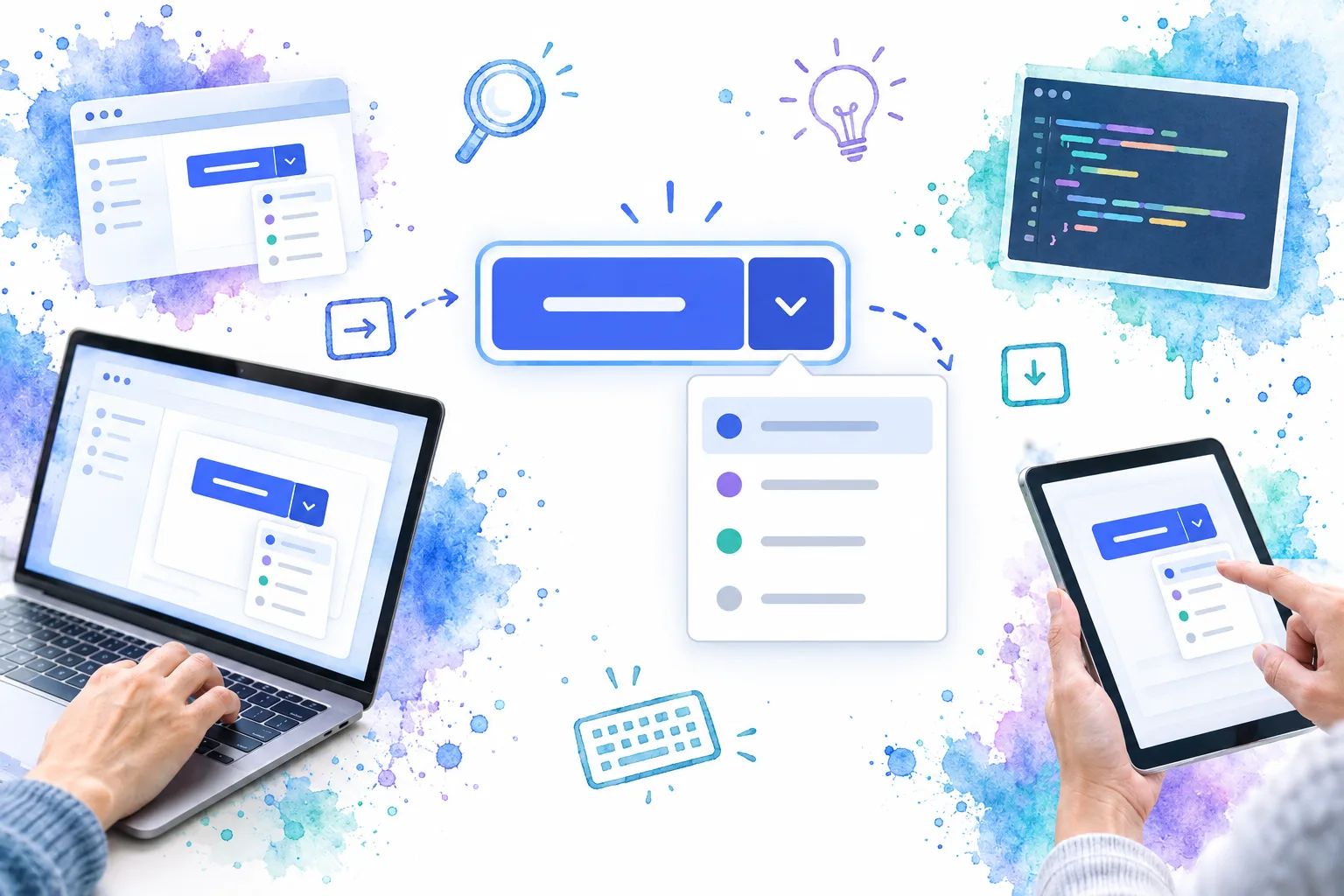
A connected visual treatment is useful, but it cannot replace separate semantics. Keep both controls in the normal tab order. Keyboard users should be able to reach the primary action, then the menu trigger, without the menu opening merely because focus moves through the group.
The menu trigger should be a native <button type="button"> with aria-haspopup="menu", aria-expanded, and optionally aria-controls. When the menu opens, set aria-expanded to true; set it back to false when it closes. W3C also specifies that Enter and Space open a menu button and move focus into the menu. Review the full keyboard expectations before implementing custom menu behavior.
Expected result: A screen reader identifies two distinct controls: one for the default action and one that opens related actions.
Troubleshooting: If the primary label and chevron are inside one <button>, users cannot reliably choose which behavior they intend. Split them into separate buttons.
3. Build the Vue structure with clear state ownership
In Vue, keep execution state separate from menu state. The primary button owns the default command. The menu trigger owns open. A selected secondary action closes the menu, runs its own command, and returns focus deliberately when the action does not move users to a new context.
DOM Studio’s Button component provides loading and disabled states for the action half. Pair it with the Menu component for keyboard-navigable action rows, and place the menu in a popover controlled by the secondary trigger.
<script setup>
import { computed, nextTick, ref } from 'vue';
import { DomButton, DomMenu, DomPopover } from '@getdom/studio/vue';

const menuOpen = ref(false);
const running = ref(false);
const menuTrigger = ref(null);

const items = [
  { value: 'run-email', label: 'Run and email' },
  { value: 'schedule', label: 'Schedule report' },
  { separator: true },
  { value: 'export', label: 'Export settings' },
];

const menuLabel = computed(() => 'More report actions');

async function runReport() {
  running.value = true;
  try {
    await createReport({ delivery: 'download' });
  } finally {
    running.value = false;
  }
}

async function selectAction({ value }) {
  menuOpen.value = false;

  if (value === 'run-email') await createReport({ delivery: 'email' });
  if (value === 'schedule') openScheduleDialog();
  if (value === 'export') openExportSettings();

  await nextTick();
  menuTrigger.value?.focus();
}
</script>

<template>
  <div class="inline-flex" role="group" aria-label="Report actions">
    <DomButton :loading="running" @click="runReport">
      Run report
    </DomButton>

    <DomPopover
      position="bottom-end"
      :arrow="false"
      @open="menuOpen = true"
      @close="menuOpen = false"
    >
      <template #trigger>
        <button
          ref="menuTrigger"
          type="button"
          class="splitbutton-trigger"
          :aria-label="menuLabel"
          aria-haspopup="menu"
          :aria-expanded="menuOpen"
        >
          <span aria-hidden="true">⌄</span>
        </button>
      </template>

      <DomMenu :items="items" :skin="false" @select="selectAction" />
    </DomPopover>
  </div>
</template>
Keep the group label contextual, such as “Report actions.” The DOM Studio menu supports action rows, separators, disabled items, and a selection event. Its examples also demonstrate moving focus into a menu after opening a popover, which is the right behavior to preserve when adapting the pattern.
Expected result: Clicking Run report runs immediately. Activating the chevron opens the menu without triggering the report.
Troubleshooting: Do not bind the primary click handler to the parent container. Parent-level click handling can accidentally execute the primary command when the user intends to open the menu.
4. Implement accessible menu behavior, not just a visible popup
A menu is more than a positioned panel. For command menus, the WAI-ARIA guidance expects focus to move into the menu when it opens, arrow keys to move between items, Home and End to reach the boundaries, and Escape to close the menu and return focus to its trigger. W3C’s menu pattern documents those interactions and roles.
Use role="menu" and role="menuitem" only when your secondary options operate like application commands and you implement the associated keyboard model. A short list of ordinary buttons inside a correctly labelled popover may be a better fit when the options do not need menu semantics. Do not add ARIA roles merely to make a component sound more sophisticated.
For a headless implementation, DOM Studio’s Dropdown web component provides trigger and menu slots, emits selection events, and documents Enter, Space, arrow key, Home, End, Escape, and Tab behavior. We can use it as the secondary-action layer while leaving the primary action as a sibling button.
<div class="splitbutton" role="group" aria-label="Generation actions">
  <button type="button" id="generate">Generate</button>

  <dom-dropdown placement="bottom-end" data-focus-value="regenerate">
    <button
      slot="trigger"
      type="button"
      aria-label="More generation actions"
    >
      <span aria-hidden="true">⌄</span>
    </button>

    <div slot="menu" aria-label="More generation actions">
      <button role="menuitem" data-value="regenerate">Generate again</button>
      <button role="menuitem" data-value="alternate">Use another mode</button>
      <button role="menuitem" data-value="save">Save prompt</button>
    </div>
  </dom-dropdown>
</div>

<script type="module">
  import '@getdom/studio/headless/dropdown.js';

  document.querySelector('dom-dropdown').addEventListener('dom:select', (event) => {
    runSecondaryGenerationAction(event.detail.value);
  });
</script>
Expected result: Opening the menu puts keyboard focus on a usable action, and Escape returns users to the compact trigger.
Troubleshooting: If Tab cycles through every menu item, focus management is incomplete. Tab should leave a command menu rather than become a second arrow-key system.
For an implementation walkthrough, watch Thinking on ways to solve SPLIT BUTTONS. It demonstrates the pattern’s interaction details, though we still recommend using two native buttons and the WAI-ARIA menu-button behavior above for production semantics.
5. Handle loading, disabled, dangerous, and long-label states
The two sides of a splitbutton do not always share state.
- Loading: If the primary action is running, prevent duplicate primary activation. Keep the menu trigger available only if its alternatives remain valid. If alternatives depend on the same pending request, disable both sides and explain the pending state nearby.
- Disabled: Disable the primary action when its requirement is missing. Do not silently disable the menu if it contains available alternatives, such as Export settings when report data is unavailable.
- Destructive actions: Put destructive alternatives after a separator, use a danger treatment, and require confirmation when the consequence warrants it. Never make destructive work the invisible default.
- Unavailable actions: Prefer a visible explanation when users need to understand why an option cannot run. A disabled command with no explanation creates a dead end.
- Long labels: Let the primary label reserve adequate width, truncate only with a way to discover the full label, and do not make the chevron half so narrow that it is hard to target.
Do not change the primary label to the last secondary action just because it was used most recently unless the UI explicitly explains that personalization and the action is reversible. A remembered default can save time, but a silent default change can create costly mistakes.
6. Adapt the layout for narrow screens
A splitbutton needs space for two focus targets, a visible divider, and a menu that stays inside the viewport. On narrow dashboards, keep the primary action label visible and preserve a separate secondary trigger. If the connected styling becomes cramped, render the controls as two adjacent buttons with a small gap rather than squeezing the chevron into an unusable target.

Position the menu with collision handling so it can flip or shift when space is limited. DOM Studio’s Dropdown exposes placement, alignment, collision padding, and viewport-oriented floating behavior for this purpose. Test a narrow viewport with browser zoom as well as a mobile touch target.
Expected result: The label remains understandable, the trigger remains easy to hit, and the menu is not clipped by the viewport or an overflow: hidden toolbar.
Troubleshooting: If the menu is clipped, do not solve it by shrinking text until it becomes unreadable. Move the popup into a layer that can escape the toolbar’s clipping context, or use a viewport-aware positioning strategy.
7. Test the completed splitbutton as two actions
Before shipping, test the control as a keyboard user and as a user who only sees the visible interface.
- Tab to the primary action, then activate it with Enter and Space.
- Tab to the secondary trigger and confirm its accessible name explains the menu.
- Open the menu with Enter and Space. If supported, verify ArrowDown and ArrowUp open it at the expected item.
- Verify
aria-expandedchanges with the open state. - Move through command items with arrow keys, then test Home, End, Escape, and Tab.
- Confirm Escape closes the menu and returns focus to the secondary trigger.
- Check that a secondary item runs only its own command and closes the menu at the right time.
- Test a pending primary request, disabled conditions, a dangerous option, long translations, 200% zoom, and a narrow viewport.
- Run the same test with a screen reader and confirm the primary action, menu trigger, and menu items are announced clearly.
A splitbutton is complete when the primary action is fast for experienced users, the alternatives are discoverable for everyone else, and neither side can be mistaken for the other.
Build the pattern once, then reuse it deliberately
A well-built splitbutton gives a dashboard or form a compact action surface without hiding important choices. Start with a predictable primary action, make the menu trigger independently named and focusable, and treat keyboard and responsive behavior as part of the component contract.
At DOM Studio, we recommend composing this pattern from a button primitive, a keyboard-aware menu, and a positioned headless dropdown, rather than relying on one opaque control. That makes the default action, secondary commands, and state transitions easier to inspect and adapt across your application.
Build one tested splitbutton wrapper for your product, document when teams should use it, and reserve it for workflows where a default action truly earns its place.