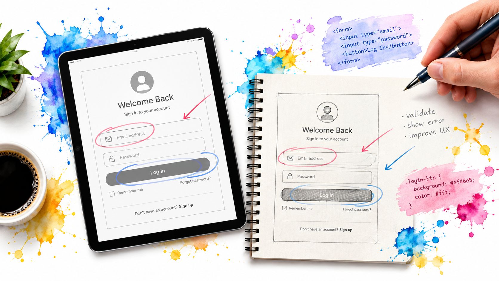
A login form is often the first real interaction users have with a product, yet most sample login page templates stop at the visual layer. They show a centred card, a logo, two fields and a button, then leave developers to solve the difficult parts: validation timing, non-revealing errors, keyboard flow, password managers, recovery, focus handling and dark-mode theming.
That’s why the most popular advice, “pick the cleanest design”, is incomplete. A polished screenshot can still produce a poor authentication journey once a user enters the wrong password, loses access to a phone, uses a screen reader or returns to the page with saved credentials. Good user interface design has to survive those states.
The examples below are judged by what they leave unfinished for the developer. The strongest options give you useful structure without pretending that a static form is a production authentication system.
Table of Contents
- 1. DOM Studio
- 2. Flowbite
- 3. Bootstrap Official Sign-in Example
- 4. MUI Toolpad Core SignInPage
- 5. Mantine UI
- 6. Tailwind UI Catalyst
- 7. Pixelcave
- Sample Login Page: 7-Tool Comparison
- Choosing a Sample Login Page You Can Ship With Confidence
1. DOM Studio
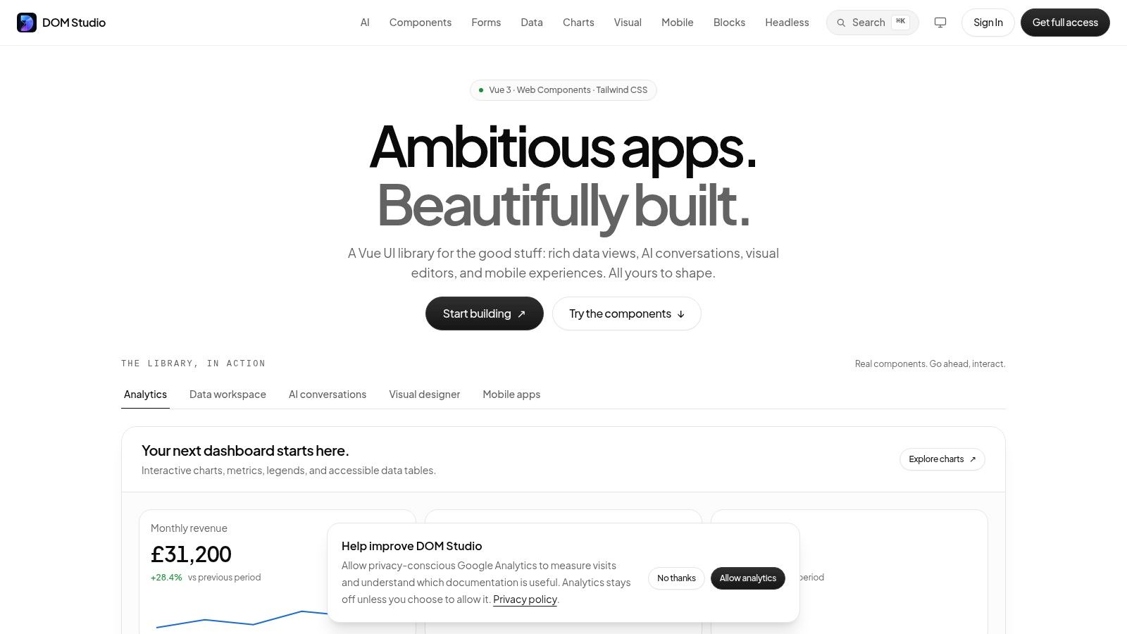
DOM Studio suits teams that care more about what a login page still needs in production than how polished the card looks in a screenshot. The selling point is not the layout alone. It is the mix of headless web component primitives, framework-agnostic behaviour, and a Vue 3 layer that supports reactive props, v-model, and slot composition. With Tailwind CSS 4 handling presentation, developers keep control of spacing, colour, validation states, and theme overrides instead of fighting a baked-in visual system.
That matters on auth screens, where the unfinished parts are usually the hard parts.
The useful work here is lower in the stack. DOM Studio bakes in WAI-ARIA roles, focus management, keyboard handling and screen-reader behaviour across the same primitives you would use around fields, buttons, alerts, and dialogs. That removes a lot of repetitive interaction code, especially if the login route later grows into recovery flows, MFA prompts, or session warnings. Its documented package sizing also helps keep the route lean. Individual modules average under 2 KB gzipped, based on the component library’s documented bundle sizes at DOM Studio.
What it leaves you to build
DOM Studio still leaves the security boundary in your hands, which is the right trade-off. You need to implement credential verification, server-side rate limiting, password hashing, passkeys, provider callbacks, recovery, and account-state handling. You also need to decide how validation behaves under failure, when focus moves after an error, and how much feedback is safe to reveal. A good component library should help with interaction patterns without choosing your identity stack or exposing account existence through default copy.
For UK-facing products, the risk is not abstract. The Cyber Security Breaches Survey 2024 reported that 50% of UK businesses, approximately 718,000 organisations, experienced a cyber security breach or attack during the preceding 12 months. A sample login page can support safer focus and error handling. It cannot secure the application on its own.
DOM Studio also stands out for AI-assisted implementation. Embedded documentation, inspector hints, and Studio specs make generated UI easier to inspect and correct instead of pasting opaque output into an app and hoping it holds up. The trade-off is framework fit. The primitives are portable, but the smoothest integration is clearly aimed at Vue 3, so React teams or teams on another stack may end up working closer to the custom-element layer.
Practical rule: Choose DOM Studio when you want a reusable system for the authenticated app, and you are prepared to build the auth logic, validation rules, and failure states yourself.
Pricing is still a gap. Public pages do not list clear price points, so licensing and the Pro tier need checking through the site flow.
Best for: Vue teams, design systems, AI-assisted implementation and products where accessibility and theming need to remain maintainable.
Website: DOM Studio
2. Flowbite
Flowbite is a practical starting point for teams already using Tailwind and wanting a sample login page they can copy into an application quickly. Its authentication examples cover compact forms, split layouts, social sign-in buttons, remember-me controls and forgotten-password links. The code is close to the markup most Tailwind developers expect, so the first pass doesn’t require translating a proprietary styling system.
The useful part isn’t the screenshot. It’s the surrounding set of components. Inputs, alerts, modals and other Flowbite elements can keep the authentication route visually consistent as it expands into registration, recovery and provider selection. The examples also use spacing and typography patterns that align with Tailwind’s defaults, which reduces the amount of design-token translation.
Where the copy-paste stops helping
Flowbite leaves the important state logic to you. You’ll need to decide when errors appear, where focus moves after a failed submission, how an invalid password is announced and whether a loading state prevents duplicate submissions. A social button is only a visual entry point until you connect it to an OAuth flow and define what happens when the provider returns an error.
Password fields deserve more attention than a template usually gives them. A production field should support password managers, appropriate autocomplete values and a visibility control that works with a keyboard and assistive technology. A focused password input example is useful when the copied Flowbite markup needs a more deliberate interaction model.
Flowbite works best when you accept its design language. Its classes are easy to edit, but mixing the components with another Tailwind kit can create small inconsistencies in border radii, focus rings, form heights and error colours. Some additional blocks and Pro variants also require a paid licence, so check the exact example before building a route around it.
Best for: Tailwind projects that want readable markup, several layout options and a fast route from example to branded form.
Website: Flowbite authentication examples
3. Bootstrap Official Sign-in Example
Bootstrap’s official Sign-in example is deliberately plain, and that’s its main strength. It gives you a small HTML and CSS baseline with familiar form controls, labels and a structure that can be moved into almost any server-rendered or client-rendered stack. There’s no React, Vue or application-specific authentication layer to unwind.
This makes it a good diagnostic reference. Before adding a hero panel, brand illustration or animated provider selector, a developer can use the Bootstrap example to verify the basic document structure. Labels, input associations, submit behaviour and browser validation are visible without a component abstraction hiding the markup.
A reliable baseline, not a finished product
The visual neutrality means you’ll have to do the design work. A premium product will need custom tokens for colour, type scale, spacing, focus indicators, field errors, loading states and responsive behaviour. Bootstrap utility classes also differ from Tailwind utilities, so a Tailwind-first team may spend more time translating rather than using the example directly.
The example doesn’t supply a complete recovery journey or an authentication state model. You still need to add a forgot-password route, registration, provider errors and a safe response for invalid credentials. Don’t expose whether an email address exists through different messages on sign-in and recovery. The form can look simple while the surrounding security decisions remain substantial.
Bootstrap is particularly useful when broad browser support and low framework coupling matter. It’s less suitable if your application already has a strict design system or if you want accessible behaviour for complex controls out of the box. For a basic sign-in route, though, its restraint is valuable. You can see exactly what you own.
Best for: Neutral HTML/CSS foundations, server-rendered applications and teams that want minimal framework lock-in.
Website: Bootstrap Sign-in example
4. MUI Toolpad Core SignInPage
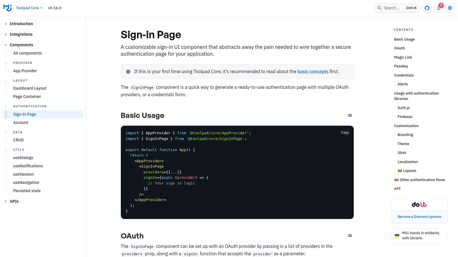
MUI’s Toolpad Core SignInPage is aimed at React teams that want a configurable authentication surface rather than isolated input markup. The component can render credential fields or a provider list, and it exposes customisation and internationalisation hooks through the MUI ecosystem. That makes it more immediately useful for an application with several authentication methods.
The component’s value is speed at the integration boundary. A React team can connect its submit handler, provider configuration and locale rather than assembling every visible part from separate controls. MUI’s theme and design-token system also gives the page a consistent relationship with the rest of a Material-based application.
The cost of choosing a component API
The obvious limitation is React dependence. A Vue, Svelte or server-rendered team can’t use the component directly, and a team that only wants the markup may find MUI’s abstraction heavier than necessary. The default Material appearance is coherent, but achieving a deliberately non-Material brand can mean overriding more theme and component behaviour than expected.
Provider lists also create states that the screenshot won’t show. Test long provider names, unavailable identity services, rejected callbacks, loading indicators and keyboard order. If the form accepts credentials as well, check that the error summary doesn’t move focus unexpectedly or announce the same message twice.
An enterprise team may also need adjacent account controls, including session management, MFA settings and SSO configuration. A related enterprise SSO setup block illustrates the kind of surrounding product surface that a sign-in component alone doesn’t provide. MUI handles the entry point well, but you still have to design the account-security journey around it.
Best for: React applications already committed to MUI and teams integrating credential and OAuth entry points into an existing Material system.
Website: MUI Toolpad Core SignInPage
5. Mantine UI
Mantine’s Authentication Form example feels closer to a complete product screen than a bare form scaffold. It combines sign-in and sign-up patterns, social buttons, validation and clean theming primitives, with @mantine/form handling much of the client-side form ergonomics. For a modern React application, the code is easy to read and straightforward to adapt.
The form utilities are the main reason to choose it over a static HTML example. They give you a clear place to define field values, validation rules and submission handling, while Mantine Core keeps the visual states consistent. Dark mode is also part of the broader theming story, which helps avoid the common result where the sign-in page looks acceptable in light mode but has poor contrast or indistinct errors at night.
Polished defaults still need testing
Mantine doesn’t remove the need for server validation. Client-side checks can catch empty values and basic formatting issues, but the server must make the authentication decision and return a safe, useful response. The developer still owns rate limiting, session handling, breached-password checks, recovery and any MFA challenge.
Accessibility defaults and keyboard behaviour are good starting points, but don’t treat them as proof. Test focus after a failed submit, the relationship between error text and its field, the password visibility toggle and the order of social buttons. The Government Digital Service accessibility monitoring programme shows that UK public-sector teams have been evaluating accessibility systematically, not treating it as a decorative enhancement.
Mantine’s biggest trade-off is migration cost. It’s React-only, and its visual language won’t automatically fit a Tailwind-first application. You can restyle it, but replacing the component APIs later is a rewrite rather than a CSS adjustment.
Best for: React teams that want form utilities, dark-mode support and a polished component API without assembling authentication controls from scratch.
Website: Mantine Authentication Form
6. Tailwind UI Catalyst
Catalyst takes a more compositional approach than a single sign-in widget. Its AuthLayout and authentication pages show how a login route can sit inside a broader application shell, with headings, hints, links, inputs and focus states following first-party Tailwind patterns. That makes it useful when the surrounding layout matters as much as the form itself.
The examples are strongest at the visual and semantic composition layer. You get a realistic page structure rather than a floating card that has no relationship to navigation, branding or responsive spacing. The code also demonstrates how to keep labels, supporting text and form controls together without relying on an elaborate abstraction.
A strong reference with a narrow entry point
Catalyst is React-centric, so it isn’t a pure HTML drop-in for every Tailwind project. It also requires a Tailwind UI All-Access licence, which changes the decision for teams seeking free examples. The licence may be reasonable for a team using the wider system, but a single login route isn’t enough justification for everyone.
The unfinished work is mostly state and backend integration. Add invalid credentials, account recovery, rate-limit messaging, loading and provider failures, then test whether the layout still works when those messages appear. A login page should also explain the next step in plain language without confirming whether a target account exists.
For teams comparing layouts, the DOM Studio conversion login block is a useful alternative reference because it treats the login screen as part of a larger conversion surface. Catalyst is better when you want Tailwind Labs’ visual conventions and React composition. It’s less attractive when framework portability or a free licence is the priority.
Best for: React and Tailwind teams that want a coherent, application-level auth layout and already use Tailwind UI.
Website: Tailwind UI Catalyst AuthLayout
7. Pixelcave
Pixelcave’s free Tailwind mini-pack solves a problem many login examples ignore: authentication rarely ends at one page. It includes coordinated Login, Register and Forgot Password screens, so the visual relationship between entry, account creation and recovery is already established. That makes it a useful choice for a small product that needs a coherent flow quickly.
The markup is simple Tailwind HTML and CSS. You can change colours, spacing and typography without learning a component API, and the three-page set reduces visual drift between routes. For a prototype or an early product, that consistency is often more useful than a large catalogue of isolated variants.
What a static pack can’t provide
Pixelcave is HTML and CSS only. There’s no built-in state management for validation, no password visibility behaviour, no provider integration and no focus choreography after a failed request. You need to add those behaviours yourself, then repeat them consistently across all three pages.
The limited variation is another trade-off. If your product needs passkey entry, a device-trust decision, an MFA code screen or an organisation selector, the pack gives you a visual starting point but not the interaction model. Recovery needs particular care. A reset link, support fallback or one-time code must not become an easier way to reveal account information or bypass the original sign-in controls.
Pixelcave is therefore best judged as a cohesive visual starter, not an authentication solution. It works well for developers who prefer owning the markup and want a free route to a consistent Tailwind auth flow. It works poorly when a team expects the template to handle the difficult states automatically.
Best for: Small Tailwind projects that need coordinated login, registration and recovery pages with no component-library dependency.
Website: Pixelcave Tailwind auth pages
Sample Login Page: 7-Tool Comparison
| Tool / Pattern | Implementation Complexity 🔄 | Resource Requirements ⚡ | Expected Outcomes ⭐ / 📊 | Ideal Use Cases 💡 | Key Advantages |
|---|---|---|---|---|---|
| DOM Studio | Medium, headless primitives + optional Vue 3 layer; some integration work 🔄 | Low runtime weight (modules ≈2KB gzipped); best with Vue 3; Pro tier for blueprints ⚡ | ⭐⭐⭐⭐⭐ Production-ready, accessible, AI-editable UIs; small bundles 📊 | Teams building production apps, Vue projects, AI-assisted UI generation 💡 | AI-ready inspector/docs; accessibility-first; ultra-lightweight; broad component & app blocks |
| Flowbite | Low, copy‑paste Tailwind patterns; minimal wiring 🔄 | Tailwind knowledge; optional Pro for extra blocks; no framework lock ⚡ | ⭐⭐⭐ Fast assembly of auth pages with consistent Tailwind markup 📊 | Tailwind projects needing quick, extendable auth pages 💡 | Easy drop-in Tailwind code; actively updated to Tailwind patterns |
| Bootstrap (Sign-in) | Low, simple HTML/CSS scaffold; minimal setup 🔄 | Bootstrap utilities only; framework-agnostic; no JS required ⚡ | ⭐⭐⭐ Stable, broadly compatible baseline with good accessibility defaults 📊 | Neutral baselines, broad-browser support, prototyping across stacks 💡 | Battle-tested patterns; large ecosystem and community guidance |
| MUI (Toolpad SignInPage) | Medium, React component with configurable props and providers 🔄 | React + MUI dependency; theming to change Material look; i18n hooks ⚡ | ⭐⭐⭐⭐ Rapid, configurable auth flows (OAuth + credentials) with accessibility 📊 | React apps needing drop-in auth tied to real auth flows 💡 | Integrated auth flows, locale support, backed by MUI ecosystem |
| Mantine UI | Medium, React components + form utilities; standard setup 🔄 | React + @mantine/form; theming for dark mode and styling ⚡ | ⭐⭐⭐⭐ Polished sign-in/sign-up with validation and consistent APIs 📊 | Modern React apps requiring strong form ergonomics and theming 💡 | Developer-friendly APIs, good accessibility defaults, built-in form utilities |
| Tailwind UI Catalyst | Medium, React + Tailwind composition; examples integrate into app shells 🔄 | Tailwind UI All‑Access license required; React + Tailwind tooling ⚡ | ⭐⭐⭐⭐ First‑party Tailwind auth pages and layouts with production semantics 📊 | Tailwind-first React apps and full-page app shells 💡 | First-party patterns, full-page composition, consistent tokens and states |
| Pixelcave | Low, HTML/CSS Tailwind templates; quick copy-paste 🔄 | Tailwind utilities; free download; no JS behaviors required ⚡ | ⭐⭐⭐ Quick, cohesive 3‑page auth flow for immediate use 📊 | Small projects or starters needing free Tailwind auth templates 💡 | Free, cohesive set; easy to theme and adopt quickly |
Choosing a Sample Login Page You Can Ship With Confidence
Start with the framework decision, not the screenshot. A React team should first compare MUI, Mantine and Catalyst against its existing component system. A Tailwind team may prefer Flowbite or Pixelcave for direct markup, while Bootstrap remains the least opinionated baseline. Vue teams and design-system owners should look closely at DOM Studio’s combination of headless primitives, custom elements and Vue integration.
Then test what each sample login page leaves unfinished. Submit empty and invalid values, enter an incorrect password, trigger a slow response and inspect where focus goes. The error should be understandable without revealing unnecessary account information, and the status should be available to keyboard and screen-reader users.
Keyboard-only testing catches problems screenshots never show. Move through every field, password visibility control, provider button, recovery link and submit state without a pointer. Check that visible focus remains obvious, that pressing Enter submits the intended form and that a failed submission doesn’t strand the user above or below the message they need.
Password managers deserve their own pass. Use correctly typed fields and autocomplete attributes, test saved credentials and confirm that the visibility control doesn’t interfere with autofill. For stronger authentication, consider passkeys, authenticator apps and other options alongside passwords. The NCSC Renfrewshire Council case study found that 50% of audited user passwords were either easy to guess or present on compromised-password lists, which is a reminder that the form’s appearance says little about the strength of the surrounding implementation.
Turn the tests into a release gate
Write the results into a short acceptance list before choosing the winner. Include:
- Validation: Errors appear at the right time, identify the recovery action and remain associated with the relevant control.
- Focus: Keyboard users land on the first useful error or status message after submission.
- Announcements: Screen readers receive changes for invalid credentials, loading, rate limiting and recovery.
- Autofill: Password managers can identify the fields, and pasted or autofilled codes work where MFA is used.
- Theming: Colours, spacing, typography and focus states can change without breaking contrast or layout.
- Recovery: Reset and fallback paths protect the account without unnecessarily confirming that it exists.
- Framework fit: The example works with your stack without introducing a component layer you’ll later replace.
UK user research also argues against assuming that every authentication path can depend on a phone or an app. A GOV.UK One Login user segmentation survey found that 80% had access to a phone number, 78% had a stable internet connection and 14% reported assistive-technology needs. It also found that 63% could use the browser journey, compared with 49% who could use an identity-check app. A browser-first, accessible route with alternatives is therefore a practical inclusion decision, not just a design preference.
The right sample login page is the one that leaves you with the least risky work, not the fewest lines of copied markup. Run the same tests against every candidate, record the failures and choose the template whose unfinished pieces match your team’s skills and authentication architecture. Before release, test the implementation with keyboard and screen-reader users, then verify that server-side controls match the promises made by the interface. That discipline matters whether you’re building a conventional web route or learning how to authenticate a Capacitor app.
DOM Studio provides headless, accessible web component primitives, polished Vue 3 integrations, Tailwind CSS 4 styling and AI-editable documentation for teams building reusable interfaces. If you want a sample login page that can grow into a consistent product system without hiding focus, keyboard and theming decisions, visit DOM Studio and explore its components and app blocks.