
You’re checking a booking page before release. A panel appears, the background dims, and the buttons look right. Then you press Tab and land on a link behind the panel. On your phone, the close button disappears beneath the browser controls. The design looks finished, but the interaction isn’t.
A pop-up modal window needs to do more than sit above a page. It must justify interrupting the visitor, guide them through a clear decision, and let them continue without losing their place.
Table of Contents
- What a Pop-Up Modal Window Does on a Page
- How Modal Windows Differ From Other Overlays
- Why Blocking Overlays Fail Real Users
- When a Modal Window Is the Right Choice
- How to Build a Modal Window Step by Step
- How to Test a Modal Across Assistive Technology
- Consent Pop-Ups and UK Privacy Expectations
- Go or No-Go Before You Ship
What a Pop-Up Modal Window Does on a Page
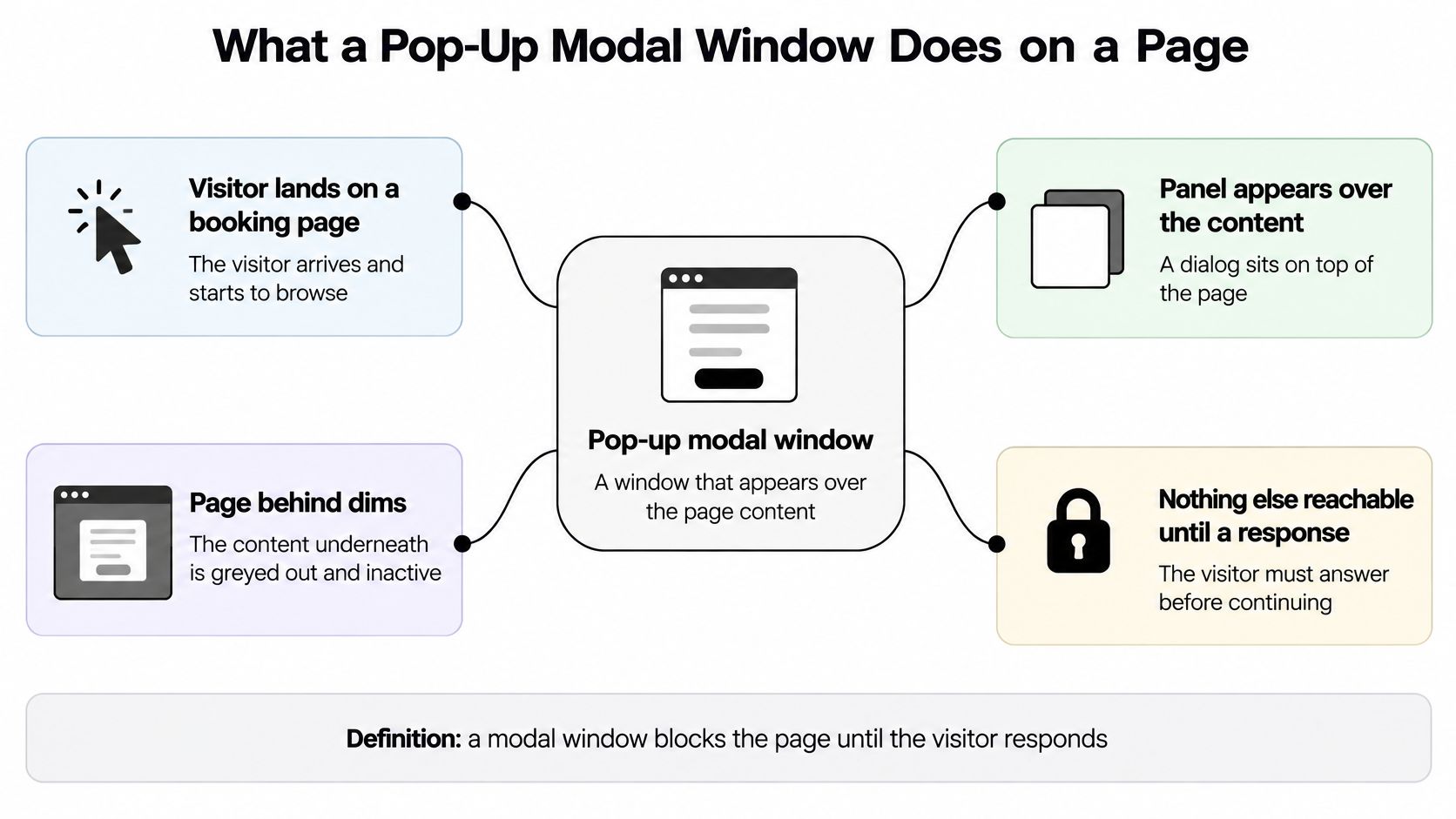
A visitor lands on a booking page and starts looking for an appointment. A panel appears over the content, the page behind dims, and nothing underneath can be reached until the visitor responds. That’s a modal interaction.
A pop-up modal window is a dialog that appears above the page, blocks interaction with the content underneath, and waits for a response. Think of a receptionist asking you to answer a question before you can walk past the desk. The interruption might be necessary, but it still needs a clear purpose and an understandable way forward.
The visible panel is only part of the component
A modal has distinct layers that need to work together:
- Surface: The panel contains a visible heading, a short explanation and the controls needed to finish or cancel the interaction.
- Backdrop: A scrim visually separates the dialog from the paused page. Dimming alone doesn’t disable anything.
- Control logic: Focus, scrolling and closing behaviour establish the interaction boundary. Without that logic, you’ve made a floating panel rather than a reliable modal.
Pop-up describes how something appears. Modal describes what happens to the surrounding interface: it enters a different mode in which the dialog is the active task. In HTML, the native <dialog> element opened with showModal() provides modal blocking behaviour.
Not every message that appears needs that boundary. For example, SignalZen’s guidance on triggering chat messages to website visitors is relevant when deciding how to offer contextual help without automatically demanding a response.
Definition check: If the window doesn’t stop interaction with the page underneath, it isn’t modal, whatever it looks like.
How Modal Windows Differ From Other Overlays
| Overlay | Blocks the page | Moves focus into it | Typical use |
|---|---|---|---|
| Modal dialog | Yes | Yes | Sign-in, session timeout, destructive confirmation |
| Non-modal dialog | No | Yes | Editor or reference panel beside the content |
| Popover or tooltip | No | Sometimes | Short help text or contextual menu |
| Toast or banner | No | No | Status message such as a saved change |
| Drawer or slide-in panel | Partly, often with a scrim | Yes | Filters, cart or mobile navigation |
| Full-page interstitial | Yes | Usually | Rare gating screens such as age checks |
Read this comparison using two questions: does it block the page, and does it move keyboard focus into itself? A modal dialog does both. A non-modal dialog can receive focus while leaving the surrounding page available, which suits an editor or reference panel that users consult alongside their work.
Popovers and tooltips need a little more care. A tooltip generally leaves focus on its trigger, while an interactive popover may receive focus so someone can use its controls. Neither should take over the page merely because it floats above other content.
Choose behaviour before appearance
A toast acknowledges something that happened without demanding a decision. A saved-change message belongs in that category, not in a blocking dialog that asks users to acknowledge every save. This explanation of what a toast notification is helps distinguish status feedback from a new task.
Drawers are a shape, not a promise about behaviour. A cart drawer might block the rest of the page, while a persistent filter panel might remain usable beside the results. If the drawer is modal, treat the whole background as unavailable, even though the panel covers only part of it.
A full-page interstitial occupies the whole screen and removes the surrounding context. Reserve it for genuine gating requirements, not routine announcements.
- Check the implementation: A panel that lets Tab reach background controls is functionally non-modal, even if it has a dark scrim.
- Choose the lighter option: Use the least interruptive overlay that lets the visitor complete the task.
Why Blocking Overlays Fail Real Users
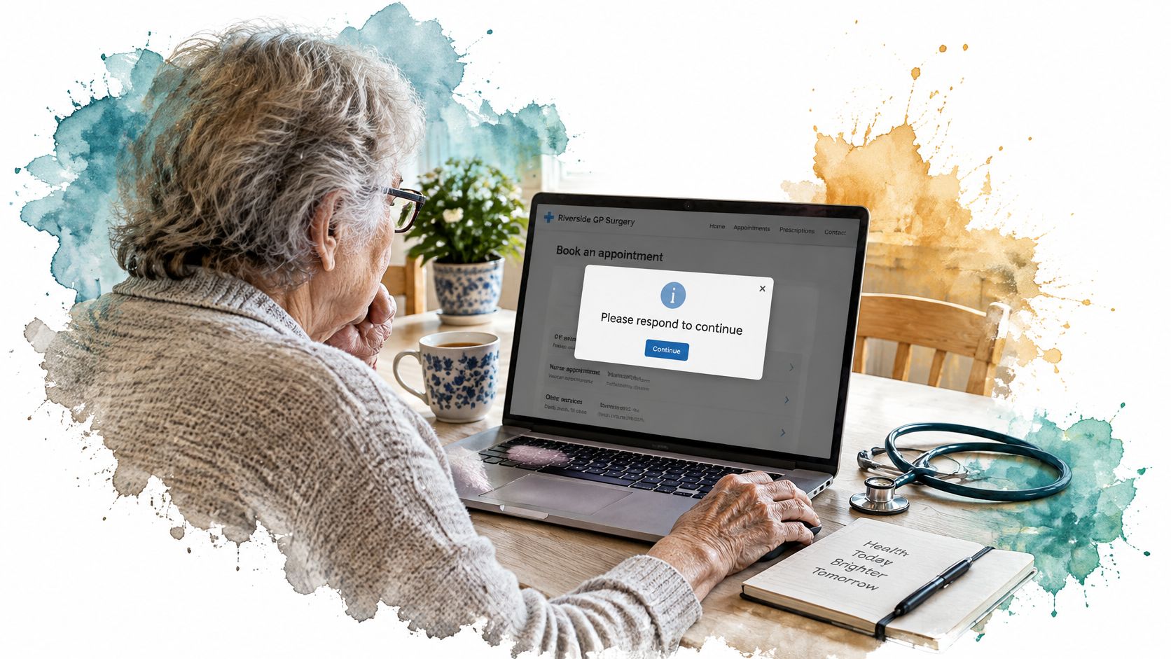
A 2023 Healthwatch North Yorkshire review found pop-ups or overlays on 12% of GP websites examined, and cited NHS England research in which 27% of participants who encountered an overlay first struggled to get past it, according to the GP website review. The review defined these overlays as windows that appear immediately when a website opens and block access until dismissed.
Those findings describe a practical barrier, not just an irritating visual treatment. Someone seeking an appointment, opening hours or urgent contact information may have to solve an unrelated interface problem before reaching the service.
Turn the barrier into design decisions
Screen-reader users need to understand that the active context has changed. Keyboard users need a reachable route out. People using magnification may see only a fragment of the panel, while speech-recognition users need controls with names they can identify and speak.
Apply these lessons before adjusting colours or animation:
- Avoid automatic arrival dialogs: Don’t put an optional interruption between visitors and the information they came to find.
- Name the blocking purpose: A heading such as Confirm appointment cancellation explains the decision. A vague heading such as Important doesn’t.
- Make dismissal discoverable: Use a visible, labelled control rather than relying on a click outside the panel or an unexplained icon.
Accessibility also sits within a public-service compliance framework. Treat the published accessibility statement as a description of tested behaviour, not a substitute for testing the component.
For current implementation work, the UK public-sector accessibility monitoring report records that monitoring moved to WCAG 2.2 from October 2024. Test against the current standard rather than freezing acceptance criteria around an older implementation.
The practical question remains straightforward: would someone who cannot see the panel or use a mouse still know how to leave it?
When a Modal Window Is the Right Choice
A modal should interrupt only when an immediate response is essential to the task, or when the visitor deliberately opens a focused subtask.
| Situation | Modal? | Why |
|---|---|---|
| Session timeout warning | Yes | Time-sensitive and needs an immediate response |
| Destructive confirmation, such as deleting an account | Yes | Stops an irreversible action; focus starts on cancel |
| Sign-in required to continue | Yes | Blocks progress until the user identifies themselves |
| Blocking data-collection step | Yes | Required input before the task can proceed |
| Image gallery or lightbox | Yes | Focused viewing task; closing returns focus to the thumbnail |
| Newsletter prompt on arrival | No | Interrupts before any task starts and becomes a barrier |
| Form field help text | No | A popover or inline hint keeps the field in view |
The distinction is necessity versus opportunity. A timeout warning asks the visitor to protect an active session. A newsletter prompt asks them to begin a separate relationship before they’ve completed their original task.
Use the accessibility principles in the government guidance on understanding WCAG as a baseline for making necessary interactions operable and understandable. Keep the decision concise, begin with a meaningful heading, and label buttons with actions such as Keep working or Delete account.
Filter the interruption
Before choosing a modal, ask:
- Is the response needed now? An optional promotion can wait; an expiring session cannot.
- Does the task stop without it? Required authentication may block progress, but field guidance usually doesn’t.
- Is the action hard to reverse? A destructive operation deserves a deliberate confirmation, not an accidental default.
If every answer is no, choose a non-blocking pattern. A user-requested lightbox is a separate case: the visitor has intentionally entered a focused viewing task rather than being interrupted on arrival.
For optional acquisition prompts, timing is a different design question from modal necessity. YipSMS Inc.’s guide to the best popup delay for SMS opt-ins offers context for evaluating that timing, but a delay doesn’t make an unnecessary blocking interaction appropriate.
A sequence of dialogs usually means the team needs to simplify the journey, not polish each interruption.
How to Build a Modal Window Step by Step
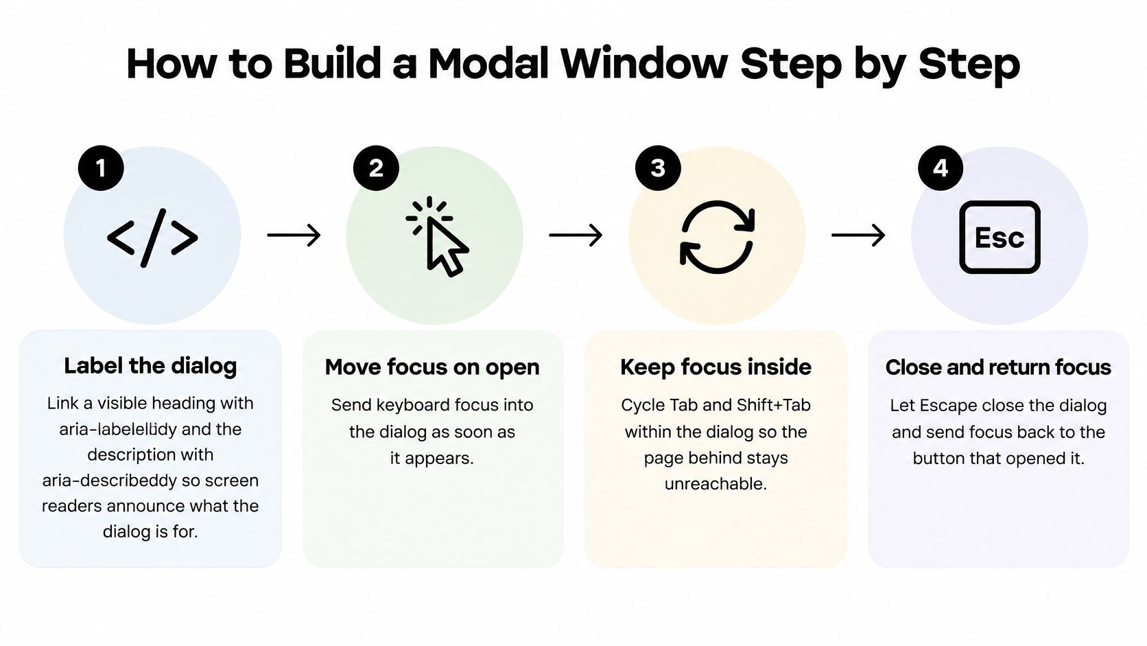
Build the interaction contract before the animation. The government dialog accessibility guidance specifies the important boundary: move focus into the dialog, keep the underlying page inert, and return focus to a logical location when the dialog closes.
Establish the boundary
-
Give the dialog an accessible name. Connect its visible heading using
aria-labelledby, and usearia-describedbyfor a concise supporting description. Don’t attach a long form or complex document as the description, because users need to move through that content rather than hear it as an uninterrupted announcement. -
Choose a deterministic initial focus target. For an informational dialog, a heading with
tabindex="-1"can provide context; for a destructive confirmation, favour Cancel. Leaving focus on the trigger behind the scrim makes the visual state and keyboard state disagree. -
Make background content inert. Prefer native
<dialog>withshowModal()when it suits your application, because a styled<div>doesn’t supply modal behaviour on its own. For a custom implementation, use appropriate dialog semantics and make the surrounding interface inert without accidentally disabling the dialog itself. -
Contain focus and control scrolling. Verify that Tab and Shift+Tab stay within the active dialog, using native behaviour or a tested focus-management implementation rather than competing traps. Lock background scrolling separately, and let oversized dialog content scroll within the available viewport.
Backdrop styling supports this boundary, but it doesn’t create it. The practical distinction between visual dimming and interaction blocking is explained in this guide to the modal backdrop.
Make every exit predictable
-
Handle Escape as cancellation when that’s safe. Escape must never confirm deletion, payment or another irreversible operation. During a non-cancellable operation, explain the state rather than ignoring the key or implying that closing will undo completed work.
-
Provide an explicit close or cancel control. A visible Cancel button may be more informative than a decorative cross, especially in a decision dialog. If you use an icon-only close button, give it an accessible name and a usable touch target.
-
Restore focus after closing. Keep a reference to the launching control and return focus there when it still exists. If the action removed it, such as deleting a list item, move focus to the nearest logical surviving control instead of the document body.
Keep closing logic separate from action logic. Clicking Cancel, pressing Escape and submitting a destructive action may all end with a closed panel, but they must not produce the same application result.
Before styling is signed off, complete the whole interaction with the keyboard. Open the dialog, reach its controls, cancel, and confirm that the visible focus indicator lands where the user can sensibly continue.
How to Test a Modal Across Assistive Technology
A modal can look finished and still fail the moment someone puts the mouse aside. Test the interruption the way it will be met: by keyboard, by screen reader, and on a phone. The table below lists observable pass conditions for each part of the interruption.
| Test | Pass condition | Check with |
|---|---|---|
| Announcement order | Heading and purpose read before the primary action | Screen readers on desktop and on mobile |
| Initial focus | Lands on a deterministic target; cancel for destructive actions | Keyboard only |
| Countdown wording | Minute-based, then 20-second updates in the final minute, following the Home Office timeout guidance | Screen reader during a timed session |
| Background inert | Tab and screen readers cannot reach page controls behind the dialog | Keyboard and screen reader sweep |
| Escape dismissal | Closes when cancellation is safe; never executes an irreversible action | Keyboard |
| Focus return | Returns to the triggering control after close, or a logical replacement | Keyboard and screen reader |
| Mobile reflow | Fits phone width and available height, scrolls internally, and keeps action and close controls reachable without requiring zoom | Device or emulator at phone width |
| Task recovery | Entered data kept after a timeout or dismissal where safe and appropriate | Manual test with a filled form |
A modal test works like a fire drill. The useful result is whether people can get out and back to work. A desktop pass can’t stand in for a phone test. Mobile screen readers may announce the primary action before they hear the rest of a warning, so a focus order that sounds calm on a laptop can jump straight to the consequential button on a phone. Treat the phone as its own environment.
Run the actual journey
Start with a keyboard-only pass. Watch the focus indicator rather than assuming that a successful click proves the controls are reachable. Try opening, cancelling, reopening and completing the dialog, including any validation errors.
Then test with a desktop screen reader, such as NVDA, and a mobile screen reader, such as VoiceOver or TalkBack. Use swipe navigation as well as direct touch on the phone, and check whether someone hears enough context before reaching a consequential action. A repeatable screen-reader testing routine makes these checks easier to include in release QA.
- Exercise the difficult layout: Open the software keyboard, increase text size and test a long translated button label.
- Run a real timed session: Listen for competing announcements and verify that the recovery action extends or restores the session.
- Inspect the result: Confirm that the user returns to the intended task, not an empty form or an unexplained sign-in screen.
Recovery test: After the interruption ends, can the visitor continue with the work they already entered?
Consent Pop-Ups and UK Privacy Expectations
Consent dialogs are often designed as visual problems: panel width, button colour and conversion copy. UK privacy guidance treats them as questions of valid choice. A beautifully styled panel can still fail if people can’t understand the request or decline it.
The Information Commissioner’s Office guidance on managing consent says requests must be specific and generally provide granular choices by purpose; silence or inactivity doesn’t count as consent. It also warns that desktop-style message boxes may be difficult to read or operate on mobile, potentially undermining valid consent, and advises against unnecessarily disruptive mechanisms.

Separate information from permission
An informational notice tells someone what’s happening. A consent request asks them to authorise something. Don’t use the same interaction indiscriminately for both.
For a consent flow, check the following:
- Balanced choices: Give accept and reject options comparable prominence rather than disguising refusal as secondary navigation.
- Purpose-level control: Let visitors understand and choose the relevant purposes.
- Readable mobile content: Keep explanations and controls usable at phone width.
- A genuine non-consent path: Let people decline without relying on an ambiguous close action.
- No passive approval: Ignoring or dismissing the panel must not become permission.
Consent evidence also matters beyond the browser interaction. Splash Access’s explanation of proving guest Wi-Fi marketing consent provides a useful adjacent example of why the recorded choice matters as much as the panel.
This is general design guidance, not legal advice. Ask your privacy and legal teams to review the complete consent flow under PECR, including what the application does before and after a choice.
Go or No-Go Before You Ship
Start with necessity. If the visitor doesn’t need to respond immediately and hasn’t deliberately opened a focused task, replace the modal with a banner, popover or inline step. Don’t spend another review cycle perfecting an interruption that shouldn’t exist.
For a justified modal, use the QA matrix as a release gate on desktop and a phone. A failed row is a no-go until someone fixes it and repeats the relevant journey.
Make the release decision explicit
- Content ready: The heading explains the decision, the description is concise, and button labels name their actions.
- Controls ready: The close control has an accessible name, and cancellation cannot accidentally submit the primary action.
- Journey ready: Validation, loading, completion and recovery states have been tested, not just the initial panel.
- Ownership clear: Record who will fix failed checks and what evidence confirms the retest passed.
For Vue teams, our Components library includes dialogs alongside menus, tabs and other app primitives. Its headless, framework-neutral foundations let teams reuse interaction behaviour rather than rebuilding each dialog independently.
That doesn’t remove the need to test your content and application state. A reusable primitive can manage the interaction boundary, but your team still decides what the dialog asks, what the actions do and whether the visitor’s work survives.
Ship when the interruption has a defensible purpose and the complete journey passes, not when the screenshot looks finished.
DOM Studio offers headless web component primitives with a Vue integration layer for building consistent app interfaces, including dialogs. Visit DOM Studio to explore the components, then apply the modal QA matrix to your own booking, confirmation or timeout flow before release.