
You click Open details, the screen dims, and the dialog appears. Then you press Tab. Nothing visibly changes. Press it again, and focus lands on a link behind the dialog. A screen reader announces unrelated page content while the new panel remains silent. Closing the dialog leaves focus somewhere near the top of the document, so the user has to hunt for the control they were using.
That failure usually comes from treating “open a dialog” as a visibility change. In a production Vue application, opening is a complete interaction: the browser or component must expose the content, move focus, contain keyboard navigation, preserve a usable exit path, announce the right name, and restore context when the dialog closes. Animation must fit around those behaviours, not interrupt them.
This matters especially for UK public-sector services. The UK accessibility monitoring guidance explains that the 2018 regulations require public-sector websites and mobile applications to meet WCAG 2.2 AA through EN 301 549 and publish an accessibility statement. The same monitoring context includes findings from January 2022 to September 2024, while the Bank of England’s Firm Engagement Portal identifies modal dialogs that aren’t announced correctly to assistive technologies as a live issue.
Table of Contents
- Why Opening a Dialog Correctly Matters More Than You Think
- How to Open a Dialog With Native APIs and Attributes
- Opening and Controlling Dialogs With DOM Studio Primitives and Vue
- Keyboard Focus and Accessibility You Must Get Right
- Theming and Animation Tips That Keep Dialogs Usable
- Choosing the Right Dialog Pattern and Shipping With Confidence
Why Opening a Dialog Correctly Matters More Than You Think
A dialog interrupts the current task. That interruption can be useful for confirmation, a focused form, or a time-sensitive warning, but it also changes the user’s navigation context. The moment the panel opens, users need to know where they are, what they can do, and how to leave without losing their place.
The most common implementation mistake is to test only the click. A developer verifies that the panel appears and assumes the feature works. In reality, the defects often happen immediately afterwards: focus stays on the trigger, the browser exposes background controls, the close button is unreachable, or the panel disappears before assistive technology can announce it.
The complete open flow
A reliable modal interaction should perform a predictable sequence:
- Activate the trigger. The opening control must work with a mouse, touch, and keyboard.
- Expose the dialog. The browser or primitive should establish the dialog’s role and modal state.
- Move focus inside. Focus normally belongs on the close button, heading, first field, or another deliberate target.
- Contain navigation. Tab and Shift+Tab must cycle through usable controls in the dialog.
- Offer an exit. Escape may close a modal where that behaviour is appropriate, and a visible close control should remain available.
- Restore context. Closing should return focus to the control that opened the dialog, unless the user’s task has moved somewhere else.
The W3C H102 technique describes this focus journey directly. The dialog opens from the keyboard, focus moves into it, focus remains contained while it’s open, and focus returns to the trigger on close.
Practical rule: A dialog hasn’t opened successfully until a keyboard user can identify it, use it, and leave it without losing their place.
The UK context makes this more than a refinement. The UK Communications Service accessibility guidance records that 1 in 5 people have an illness, condition or disability that can affect their ability to access or understand a message. A separate UK accessibility facts page reports that 88% of disabled people experience accessibility barriers at least once a week. Those figures describe a broad user need, not a niche edge case.
The rest of the implementation should follow that mental model. Native APIs provide a strong baseline, headless primitives can package the difficult behaviour, Vue can control state reactively, and CSS can add motion without delaying focus or hiding essential controls.
How to Open a Dialog With Native APIs and Attributes
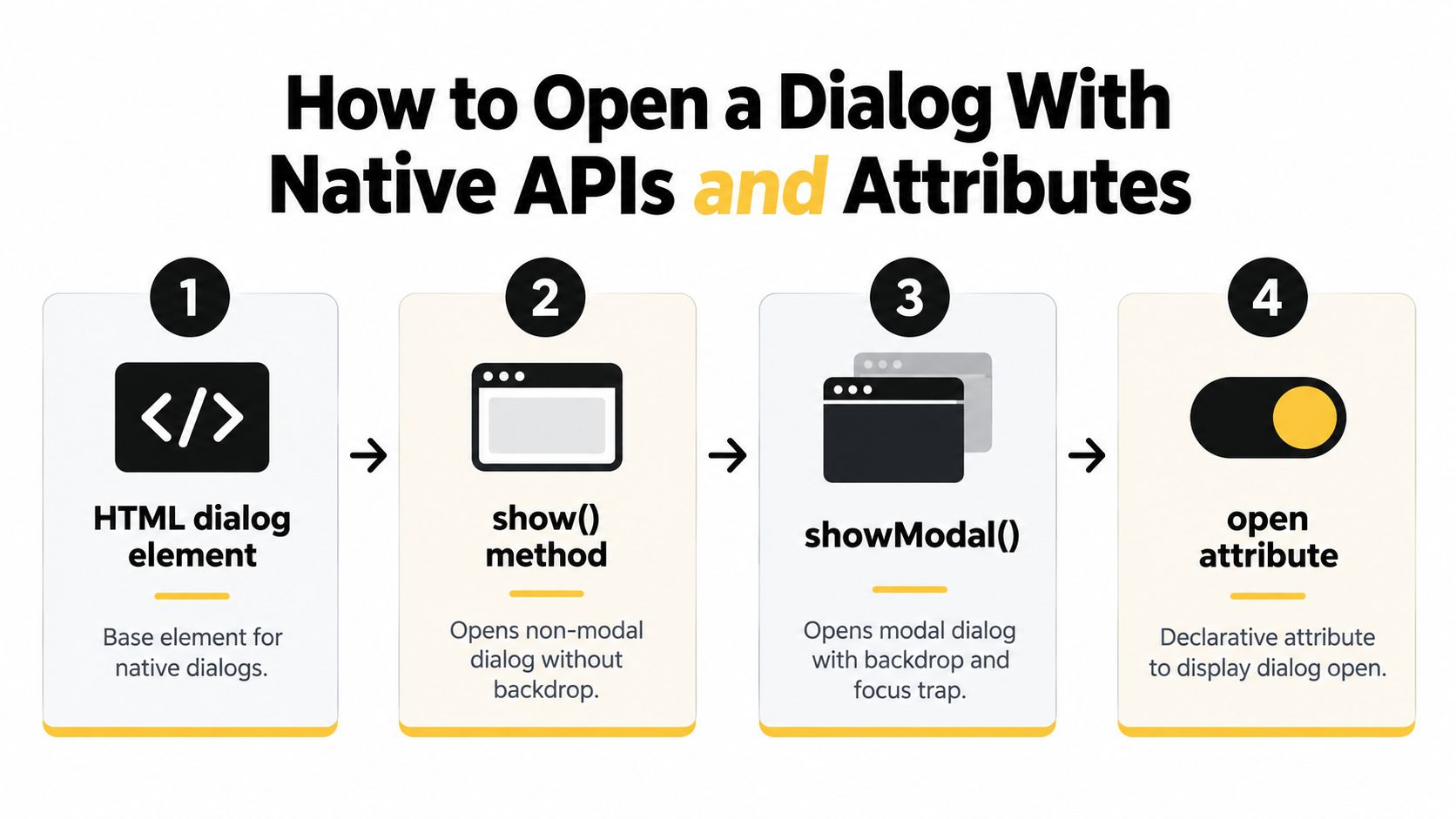
The native HTML <dialog> element gives you two distinct opening modes. Use show() for a non-modal dialog, where the rest of the page remains interactive. Use showModal() for a modal dialog, where the browser places the element in the top layer, displays the modal backdrop, and makes the surrounding document inert.
The open attribute indicates that the element is open, but it isn’t equivalent to showModal(). Setting it declaratively can display the element without establishing the complete modal behaviour you expect. For a modal interaction, call the modal API rather than treating open as a substitute.
Choose the opening method deliberately
A simple native structure might look like this:
<button type="button" id="edit-trigger">Edit profile</button>

<dialog id="edit-dialog" aria-labelledby="edit-title">
  <h2 id="edit-title">Edit profile</h2>
  <button type="button" id="close-dialog">Close</button>
  <form>
    <!-- fields -->
  </form>
</dialog>
Imperative control is straightforward when a button owns the interaction:
const trigger = document.querySelector('#edit-trigger')
const dialog = document.querySelector('#edit-dialog')
const close = document.querySelector('#close-dialog')

trigger.addEventListener('click', () => {
  dialog.showModal()
})

close.addEventListener('click', () => {
  dialog.close()
})
Use show() instead when the panel behaves like a non-blocking inspector, contextual tool, or floating utility. A non-modal dialog doesn’t create the same inert backdrop, so you must make sure the page remains understandable when both the dialog and its background are active.
Programmatic opening after asynchronous work
Opening after an API response is useful when the dialog contains server-provided content. Keep the state transition explicit and open only after the content and accessible name are ready:
async function openRecord(recordId) {
  const record = await fetchRecord(recordId)
  renderRecord(record)
  dialog.showModal()
}
Don’t open an empty shell and then inject its heading later. A screen reader user may receive an incomplete announcement, while sighted users see content shift inside the panel.
The browser also supports dialog forms with method="dialog". Submitting a button in that form closes the dialog and exposes the button’s value through returnValue, which can be useful for confirmation choices:
<form method="dialog">
  <button value="cancel">Cancel</button>
  <button value="confirm">Confirm</button>
</form>
Close behaviour and the backdrop
A modal backdrop should make the interruption clear, but click-outside dismissal needs a product decision. It works well for lightweight panels where losing entered content is harmless. It can be risky for destructive confirmations or long forms, where an accidental click could discard work.
The native dialog guidance explored by Ben Nadel shows the practical distinction between modal and non-modal use, including native close handling and backdrop styling. Test your chosen behaviour across keyboard and pointer input rather than assuming every dismissal method suits every dialog.
This video gives a visual introduction to the native model and its controls:
Opening and Controlling Dialogs With DOM Studio Primitives and Vue
Native APIs are a solid foundation, but larger Vue applications need consistent state ownership, slots, transitions, and composition. A headless primitive can own the difficult interaction rules while Vue controls when the dialog is open and what it contains.
The DOM Studio dialog documentation describes a component model designed for modal dialogs in Vue and headless HTML integrations. In practice, that means you can keep the trigger, content, title, description, and close controls in a composable structure rather than rebuilding ARIA attributes and focus behaviour in every feature.

Use uncontrolled state for local interactions
For a self-contained confirmation, let the dialog manage its own open state through its trigger and close controls:
<template>
  <DomDialog>
    <template #trigger>
      <button type="button">Delete account</button>
    </template>

    <template #title>Delete account</template>
    <template #description>
      This action can't be undone.
    </template>

    <button type="button">Cancel</button>
    <button type="button" @click="deleteAccount">Delete</button>
  </DomDialog>
</template>
This pattern keeps ownership close to the feature. The parent doesn’t need a watcher merely to mirror a local click, and the primitive can associate the trigger with the dialog correctly.
Use controlled state for application workflows
Controlled state makes more sense when a store, route, table row, or asynchronous process decides whether the dialog opens:
<script setup>
import { ref } from 'vue'

const isOpen = ref(false)
const selectedUser = ref(null)

function editUser(user) {
  selectedUser.value = user
  isOpen.value = true
}
</script>

<template>
  <button type="button" @click="editUser(user)">
    Edit
  </button>

  <DomDialog v-model:open="isOpen">
    <template #title>Edit user</template>

    <UserForm
      v-if="selectedUser"
      :user="selectedUser"
      @saved="isOpen = false"
    />
  </DomDialog>
</template>
The order matters. Assign the selected record before setting isOpen so the dialog has a meaningful title and body when it becomes available. When a save completes, close through the controlled state rather than removing the component abruptly.
Programmatic control without duplicated behaviour
A composable can expose a single source of truth for a workflow that may be launched from several places:
import { ref } from 'vue'

export function useEditDialog() {
  const open = ref(false)
  const record = ref(null)

  function show(recordToEdit) {
    record.value = recordToEdit
    open.value = true
  }

  function hide() {
    open.value = false
  }

  return { open, record, show, hide }
}
This is safer than manually toggling classes, aria-hidden, body scroll, and focus in each caller. The Vue wrapper handles reactive updates, while the headless element supplies the interaction model.
Composition also matters when a dialog contains menus, listboxes, or a drawer-like secondary action. Keep one modal owner, avoid accidentally nesting independent focus traps, and make the current layer obvious to keyboard and screen reader users. A child menu should close before its parent dialog, not leave two competing escape handlers active.
Keyboard Focus and Accessibility You Must Get Right
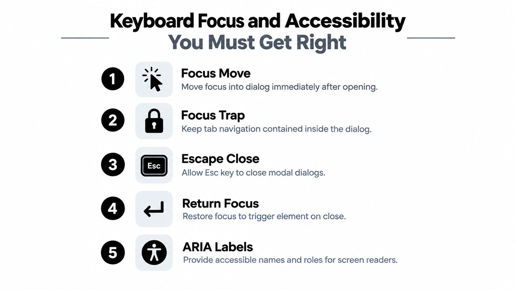
A dialog can look open while the keyboard user remains on the trigger. That mismatch breaks the task immediately. On open, move focus into the dialog. On close, restore it to the trigger or the next logical task. While the dialog is modal, background controls must not remain available to keyboard or assistive technology users.
The GOV.UK operable guidance sets the practical direction for UK public-sector interfaces: users need a clear way into and out of the dialog, a visible focus order that follows the logical interaction order, and an exit path from any focus trap. Restrict focus to interactive elements and keep visually hidden content out of the tab sequence. These details are part of meeting UK WCAG 2.2 AA expectations in a production Vue application, not optional polish.
What the dialog must communicate
Every dialog needs an accessible name. A visible heading connected with aria-labelledby is usually the strongest choice because it gives screen reader users context and helps sighted users understand the task. Add a description when the purpose, risk, or consequence needs more explanation. Use the appropriate dialog role and modal state through the native element or headless primitive, rather than rebuilding those semantics with classes and reactive flags.
Choose the initial focus target deliberately:
- A confirmation often focuses the least destructive action or the heading, depending on the content and interaction.
- A form commonly focuses the first field, provided the user can understand what the form is for.
- A long explanation may focus the heading or close button, giving the user a predictable starting point.
- A validation error should focus the error summary or first invalid control, rather than resetting blindly to the first field.
A heading that cannot be announced adds little value. If the heading is the target, it may need a suitable focus treatment, while a decorative heading should stay out of the focus order.
Verify the whole keyboard journey
Test with the mouse unplugged. Open the dialog, use Tab and Shift+Tab, activate each control, press Escape where supported, and verify focus restoration. Repeat after validation errors, asynchronous content updates, and failed submission. These states often expose timing bugs that a simple open-and-close check misses.
| Check | Pass criteria |
|---|---|
| Opening | The keyboard trigger opens the dialog and focus moves inside it |
| Containment | Tab and Shift+Tab stay within the active modal |
| Exit | A visible close control is reachable, with Escape behaving as designed |
| Restoration | Closing returns focus to the trigger or the next logical task |
| Labelling | Screen readers announce the dialog name, role, and relevant description |
The DWP Design System timeout warning modal connects modal behaviour with WCAG 2.2 SC 2.2.1 Timing Adjustable at Level AA and notes that SC 2.2.6 Timeouts is required for Level AAA. A timeout warning must preserve the user’s context, provide a usable decision, and remain accessible while the timer or warning state changes.
The UK Communications Service accessibility guidance records that 1 in 5 people have an illness, condition or disability that can affect their ability to access or understand a message. 88% of disabled people experience accessibility barriers at least once a week, so test the interaction, not only the markup.
Screen reader testing should cover the browser and assistive technology combinations your service supports. Confirm that the dialog is announced once, its title is meaningful, background content is unavailable while it is active, and closing does not cause a confusing jump. Teams working on interface copy and visual hierarchy can also consult creative content roles GENTY when those parts need to support the same accessible task.
Backdrop behaviour deserves a separate review. The DOM Studio modal backdrop guide covers styling the dimmed layer without placing it above the dialog, capturing focus, or making the backdrop the only apparent dismissal method. In headless primitives and Vue wrappers, keep backdrop state, focus handling, and dismissal ownership together so animation cannot change which layer receives input.
Theming and Animation Tips That Keep Dialogs Usable
A polished dialog doesn’t need elaborate motion. It needs a stable surface, a readable backdrop, sensible dimensions, and an animation that confirms the state change without delaying access to the content.
Style the dialog surface and backdrop as separate layers. The surface should have a clear contrast boundary, a visible close control, internal spacing, and a scroll strategy for content that exceeds the viewport. The backdrop should reduce visual competition without making the page look broken or suggesting that the underlying controls remain available.
Animate state, not accessibility
Use opacity and transform for entrance motion, rather than animating display or delaying the element’s availability. Focus should move as soon as the dialog opens. The animation can then provide visual feedback while the focused control remains usable.
.dialog {
  opacity: 0;
  transform: translateY(0.5rem) scale(0.98);
  transition:
    opacity 160ms ease,
    transform 160ms ease;
}

.dialog[open] {
  opacity: 1;
  transform: translateY(0) scale(1);
}

.dialog::backdrop {
  background: rgb(0 0 0 / 0.48);
  transition: background 160ms ease;
}

@media (prefers-reduced-motion: reduce) {
  .dialog,
  .dialog::backdrop {
    transition: none;
  }
}
Exit animation needs more care. Native closing may remove the element before a CSS transition can finish, while a Vue transition can keep it mounted after the modal state has changed. Coordinate the transition lifecycle with the primitive so the dialog isn’t visually present but no longer available to assistive technology.
Make the layout resilient
Avoid fixed heights that create nested scrolling without a strong reason. Constrain the surface to the viewport, let the content area scroll, and keep the close control reachable. Test browser zoom, narrow screens, long translated strings, large text settings, and validation messages that expand the form.
Tailwind CSS 4 or DOM Studio Visual Blocks can help teams standardise surface tokens, backdrop colour, spacing, radius, and responsive widths. The useful boundary is design-system consistency, not decoration. A component should expose the states designers and engineers need, including open, closing, invalid, busy, and reduced-motion variants.
Motion should explain the state change. It shouldn’t make a keyboard user wait for the interface to become usable.
Prevent layout shift by deciding how the page scrollbar behaves when a modal opens. If the document loses its scrollbar abruptly, content can move horizontally and the user may lose visual orientation. Apply a consistent scroll-lock strategy, preserve the scrollbar gutter where appropriate, and verify that the lock doesn’t prevent the dialog’s own content from scrolling.
Choosing the Right Dialog Pattern and Shipping With Confidence
A dialog is appropriate when the user must make a focused decision, complete a contained task, or acknowledge information before continuing. It isn’t a universal replacement for clear content. If users need to compare details, refer back to instructions, or keep guidance visible while working, inline disclosure or a persistent panel may serve them better.
That distinction matters because interruptions impose a cost. Euan’s Guide reports that 85% of disabled respondents consider clear and accurate access information the single most effective way to reduce the time-cost of accessibility, while 53% spend 1–5 hours each week making sure their access needs are met and 12% spend 6–20 hours each week doing so, as documented in the Euan’s Guide Access Survey. A modal that hides essential information can add friction where better content would remove it.
Use this pre-ship check before releasing a dialog:
- Decide the pattern: Confirm that a modal interruption is necessary, rather than using inline content or a drawer. For broader side-panel tasks, compare the drawer component guidance.
- Choose ownership: Use native
showModal()or a headless primitive for modal behaviour, and keep Vue state controlled in one place. - Test the journey: Open with keyboard, identify the title, tab through every control, use the close paths, and verify focus restoration.
- Test real conditions: Check zoom, small screens, long content, validation states, reduced motion, and supported screen reader combinations.
- Review compliance evidence: Make sure the service’s accessibility statement accurately reflects known limitations and remediation work.
The implementation choice is less important than the outcome. Native APIs can provide browser behaviour, while a Vue wrapper around a headless primitive can make repeated patterns consistent across a product. In both cases, the team must test the complete interaction rather than stopping when the panel becomes visible.
DOM Studio provides headless dialog primitives with a Vue integration layer for reactive props, v-model, slots, and programmatic control, so teams can compose accessible dialog behaviour without duplicating focus and ARIA logic in every feature. Visit DOM Studio to explore the dialog alongside drawers, menus, toasts, and other production UI primitives, then use the component that matches the task rather than forcing every interaction into a modal.