
Most teams still treat legend text as a finishing touch, the bit you style after the chart or form already works. That habit breaks down fast in production, because the legend is often the only thing telling a screen reader user, a keyboard user, or a low-vision user how the interface is organised. If the text is decorative, the component is fragile. If it carries meaning, the component needs real structure.
Legend text is not just labelling. In forms, it defines the scope of related controls. In charts and maps, it tells users how symbols, colours, and categories connect to the underlying data. That makes it part of the interface’s information architecture, not a cosmetic layer.
Table of Contents
- Rethinking Legend Text as Semantic Infrastructure
- HTML Fieldsets and the Native Legend Element
- Accessibility Standards for Chart and Graph Legends
- Spatial Association in Map Interface Legends
- Responsive Typography and Tailwind CSS Techniques
- Integrating Legends with Headless Vue Components
- Testing and Verifying Legend Accessibility
Rethinking Legend Text as Semantic Infrastructure
A dashboard ships with a colour-only legend, and QA signs it off because it looks right on a Retina display. The same component becomes difficult to interpret for someone using a screen reader, keyboard navigation, magnification, or a monochrome display. The failure began in the information architecture, long before CSS was applied.
A legend defines relationships. In a form, it names the group of controls that follows. In a chart or map, it connects labels with series, symbols, colours, or categories. Once legend text enters the DOM, it becomes part of the data contract: remove it and the visual stops being interpretable.
The HTML structure determines whether that relationship survives outside the original design. A heading beside a graphic may look equivalent to a semantic label, yet assistive technology can receive no connection between the two. The same principle behind semantic HTML patterns applies here: put meaning in the structure, then style the structure to match the design.
The part that gets missed in design reviews
A clean visual arrangement can conceal a weak reading order. Review the component with CSS disabled, inspect the DOM, and ask what a user encounters first, what each label describes, and whether the relationship remains clear without colour. This catches problems that a screenshot review will miss.
Practical rule: if users must cross-reference colour alone to understand a legend, the component has placed too much interpretation on the user.
For compact data visualisations, provide the same meaning in text near the graphic. A visual key can support scanning, while a written description gives screen reader users and people who cannot distinguish the colours another route through the content. The description should explain the relevant comparison or trend, rather than merely repeat the legend labels.
The decision you should make first
Decide whether the legend is needed before choosing its layout. Direct labels often keep the relationship between a value and its visual element visible at the point of use. A separate legend remains useful when labels would collide, obscure marks, or make a dense chart harder to scan.
If a legend stays, define its responsibilities in the component contract. Preserve a predictable order, communicate category meaning through text or structure, and keep the content available to assistive technology. Treat the legend as a named interface element with an owner, expected data shape, and test cases.
That decision prevents a Figma caption from becoming an undocumented React or Vue prop. It also gives design-system teams a stable foundation for forms, charts, and maps, even when the presentation changes.
HTML Fieldsets and the Native Legend Element
A native <fieldset> with a <legend> carries form structure that a collection of <div> elements cannot reliably reproduce. The fieldset groups related controls, while the legend names that group for screen reader users, keyboard users, and everyone scanning the form. For radio groups, checkbox sets, and other clustered controls, start with the platform semantics before adding ARIA.

Keep the DOM simple enough for browsers to understand
Make the relationship explicit in the DOM:
<fieldset class="choice-group">
  <legend class="choice-group__title">Notification preferences</legend>

  <label><input type="checkbox" name="alerts" value="email"> Email</label>
  <label><input type="checkbox" name="alerts" value="sms"> SMS</label>
  <label><input type="checkbox" name="alerts" value="push"> Push notifications</label>
</fieldset>
Keep the <legend> as the fieldset’s direct naming element, and place the controls inside the same group. As focus moves between inputs, assistive technology can retain the group context. Replacing this structure with generic containers creates extra work for every component and every accessibility test. See this guide to accessible fieldset styling for practical CSS patterns.
Reset styling without deleting semantics
User agent styles make fieldset borders and legend positioning awkward, particularly after a design-system reset. Remove the visual treatment, not the semantic elements.
.choice-group {
  border: 0;
  padding: 0;
  margin: 0;
  min-inline-size: 0;
}

.choice-group__title {
  font: inherit;
  font-weight: 600;
  margin: 0 0 0.5rem;
  padding: 0;
}
The min-inline-size: 0 rule prevents the fieldset’s intrinsic sizing from creating unexpected overflow in constrained layouts. Keep the legend visible in the DOM even when the visual design uses a compact heading treatment. Hiding or replacing it removes the group name that users need.
The cleanest fieldset looks custom while behaving like native HTML.
Headless primitives should preserve that contract. Keep the semantic element, then style around it.
Accessibility Standards for Chart and Graph Legends
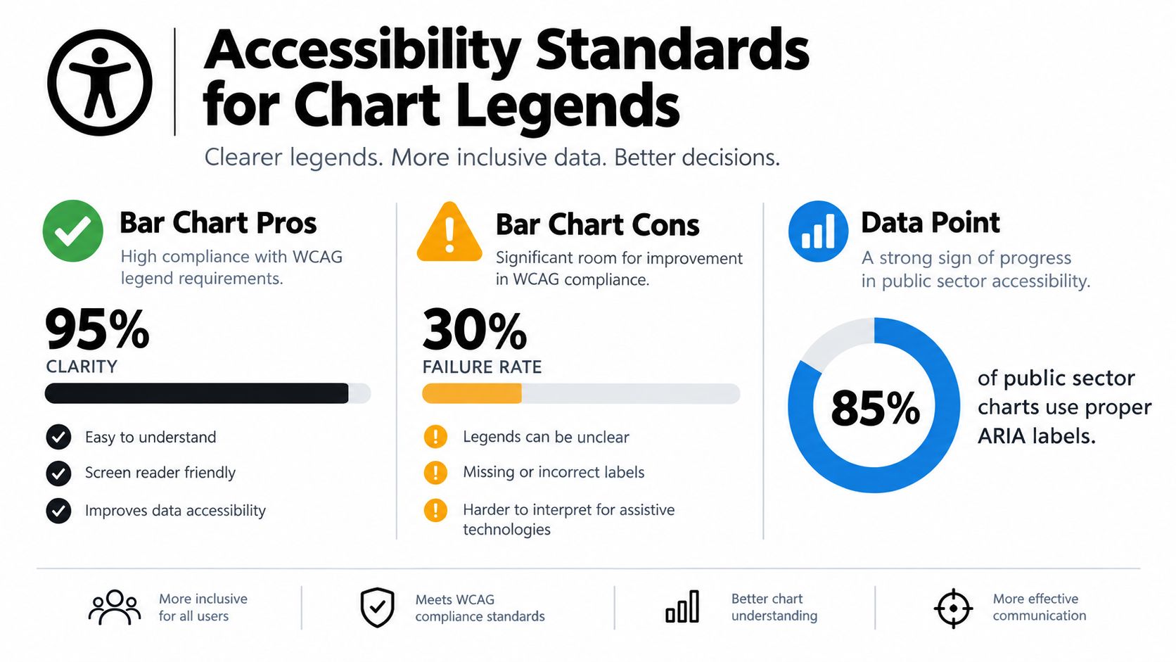
A polished chart legend can still fail as an interface. Treat its text, structure, and responsive behaviour as part of the chart’s information architecture, rather than as decoration added after the visual design is complete. As covered above, chart accessibility guidance rules out colour-only legends under WCAG 2.1 Use of Colour. The production baseline here is the text itself and how users encounter it.
Choose the right text structure
Direct labels may suit a chart with only a small number of series, but the implementation decision should follow the chart’s reading pattern. A separate legend remains useful when several series would make labels collide, when the chart needs a compact key, or when users can inspect series independently. Polishing a legend is wasted effort when direct labels would communicate the same information more clearly.
For an interactive chart, expose each series as a named control when visibility can change. A button should contain the series name, expose its current state, and update that state when the series is hidden or shown. Keep the control in the same DOM group as the chart’s explanatory text so keyboard and assistive-technology users can find the relationship without depending on positioning or colour.
A static legend can use a heading followed by a list. Give each item a text label and a swatch with an appropriate hidden or descriptive treatment, depending on whether the colour carries information already stated in the text. The DOM should preserve a readable text layer even when the chart is rendered with SVG or canvas.
Apply a measurable typography baseline
The UK Office for National Statistics provides production values that are useful when a design system has no chart-specific specification. Set legend text to 14 pixels, use 16.8 pixels line height, and use Open Sans as the primary typeface. Write labels in sentence case and keep text horizontal. These decisions improve scanning and reduce the number of rendering variables that need separate testing. ONS typography specification
The same specification calls for chart alt text between 100 and 200 characters, ending with a full stop. Keep that description near the chart in the accessible name or supporting content, according to the chart component’s structure. A legend provides series names. Alt text should explain what the chart communicates.
Test the rendered result
Desktop screenshots are an incomplete check. Test zoom, narrow viewports, long translated labels, increased text spacing, and keyboard interaction. Text should remain legible, maintain clear contrast, and reflow without clipping or overlapping the plot or adjacent controls. An infographic illustrating accessibility standards for chart legends, highlighting pros, cons, and data point statistics.
A useful final check compares the visual chart, the legend’s DOM, and the text alternative. If those three layers expose different information, fix the component before refining its spacing or appearance.
Spatial Association in Map Interface Legends
Map legends are different from chart legends because the relationship is spatial as much as linguistic. Ordnance Survey guidance says the symbol’s size, shape, colour, and orientation in the legend must match the map representation exactly, and the explanatory text should stay adjacent or connected so users can’t confuse which label belongs to which symbol. For quantitative maps, the legend also has to expose the variable and unit, because colour or size encodings without units are easy to misread. map legend guidance
Treat each legend row as one unit
The best implementation pattern is boring in the right way. Model every legend row as a single semantic unit, with the symbol and text bound together in the DOM instead of positioned independently. That keeps the row stable when it wraps, and it stops the label from drifting away from the swatch on narrow screens.
A good structure looks more like a list than an overlay:
- Group by feature type: keep points, lines, and areas distinct so the user can scan by geometry first.
- Keep the symbol adjacent: never rely on absolute positioning if a wrapped label might detach from the icon.
- Expose hierarchy: give the legend a heading and nested grouping so keyboard users can move through it without guessing.
This approach works because it mirrors how users interpret a map. They look at the symbol, then the text, then the map feature. If the legend breaks that sequence, comprehension drops fast.
Make the legend serve the task
A map legend should help a user answer a specific question, not just list every category the renderer can produce. That means ordering groups by task relevance, not by whatever order the styling layer happens to emit. It also means keeping the explanatory text compact enough that the legend doesn’t compete with the map for attention.
Useful heuristic: if the legend needs lots of visual ornament to stay legible, the layout is already doing too much and the structure is doing too little.
The strongest map legends feel attached to the geography. They preserve adjacency, state the unit when needed, and keep the meaning visible whether the user is scanning with a mouse, a keyboard, or a screen reader.
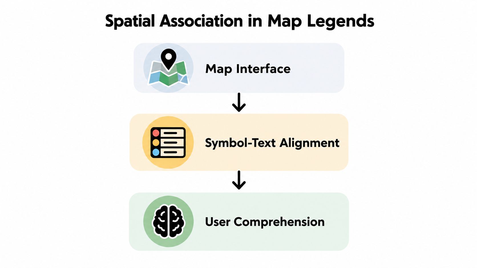
That spatial discipline is what keeps the legend operational instead of decorative.
Responsive Typography and Tailwind CSS Techniques
Legend text is part of the interface’s information architecture, not a decorative label added after the layout is finished. A narrow container, a long category name, or browser zoom can change whether users understand the symbol-to-label relationship. UK public-sector accessibility guidance requires text to remain usable when enlarged, while the cited contrast requirements are 4.5:1 for normal text and 3:1 for large text. accessibility standards guidance
Use utilities that preserve the relationship
Tailwind is most useful when each utility protects a behaviour. The legend should reflow, preserve the association between symbol and text, and expand vertically instead of clipping content.
| Challenge | Tailwind Utility | Purpose |
|---|---|---|
| Long legend label | whitespace-normal break-words |
Wraps text rather than allowing overflow |
| Symbol and text drift | flex items-start gap-2 |
Keeps the swatch and label aligned as one item |
| Dense vertical space | leading-5 or a custom line-height |
Gives wrapped lines room to breathe |
| Small container width | grid grid-cols-[auto_1fr] |
Holds the symbol in a stable column while text uses the remaining width |
| Emphasis without shouting | text-slate-700 or a similar contrast-safe token |
Maintains readable contrast without excessive visual weight |
The grid pattern is particularly useful for multi-line labels. The symbol occupies the auto column, while the label occupies 1fr, so wrapped lines return to the text column rather than moving beneath the swatch. For a simple single-line item, flex is often sufficient. Choose the structure according to the content instead of forcing every legend into one layout.
Prefer relative sizing over fixed assumptions
Relative units such as em and percentages give text more room to respond to user settings and browser zoom. The Home Office guidance cited in the original section recommends relative sizing and layouts that retain their function at up to 400% zoom. A legend that looks correct at its default size may clip a label, overlap its symbol, or push adjacent controls out of view when enlarged.
Test the actual component at increased zoom, not only in a responsive browser preview. Check long translated labels, wrapped lines, high text scaling, and containers narrowed by surrounding controls. The layout should grow in height and preserve the DOM relationship between the symbol and its label. Avoid fixed heights on legend rows unless the content is strictly constrained and an accessible alternative is available.
Keep typography responsive, not merely smaller
Reducing the font size until the legend fits hides the layout problem. Use left-aligned labels, a line height that remains comfortable across wrapped lines, and a container that can expand vertically. Truncation should be rare. An ellipsis can conceal the category or unit a user needs to interpret the graphic, and a tooltip does not replace visible text for every input method.
Typography decisions also need a system. The typography system guide can help standardise font scales across legends, labels, and helper text. For the distinction between letterform clarity and ease of reading in context, see the Simon Stratford typography blog.
Responsive legend text starts with DOM-friendly layout rules, then adds type scale, colour, and spacing. That order keeps the component usable when content, viewport width, or user settings change.
Integrating Legends with Headless Vue Components
Styled components tend to bake in the wrong assumptions about legend text. They often hard-code spacing, lock the icon and label into a fixed arrangement, and make it hard to swap in different content without forking the component. Headless primitives avoid that problem by separating behaviour from presentation, so the wrapper can manage semantics while the app decides how the legend looks.
Let the primitive own the behaviour
A headless legend primitive should handle the hard parts, like keyboard interaction, focus management, and the accessible relationship between items. The Vue wrapper can then expose slots for symbol content, label text, and any series toggling state. That gives product teams freedom to localise labels, inject icons, or connect the legend to chart visibility without re-implementing interaction logic every time.
One practical pattern is a tiny primitive paired with a thin Vue layer. The primitive keeps the state machine and accessibility contract. The Vue wrapper surfaces reactive props and v-model support for interactive legends, so a user can toggle series visibility or switch categories without losing the underlying semantics.
Compare that with a styled-only approach
A fully styled legend component is faster to demo and slower to maintain. It usually works until you need one of three things, custom ordering, keyboard support, or a different rendering context such as a chart, a form, or a map. Then the styling layer becomes a liability because the behaviour is buried inside it.
By contrast, a wrapper around a headless primitive stays reusable across contexts. The same structural pattern can support form groups, chart series toggles, or map keys because the DOM contract remains clear and the visual layer stays replaceable. DOM Studio follows that model with headless web component primitives and a thin Vue integration layer, so teams can compose legends without rebuilding the accessible interaction patterns from scratch.
Good legend components are composable first, pretty second.
That’s the payoff of headless architecture. The legend text stays where the semantics belong, and the wrapper only handles the parts that should vary.
Testing and Verifying Legend Accessibility
A legend can look correct in a screenshot and still fail in production. The useful test is not visual polish, but whether the DOM exposes the right group, label, and control relationship to keyboard and assistive technology users.
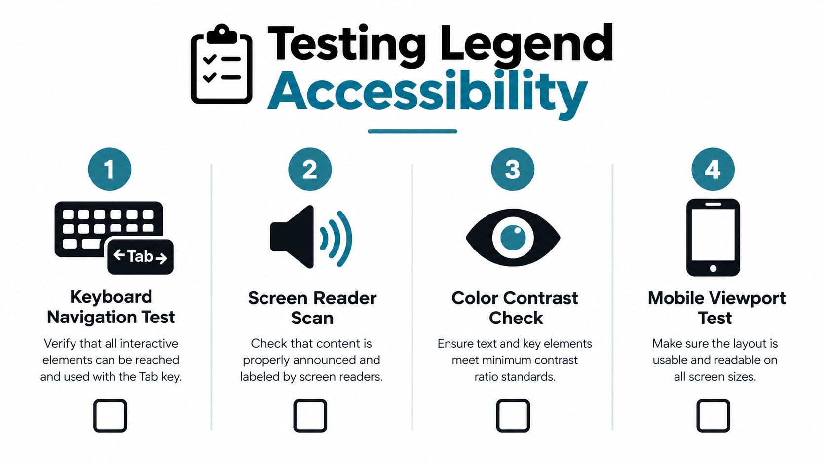
A practical test pass
Start with keyboard navigation. Tab through every legend item and verify the order follows the visual and DOM structure. Focus must remain visible against the surrounding interface. If an item toggles a chart series or map layer, expose it as a real button or other appropriate control, with an accessible name and state, rather than a clickable text element.
Run a screen reader through the component next. For a form fieldset, confirm that the native legend is announced as the group label before its controls. For a chart or map, check that the legend text, symbol meaning, and related explanatory copy remain understandable when read linearly. A visual connection between a swatch and label is not enough if the DOM separates them without a usable name.
Check contrast at normal and enlarged text sizes. A row may have sufficient contrast while still failing after zoom causes labels to wrap, symbols to drift away, or controls to collide. Test the actual rendered component, including long localized labels and the focus indicator.
Then test narrow viewports. Confirm that each symbol stays associated with its label, interactive targets remain usable, and the legend does not disappear behind overflow or clipped containers. Test both a static legend and an interactive one, since state changes can introduce new layout and announcement problems.
What a good failure teaches you
A failed test usually points to a specific design or DOM defect: weak grouping, an unstable layout, an unclear label, or a control with missing state. Fix the underlying structure instead of adding another visual adjustment. Recheck the component in every context where it is reused, because a pattern that works for a fieldset may not describe a chart or map accurately.
Test legends with real focus movement, zoom levels, and assistive technology. That process shows whether the text carries meaning or only decorates the interface.
DOM Studio provides headless primitives and Vue wrappers for legend text, symbol slots, and accessible state. Teams standardising charts, maps, or grouped form controls can review its component patterns at DOM Studio.