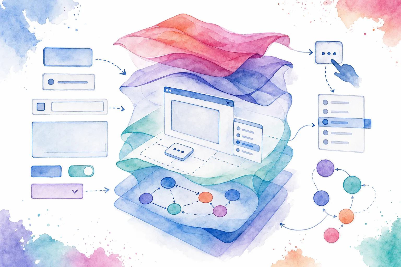
Headless Vue components let us ship interaction behavior, semantics, state, and accessibility without prescribing a visual system. That separation is useful when the same product needs different themes, brand surfaces, or application contexts.
In this guide, we will build a headless Vue dialog with a small, testable API. The component owns modal behavior, Escape handling, focus return, and keyboard containment. Consumers own the trigger markup, dialog content, layout, and CSS.
DOM Studio is a practical reference point because its library pairs framework-neutral headless elements with Vue wrappers and higher-level application components. We can use the same layered approach in our own code: establish behavior first, then apply an intentional visual shell. Start by reviewing the DOM Studio headless overview if you want to compare this pattern with installable primitives.
Table of contents
- Define the component contract
- Build the behavior-only dialog
- Provide slots and styles at the usage site
- Test keyboard and focus behavior
- Expand the pattern into a component system
- Decide when to adopt an existing tool
- Document the completed contract
Prerequisites
Before we start, make sure we have:
- Vue 3.4 or later, so we can use
defineModel(). - A Vue application that supports Single-File Components and TypeScript.
- Basic familiarity with
ref, slots, andv-model. - A browser environment for testing native
<dialog>behavior.
Our example uses the native dialog element deliberately. It supplies meaningful modal semantics, while Vue manages the component state and API.
1. Define a narrow, explicit contract
A headless component should expose behavior, not opinions about border radius, colors, spacing, shadows, or typography. We will keep the contract limited to four responsibilities:
v-model:opencontrols whether the dialog is open.- A named
triggerslot receives anopen()function. - The default slot receives
close()andisOpen. - The component handles Escape, backdrop dismissal, focus movement, and focus return.
Expected result: consumers can replace every visual element around the dialog without changing the interaction contract.
Verification check: if the consumer can use a text button, icon button, or menu item as the trigger, the API is headless enough.
Avoid a catch-all prop API such as color, variant, size, rounded, and elevation at this layer. Those are styling decisions that belong in a wrapper component or the consuming view.

The DOM Studio dialog playground is a useful example of how an interaction primitive can be inspected independently of its final product styling. Its headless Dialog reference also shows slot-based triggering, programmatic control, close events, and keyboard behavior.
2. Build the behavior-only dialog
Create HeadlessDialog.vue. This component renders a native <dialog> but deliberately adds no authored presentation styles.
<script setup lang="ts">
import { nextTick, ref, useAttrs, watch } from 'vue'

const attrs = useAttrs()
const open = defineModel<boolean>('open', { required: true })

const dialog = ref<HTMLDialogElement | null>(null)
const trigger = ref<HTMLElement | null>(null)

const focusableSelector = [
  'a[href]',
  'button:not([disabled])',
  'input:not([disabled])',
  'select:not([disabled])',
  'textarea:not([disabled])',
  '[tabindex]:not([tabindex="-1"])',
].join(',')

function getFocusable(root: HTMLElement) {
  return [...root.querySelectorAll<HTMLElement>(focusableSelector)]
    .filter((element) => element.getClientRects().length > 0)
}

function requestOpen(event?: Event) {
  const element = event?.currentTarget
  if (element instanceof HTMLElement) trigger.value = element
  open.value = true
}

function close() {
  open.value = false
}

function onCancel(event: Event) {
  event.preventDefault()
  close()
}

function onNativeClose() {
  if (open.value) open.value = false
  trigger.value?.focus()
}

function onBackdrop(event: MouseEvent) {
  if (event.target === dialog.value) close()
}

function trapTab(event: KeyboardEvent) {
  if (event.key !== 'Tab' || !dialog.value) return

  const focusable = getFocusable(dialog.value)
  if (!focusable.length) {
    event.preventDefault()
    dialog.value.focus()
    return
  }

  const first = focusable[0]
  const last = focusable[focusable.length - 1]
  const current = document.activeElement

  if (event.shiftKey && current === first) {
    event.preventDefault()
    last.focus()
  } else if (!event.shiftKey && current === last) {
    event.preventDefault()
    first.focus()
  }
}

watch(
  open,
  async (isOpen) => {
    await nextTick()
    const node = dialog.value
    if (!node) return

    if (isOpen) {
      if (!node.open) node.showModal()
      await nextTick()
      const initialFocus = node.querySelector<HTMLElement>('[data-autofocus]')
      initialFocus?.focus() ?? getFocusable(node)[0]?.focus() ?? node.focus()
    } else if (node.open) {
      node.close()
    }
  },
  { flush: 'post' },
)
</script>

<template>
  <slot name="trigger" :open="requestOpen" :is-open="open" />

  <dialog
    v-bind="attrs"
    ref="dialog"
    tabindex="-1"
    @cancel="onCancel"
    @close="onNativeClose"
    @click="onBackdrop"
    @keydown="trapTab"
  >
    <slot :close="close" :is-open="open" />
  </dialog>
</template>
Expected result: toggling the parent state opens or closes the modal. Pressing Escape closes it, and the trigger receives focus after close.
Troubleshooting: showModal() throws if the dialog is already open. The if (!node.open) guard prevents that. If the dialog does not open, confirm that the component is mounted in a browser and that the parent is using v-model:open, not an unrelated prop name.
3. Supply the markup and the visual system from the consuming view
Now use the component inside a product view. The consumer controls the entire visual hierarchy and can swap classes or markup without modifying modal logic.
<script setup lang="ts">
import { ref } from 'vue'
import HeadlessDialog from './HeadlessDialog.vue'

const deleteDialogOpen = ref(false)

function deleteProject() {
  // Call the application mutation here.
  deleteDialogOpen.value = false
}
</script>

<template>
  <HeadlessDialog
    v-model:open="deleteDialogOpen"
    class="project-dialog"
    aria-labelledby="delete-project-title"
    aria-describedby="delete-project-description"
  >
    <template #trigger="{ open }">
      <button type="button" class="danger-button" @click="open">
        Delete project
      </button>
    </template>

    <template #default="{ close }">
      <section class="dialog-panel" role="document">
        <h2 id="delete-project-title">Delete project?</h2>
        <p id="delete-project-description">
          This action permanently removes the project and its saved work.
        </p>

        <div class="dialog-actions">
          <button type="button" data-autofocus @click="close">Cancel</button>
          <button type="button" class="danger-button" @click="deleteProject">
            Delete project
          </button>
        </div>
      </section>
    </template>
  </HeadlessDialog>
</template>

<style scoped>
.project-dialog {
  inline-size: min(92vw, 32rem);
  border: 0;
  padding: 0;
  background: transparent;
}

.project-dialog::backdrop {
  background: rgb(15 23 42 / 0.52);
}

.dialog-panel {
  display: grid;
  gap: 1rem;
  padding: 1.5rem;
  border-radius: 1rem;
  background: white;
}

.dialog-actions {
  display: flex;
  justify-content: end;
  gap: 0.75rem;
}
</style>
Expected result: the dialog has product-specific styling, but HeadlessDialog.vue stays reusable and free of design-token dependencies.
Verification check: replace the trigger with an icon-only button or move it into a menu. The same open() slot function should still work.
For a production library, we recommend keeping this behavior layer separate from a branded AppDialog wrapper. DOM Studio follows a related path by offering headless elements and Vue-level components in the same editable system. Its component specification shows how local Vue metadata, props, slots, and events can drive generated documentation and visual tooling.

4. Test the behavior before polishing the CSS
A component is not headless if consumers must reimplement essential behavior every time they style it. Test these interactions before working on animation or surface details:
- Open state: click the trigger and assert that the dialog becomes visible.
- Initial focus: assert that the element marked
data-autofocusreceives focus after opening. - Escape: press Escape and assert that the model becomes
false. - Backdrop: click the exposed dialog surface outside the panel and assert that it closes.
- Tab order: tab forward from the final control and assert that focus returns to the first control. Repeat in reverse with Shift+Tab.
- Focus return: close the dialog and assert that focus returns to the trigger.
Troubleshooting: avoid replacing native buttons with generic elements plus role="button". Native buttons carry keyboard activation behavior by default. If a team needs a non-button trigger, it must implement equivalent keyboard behavior and visible focus treatment.
5. Grow the pattern into composable primitives
Once the dialog is reliable, use the same sequence for menus, popovers, tabs, comboboxes, and listboxes:
- Define controlled state and emitted events.
- Preserve semantic HTML whenever possible.
- Expose slots or render props for consumer markup.
- Move shared behavior into composables.
- Use
provideandinjectwith typed symbol keys only when several coordinated child components need shared state.
For example, a listbox can own selection and arrow-key behavior while its option slot renders badges, descriptions, or richer product context. See the DOM Studio Listbox documentation for an example of a Vue v-model control with custom option markup.
A useful rule is simple: use a composable when we are sharing stateful logic only, and use a headless component when we also need a semantic element, lifecycle, DOM relationship, or slot contract.

6. Decide whether to build or adopt
Building headless Vue components is worthwhile when the interaction contract is product-specific, the design system needs complete control, or the components must work across several branded experiences.
Adopt an existing primitive layer when the behavior is common and well understood. Headless UI provides unstyled, accessible Vue components. DOM Studio is another option when we need framework-neutral headless elements alongside Vue wrappers, form controls, blocks, and editable component metadata. Both approaches can reduce the cost of maintaining tricky interaction behavior ourselves.
We should still inspect the adopted API carefully. Confirm that it supports our controlled state model, markup needs, keyboard expectations, browser targets, and styling approach before standardizing on it.
7. Document the contract where the component lives
A headless component becomes easier to adopt when its contract is discoverable beside the source. Document:
- Controlled props and defaults.
- Emitted events and event payloads.
- Required or recommended slots.
- Keyboard behavior and focus expectations.
- Accessibility responsibilities that remain with consumers, such as supplying a dialog label.
- One minimal example and one fully styled product example.
Completed outcome: we now have an accessible, style-free Vue dialog whose behavior is stable while its presentation stays replaceable.
Next action
Extract this dialog into your component workspace, add the six interaction checks to your test suite, then build one companion primitive such as a listbox or popover using the same contract-first approach. When the patterns repeat, document them as a small headless foundation rather than scattering them across product views.
Ready to extend the pattern? Start with DOM Studio’s headless Dialog reference, then compare its headless primitives with your own wrapper and testing conventions.