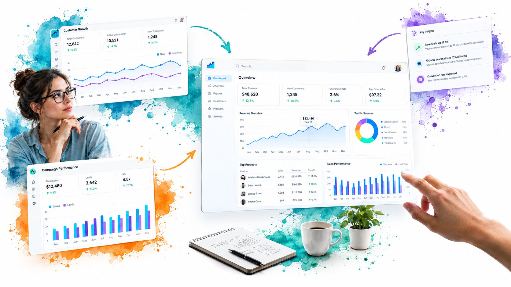
Collecting attractive screenshots isn’t dashboard research. A polished image can hide a weak hierarchy, an unusable filter flow, missing keyboard states, or a layout that collapses on a narrow screen. Useful research separates structure from decoration: navigation shells, KPI cards, charts, tables, filters, empty states, responsive behaviour, focus order, and screen-reader meaning.
The seven examples below are best treated as research methods rather than galleries. DOM Studio is the implementation reference, while Mobbin and Nicelydone help benchmark shipped interfaces, SaaS Interface and SaaSFrame expose visual composition, Tableau Public demonstrates interaction, and Grafana reveals production-grade information density. The lens stays practical: what to inspect, what to replicate, what to avoid, and how DOM Studio primitives, Vue wrappers, Tailwind CSS 4, Visual Blocks, and AI-editable metadata can turn an observation into an accessible build. The route is simple: shell composition, visual benchmarking, responsive comparison, interactive behaviour, observability density, then a production workflow.
Table of Contents
- 1. App Shells Dashboard
- 2. Mobbin
- 3. SaaS Interface
- 4. SaaSFrame
- 5. Tableau Public Dashboard Examples
- 6. Grafana Dashboards Library
- 7. Nicelydone
- Top 7 Dashboard Examples Comparison
- Turn Reference Screens Into an Accessible Build Plan
1. App Shells Dashboard
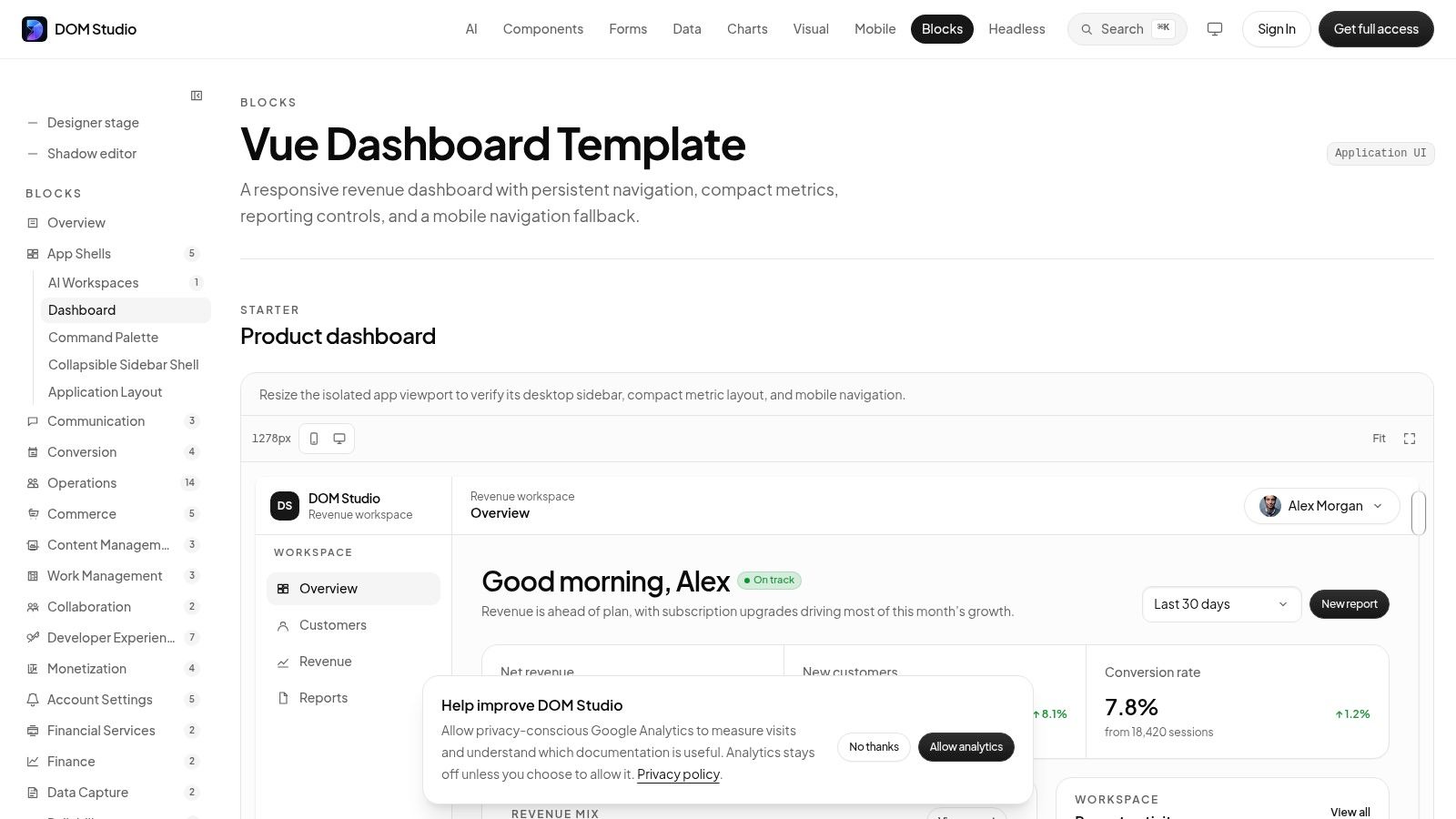
The most useful starting point in this list is App Shells, Dashboard, because it addresses the part many dashboard examples leave implicit: the shell that makes every later screen usable. The reference combines a responsive sidebar, header, content region, navigation states, and room for metrics or reporting controls. That makes it a better implementation baseline than a screenshot of an isolated chart.
DOM Studio builds this shell from headless web component primitives, a thin Vue integration layer, and Tailwind CSS 4 styling. The underlying custom elements keep behaviour framework-agnostic, while Vue wrappers provide reactive props, v-model support, and slots for application wiring. Teams get a standards-based foundation without committing the shell to a heavy framework-specific runtime.
What to inspect
Look at the hierarchy before changing colours. The persistent navigation establishes location, the header carries global actions, and the main content region gives the page a clear landmark. On smaller screens, the sidebar needs to become a deliberate interaction, usually a drawer or collapsible navigation, rather than disappearing and leaving users without orientation.
The accessibility details matter more than the visual polish. DOM Studio includes WAI-ARIA roles, focus management, keyboard behaviour, and screen-reader support, so the implementation starts with interaction rules rather than retrofitting them after styling. Its individual modules average under 2 KB gzipped, according to the DOM Studio dashboard shell, and the components are tree-shakeable, which supports a performance-conscious build.
Practical rule: Treat the shell as a contract. Every page should inherit the same landmarks, focus path, responsive states, and navigation language.
The strongest workflow is to use the shell for structure, then add only the components the page needs. Visual Blocks can establish spacing, colour, and component treatment, while embedded documentation, inspector hints, and Studio specs give AI-assisted tooling enough context to inspect and revise the interface. Pro blueprints and full app templates can accelerate a more opinionated build, but the headless base keeps teams in control.
2. Mobbin
Mobbin is valuable because it shows interfaces that have made it into shipped products, not just idealised concept screens. Its pattern, screen, and flow search lets a team find dashboards alongside navigation shells, tables, filters, and other supporting patterns. That makes it useful when a product review needs evidence for a familiar interaction rather than a speculative visual direction.
Use Mobbin for visual benchmarking and flow comparison. Search several products serving similar roles, then compare what stays consistent: where the date range sits, how filters are grouped, whether the primary KPI appears in a card or a dense summary row, and how the interface communicates drill-down. The value isn’t copying a screen. It’s identifying conventions that reduce explanation and training effort.
A better annotation method
Capture the reference, then annotate the screen in four passes:
- Shell: Mark navigation landmarks, page title, account controls, and persistent actions.
- Hierarchy: Identify the first decision, supporting metrics, and detail that can wait.
- Interaction: Note which controls open, filter, expand, sort, or take the user elsewhere.
- Failure states: Look for loading, empty, error, permission, and no-results behaviour.
Mobbin’s broad coverage saves research time, but it mostly shows the result rather than the implementation. A still image won’t tell you whether a menu is keyboard accessible, whether a chart has a text alternative, or what happens when a filter produces no results. Validate those decisions against component examples for production interfaces, then rebuild the selected pattern with DOM Studio primitives instead of treating the screenshot as a specification.
The platform is also a paid research tool, and full pricing information sits behind account and billing details. That trade-off is reasonable when the team needs a broad reference library, but less attractive for a one-off exploration. Use it to answer what pattern should we consider, not how should we implement the pattern.
3. SaaS Interface
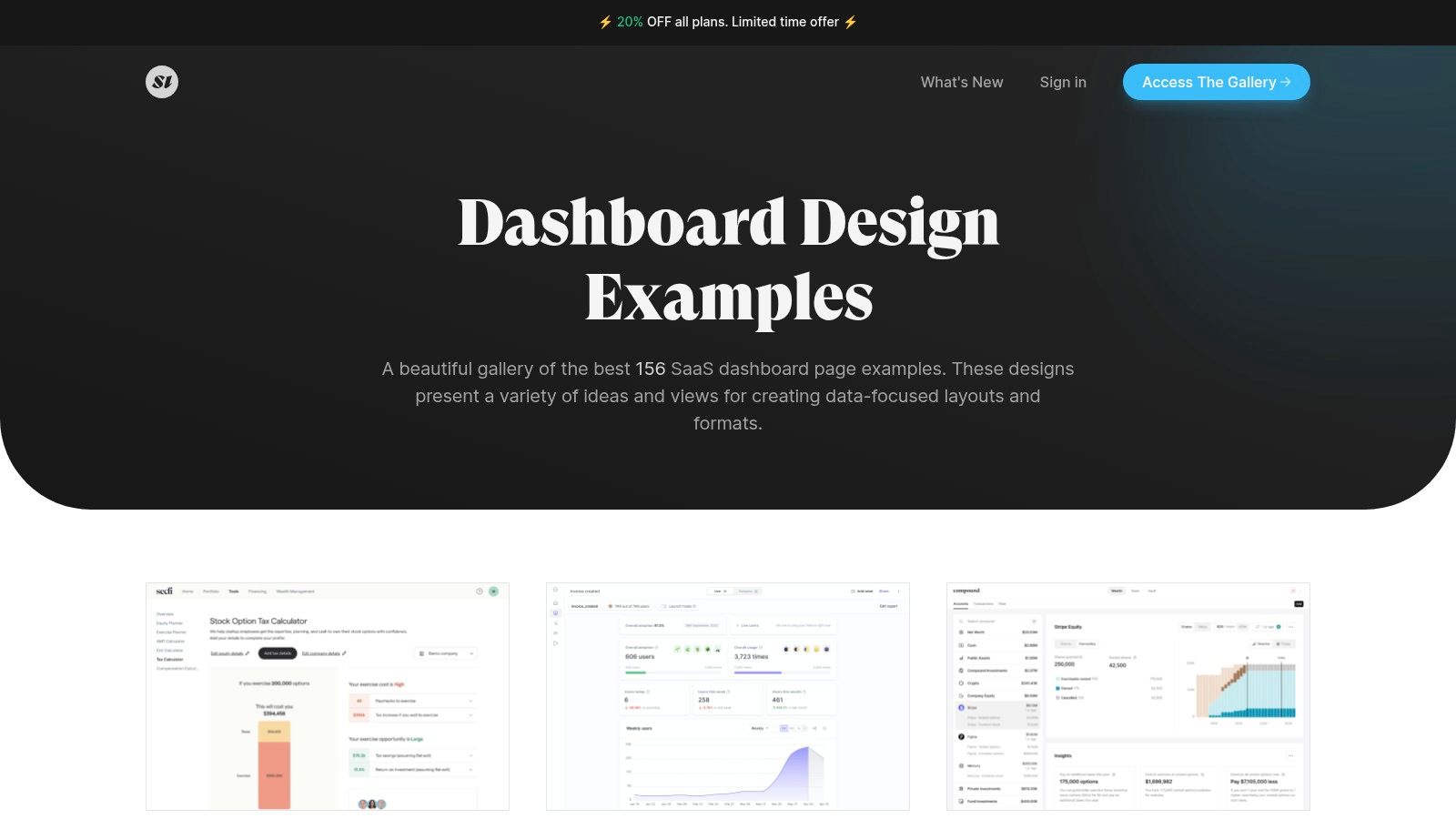
SaaS Interface is a sharper instrument than a general product gallery. Its dashboard section contains 150+ curated SaaS dashboard screenshots, giving teams a concentrated set of layouts to compare without filtering through unrelated mobile flows or marketing pages. It works particularly well at the beginning of a project, when the team needs to decide whether the page should lead with compact KPI cards, a dominant chart, a table, or a mixed composition.
The screenshots are strongest for visual hierarchy and page composition. Compare the relative size of primary and secondary information, the amount of whitespace around chart panels, and how each product separates reporting controls from the data itself. You can also move into adjacent categories such as settings, billing, and filters to find the surrounding screens that a dashboard normally depends on.
Where the reference stops
Static screenshots can’t show interaction. You have to infer whether a metric card opens a detail view, whether a chart supports hover states, or whether a table has client-side sorting and pagination. They also conceal responsive behaviour, so a desktop composition shouldn’t be copied directly into a mobile layout.
That limitation is useful if you handle it deliberately. Treat each screenshot as a layout hypothesis, then write the missing behaviour before building:
- Primary action: State what users should do after scanning the page.
- Filter state: Define labels, applied values, reset behaviour, and no-match messaging.
- Chart alternative: Specify the text or table view for users who can’t use the visualisation.
- Responsive state: Decide what stacks, scrolls, collapses, or moves below the fold.
SaaS Interface offers a one-time payment access option, which suits short research projects better than a recurring commitment. Its clean curation keeps the exercise focused, but the team still needs a component system to turn a still image into a fully built page. DOM Studio’s metric cards, charts, legends, data tables, and date-range controls provide that next step without making the gallery’s visual assumptions part of the product architecture.
4. SaaSFrame
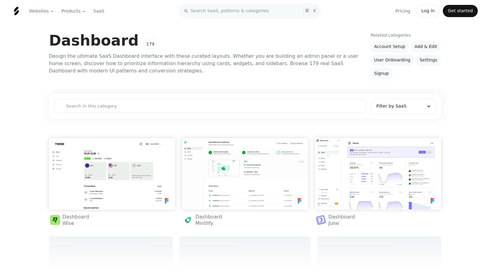
SaaSFrame earns its place through comparison rather than sheer visual volume. The library includes a Dashboard category plus related patterns such as tables, filters, audit logs, and usage indicators. That surrounding context is important because a dashboard rarely fails through its hero chart. It fails when the filter drawer, detail table, activity history, or mobile view doesn’t share the same interaction language.
Its strongest research feature is the ability to compare desktop and mobile variants. Put the two views side by side and ask whether the product preserves the user’s decision path or merely shrinks the desktop page. A good responsive dashboard may reorder metrics, move filters into a drawer, convert a table into a horizontally scrollable region, or replace a dense chart with a concise summary. Those are product decisions, not just CSS breakpoints.
From screenshot to prototype
Pro plans provide downloadable Figma files for many pages, which can speed up deconstruction and internal benchmarking. Figma access is helpful for inspecting spacing and grouping, but don’t confuse editable layers with production semantics. A rectangle labelled “button” isn’t necessarily a keyboard-operable button, and a chart group doesn’t provide a meaningful alternative for screen readers.
Use SaaSFrame to create a responsive comparison board with three columns:
- Desktop composition: Record the original hierarchy and content density.
- Small-screen behaviour: Mark what changes position, size, or interaction.
- Implementation decision: Map each role to a DOM Studio primitive or a custom component.
The library is primarily made of static captures, so motion, loading transitions, and drill-down behaviour need another source. Team and compliance billing details also require vendor contact, which can matter for larger organisations. For most product teams, the practical value is its active updates, broad SaaS coverage, and the way its related categories expose the screens around the dashboard rather than treating the dashboard as an isolated poster.
5. Tableau Public Dashboard Examples
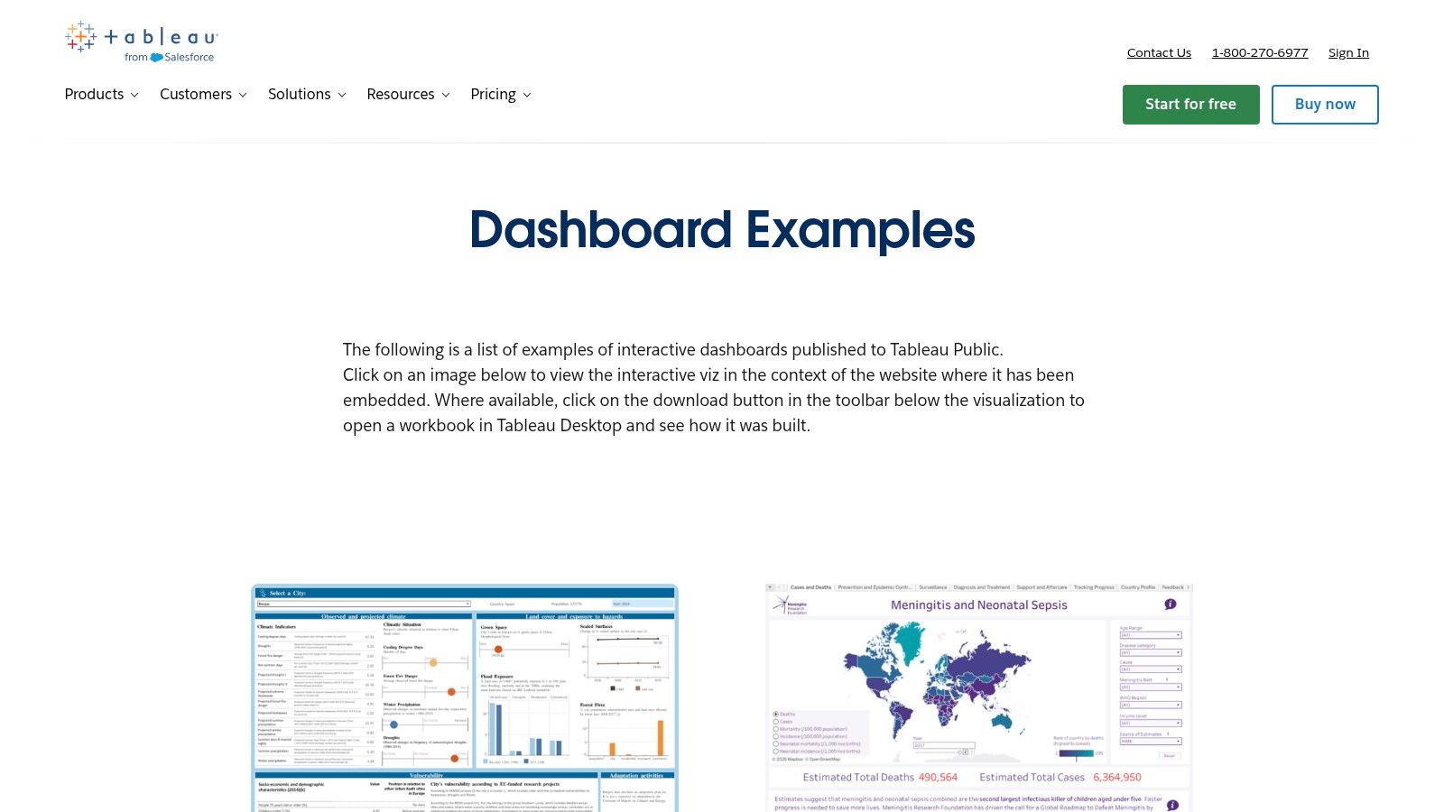
Tableau Public changes the research question from “does this look good?” to “what happens when I use it?” Its dashboard examples collection contains interactive work that can demonstrate filtering, tooltips, drill-through, and exploratory storytelling. Even when the final product won’t use Tableau, those behaviours help teams evaluate which interactions clarify a decision and which merely add movement.
Start with one task, such as comparing a segment over time. Follow the focus path with a keyboard where possible, test filters in different combinations, and observe whether the page explains the current state. A useful dashboard should make applied filters visible, preserve context after a drill-down, and provide a clear route back. If a tooltip contains essential information that never appears elsewhere, the design has created an accessibility and discoverability problem.
Borrow behaviour, not visual noise
The collection’s quality and style vary because many examples come from the wider community. Some are excellent teaching references, while others are too decorative, too dense, or too dependent on a particular data-storytelling convention for a SaaS application. Downloadable workbooks, where authors provide them, can reveal the structure behind a page, but they still don’t replace a review of semantics, performance, and application state.
Interaction should answer a question, not prove that the chart can move.
For a production web dashboard, translate the useful behaviour into explicit states. A chart filter should have a labelled control and a visible result. A drill-down should update the heading or announce the new context. A table should retain table semantics rather than becoming a collection of styled containers. DOM Studio’s reporting components can provide the visual building blocks, while a dashboard React template reference can help teams compare broader application composition before adapting the approach to their own stack.
The same discipline applies to incident and operations interfaces. The incident response dashboard guidance is a useful complementary reference for thinking about which signal deserves attention first, rather than filling the screen with every available measure.
6. Grafana Dashboards Library
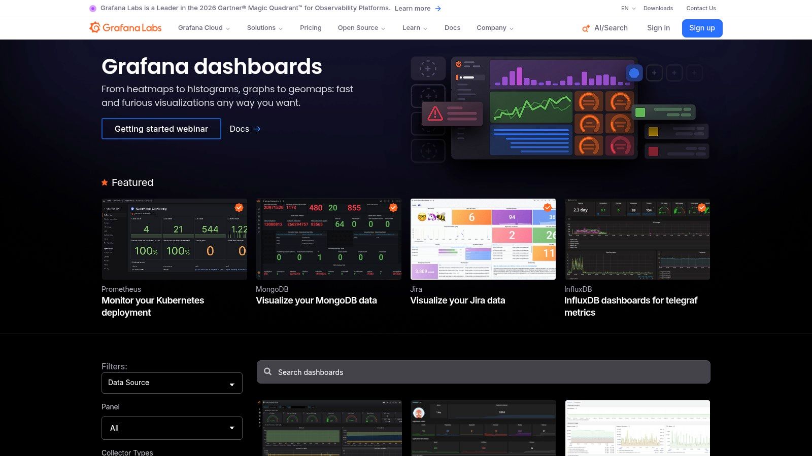
Grafana is the most useful source here for observability density and production structure. Its official library contains hundreds of importable dashboards for stacks such as Kubernetes, Prometheus, MongoDB, and Jira. The dashboards are not merely images. They can be imported, opened in Grafana Play, and examined as JSON configurations containing panels, variables, queries, and layout decisions.
That transparency makes Grafana different from screenshot libraries. You can see how a dense operational view groups time-series charts, logs, KPIs, thresholds, and controls. The visual language is often restrained because the user is monitoring change, not browsing a brand experience. Panel repetition creates a rhythm that helps operators scan for an exception.
What general SaaS teams should not copy
Grafana’s bias is also its limitation. An operations dashboard can justify high information density, persistent refresh controls, alert thresholds, and several time-series panels. A customer-facing business dashboard may need more explanation, stronger empty states, clearer permission messaging, and less simultaneous detail. Copying the density without copying the user context creates an exhausting interface.
Study the underlying logic instead:
- Signal grouping: Keep related measures in a visually coherent region.
- Exception emphasis: Make unusual states distinguishable without relying only on colour.
- Variable controls: Label filters in the language of the user’s task.
- Time context: Show the period, refresh state, and data freshness close to the visualisation.
For a SaaS implementation, a cohort view such as DOM Studio’s cohort retention heatmap can apply the same principle to product analytics without inheriting Grafana’s operations-first styling. The JSON approach is worth emulating as a design practice too. Store dashboard metadata, panel roles, and data-state expectations in a form that developers and AI tools can inspect, rather than burying every decision in visual styling.
7. Nicelydone
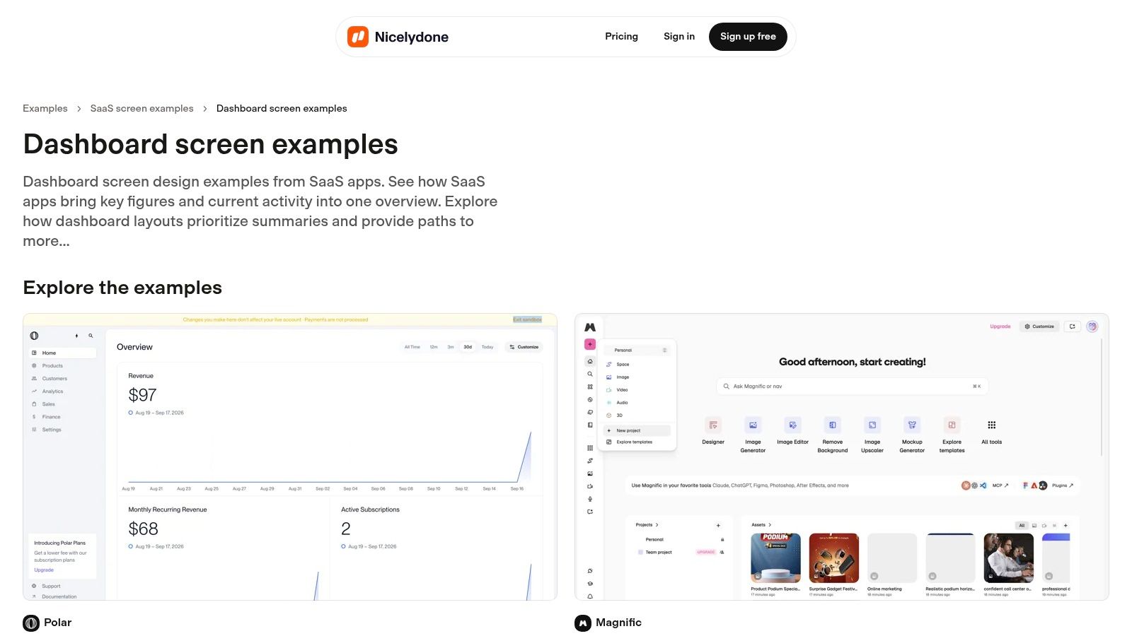
Nicelydone is built for fast comparative mining. Its catalogue contains 200k+ app screens and includes a dedicated Dashboard screen type, so a team can move quickly from broad inspiration to specific references for KPI tiles, tables, filters, navigation shells, and empty states. Search within screenshots is particularly useful when the team knows the interface element it needs but not the product that uses it.
This makes Nicelydone a good choice for workshops. Ask each participant to collect examples of one component role rather than an entire page. One person can gather empty states, another can compare filter controls, and another can inspect tables across different industries. Collections and favourites then create a shared evidence set for the design review.
The danger of volume
A large library can encourage indiscriminate collecting. Ten similar screenshots don’t provide ten decisions. Before saving a reference, record the job it performs:
- Orientation: How does the page tell users where they are?
- Prioritisation: Which value or risk appears first?
- Action: What can users do directly from the view?
- Recovery: What happens when there is no data, an error, or insufficient access?
Nicelydone offers a free tier for exploration, while full text-in-screenshot search and team collections require paid tiers. Exact Solo and Team pricing isn’t always displayed inline on the public page, so procurement may need a separate check. More importantly, screenshot search doesn’t validate implementation quality. It helps you find the right visual comparison, but you still need to test focus visibility, heading order, table semantics, and chart alternatives in the build.
Use the catalogue as a breadth tool, then narrow aggressively. A small set of annotated references is more useful than a large inspiration folder because each chosen screen can map to a DOM Studio primitive, a responsive state, and a measurable accessibility requirement.
Top 7 Dashboard Examples Comparison
| Item | Complexity 🔄 (Implementation) | Resources ⚡ (Requirements / Cost) | Expected Outcomes 📊 (Results / Impact) | Ideal Use Cases | Key Advantages ⭐ / Tips 💡 |
|---|---|---|---|---|---|
| App Shells - Dashboard | Moderate 🔄, requires Tailwind + DOM Studio primitives and Vue wrappers | Low ⚡ runtime cost (tiny modules <2KB); Pro tier for turnkey templates (paid) | Production-ready, accessible, performant dashboards with extensibility | Building production admin/analytics UIs where performance and control matter | ⭐⭐⭐⭐⭐ Production-grade, tree‑shakeable; 💡 Pro blueprints speed delivery but expect small setup learning curve |
| Mobbin | Very low 🔄, browse and filter library (no integration) | Medium ⚡, subscription product; web access | Design decisions grounded in real, shipped UI patterns | Design research, benchmarking, pattern discovery | ⭐⭐⭐⭐ Large, real-world coverage; 💡 pricing/details behind account |
| SaaS Interface | Very low 🔄, static gallery, minimal setup | Low ⚡, one-time purchase option available | Fast visual benchmarking of dashboard layouts and hierarchies | Short-term research, quick inspiration and layout choices | ⭐⭐⭐ Focused, curated examples; 💡 static screenshots only (no interaction) |
| SaaSFrame | Low‑Moderate 🔄, browse + optional Figma asset downloads on Pro | Medium ⚡, affordable entry; Pro for Figma files (paid) | Prototyping-ready examples and responsive comparisons | Rapid prototyping, internal benchmarking using Figma assets | ⭐⭐⭐⭐ Figma downloads accelerate prototyping; 💡 mostly static captures, contact vendor for team billing |
| Tableau Public (Dashboard Examples) | Low 🔄, browse and interact with live dashboards | Low ⚡, free to browse; many workbooks downloadable | Interactive examples showing filters, tooltips, drill-throughs for learning | Data visualization patterns, interactive dashboard design education | ⭐⭐⭐⭐⭐ Interactive, downloadable workbooks; 💡 quality/style varies by community submissions |
| Grafana Dashboards Library | Moderate 🔄, import and adapt JSON dashboards into Grafana | Low‑Medium ⚡, Grafana familiarity and target data stack required | Practical, production-ready observability dashboards and panel composition | Monitoring/observability, ops dashboards, time-series analytics | ⭐⭐⭐⭐ Real, importable JSONs for hands-on learning; 💡 biased toward ops use cases, adapt for B2B analytics |
| Nicelydone (Nicelydone.club) | Low 🔄, searchable curated catalog with dashboard filter | Low‑Medium ⚡, free tier; paid tiers unlock search/team features | Broad comparative UI references across industries for alignment | Comparative research, collecting examples for stakeholder review | ⭐⭐⭐ Large catalog with text-in-image search; 💡 paid tiers needed for full text search and team features |
Turn Reference Screens Into an Accessible Build Plan
The seven sources work best as a sequence, not as competitors in a single inspiration contest. Start by defining the user’s decision. A dashboard for monitoring live service health needs a different density and refresh model from a dashboard for reviewing quarterly performance or investigating retention. If the decision isn’t clear, every gallery will encourage you to add more cards.
Select the reference method that matches the question. Use App Shells, Dashboard for a production-ready structure, Mobbin and Nicelydone for shipped patterns and comparative research, SaaS Interface for quick visual benchmarking, SaaSFrame for desktop and mobile comparison, Tableau Public for interaction, and Grafana for operational density and inspectable configuration. Don’t ask a static gallery to answer a behaviour question, and don’t use a technically dense observability example as a default SaaS layout.
Annotate the chosen screens by role. Mark navigation landmarks, page and section headings, primary metrics, supporting visuals, filters, tables, alerts, and empty states. Then write the interaction contract for each control. A filter needs a label, applied state, reset path, and no-results response. A chart needs a meaningful title, a readable data alternative, and a way to understand selected values without relying only on hover.
A repeatable DOM Studio workflow
Translate the annotations into DOM Studio primitives and Vue wrappers. Use the headless elements for menus, drawers, tabs, comboboxes, dialogs, tooltips, and data-entry controls, then use Vue’s reactive wiring and slots to connect them to application state. Visual Blocks can keep spacing, colour, typography, and surface treatments consistent without forcing every page into the same composition.
AI-assisted iteration becomes more reliable when the interface carries its own context. DOM Studio components include embedded docs, inspector hints, and Studio specs, so generated changes can be reviewed against the intended role rather than judged only by appearance. Ask the tool to preserve landmarks, focus order, labels, and responsive states while changing the visual treatment. That is much safer than asking it to reproduce a screenshot blindly.
A reference screen is successful when it produces a testable implementation decision.
Before shipping, test the page at each meaningful responsive state and with keyboard navigation. Check visible focus, logical tab order, heading hierarchy, labelled filters, table semantics, chart alternatives, loading and empty states, permission errors, and data freshness. Keep performance in view as well. Select tree-shakeable components where possible, avoid loading interaction code for panels the user can’t access, and check that dense visualisations don’t block the main decision.
The compact build checklist is:
- Navigation landmarks: Users can identify and move between the shell, header, navigation, and main content.
- Heading order: Titles and section headings follow a meaningful hierarchy.
- Chart alternatives: Important values remain available in text or a semantic table.
- Visible focus: Keyboard users can see where they are at every interactive step.
- Filter labelling: Controls explain their purpose, current value, and reset behaviour.
- Table semantics: Rows, columns, headers, sorting, and pagination remain understandable.
- Empty states: No data, no results, loading, error, and restricted states tell users what to do next.
- Performance-conscious selection: Components and visualisations load only when the page needs them.
DOM Studio gives teams headless dashboard primitives, Vue wrappers, accessible charts, metric cards, legends, tables, and responsive app-shell patterns for turning dashboard research into production UI. Use the references above to define the structure, then visit DOM Studio to build and iterate on that structure with Visual Blocks and AI-editable component metadata.