
A polished button won’t rescue the wrong verification flow. A user signing up for a low-risk newsletter needs a different message from a finance administrator confirming a sensitive account, and both flows must survive blocked CSS, mobile layouts, screen readers, link scanners and translation. The email verification email template is an implementation pattern, not a gallery exercise.
This guide compares eight practical patterns, from a single-action message to a text-first fallback, OTP, localised and security-enhanced flows, plus AMP for Email. Each example considers the subject line, preheader, semantic markup, plain-text alternative, client support, accessibility and maintenance. The examples are patterns inspired by familiar product experiences such as Slack, GitHub, Stripe, Shopify, Microsoft and Google, not claims about their current private implementations.
A reliable evaluation asks simple questions. Can the recipient understand the purpose without loading images? Can they activate the action with a keyboard or screen reader? Does the link remain safe and usable when a mail client rewrites it? Can your team test expiry, localisation, analytics and backend controls independently from the visual layer?
Table of Contents
- 1. Minimalist Single-Action Verification Template
- 2. Accessible Text-First Plain Text Template
- 3. Brand-Consistent Multi-Section Template
- 4. Progressive Enhancement OTP Template
- 5. Dark Mode Adaptive Verification Template
- 6. Localised Multi-Language Verification Template
- 7. Security-Enhanced Zero-Trust Verification Template
- 8. Interactive AMP for Email Template
- 8-Template Email Verification Comparison
- Turn the Best Template Into a Reliable Flow
1. Minimalist Single-Action Verification Template
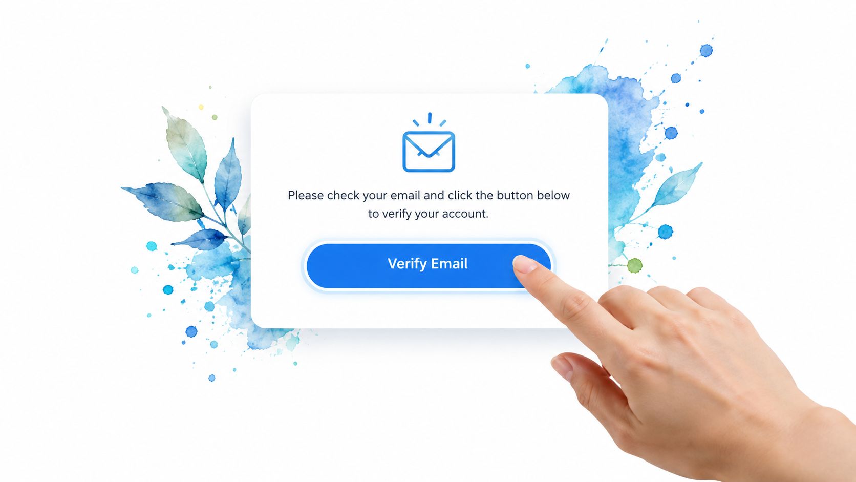
The minimalist pattern works when the recipient needs one clear next step and the surrounding product already explains the context. A short greeting, one sentence of purpose, a prominent Verify email button and a fallback link are usually enough. Slack-style onboarding, GitHub-style account confirmation and Stripe-style account setup all illustrate the kind of focused experience teams commonly aim for, though the exact templates and flows change over time.
Use a subject such as Verify your email address and a preheader that completes the instruction, such as Confirm your address to finish setting up your account. Don’t hide the product name. Users should recognise the sender before opening the message, especially when they may be checking an inbox full of automated mail.
The button needs semantic link markup, not a clickable image or a JavaScript dependency. Give it a strong focus state in the destination interface, a clear accessible name, and a text link below it containing the same destination. The email itself can’t guarantee a consistent focus experience across clients, so the fallback matters.
Keep the action obvious and the token safe
State the validity window in plain language, for example, This link is valid for 24 hours. That example is copy guidance, not a universal security recommendation. Your backend should enforce the actual expiry, single-use behaviour and replay handling.
- Touch target: Make the destination button comfortable to tap on mobile, while validating the rendered result across clients.
- Contrast: Test the button and its text against the relevant WCAG contrast requirements.
- Analytics: Add campaign parameters only if your privacy model permits them, and avoid placing sensitive token data in analytics fields.
- Support path: Include a short instruction for recipients who didn’t request the account, with a route to report abuse or contact support.
Don’t add navigation, promotional cards or competing calls to action. They dilute a transactional message and increase the surface area you must maintain.
2. Accessible Text-First Plain Text Template
HTML isn’t automatically more accessible. A plain-text verification email remains readable when a client strips styles, blocks images or presents mail through a terminal or assistive technology. It also provides a dependable fallback for enterprise environments where branded layouts are altered by security gateways.
The structure should be explicit:
Verify your email address

Hello,

Please verify your email address to finish creating your Example account.

Open this link:
https://verify.example.com/abc123

If the link doesn't open, copy and paste the full address into your browser.

This verification link will expire according to your account security policy.
If you didn't request this account, you can ignore this message or contact support.

Example Support
Don’t rely on colour, indentation or visual position to communicate priority. Use short section breaks, full URLs and descriptive wording. Avoid excessive capitalisation, which can be uncomfortable for some readers and may sound like an alarm rather than an instruction.
Build the plain-text version first
The accessibility best practices guide is useful for the surrounding sign-up and confirmation interface, particularly where semantic structure, focus management and screen-reader feedback are under your control. Email markup has different limitations, so don’t assume a web component can be copied into a message and retain its behaviour.
Test the same content in Gmail, Outlook and Apple Mail, then test a genuine plain-text client or command-line workflow if your audience includes technical or enterprise users. Check that the URL wraps predictably, remains copyable and doesn’t acquire punctuation that could confuse a recipient.
Practical rule: Treat plain text as a first-class message, not as the HTML template with its styling removed.
This pattern is less visually distinctive and offers fewer opportunities for brand expression. Its strength is compatibility, clarity and resilience. For a broad audience, pair it with a restrained HTML version and keep both versions aligned whenever the expiry message, support details or security wording changes.
3. Brand-Consistent Multi-Section Template
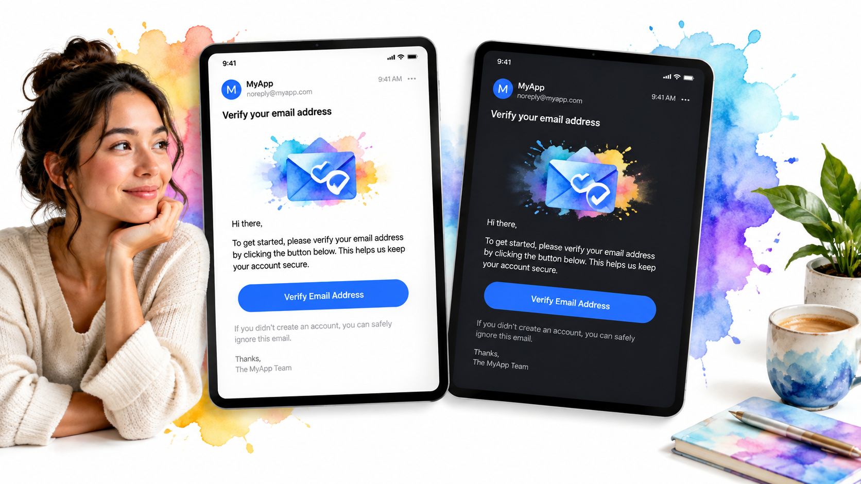
A larger organisation often needs more than a button. A branded header can reassure the recipient, an introductory paragraph can explain the account context, a security note can clarify why the email arrived, and a footer can provide a legitimate support route. Shopify-style account messages, HubSpot-style onboarding communications and Notion-style workspace invitations demonstrate the broader product pattern, though teams should verify each current experience rather than copying assumptions.
Keep the hierarchy transactional. The first visible block should identify the product and explain the required action. Put the main CTA early on mobile, then follow with supporting information such as the destination account, request time or advice to ignore the message if it wasn’t expected.
Keep brand assets subordinate to the task
A centred container with a maximum width of 600px is a common implementation choice for readable email layouts. Use table-based structures or a tested email component system where client support requires them. CSS Grid and Flexbox can work in selected clients, but they shouldn’t be your only rendering strategy without evidence from your test matrix.
Every informative image needs meaningful alternative text. Decorative images should be hidden from assistive technology rather than given artificial descriptions. Don’t put the verification URL inside an image, because recipients may lose the action when images are blocked.
Use dynamic personalisation carefully. A recipient’s display name, application name and target email can improve recognition, but malformed or missing values can make a security email look suspicious. Render test data that includes long names, unusual characters and empty optional fields before release.
The footer can include the verified sending identity, support contact and a warning that the team won’t ask for a password. It shouldn’t become a marketing footer with unrelated offers. A subject such as Verify your email to get started and matching preheader copy should set an accurate expectation, not tease a promotional benefit that isn’t in the message.
4. Progressive Enhancement OTP Template
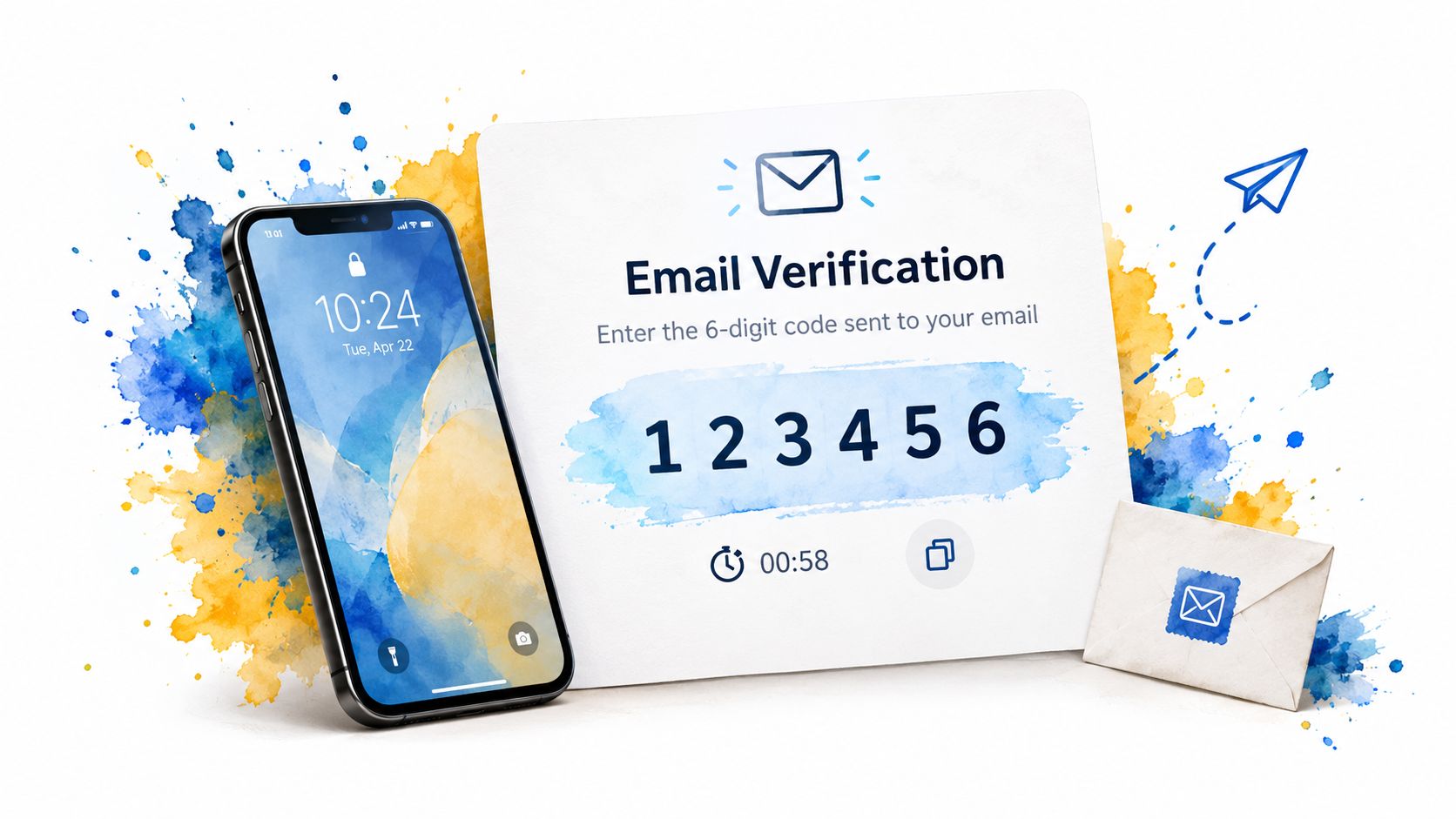
An OTP email should be treated as an implementation pattern, not a visual showcase. A code is useful when someone opens the message on a different device, while a verification link can support faster completion when the client and product handle it safely. Present the code as the primary action, then include a secondary link only if both paths are implemented and tested.
Microsoft and Azure account verification, Google security flows and Twilio-style OTP delivery offer reference points for the interaction model, not interchangeable templates. The backend must protect codes against guessing, while link-based flows need secure tokens, controlled destinations and clear handling for scanners that prefetch URLs.
Show the code as selectable text rather than an image. A monospace stack such as Monaco, Courier New, monospace can distinguish similar characters, but spacing should come from the layout because some clients ignore letter-spacing. Tell recipients where the code belongs, for example, Enter this code in Example. Keep the subject and preheader literal so the message remains recognisable in an inbox.
Pair the email with a forgiving code-entry screen
The Vue OTP and verification code input can inform the application interface around this email journey. It does not render email markup. Use an accessible label, predictable focus behaviour, paste support and an error message that does not reveal whether part of a token is valid. Test keyboard use, screen readers, mobile browsers and autofill before release.
For users who cannot receive email reliably, a private SMS verification number can provide an alternative channel, provided the fallback is rate-limited and verified server-side.
The backend remains responsible for:
- Attempt control: Rate-limit code requests and verification attempts to resist guessing.
- Token lifecycle: Invalidate successful codes and handle expired or superseded codes consistently.
- Copy guidance: Explain how to copy the code without requiring clipboard APIs.
- Fallback behaviour: Let users request another code without creating an email-sending loop.
- Privacy: Keep full addresses, codes and internal identifiers out of tracking parameters.
A countdown may create urgency, but a static expiry statement is more reliable across email clients. If the product shows a live timer, let the server determine expiry and explain what happens when the timer reaches zero. Recipients who did not initiate the request need a safe reporting route, not instructions to forward the code. Test alternate copy, expiry wording and fallback visibility with A/B experiments while keeping security controls unchanged.
5. Dark Mode Adaptive Verification Template
Dark mode testing should start with the email’s implementation constraints, not its appearance in a single preview. Define text, surface, border and action colours, then provide fallbacks for clients that ignore media queries or transform colours.
Apple Mail, Gmail and Outlook apply dark mode differently. Review representative versions and configurations with a rendering service such as Email on Acid or Litmus, and compare results with the clients your recipients use. A browser preview cannot confirm reliable email rendering.
Build for client transformations
Set background colours on the outer body, container and major sections. Inline styles that must survive clients removing or rewriting embedded CSS. Custom properties can keep the source maintainable, but compile or inline them where support requires it.
Check normal copy, small labels, button text, borders and meaningful graphics against WCAG 2.2 contrast guidance in both modes. Brand colours that pass on white can fail when a client darkens the background, so test transformed output rather than relying on the original palette.
The DOM Studio colour scheme guidance can inform a coherent light and dark presentation for the confirmation page surrounding this email journey. DOM Studio does not render email markup or account for client-side colour transformations. Treat its component approach as guidance for the web experience, then test the email separately.
Use these implementation decisions:
- Logo treatment: Provide a mark that stays legible on light and dark surfaces, with tested contrast.
- Button state: Preserve a recognisable action when a client changes the button colour. Keep shape, spacing and text contrast clear.
- Borders: Combine borders, spacing and grouping so colour is not the only structural cue.
- Fallback: Inspect the message with styles disabled and images blocked. The verification action and expiry guidance must remain understandable.
Dark mode increases maintenance work. Review every new brand colour, illustration and footer change in light, dark and forced-colour conditions. For A/B tests, vary one presentation or subject-line decision at a time, while holding verification logic and security controls constant. Track completion, client-specific failures and support contacts, not clicks alone.
6. Localised Multi-Language Verification Template
A localised verification email is an implementation pattern, not a translated English template. The system must decide which language to use, what happens when a regional variant is missing, how dates and times appear, how longer text affects layout, and whether right-to-left rendering works. Airbnb, Uber and AWS operate across regions where these choices belong in the template system.
Keep message strings separate from markup. Select the locale from a trusted account or signup preference, then use a fallback chain such as es-MX to es to en. Apply the same locale to the subject, preheader and body. A translated body paired with an English subject creates an immediate inconsistency.
Put localisation under release control
Use language metadata where the email format and client support allow it. BCP-47 tags identify the intended language, but mail clients may ignore them. Test right-to-left rendering in representative clients, including mixed-direction content such as URLs, email addresses, application names and numeric codes. Set direction deliberately, and isolate left-to-right tokens inside right-to-left copy.
A native-speaker review should cover the subject, preheader, button label, expiry wording, support instruction and abuse warning. Give translators context for each string. A short English CTA may need a longer phrase elsewhere, so test the actual rendered layout rather than approving text alone.
Before release, verify these behaviours:
- Variable safety: Escape user-provided names and keep untrusted values out of raw HTML.
- Date formatting: Follow the recipient’s locale and timezone policy, or use an unambiguous relative statement.
- Text growth: Let buttons and headings wrap without clipping or hiding the verification action.
- Fallback testing: Confirm that missing translations select the intended fallback instead of exposing a raw key.
Keep the security message intact in every language. Recipients need to understand why the email arrived, what action is required, and what to do if they did not request it. Test each locale across supported clients, then A/B test one subject or copy decision at a time while holding the verification logic constant. Track completion, rendering failures and support contacts, not clicks alone.
7. Security-Enhanced Zero-Trust Verification Template
A security-sensitive verification email should explain the request without turning the message into an attack surface. Identify the product, account or address involved, and the action required. State what the recipient should do if they did not initiate it. Keep additional checks in the application, where the system can enforce policy and record outcomes.
Authentication notices from Google, Microsoft and Okta illustrate the communication pattern: provide enough context for recognition while withholding unnecessary internal data. Device and location signals can help, but they may be inaccurate, sensitive or alarming. Present them as clues, not proof, and avoid details that could assist account enumeration.
Use cryptographically protected, short-lived, single-use tokens. Enforce rate limits on the server, log requests and outcomes for investigation, and restrict retention and access to operational needs. Configure SPF, DKIM and DMARC for the sending domain, following guidance on email authentication and mailbox hygiene to support transactional delivery.
Give suspicious recipients a defined response
Add This wasn’t me only when the control performs a specific action, such as cancelling the pending request, starting an account review or opening a trusted support route. Never ask recipients to interpret a raw IP address or other technical identifier. The same principle should shape signup policy: document how you manage disposable emails at signup, while preserving a recovery path for legitimate users who rely on temporary addresses.
HTTPS protects transport, not token handling. Keep secrets out of referrers where possible, avoid logging complete verification URLs, and ensure the endpoint does not reveal whether a token belongs to a real account. A confirmation screen can also prevent security gateways from completing a state-changing action after pre-fetching the link.
Test the implementation against these cases:
- Replay handling: A used token cannot authenticate another request.
- Enumeration resistance: Errors do not disclose whether a token, email or account exists.
- Scanner behaviour: Link pre-fetching does not complete verification before the recipient confirms.
- Support recovery: Mailbox loss leads to a documented route with stronger identity checks where appropriate.
- Client compatibility: The action remains understandable in HTML and plain text across supported clients.
Security copy should reduce uncertainty without creating fear. Pair subject, preheader, markup and endpoint behaviour in review. A/B test one copy or subject decision at a time, keep verification logic unchanged, and measure completion, false reports and support contacts alongside clicks.
8. Interactive AMP for Email Template
AMP for Email can keep verification inside supported inboxes, yet it creates another application surface alongside HTML and plain text. Use it for high-value journeys where leaving the inbox adds measurable friction, not as the default signup pattern.
Build the message around a complete fallback. Unsupported clients should receive the same verification outcome through a conventional link or code, with equivalent instructions and endpoint behaviour. Include both paths in preview and device tests. An attractive AMP state does not compensate for a confusing fallback.
Google’s AMP demonstrations, Pinterest’s interactive campaigns and Dyspatch’s interactive templates illustrate the interaction model. Treat them as implementation references, not compatibility or security evidence. Confirm current client support, sender requirements and authentication controls before committing engineering time.
Treat the inbox as an untrusted client
An amp-form request still requires CSRF protection, authenticated server-side state and safe retry handling. The interface may show a loading state, but it must not report success until the backend confirms the token. Failed requests should give a clear recovery route without revealing internal details.
Validate inputs before sending where the use case permits. Check syntax, domain validity, mailbox existence and risk signals, and treat any vendor-stated accuracy figure as that vendor’s claim rather than a universal guarantee. Keep validation and verification decisions server-side.
Test the AMP version in supported Gmail and Yahoo Mail environments. Test the HTML and plain-text fallback in Outlook, Apple Mail and clients that strip advanced markup. Recheck support as clients change, and keep the standard message understandable for recipients using unsupported software.
The cost is often the deciding trade-off. Start with a reliable single-action or OTP flow, then consider AMP after delivery, accessibility, security and fallback behaviour produce stable measurements. DOM Studio’s accessible component approach can guide the surrounding confirmation journey, while email markup still needs separate client-specific implementation and testing.
8-Template Email Verification Comparison
| Template | 🔄 Implementation Complexity | ⚡ Resource Requirements | 📊 Expected Outcomes | 💡 Ideal Use Cases | ⭐ Key Advantages |
|---|---|---|---|---|---|
| Minimalist Single-Action Verification Template | Low, simple HTML + ARIA | Low, minimal CSS/assets | High completion and CTR; fast rendering | High-conversion onboarding flows | ⭐⭐⭐⭐ Clear CTA, excellent accessibility, fast integration |
| Accessible Text-First Plain Text Template | Very low, plain text only | Very low, no assets or CSS | Maximum compatibility; smallest payload | Accessibility-first, terminal/legacy clients, security alerts | ⭐⭐⭐⭐ Universal compatibility; easiest to maintain |
| Brand-Consistent Multi-Section Template | Medium–High, multi-section CSS/layout | Medium–High, images, personalization, testing | Strong brand trust, contextual clarity; supports compliance | Enterprise/SaaS onboarding and marketing emails | ⭐⭐⭐ Brand reinforcement, compliance support, A/B testing |
| Progressive Enhancement OTP Template | Medium, OTP formatting + backend validation | Medium, backend logic, input UX | High security and reliability; reduced phishing risk | 2FA, high-security account verification | ⭐⭐⭐⭐ Enhanced security; explicit user verification |
| Dark Mode Adaptive Verification Template | Medium, prefers-color-scheme and fallbacks | Low–Medium, color palettes, testing matrix | Improved UX for dark-mode users; better perception | Modern apps where users prefer dark mode | ⭐⭐⭐ Better readability and brand polish in dark mode |
| Localized Multi-Language Verification Template | High, locale logic + RTL handling | High, translations, locale testing | Higher completion in global markets; regulatory alignment | Global platforms, multilingual user bases | ⭐⭐⭐ Supports RTL & locale formats; improves regional conversion |
| Security-Enhanced Zero-Trust Verification Template | Very high, multi-step security workflows | Very high, fingerprinting, logging, infra | Strong mitigation of account takeover; audit trails | Security-sensitive enterprises, regulated services | ⭐⭐⭐⭐ Robust protection, context-aware verification, compliance |
| Interactive AMP for Email Template | High, AMP constraints and sandboxing | Medium–High, backend APIs, AMP expertise | Very high engagement where supported; limited reach overall | High-value verification flows targeting AMP-capable clients | ⭐⭐⭐⭐ In-inbox interactivity and instant confirmations (limited client support) |
Turn the Best Template Into a Reliable Flow
Choose the lowest-friction pattern that matches the risk of the account and the user’s context. A minimalist link is appropriate for a straightforward onboarding journey. An OTP is useful when users switch devices or need to enter a code deliberately. A security-enhanced flow fits sensitive actions, while localisation becomes essential as soon as your product serves users with different language or regional preferences. AMP should remain a targeted experiment, not a substitute for a dependable fallback.
Start with the message contract before writing markup. Define the sender identity, subject, preheader, purpose, action, expiry wording, support route and unrequested-email instruction. Keep the same contract in HTML and plain text. For implementation details such as variable substitution and framework-based email rendering, Laravel email validation best practices can sit alongside your platform’s own identity and delivery documentation, but your team must still test the final rendered message.
Deliverability belongs in the launch plan. The DMA Email Benchmark Report 2025 recorded UK delivery rates of 98% in 2024, with B2C delivery reaching 99.2%. Those figures reinforce the value of clean lists, authenticated sending domains and concise transactional copy, but they don’t guarantee delivery for your own message.
Historical UK benchmarks also show why inbox placement deserves direct monitoring. The 2023 UK deliverability benchmark reported an inbox rate of 89.8%, a spam rate of 2.2% and a missing rate of 8%. Treat those as benchmark context, not a forecast. Authentication, sender reputation, content and recipient-provider behaviour can all change the result.
Use a release sequence your team can repeat
- Validate inputs: Check syntax, domain validity, mailbox existence and risk signals before sending where the use case permits. One UK-focused checklist reports bulk verification accuracy of 98.9%, as described in its deliverability guidance for European senders. Treat that as the checklist’s stated figure, not a universal guarantee.
- Build both formats: Produce responsive HTML with semantic structure, and write a plain-text version intentionally.
- Review access: Check heading order, link purpose, readable text, keyboard access on the destination page, and screen-reader announcements for errors and success.
- Test rendering: Inspect images blocked, CSS removed, dark mode, mobile widths, long translations, right-to-left content and enterprise security scanners.
- Test the backend: Verify expiry, single use, replay rejection, rate limits, logging, resend behaviour and safe error messages.
- Measure the whole journey: Separate send, delivery, click, code submission, successful verification and support contact. A click doesn’t prove that verification completed.
- Run controlled tests: Compare one variable at a time, such as subject line, preheader, CTA wording or layout. Keep token rules, audience, send timing and destination experience stable, and define the success event before reading the result.
Accessibility requirements apply to the surrounding digital service as well as the email. UK government guidance for digital verification services points providers towards WCAG 2.2 AA or EN 301 549, making contrast, semantic structure and screen-reader-friendly instructions implementation concerns rather than decorative refinements. Read the UK Digital Verification Services Trust Framework alongside your product accessibility process.
DOM Studio can support the web interface around the journey with accessible components, focus management and verification-code input patterns. It doesn’t render email markup or replace email-client testing, delivery controls or backend token logic. Keep those layers independently owned, tested and versioned so a template change does not undermine the verification system.
Use DOM Studio to build the accessible sign-up, confirmation and OTP interfaces that surround your verification emails, with headless components and Vue integrations for consistent keyboard and ARIA behaviour. Visit DOM Studio to explore the verification code input and related form components, then connect the resulting interface to your independently tested email and backend flow.