
A brand refresh lands on a Tuesday. The new primary blue is approved, the deck is signed off, and someone asks the obvious question: how long until the product matches? The honest answer depends on something nobody has tracked, which is how many files contain the old hex value typed by hand. Forty? Four hundred? Colour is the easy part anyway. Focus rings, error states, dark-mode surfaces, and the one hover shade that exists in a single component all live in the same pile.
Design tokens are the usual answer to that question. They’re also one of the most over-explained and under-governed ideas in front-end work. What follows builds the concept from a single named value up to a theming system you can ship, with accessibility constraints baked in rather than bolted on later.
Table of Contents
- What Design Tokens Are and How They Work
- Token Types and Layers at a Glance
- How to Structure a Token File
- Accessible Defaults Tokens Should Encode
- How to Set Up Light, Dark and Brand Themes
- Connecting Tokens to Components and Platforms
- Governing Token Changes Without Breaking Products
- Confirm Your Token Setup Before You Ship
What Design Tokens Are and How They Work
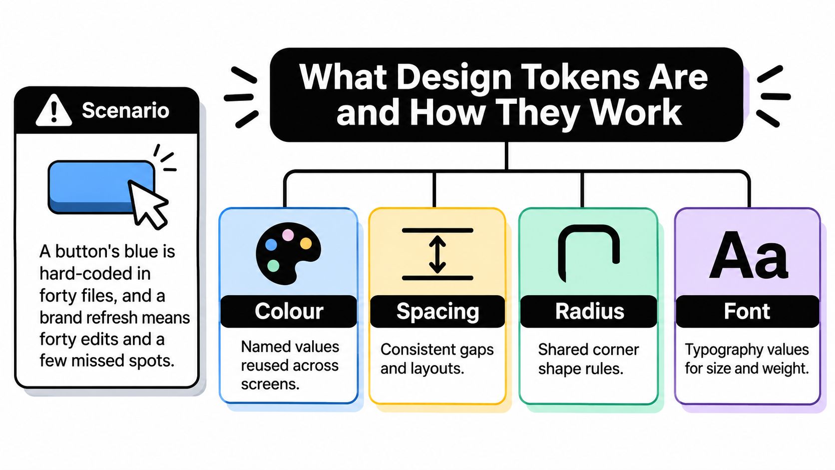
A checkout button uses #2563EB directly in its component styles. Later, that same blue appears in a banner, a link, a focus ring and a chart legend. When the brand changes the blue, every place that contains the old value becomes a separate edit.
A design token gives a design value a name and a defined place in the system. For example, color.blue.600 can refer to #2563EB. Components use the token rather than repeating the raw value, and a build step turns the token into the format each platform needs. Change the value once, then rebuild the outputs.
Why two layers beat one
A token system often separates raw values from the roles those values serve. A primitive token names a value, such as color.blue.600, space.4 or radius.md. A semantic token names a purpose and refers to a value: color.action.primary might point to color.blue.600, while color.text.muted might point to color.grey.700.
That distinction lets the same purpose use different values in different themes. Component code can refer to color.action.primary without needing to know which blue it resolves to. The semantic name is the interface; the primitive is one of the values behind it.
Token names and values can live in a shared file, often JSON, and a build tool can generate platform-specific outputs. For example, web styles can use CSS custom properties, while other platforms can receive values in their own formats. The source stays organized around named decisions instead of scattered raw values.
The GOV.UK Design System component library documents components as reusable, versioned parts of a service. Tokens benefit from the same kind of deliberate maintenance: teams need to know what a value means and manage changes to it carefully.
Tokens also give teams a shared vocabulary. A review can identify a semantic role, the surface it appears on and whether the pairing is accessible. A token is a named design decision with a value that can change, not just a label for a colour code.
Token Types and Layers at a Glance
Five groups cover almost every system in production. The table is the map; the paragraphs after it explain the judgement calls each row hides.
| Layer | What it holds | Typical owner | When it changes |
|---|---|---|---|
| Primitive | Raw palette and scale values | Design system lead | Rarely, when the brand palette changes |
| Semantic colour | Purpose-based colour roles | Theme owner with accessibility reviewer | When a theme or interaction role changes |
| Component | Values scoped to one component | Component maintainer | When that component’s design changes |
| Density and sizing | Spacing, sizing and radius values | Layout owner | When layout density changes |
| Motion | Timing and easing values | Interaction owner | When interaction feel changes |
Primitives should be scales, not a mood board. A blue ramp running from 100 to 900 gives the semantic layer enough raw material to hit contrast targets in both light and dark themes. If your palette has one blue, the theme owner has nothing to reach for when that blue fails on a dark surface.
Semantic colour is where accessibility review belongs. The theme owner sets values, but a change to color.text.muted against color.surface.default alters a contrast pairing, so an accessibility-aware reviewer signs it off. This is also the layer that makes dark mode cheap later.
Component tokens exist for genuine exceptions, such as button.background pointing at color.action.primary. Keep the layer thin. A component token that repeats a semantic role adds a hop without adding information.
Density and sizing covers space.control at 12px and radius.md at 8px. Density themes live here too, so a compact data grid can shrink control spacing without touching colour. Motion covers motion.duration.fast at 150ms alongside a reduced-motion alternative, which is a value rather than a CSS afterthought.
Typography and elevation are optional sixth and seventh groups. font.size.body and line-height.body usually belong together in one file, because a size without its line height creates a broken pair that nobody notices until a long paragraph looks cramped.
Depth is where traceability dies. Two hops, primitive to semantic to component, are usually plenty. Once a value travels through three or four aliases, a wrong result means opening four files and holding the chain in your head.
When a new value appears, ask what it describes. A raw value belongs in primitives. A purpose belongs in semantic. One component’s exception belongs in a component token, and if you can’t name the component, it isn’t one.
How to Structure a Token File
Structure is the part people skip, then regret at the first rename. Six steps, each with the reason it earns its place.
- Split files by layer. Put primitives in
tokens/primitiveand semantics intokens/semantic. One job per file means a reviewer can read a diff and know immediately whether a palette value moved or a role changed, which are different risk levels. - Use a single naming pattern everywhere.
category.role.variant.stategives youcolor.action.primary.hoverandcolor.text.muted. Predictable names let someone find a token by reasoning rather than searching, and they make generated CSS custom properties predictable too. - Give every entry a value and a type. The DTCG format uses
$valueand$type, with types such ascolor,dimensionandduration. Types let a build tool emit the right output for each platform and let validators catch a duration pasted into a colour field. - Add a
$descriptionwherever a constraint applies. Ifcolor.action.primarymust sit on a surface at a stated contrast level, write that into the description. The person who changes it in eight months reads the description, not your memory of the decision. - Reference other tokens with curly braces. A semantic entry whose
$valueis{color.blue.600}inherits every future change to that primitive. Copies don’t inherit anything. - Keep one source per brand and generate every output from it. The moment someone hand-edits the CSS while also editing the JSON, you have two truths and no way to tell which shipped.
A worked entry and the two mistakes that hurt
Take color.action.primary. Its $value is {color.blue.600}, its $type is color, and the build step writes a CSS custom property called --color-action-primary. A button then styles its background with var(--color-action-primary) and never mentions a hex value at all.
The first common mistake is naming by appearance. color.lightblue breaks the day the palette shifts and the token is now a medium blue, while color.brand.primary survives a hue swap intact. Names should describe a role you’d still recognise after a rebrand.
The second is hard-coded values inside components. One #2563EB in a bespoke card bypasses every theme, every contrast fix and every audit, and it’s invisible in a token diff because it never entered the token file. Catch these with a lint rule rather than a code review habit.
Pin the format version your build tool supports. The DTCG specification gains features regularly, and a tool pinned to an older module can ignore newer fields without an error. Test an upgrade on a branch against one real theme before you migrate the whole repository.
Accessible Defaults Tokens Should Encode
A button can pass a colour check in one theme and fail in another. A focus ring can be clear on a pale surface but disappear against a dark one. Accessibility defaults need to account for these relationships, not just name individual values.

People with disabilities still encounter barriers online, including technology that was not designed with their needs in mind. Tokens can help teams set consistent defaults, but they cannot establish that a product is accessible on their own.
The values to encode
- Contrast pairs, not isolated colours. Define
color.text.defaultfor use oncolor.surface.default, then test the pair. Repeat for muted text, error text and text on a filled button. A token name alone cannot guarantee sufficient contrast. Learn how to test colour contrast for accessibility. - Focus indicators. Provide shared tokens such as
color.focus,focus.widthandfocus.offsetfor interactive components. A shared default makes focus styling consistent, but components still need to display it clearly against their surroundings. - Touch target sizes. A
size.touch.mintoken helps keep small icon buttons usable. The icon’s dimensions and its clickable area are different measurements. - Hiding behaviour.
display.noneremoves content from layout and from assistive technology. A visually hidden pattern keeps content available to screen readers. These behaviours serve different purposes, so give them distinct implementations. - Reduced motion. Define a reduced-motion alternative, such as
motion.duration.reduced, and apply it when the user’s system requests reduced motion.
GOV.UK’s guidance on accessibility for developers identifies common CSS-related problems: content removed from assistive technologies, insufficient colour contrast, missing visible focus states and interactive areas that are too small. Encoding defaults can reduce inconsistent implementation, while tests check whether those defaults work in context.
| Token type | Minimum to encode | Check |
|---|---|---|
| Normal text on surface | 4.5:1 contrast ratio | Automated contrast test per theme |
| Large text on surface | 3:1 contrast ratio | Automated contrast test per theme |
| Focus indicator against adjacent colours | 3:1 contrast ratio | Automated check and mandatory focus-ring token |
| Interactive touch target | 24 by 24 CSS pixels | Layout test on each primitive |
| Motion and animation | Reduced-motion alternative value | Manual check with reduced motion enabled |
These thresholds come from WCAG 2.2 Level AA. Turn them into test assertions where possible, rather than leaving them only in a wiki page. A large token catalogue can make that harder: hundreds of colour names may obscure which foreground and background pairs need testing. Organise checks around the combinations people encounter.
Where the constraint stops
Tokens set boundaries; they do not prove that an interface is accessible. GOV.UK’s developer guidance makes the same distinction: using an accessible design system does not, by itself, make a service accessible. A dialog can still trap focus in the wrong order, or an error message can be announced too late. Include user research and assistive-technology testing alongside token checks.
How to Set Up Light, Dark and Brand Themes
Themes are where tokens stop being tidiness and start paying for themselves. Seven steps, in the order that avoids rework.
The pressure to get this right is measurable. Nearly half of UK websites analysed in late 2025 required accessibility improvements, with low-contrast interactive elements a recurring barrier, according to THIIS reporting on UK accessibility research. A theme multiplies exactly that failure: one weak foreground and background pairing, repeated across every surface.
The seven steps
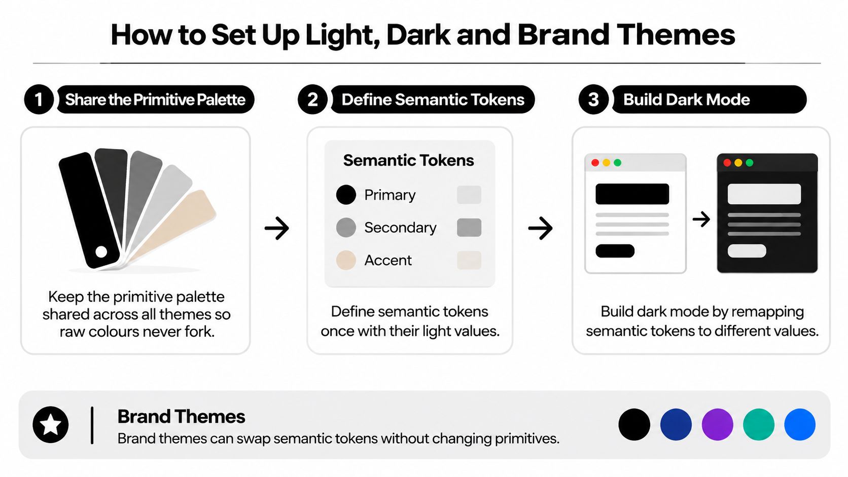
- Keep the primitive palette shared across every theme. If dark mode gets a private blue ramp, you’ve forked the palette and every future shade needs two decisions from two people.
- Define semantic tokens once, with light values.
color.surface.defaultpoints at the lightest grey andcolor.text.defaultat the darkest. This becomes the baseline every other theme is measured against. - Build dark mode by remapping semantics.
color.surface.defaultpoints at a dark grey instead; component styles never learn that a theme changed. Dark mode is not inversion, though. Raised surfaces usually get lighter as they rise, shadows stop reading as depth, and a brand blue that passes on white often fails on near-black, so it needs a lighter tint from the same ramp.
- Create a brand skin by overriding primitives, not names. Swap the blue ramp and keep every semantic name identical. Forty components update because none of them named a colour, and the skin stays a theme rather than a fork.
- Scope each theme with an attribute.
html[data-theme="dark"]redefines the same custom property names, so the cascade does the switching and no JavaScript rewrites styles. - Respect the system setting and allow a manual override.
prefers-color-schemesets the initial state, a stored preference wins over it, and the toggle remembers what the user chose. A theme that ignores the operating system feels broken on first load. - Re-run contrast and focus checks for every theme before release. A theme is a new set of colour pairs, so treat it as new code rather than a stylesheet swap.
High-contrast and forced-colour modes deserve their own pass. These users often override your colours entirely, so the goal shifts from matching the palette to surviving without it: make sure borders and focus rings still read when your background colour is discarded.
A single semantic remap can update forty components at once. That’s the promise. It’s also the risk, because one wrong remap reaches forty components in the same release.
Connecting Tokens to Components and Platforms
Layering is what keeps component behaviour stable while visuals move. Headless primitives for menus, dialogs, tabs, listboxes and buttons consume color.focus, color.text, color.surface and space.control at the semantic layer, never a raw value. A theme change or a high-contrast adjustment then propagates through the styling while ARIA attributes and keyboard handling stay untouched, which is the whole point of separating them.
The public-sector pattern shows why tested behaviour matters alongside tested values. GOV.UK’s guidance and tools for digital accessibility describes a design system of reusable styles, components and patterns, with its frontend tested against commonly used assistive-technology and browser combinations while targeting WCAG Level AA. Values and behaviour are verified together, not separately.
Complete screens follow the same rule. When a screen is assembled from the same tokens as the primitives underneath, copying it into a new product inherits the active theme rather than carrying its own colours, so a dark-mode launch doesn’t produce a light rectangle in the middle of the page.
One source, three platform outputs
| Platform | Output format | How it is consumed |
|---|---|---|
| Web | CSS custom properties such as --color-action-primary | Imported once in a global stylesheet |
| iOS | Swift constants or asset catalogue colours | Generated file added to the Xcode project |
| Android | colors.xml resources or a Compose theme object | Generated into the res/values folder or theme file |
| Design tools | JSON token export | Imported as variables so designs match the code |
The web side is where many teams start, and a guide to CSS variables and how the cascade resolves them is worth reading before you commit to a scoping strategy. iOS and Android consume generated files, which means the only manual step is adding the generated output to the project once.
A component with a hard-coded hex value silently bypasses every theme you build. One lint rule that flags raw colour values outside the token files will save more accessibility bugs than any documentation page.
Enforce it in continuous integration, not in review comments. Fail the build when a component file contains a hex code or a raw pixel value for spacing, because the person adding it usually means well and doesn’t know the token exists.
Token changes then get reviewed like code: rendered component tests, keyboard journeys, screen-reader checks and forced-colour-mode checks, all against the same pull request. A healthy setup has one source, generated outputs and no raw values in components.
Governing Token Changes Without Breaking Products
A token name is an API contract. A stylesheet may import it, a component may use it for a background, and a test may check the contrast of the resulting combination. Renaming a token or changing what it means can therefore break products, even if the change looks like a small cleanup.
Treat a token name as an API contract
Set clear rules for how tokens change:
- Classify each change. Additions are generally safe. Renames, removals and changes in meaning can break consumers.
- Deprecate before removing. Keep the old name as an alias for a defined period. One minor release is a common choice. List the replacement in the changelog.
- Assign owners by group. Name an owner for colour, density, motion and typography. Changes affecting contrast, focus or motion should receive accessibility-aware review.
- Check component states. Hover, focus, disabled and error states can reveal regressions that the default state hides.
- Pin the version consumers install. A pinned version makes rollback easier than tracking down changes across repositories.
More layers do not automatically make a token system safer. If global, alias, component, density, brand and state layers lack clear purposes, developers may reach for primitives because those values seem more predictable. The catalogue grows, unused tokens accumulate, and teams spend more time finding the right value. Add a layer only when it answers a question the existing layers cannot.
Governance also needs to account for accessibility uncertainty. An organisation may not be able to say which accessibility standard its service meets. Without that baseline, a token change has no clear reference point for judging its effect.
Keep a record of each change: the token affected, the component states reviewed, the contrast result and the approver. A design-tool sync and a Slack message alone leave too little context for a future maintainer. A design system governance approach for ownership and change approval helps teams make those decisions consistently.
Confirm Your Token Setup Before You Ship
Five checks, each a pass or fail. Run them against a single theme before you migrate anything else, because a failed check on one theme will fail on the next one too.
- Every semantic token resolves in every theme. A dark surface falling back to a light value because nobody defined it is the most common launch bug.
- No component references a primitive or a raw hex value. One exception is enough to break a theme, and the exception is usually in a component someone added last week.
- Each theme passes contrast and focus checks against the thresholds above, including disabled and error states.
- Deprecated aliases carry a removal date. An alias with no end date becomes permanent, and permanent aliases become the system.
- Each token group has a named owner. Unowned groups drift, and drift shows up as three slightly different greys.
Pick one existing component and audit it against all five. Record what had to change: the values you replaced, the pairing that failed, the owner you had to find. That record is your migration plan, and it’s more useful than any documentation template.
If all five pass, the setup is ready to ship. If any fail, fix that item first, starting with contrast or focus failures, because those block users rather than merely inconveniencing developers. Themes in DOM Studio use semantic tokens shared by every product in light and dark modes, with an AI theme editor for turning the foundation into a brand, and theme values are CSS variables where the host app owns the final tokens rather than the package. That structure suits teams that want the checks above to stay under their own control, and accessibility testing still applies to any theme you build on it.
If you want a component layer that already consumes semantic tokens instead of hard-coded values, DOM Studio ships headless primitives and Vue wrappers built on the same theming model, so the colour decisions stay in the token layer where you can audit them. Start with the light and dark themes, swap the primitives for your brand, and run the five checks above before you roll it out. You can explore the library at DOM Studio.