
Component Documentation Generator: Build Living Vue Docs From Your Components
A component documentation generator turns the components we already ship into living reference pages. Instead of maintaining a separate inventory by hand, we discover a component, inspect its API and metadata, then render docs, navigation, examples, and editing controls from the same source.
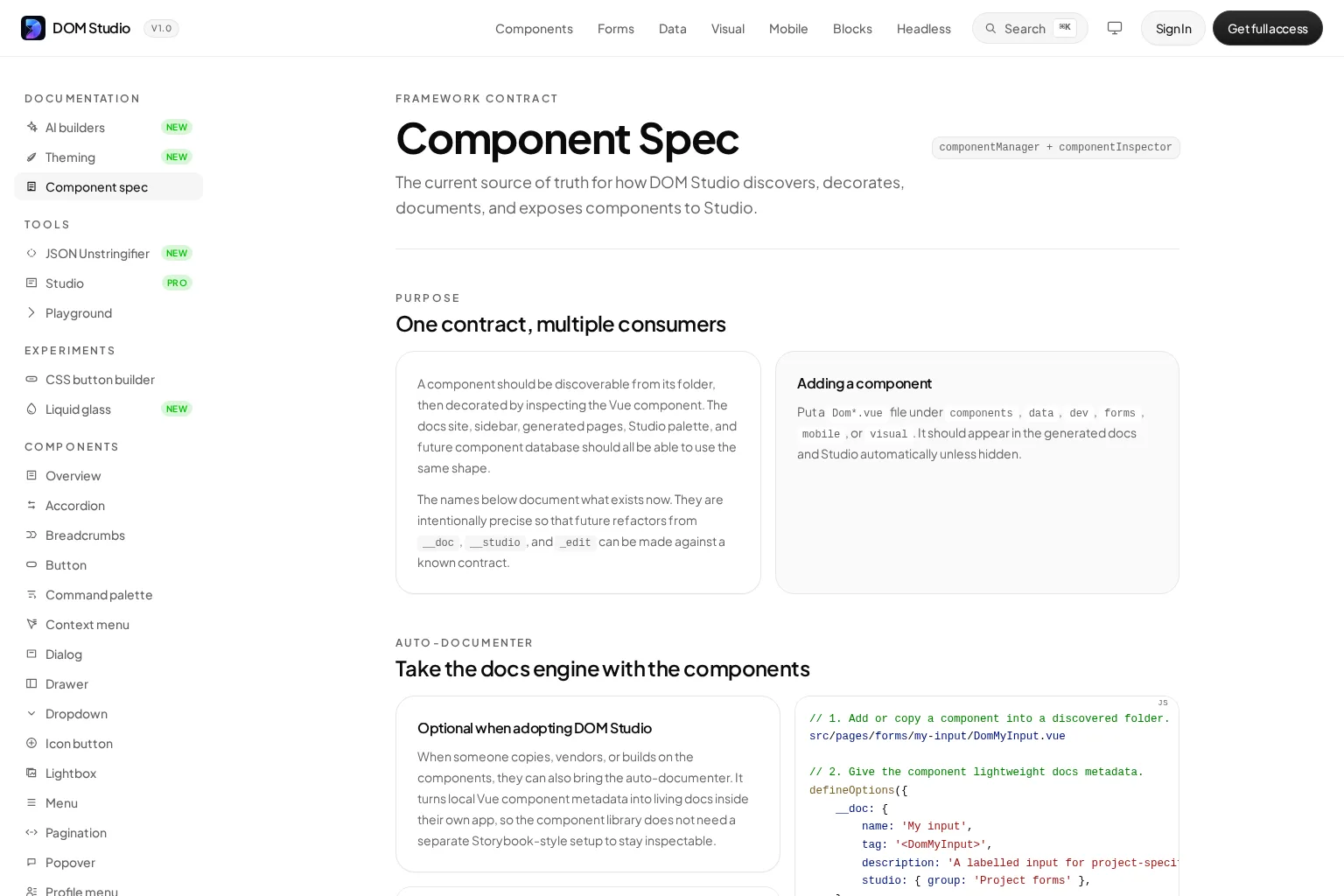
For Vue teams, that means a new Dom*.vue file can become discoverable documentation with a prop table, live preview, slots, events, and source hints. DOM Studio is built around this source-local approach: components, metadata, examples, and optional authored docs pages can stay together. We can then make the documentation useful to developers, design system owners, and AI-assisted workflows without duplicating the component contract.
This guide walks through a practical implementation pattern. By the end, we will have a generator that discovers components with Vite, reads a lightweight Vue metadata contract, creates a fallback docs page, and leaves room for richer hand-authored guidance where it matters.
Table of contents
- Before we start: prerequisites and success criteria
- 1. Define one documentation contract for every consumer
- 2. Create a folder convention that Vite can discover
- 3. Put lightweight metadata beside the Vue component
- 4. Inspect the loaded component and merge derived facts
- 5. Render a generated page with a live preview
- 6. Keep examples near the component, then override deliberately
- 7. Validate the generator before publishing it to the team
- Build documentation that stays close to the interface
Before we start: prerequisites and success criteria
We need a Vue application, Vite-based component discovery, and a predictable folder convention. If we use defineOptions() for metadata, use Vue 3.3 or later. We also need a component registry or route layer where generated documentation can be displayed.
For this guide, our success criterion is testable: after adding DomStatusPill.vue to a discovered folder, the component should appear in documentation navigation and open a generated page with a live preview and a basic API reference. No separate documentation entry should be required for that first pass.
1. Define one documentation contract for every consumer
Action: Decide which facts should be owned by the component and which should be derived by the generator.
Start with a small record that every consumer can share. The generator can derive mechanical facts such as the path, route, section, slug, and export name. The component should provide product language and behavior details: display name, tag, description, slots, events, ordering, and any Studio-specific hints.
This split matters because the docs site is rarely the only consumer. We may also need the same information for a sidebar, a visual editing palette, generated examples, or compact context for an AI tool. DOM Studio’s Component Spec uses this exact division: discovery finds the component, then inspection decorates it with Vue props and component metadata.
A lean component contract might look like this:
type ComponentDoc = {
  name?: string
  tag?: string
  description?: string
  order?: number
  hidden?: boolean
  studio?: {
    group?: string
    hidden?: boolean
  }
  slots?: Array<{ name: string; description: string }>
  events?: Array<{ name: string; payload?: string; description: string }>
}
Expected result: We have one documented shape that can drive generated docs and navigation without forcing every component to carry a long-form page.
Troubleshooting: Do not put route paths, duplicated labels, or rendered HTML in the metadata. If a value can be calculated reliably from the file path or component definition, derive it once in the generator.

2. Create a folder convention that Vite can discover
Action: Put documentable components in a small set of known directories and enforce a consistent file name pattern.
For example, we might use Dom*.vue for components in sections such as components, forms, mobile, and visual. Vite’s import.meta.glob can collect matching files from literal glob patterns, which makes it a good fit for a build-time component documentation generator.
// componentManager.ts
const componentModules = import.meta.glob([
  '../pages/components/*/Dom*.vue',
  '../pages/forms/*/Dom*.vue',
  '../pages/mobile/*/Dom*.vue',
  '../pages/visual/*/Dom*.vue',
])

export const discoveredComponents = Object.entries(componentModules).map(
  ([path, load]) => ({
    id: path
      .replace('../pages/', '')
      .replace(/\/Dom[^/]+\.vue$/, ''),
    path,
    load,
  }),
)
Next, normalize each path into a stable section, slug, route, and exportName. Keep this raw discovery record intentionally plain. It should report what exists on disk, not make product decisions about labels or visibility.
Expected result: Adding a matching file produces a discovery record during development and build.
Troubleshooting: import.meta.glob requires literal patterns. If a component is missing, log the matched paths first, then check its location, file casing, and naming convention before changing the inspector.
3. Put lightweight metadata beside the Vue component
Action: Add the human context that code alone cannot communicate.
Vue’s defineOptions() lets us declare component options within <script setup>. DOM Studio uses a custom __doc object for source-local documentation metadata, while standard prop definitions remain the source for the component’s inputs.
<!-- src/pages/components/status-pill/DomStatusPill.vue -->
<script setup lang="ts">
defineOptions({
  __doc: {
    name: 'Status pill',
    tag: '<DomStatusPill>',
    description: 'A compact label for communicating workflow state.',
    order: 40,
    studio: { group: 'Feedback' },
    slots: [
      { name: 'default', description: 'Text shown inside the pill.' },
    ],
    events: [
      {
        name: 'click',
        payload: 'MouseEvent',
        description: 'Fired when the pill is selected.',
      },
    ],
  },
})

const props = defineProps({
  tone: {
    type: String,
    default: 'neutral',
    _edit: {
      options: ['neutral', 'success', 'warning', 'danger'],
      description: 'Visual state shown by the pill.',
    },
  },
  label: { type: String, default: 'Draft' },
})
</script>

<template>
  <span :data-tone="props.tone">{{ props.label }}</span>
</template>
This is progressive documentation. We can start with props and a descriptive name, then add slot details, event payloads, editor hints, or a better navigation grouping only when the generated page needs them. The same source-local metadata approach aligns with DOM Studio’s AI builder guidance, where concise component names, prop shapes, events, examples, and theme rules are more useful than a large, disconnected marketing page.
Expected result: The component can supply a polished label and purpose while retaining its ordinary Vue API.
Troubleshooting: Keep metadata static and serializable. If the generator needs a value at build time, avoid metadata that depends on runtime state, injected services, or browser globals.
4. Inspect the loaded component and merge derived facts
Action: Load the Vue module only when needed, then decorate the discovery record with its documentation contract and runtime prop options.
The inspector is where raw file data becomes the row that a docs page, sidebar, or visual editor can consume. Use sensible fallbacks so a component remains visible even when it has no custom metadata.
async function inspectComponent(record: {
  id: string
  path: string
  load: () => Promise<{ default: Record<string, unknown> }>
}) {
  const module = await record.load()
  const component = module.default
  const doc = (component.__doc ?? {}) as ComponentDoc

  return {
    ...record,
    label: doc.name ?? humanizeSlug(record.id),
    description: doc.description ?? '',
    hidden: doc.hidden ?? false,
    studioHidden: doc.studio?.hidden ?? false,
    props: component.props ?? {},
    slots: doc.slots ?? [],
    events: doc.events ?? [],
    doc,
  }
}
We should treat this decorated record as the generator’s public internal API. The sidebar can sort it, the docs page can render it, and a DOM Studio workspace can decide whether the component belongs in an editing palette. That avoids a drift-prone architecture where every interface invents its own interpretation of the component.
Expected result: Each discovered file resolves to one inspected record with stable fallbacks for name, visibility, props, slots, and events.
Troubleshooting: Inspect the actual default export in development. If props do not appear, confirm that your SFC build exposes the prop options you expect. For deeply type-only APIs, supplement runtime data with explicit metadata or a build-time parser rather than silently publishing an incomplete table.
5. Render a generated page with a live preview
Action: Build a default page that is immediately useful, even when no custom documentation page exists.
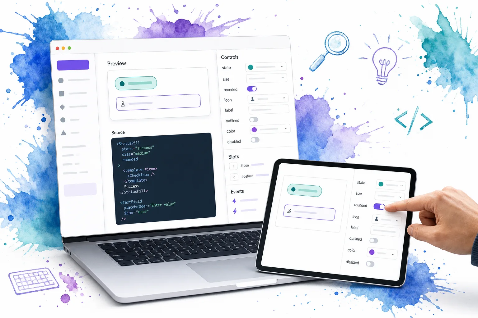
A strong fallback page has four jobs:
- Show the component’s name, tag, and short description.
- Render an isolated live preview with safe default prop values.
- List props, defaults, slots, and events.
- Link to source and nearby examples when they exist.
DOM Studio follows this pattern with generated component pages: a component can appear in docs from its folder, export name, and prop definitions, then receive more specific content later. We can use the same approach to keep our component library inspectable as it grows.
<script setup lang="ts">
const props = defineProps<{ component: InspectedComponent }>()
const previewState = reactive(seedDefaults(props.component.props))
</script>

<template>
  <article>
    <header>
      <code>{{ component.doc.tag }}</code>
      <h1>{{ component.label }}</h1>
      <p>{{ component.description }}</p>
    </header>

    <ComponentPlayground
      :component="component"
      v-model:props="previewState"
    />

    <PropsReference :props="component.props" />
    <SlotsReference :slots="component.slots" />
    <EventsReference :events="component.events" />
  </article>
</template>
An interactive preview is not decorative. It lets us verify that defaults are sensible, lets users test allowed options, and makes documentation a practical aid during implementation. Similar tools, including Storybook Autodocs, also infer a starting documentation page from component and story metadata. The differentiator for an owned generator is that we can expose the same inspected record to our application docs, navigation, and editable UI system.
Expected result: A component without a bespoke docs page still gets a navigable, useful reference.
Troubleshooting: Never render untrusted values as HTML in an example or metadata field. Start with predictable defaults, constrain editor options where possible, and isolate previews that might trigger network activity or destructive actions.
6. Keep examples near the component, then override deliberately
Action: Add examples beside the component and author a full docs page only when the fallback can no longer explain the right usage.
Use a directory shape like this:
src/pages/forms/my-input/
  DomMyInput.vue
  examples/
    Basic.vue
    Validation.vue
  Index.vue
The generator can use examples/ for a gallery while preserving the generated reference as the baseline. When the component needs accessibility guidance, composition patterns, migration instructions, or an opinionated workflow, add Index.vue as the route-level override.
This keeps our investment proportional to complexity. A simple field can live with generated docs and one canonical example. A complex form system control may deserve authored validation rules, schemas, async behavior, and usage boundaries.
Expected result: Documentation depth grows where readers need it, without forcing every component into the same large template.
Troubleshooting: Do not copy the generated prop table into a custom page. Reuse the same reference subcomponents so the manual guidance and source-derived API stay synchronized.
7. Validate the generator before publishing it to the team
Action: Add checks for discovery, inspection, rendering, and link health.
At minimum, test these conditions in CI:
- A component in each supported folder is discovered.
- A hidden component does not appear in navigation or the editor palette.
- A component without
__docreceives a readable fallback label. - Every documented event and slot has a name.
- Prop editor options match the allowed runtime values.
- A generated route renders without console errors.
- Example imports and source links resolve.
Also add a small review workflow. When a component changes its props, reviewers should check the generated page and a canonical example before merging. This is how the documentation generator earns the word “living”: it is verified as part of the same change that updates the component.
Expected result: We catch broken contracts before documentation users discover them.
Troubleshooting: If the docs work locally but fail in production, compare the build’s glob matches and lazy-loaded chunk paths. Discovery and route generation are build-time concerns, so production logs should include enough context to identify the missing file or failed module.
Build documentation that stays close to the interface
A component documentation generator is most valuable when it removes a second documentation backlog. We start with source discovery and a restrained metadata contract, generate a dependable fallback page, and add authored examples only for the components that need deeper teaching.
The completed outcome is a library where a component can be found, understood, previewed, and reused from the same codebase that ships it. Our most useful next step is to choose one existing component, add the smallest viable metadata block, and confirm that it appears correctly in generated docs. From there, explore DOM Studio’s component spec to adapt the pattern to your own Vue component folders and documentation workflow.
Ready to make your UI library inspectable? Use DOM Studio to keep components, metadata, examples, and editable UI workflows in one system.