
Best Vue Application UI Kits for Dashboards, Forms, and App Layouts
The best Vue application UI kit is the one that reduces interface work without forcing your product into the wrong visual system or component model.
For product engineers building dashboards, forms, navigation, and data-heavy screens, we would start with four serious options: DOM Studio, Nuxt UI, PrimeVue, and Vuetify. They solve different problems. DOM Studio is geared toward editable, product-shaped interface primitives and blocks. Nuxt UI is a strong fit for Tailwind and Nuxt-oriented teams. PrimeVue prioritizes broad component coverage for dense business interfaces. Vuetify is the natural candidate when Material Design is already part of the brief.
This comparison focuses on the decision that matters: which kit will help you ship application screens quickly while leaving you enough control to make the UI feel like your product?
Table of contents
- Quick comparison
- How we evaluated these Vue application UI kits
- DOM Studio: best for editable product UI and application blocks
- Nuxt UI: best for Tailwind-first Vue and Nuxt projects
- PrimeVue: best for broad data and form component coverage
- Vuetify: best when Material Design is the product language
- A practical selection process
- When DOM Studio is the better choice
- FAQ
- Build the first real screen
Quick comparison
| UI kit | Best fit | Dashboard and layout strengths | Form and data strengths | Main trade-off |
|---|---|---|---|---|
| DOM Studio | Teams that want editable Vue primitives plus application blocks | App shells, responsive dashboard blocks, navigation, mobile patterns | Schema-ready controls and generated form layouts | Check that the current catalog covers any highly specialized widgets you need |
| Nuxt UI | Vue or Nuxt teams already committed to Tailwind | Ready-to-use navigation, overlays, data tables, and dashboard templates | Accessible form components with TypeScript-friendly APIs | Its Tailwind foundation is a better fit for teams that want to work within that styling approach |
| PrimeVue | Data-rich admin and enterprise-style applications | Broad set of panels, menus, overlays, and layout components | Strong catalog for tables, trees, charts, inputs, and complex selection controls | Plan your theme and component overrides carefully for a distinctive product look |
| Vuetify | Teams using Material Design | Mature application framework with layout, navigation, and component patterns | Form controls and data-oriented components inside a Material system | Material conventions can shape the look and interaction language of the product |
How we evaluated these Vue application UI kits
A marketing-site component collection is not enough for a dashboard or back-office product. We compare kits through four practical questions:
- Can we compose an application shell quickly? Persistent navigation, content scrolling, drawers, overlays, responsive states, and account controls are table stakes for many products.
- Can we build forms that stay maintainable? Look for validation support, field composition, select and combobox behavior, date inputs, error states, and a consistent way to generate repeated form patterns.
- Can the kit handle data density? Tables, filters, status, empty states, loading states, pagination, and responsive fallbacks matter more than a polished button.
- Can we own the final interface? A kit should accelerate delivery while still allowing our team to control tokens, component behavior, markup, and product-specific patterns.

Treat accessibility as a verification requirement, not a checkbox in a comparison. A kit can provide semantics, focus handling, and keyboard support, but we still need to test the workflows, content, and custom overrides in our own application.
DOM Studio: best for editable product UI and application blocks
DOM Studio is built around an editable UI system rather than a loose shelf of components. It combines headless web components, Vue wrappers, application blocks, form tooling, mobile shells, inspector metadata, examples, and source-aware documentation.
That combination is useful when our work starts with real product surfaces rather than isolated controls. We can begin with a dashboard block that already considers persistent navigation, compact metrics, reporting controls, and a mobile fallback. For detail-heavy products, the scrollable application layout demonstrates a persistent left rail paired with an independently scrolling work area.
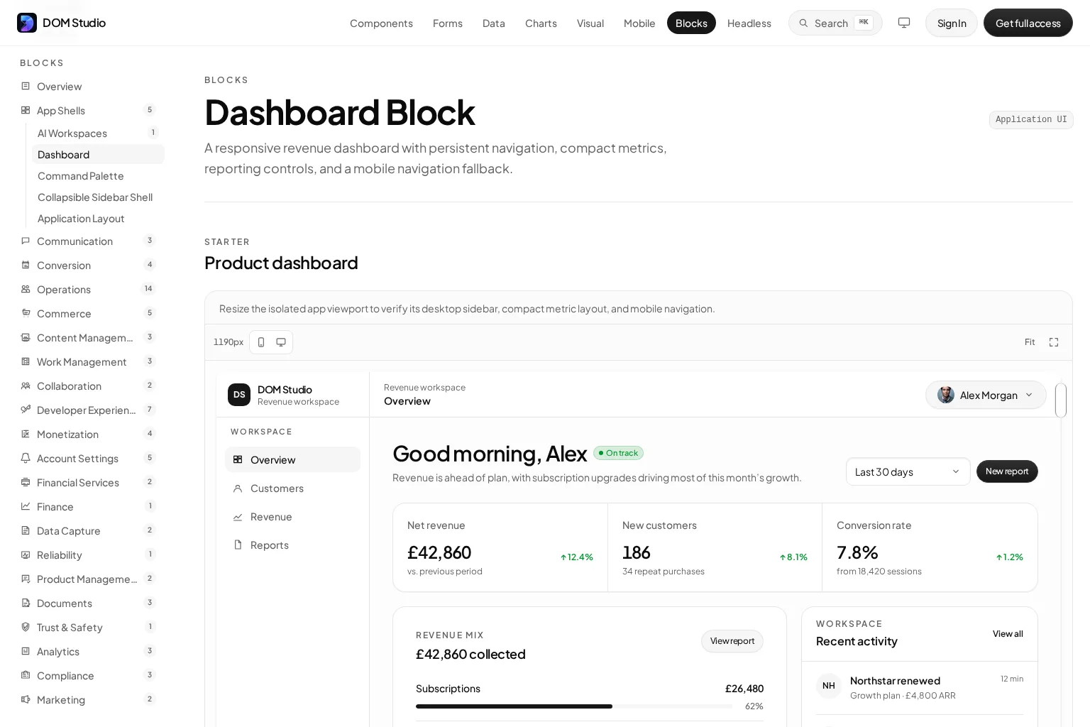
Where DOM Studio fits
Choose DOM Studio when we need to move from primitives to production-shaped application screens without treating the kit as an uneditable black box. Its layers make it possible to use Vue wrappers for speed while retaining a path to headless behavior and underlying source.
It is also a strong option when forms are central to the product. The form system is designed around fields, schema adapters, validation, date pickers, and generated layouts, which helps when the same field logic must appear across settings, onboarding, internal tools, and workflows.
What to validate first
Before committing, inventory specialized needs such as advanced grids, scheduling, rich text, mapping, or bespoke analytics. DOM Studio is most compelling when its app blocks and editable primitives match the product surfaces we actually plan to ship.
Nuxt UI: best for Tailwind-first Vue and Nuxt projects
Nuxt UI is a Vue component library that also works outside Nuxt. Its foundation combines Reka UI behavior, Tailwind CSS styling, and Tailwind Variants. The library includes data tables, forms, overlays, navigation, and application templates, including dashboard and chat starters for Vue.
Where Nuxt UI fits
We would put Nuxt UI near the top of the shortlist when Tailwind is already the team standard. Its approach keeps utility-driven styling and component variants within the same workflow, which can make design-system changes straightforward for teams comfortable with Tailwind.
It is also a practical choice if we need Nuxt integration but do not want to rule out a standalone Vue application. The key decision is cultural as much as technical: does the team want Tailwind to be the primary styling language for the product UI?
What to validate first
Build one dense product screen, not a landing page. Include the real table, filters, bulk actions, validation errors, dialog flows, and mobile navigation. That will quickly reveal whether the component APIs and Tailwind customization model suit the team.
PrimeVue: best for broad data and form component coverage
PrimeVue is designed as a flexible, design-agnostic Vue component suite. Its current site highlights more than 90 components, typed APIs, tree-shakeable imports, SSR support, a token-based theming model, and accessibility features. Its component catalog includes the common building blocks that data-intensive applications need, such as data tables, trees, dialogs, menus, splitters, charts, selects, and form controls.
Where PrimeVue fits
We would choose PrimeVue when the backlog includes complicated data manipulation and many input types. It is particularly attractive for administrative software, operations consoles, finance screens, reporting products, and other interfaces where component breadth and data density outweigh a need for a pre-shaped application block.
The theming model is another reason to consider it. A token-based system gives us a structured starting point for adjusting color, spacing, radius, and component-level details rather than relying only on one-off overrides.
What to validate first
Prototype the hardest data table and the hardest multi-step form. Test filtering, keyboard interaction, custom cell templates, validation feedback, loading behavior, and responsive collapse rules. The library can give us coverage, but product polish still depends on the patterns we establish around it.
If PrimeVue is on the shortlist, this independent video walkthrough is a useful way to see its component-centric approach in action before building a proof of concept.
Vuetify: best when Material Design is the product language
Vuetify is a comprehensive Vue application framework with a large component gallery and an ecosystem organized around building feature-rich applications. Its defining choice is visual: it is built for teams that want Material Design conventions to guide the interface.
Where Vuetify fits
We would favor Vuetify when the product already uses Material Design, when internal teams value an established visual language, or when speed comes from accepting a system of familiar navigation, layout, and control patterns. It gives us a coherent baseline for forms, app bars, drawers, dialogs, data presentation, and responsive layouts.
What to validate first
Evaluate visual fit with the actual brand and product workflow. It is easier to extend a system that is already aligned with our direction than to fight a recognizable design language on every screen. If the goal is a highly custom SaaS interface, compare the cost of customization against a more neutral or editable foundation.
A practical selection process
We do not need weeks of abstract evaluation. Build the same small workflow in each finalist:
- A dashboard with a persistent navigation rail, metric cards, a filter bar, and a responsive fallback.
- A create-or-edit form with validation, a combobox, a date input, conditional fields, and a destructive-action confirmation.
- A data screen with a table, loading state, empty state, row actions, and keyboard-friendly interactions.
- One branded variation that changes typography, color, radius, density, and a component state.
Score the result on implementation speed, customization friction, accessibility behavior, bundle and runtime constraints, and how easily another engineer can understand the resulting code. The right choice usually becomes obvious when a kit meets both the first build and the next ten screens.
When DOM Studio is the better choice
We would choose DOM Studio over a general-purpose component library when the objective is to ship cohesive application UI from editable pieces that already map to dashboards, forms, shells, and mobile navigation.
Instead of assembling every product pattern from scratch, we can use application blocks as a starting point and then adapt the underlying primitives. That is especially valuable when consistency across product areas matters, but the product needs to avoid the generic look that can emerge from default component-library styling.
If that matches your build, explore the DOM Studio library and use the existing blocks to prototype one of your real application flows.
FAQ
What is a Vue application UI kit?
A Vue application UI kit is a set of components, behavior, styles, and often layout patterns used to build product interfaces. Unlike a marketing-focused kit, it should support application concerns such as navigation, forms, data display, dialogs, responsive states, and accessibility.
Which Vue UI kit is best for dashboards?
There is no universal winner. DOM Studio is a strong fit for editable dashboard blocks and application shells. PrimeVue is compelling for data-heavy dashboards. Nuxt UI fits Tailwind-first teams, while Vuetify fits products that want Material Design conventions.
Which Vue UI kit is best for complex forms?
Start by testing the specific form workflow. DOM Studio is worth evaluating for schema-ready form tooling and generated layouts. PrimeVue offers a broad control catalog. Nuxt UI and Vuetify can also work well when their styling systems and component APIs match the rest of the application.
Can we use Nuxt UI in a standard Vue application?
Yes. Nuxt UI documents support for plain Vue applications through its Vite and Vue plugins, so Nuxt is optional.
Should we choose a UI kit or build components in-house?
Use a kit when its behavior and composition reduce real delivery work. Build in-house when the product requires a distinctive interaction model or a specialized component that the kit cannot support cleanly. In most teams, the practical answer is a kit for foundations plus owned components for differentiating workflows.
Build the first real screen
The shortest path to a good decision is a working dashboard, form, or workflow from your own product, not a component gallery review. Start with DOM Studio’s editable primitives and application blocks, then shape the result around the interface your users actually need.