
AI Component Documentation: A Step-by-Step Guide for Reliable AI-Assisted UI
AI component documentation is the structured, testable explanation that lets a developer or coding assistant choose, configure, and validate a UI component without guessing. The practical goal is simple: give every reusable component one trustworthy contract that covers its API, behavior, accessibility, examples, and limits.
We recommend treating the documentation as part of the component itself, not as a separate writing task that follows development. That approach keeps the source of truth close to the code and makes the same information usable in docs, a component palette, a playground, and AI-assisted workflows. DOM Studio is built around this model, with an editable library of components, metadata, examples, and LLM-ready documentation. Explore the component library to see the kind of reusable building blocks this supports.
Prerequisites: access to the component source, a locally runnable preview, a docs route or documentation generator, and a way to run interaction and accessibility checks. If an AI tool will consume the documentation, also prepare a short repository-level instruction file or manifest.
Table of contents
- 1. Define the component’s job and boundaries
- 2. Keep one documentation contract beside the component
- 3. Document behavior as observable states
- 4. Create one canonical example, then a compact AI brief
- 5. Make the documentation discoverable by people and tools
- 6. Validate the contract with an implementation task
- 7. Maintain documentation as part of the release
1. Define the component’s job and boundaries
Start with a one-sentence purpose that distinguishes the component from nearby alternatives. Then write down what it owns and what it deliberately does not own. This removes ambiguity before you document props or ask an AI assistant to use the component.
For a dialog, a useful boundary might be: “A controlled overlay for confirming or completing a focused task. It owns focus movement and dismissal behavior, but it does not fetch data or persist form submissions.”
Create a small inventory for each component:
- Purpose: the user-facing problem it solves.
- Use when: the situations where it is the preferred choice.
- Do not use when: nearby patterns that fit better.
- Dependencies: required primitives, tokens, providers, or browser capabilities.
- Stability: experimental, stable, deprecated, or internal.
Expected result: a reviewer can select the right component from two similar choices without reading its implementation.
Troubleshooting: if the purpose requires several “and” clauses, you may be documenting a block or workflow rather than a primitive. Split the behavior into smaller components, or publish it as a higher-level composition.
2. Keep one documentation contract beside the component
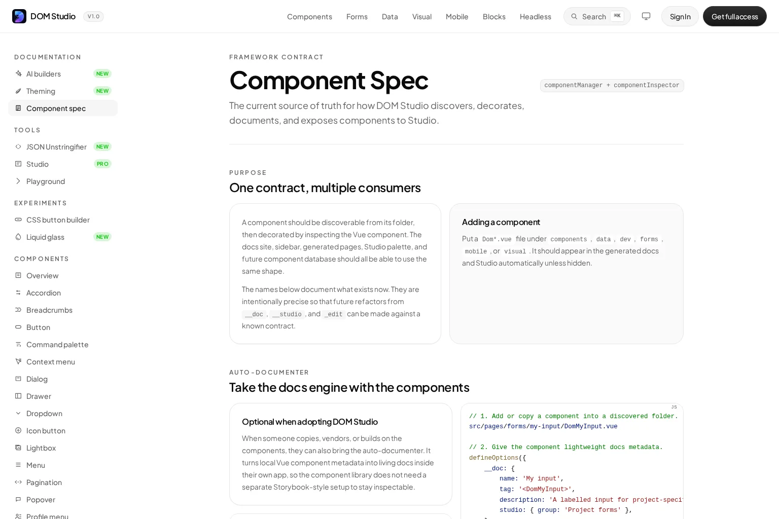
Put the component’s metadata, API reference, and examples close to its source. DOM Studio’s component specification demonstrates this pattern: a discovered Vue component can be decorated with metadata, props, slots, events, and Studio details, then used to generate docs and navigation from the same shape.
For Vue components, we can use lightweight metadata to supply the product language that runtime prop inspection cannot infer:
<script setup>
defineOptions({
  __doc: {
    name: 'Status pill',
    tag: '<DomStatusPill>',
    description: 'A compact label for workflow state.',
    studio: { group: 'Feedback' },
    slots: [
      { name: 'default', description: 'Status label content.' }
    ],
    events: [
      {
        name: 'dismiss',
        payload: '{ id: string }',
        description: 'Emitted after the user dismisses the pill.'
      }
    ]
  }
})

const props = defineProps({
  tone: {
    type: String,
    default: 'neutral'
  },
  dismissible: {
    type: Boolean,
    default: false
  }
})
</script>
Document each prop with its type, default, allowed values, whether it changes behavior or only presentation, and any invalid combinations. For events, show the payload and timing. For slots, explain the permitted content and whether the parent must preserve a particular semantic structure.
Expected result: the rendered docs, visual inspector, and an AI prompt all describe the same component.
Troubleshooting: do not overload editor-specific metadata as the main AI contract. Keep the primary documentation centered on names, props, events, slots, examples, and design rules. Add inspector configuration only for visual editing workflows.
3. Document behavior as observable states
A prop list alone cannot tell an engineer or model how a component behaves. Add a state matrix that describes what users can observe.
For each interactive component, cover these states:
- Initial and default state
- Empty, loading, disabled, invalid, and error states
- Keyboard focus and focus return behavior
- Pointer, touch, and keyboard activation
- Open, closed, selected, expanded, and dismissed states
- Async and server-response states, when the component owns them
Use precise checks rather than adjectives. Instead of “the menu is accessible,” write “pressing Escape closes the menu and returns focus to its trigger.” For composite widgets, explain where Tab moves focus and which keys operate items inside the widget. W3C’s ARIA Authoring Practices emphasize that authors must provide keyboard support for custom ARIA widgets and should follow established keyboard conventions.
Expected result: a tester can turn every documented behavior into a manual test or automated assertion.
Troubleshooting: if a state is difficult to describe, the component may have hidden state transitions. Expose them through explicit props, events, or status values instead of requiring consumers to infer them from the DOM.
4. Create one canonical example, then a compact AI brief
Examples are the fastest route from documentation to correct implementation. Give every stable component one short, complete example that follows your preferred imports, composition, tokens, and event handling. Then add variants only when they teach a meaningful decision.
A canonical dialog example should show the trigger, the controlled open state, a meaningful title, keyboard-safe dismissal, and a realistic action. It should not hide key setup in unrelated helpers.
Next, create a compact AI brief from the same contract. We keep this brief directive and specific:
# Component guidance
- Prefer existing components and blocks before custom markup.
- Use documented props for behavior and classes only for layout.
- Preserve documented keyboard and focus behavior.
- Follow canonical examples before creating a new composition.
- Return an error or ask for clarification when a required prop is unknown.
The AI builder guide follows the same principle: known primitives, canonical examples, semantic tokens, and concise machine-facing guidance give an agent safer choices than an unbounded prompt. Google Cloud’s developer guidance similarly recommends documenting a codebase early to improve later AI-assisted generation.
Expected result: a developer can copy an example into an app, and an AI assistant has a short rule set that limits unnecessary invention.
Troubleshooting: avoid feeding a model an entire documentation site by default. Start with the component index, the relevant contract, one or two canonical examples, and the applicable design rules. Expand context only when the task requires it.
5. Make the documentation discoverable by people and tools
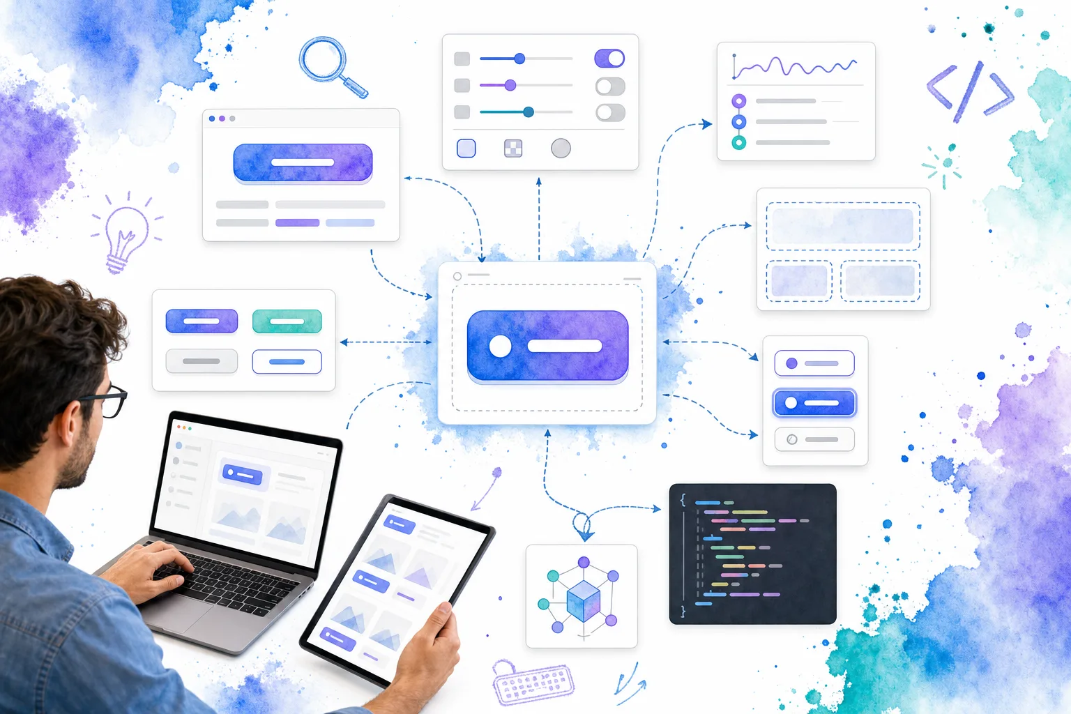
Publish human-readable pages, but also make the component catalog easy for tools to navigate. At minimum, expose a stable component name, route, category, status, source location, and links to examples. A generated index can then supply a sidebar, a search result, a Studio palette, and an AI retrieval surface from one inventory.
For complex application libraries, distinguish presentational developer utilities from components that own server workflows. DOM Studio’s developer utilities section is aimed at documentation, diagnostics, code previews, and JSON inspection, while data components document their own backend-facing contracts. That distinction prevents an assistant from assuming a display component performs fetching, mutation, or pagination.
We also recommend a small machine-readable manifest with only the fields an agent needs to choose and use a component. Keep detailed prose and long troubleshooting material in the linked docs page.
Expected result: searching for “combobox,” “status,” or “account settings form” returns the canonical component or block instead of a collection of ad hoc snippets.
Troubleshooting: version your manifest alongside the library. An outdated component index is worse than a missing one because it creates confident but incorrect AI output.
For a short companion discussion of responsible AI coding workflows, watch this video before rolling the process out across a team.
6. Validate the contract with an implementation task
Do not declare the documentation AI-ready until it succeeds in a small, repeatable implementation test. Give a developer or AI assistant a bounded task, such as “build a settings card with an email field, status pill, and confirmation dialog using only documented components.”
Review the result against this checklist:
- Only documented components and props were used.
- Imports, tokens, and event payloads match the canonical example.
- Required labels, help text, and error states are present.
- Keyboard behavior works as documented, including focus movement and Escape handling.
- Unsupported combinations are rejected or clearly surfaced.
- The implementation can be changed without editing generated markup by hand.
Run the same test after a breaking component change, a documentation-generator change, or a major model change. Track failures as documentation defects first. If several attempts choose the wrong component, the taxonomy or example is probably unclear.
Expected result: you have evidence that the contract supports both implementation and review, not merely an attractive reference page.
Troubleshooting: if the agent invents props, inspect the component name, default values, permitted options, and example completeness. If it recreates behavior such as a dialog or combobox from scratch, make the preferred primitive more visible in the index and AI brief.
7. Maintain documentation as part of the release
The finished outcome is a component library where humans and AI can retrieve a reliable answer to five questions: what is this component for, how do we configure it, how does it behave, what is the preferred example, and how do we verify it works?
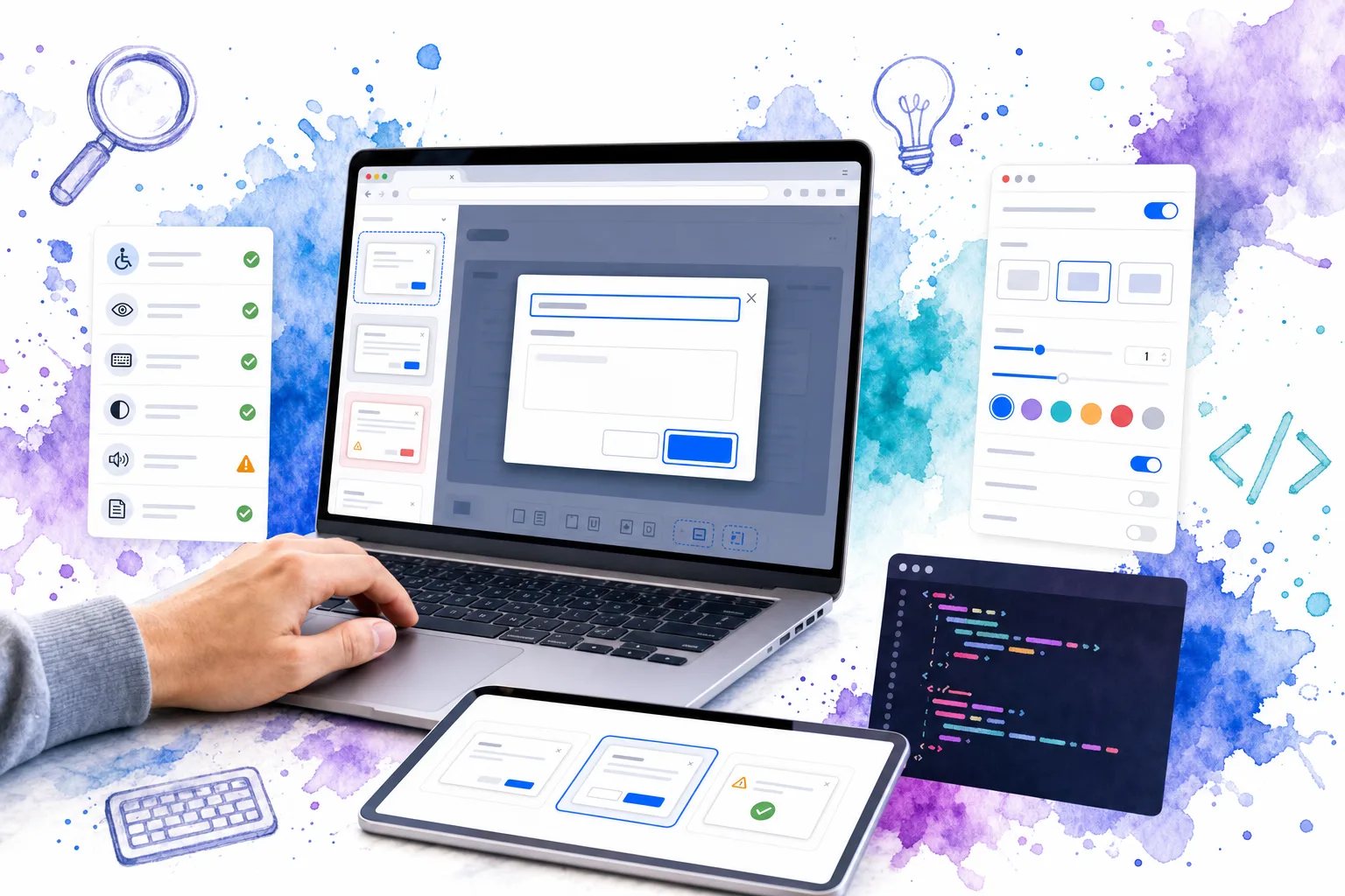
Make the contract part of your pull request and release process. When a prop, event, accessibility behavior, visual token, or supported composition changes, update the metadata, example, validation case, and AI brief in the same change. Mark deprecations explicitly and provide the replacement component or migration path.
That discipline turns AI component documentation into a practical engineering control: it helps teams ship consistent interfaces, reduces undocumented one-off markup, and gives coding assistants a smaller, safer vocabulary to work with.
Ready to apply the workflow to an editable component system? Start by reviewing one high-use component in DOM Studio, add its contract and canonical example, then use that pattern as the template for the rest of your library.