
AI coding components are reusable UI building blocks packaged with enough reliable context that a coding assistant can select, configure, and validate them without inventing behavior. They combine the component itself with a usable contract: purpose, source, props, events, states, accessibility expectations, examples, and constraints.
For an AI-assisted development team, that distinction matters. An ordinary UI component may be reusable by an engineer who knows the library well. An AI coding component is reusable by both the engineer and the AI tool because the intended use is explicit and discoverable.
We see the goal as making the best implementation path the easiest one. When a request calls for a confirmation flow, the assistant should reach for the team’s documented dialog and form patterns, not assemble a lookalike overlay from ad hoc markup. The result is faster UI work, but more importantly, it is easier to inspect, edit, test, and keep consistent.
Table of contents
- AI coding components are more than generated UI
- The essential contract behind an AI coding component
- Why source awareness changes AI-assisted UI work
- A practical model: primitives, components, and blocks
- What an AI-ready component record should include
- When AI coding components provide the most value
- Common misunderstandings to avoid
- How to evaluate whether your components work with AI
- The strategic payoff: better choices, not just faster code
AI coding components are more than generated UI
The phrase can be confusing because it is used in two different ways:
- Components generated by AI: UI code created from a prompt. It may be useful, but it is not automatically reusable, documented, or aligned with a system.
- Components designed for AI-assisted coding: established primitives, visual components, or application blocks with structured information that helps an AI tool use them correctly.
This article focuses on the second meaning.
A familiar component library can include buttons, inputs, dialogs, menus, cards, and layouts. AI coding components add a layer of operational knowledge. They tell the agent what a component is for, which alternatives are nearby, which inputs are valid, what behavior must be preserved, and how a correct implementation should look.
That makes an AI coding component a bounded choice, not just a chunk of markup.
The essential contract behind an AI coding component
A component becomes significantly more useful to an AI tool when its documentation answers the questions a developer would ask during implementation.
Purpose and boundaries
Start with a clear job description. A dialog might own focus movement, keyboard dismissal, and an overlay. It should not silently own a network request or the persistence logic for the form it displays.
Boundaries help a coding assistant choose between close alternatives. For example, an assistant should know when to use a menu, a popover, a dialog, a full-page workflow, or an existing application block. Without this information, it can produce technically valid but structurally inconsistent UI.
A stable API
Props, slots, events, accepted values, defaults, and required combinations need to be documented in a format that can be retrieved and checked. Semantic props are especially helpful because they express intent. A tone, variant, placement, or items prop gives an AI assistant a constrained way to change behavior or appearance without recreating it by hand.
Observable states and interactions
Interactive UI cannot be described by a prop list alone. The component contract should cover loading, empty, disabled, invalid, open, closed, selected, error, and asynchronous states when relevant. It should also specify keyboard and focus behavior.
For custom ARIA widgets, keyboard support is not supplied automatically by the browser in the same way it is for native controls. W3C guidance makes this a practical reason to prefer established, tested primitives over AI-generated approximations of complex controls such as dialogs, menus, and comboboxes.
A canonical example
An AI assistant benefits more from one small complete example than from a long list of disconnected snippets. The canonical example should demonstrate the preferred import, composition, event handling, tokens, labels, and realistic content.
Examples teach the code shape the team actually wants. They also make review easier: instead of debating an invented pattern, we can compare the change against a known reference.
Source and validation context
Source-aware components keep the connection between documentation and implementation visible. That can include a source path, component metadata, tests, supported compositions, and validation rules. It gives people and tools a way to trace an answer back to the code that defines it.

Why source awareness changes AI-assisted UI work
A coding assistant is good at producing plausible code. Plausible is not the same as compatible with the application you need to ship.
Source awareness shifts the task from “write a settings screen” to “compose the documented settings components using their supported interfaces.” That change has several effects:
- Less invention. The assistant has a smaller vocabulary of trusted primitives and blocks to choose from.
- More predictable review. Reviewers can check component names, props, event payloads, source references, and interaction behavior against the contract.
- Lower migration cost. Code composed from library components is easier to update than a collection of one-off generated patterns.
- Clearer responsibility. A presentational component can remain transport-free, while a data component can explicitly document its query, mutation, and response contract.
- Better handoff. Engineers can understand and modify the generated output without reverse-engineering the AI’s choices.
This is also why a concise repository instruction file can help. Current GitHub Copilot documentation supports repository-wide, path-specific, and agent instruction files. Those files can tell an agent where components live, which patterns are preferred, and how changes should be tested. They are useful context, but they should point to a reliable component contract rather than replace it.
A practical model: primitives, components, and blocks
Not every UI task needs the same level of abstraction. We recommend organizing AI coding components into layers so an assistant can use the narrowest reliable tool for the job.
1. Behavioral primitives
These own hard interaction details such as focus management, keyboard controls, ARIA semantics, dismissal, or selection behavior. A headless dialog or combobox is a strong example.
Use a primitive when you need a specific behavior but want to control the visual surface.
2. Visual components
These provide a designed, repeatable interface on top of behavior. They may expose component-level choices for size, tone, density, status, icon placement, and layout.
Use a visual component when the interface should match the product system and the task is still relatively local, such as adding a status label, field, card, dialog, or toast.
3. Application blocks
Blocks are composed patterns for repeated product surfaces: account settings, data tables, login, chat, dashboards, mail views, or mobile shells. They encode decisions about hierarchy and composition that an isolated component cannot.
Use a block when the user request maps to a common application pattern. It gives the AI a well-formed starting point and reduces unnecessary assembly work.
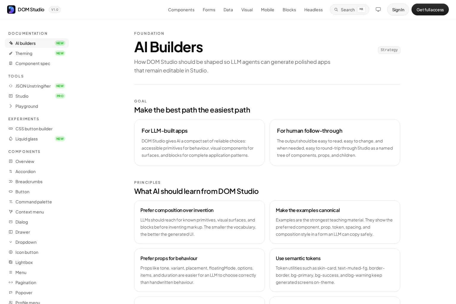
DOM Studio is organized around these layers, with headless elements for behavior, Vue wrappers for product surfaces, and blocks for complete application patterns. Its AI guidance emphasizes composition over invention, canonical examples, semantic tokens, props for behavior, and checkable failure conditions. You can explore the approach in our AI builder guidance, browse a concrete dialog component, or review the broader library of application blocks.

What an AI-ready component record should include
You do not need a giant document for every component. You need the right information in a form that stays close to the source and remains easy to retrieve.
A useful record normally includes:
- Name and category: a stable component name, plus whether it is a primitive, visual component, data component, or block.
- Purpose: the user problem it solves in one or two sentences.
- Use and do-not-use guidance: nearby alternatives and decision boundaries.
- API contract: props, defaults, allowed values, slots, events, and event payloads.
- State behavior: visual and interaction states, including errors and async transitions where relevant.
- Accessibility rules: semantic requirements, labels, focus behavior, keyboard behavior, and supported child structure.
- Canonical example: a short working composition that includes the meaningful setup.
- Source hints: import path, component source location, and related tests or stories.
- Validation rules: unknown props, prohibited child placement, missing required labels, token misuse, and other predictable failure modes.
- Stability signal: stable, experimental, deprecated, internal-only, or replacement guidance.
In DOM Studio, component metadata, examples, and documentation can live alongside the component source, allowing the same information to inform documentation, discovery, inspection, and AI context. The component specification is a useful reference for this source-adjacent approach. For teams working on documentation or generated-code previews, our developer utilities also distinguish presentation helpers from components that own backend workflows.
When AI coding components provide the most value
The concept is most valuable when your team has UI work that repeats, needs consistency, or includes non-obvious interaction rules.
Complex interactions
Dialogs, menus, popovers, comboboxes, command palettes, date pickers, trees, and toasts look simple until they need keyboard navigation, focus handling, selection state, and error cases. Established components let the AI compose behavior rather than attempt to recreate it.
Form-heavy application screens
Form controls benefit from stable naming, schema information, validation states, and canonical field layouts. The AI can then generate a settings or invite flow from known fields and rules instead of composing unlabeled inputs with disconnected validation.
Large teams and long-lived products
The more engineers, repositories, or product surfaces you have, the more costly UI drift becomes. AI coding components provide a shared vocabulary for human contributors and AI assistants.
Editable UI workflows
In a visual editor or a system that needs to round-trip generated output, a named component tree with explicit props and children is more useful than anonymous HTML. Intent stays visible: a card remains a card, a form field remains a form field, and each node can retain a stable identity.
Common misunderstandings to avoid
“The model knows our component library already”
A public library page or prior model exposure is not a dependable substitute for current, project-specific context. Your implementation conventions, component versions, supported tokens, and local boundaries matter. Give the agent a small, accurate path to the relevant contract.
“More documentation is always better”
An AI agent does not need the entire documentation site for every task. Broad, unfocused context can bury the useful rules. Start with an index, the selected component record, one canonical example, and task-specific guidance. Expand only when the request genuinely requires it.
“Metadata alone makes a component AI-ready”
Metadata helps discovery, but it does not replace examples, behavior rules, accessibility guidance, and validation. The AI needs an operational contract, not just a label and a list of properties.
“Generated code can skip normal quality checks”
AI-assisted UI should be subject to the same standards as hand-authored UI. Verify imports, props, semantics, responsive layout, error states, tests, and accessibility behavior. When a generated result repeatedly fails the same way, treat that as a documentation or component-system defect to fix.
How to evaluate whether your components work with AI
The strongest test is a small implementation task. Ask an engineer or coding assistant to build a bounded screen using only documented components, for example an account settings card with an email field, a status indicator, and a confirmation dialog.
Then review the result:
- Did it choose the intended component or block?
- Did it use only documented props and events?
- Did it follow the canonical composition and semantic token rules?
- Are labels, errors, focus, and keyboard behavior present where needed?
- Can a developer edit the output without untangling generated markup?
- Do validation checks catch unsupported components, invalid prop values, and missing requirements?
This evaluation is more revealing than asking whether the output looks polished. It tests whether the component system supplies enough guidance for implementation and review.
For a concise companion discussion of repository context, watch the video below on using custom instructions with GitHub Copilot. Its core lesson applies broadly: put clear, durable team guidance where the coding tool can use it.
The strategic payoff: better choices, not just faster code
AI coding components do not eliminate design or engineering judgment. They concentrate that judgment into reusable, testable artifacts so the assistant can apply it consistently.
That changes the role of the UI system. Instead of being a shelf of parts, it becomes a decision system: which component to use, how to configure it, how it behaves, where its limits are, and how to check the result.
For teams building app interfaces with AI, that is the durable advantage. We can ask the assistant to move faster without giving up ownership of component behavior, accessibility, visual language, or maintainability.
Ready to turn an existing library into a more reliable AI coding surface? Start with a high-use component, document its purpose and boundaries, add one canonical example and state rules, then validate it with a real implementation task. From there, expand the same contract across your primitives, visual components, and application blocks.